With websites turning more and more into web applications, functionally as well as aesthetically, it’d be interesting to look at what makes a Web app work in terms of skinning. We start off by comparing two different approaches: HTML-skin vs. desktop-application-skin. In other words, Google versus Apple.
GMail clearly looks and feels like an HTML-website, which aesthetically takes away some of what a regular user imagines to be an application. The new .Mac environment, MobileMe, looks more like a desktop application and feels more like an application, but doesn’t follow design guidelines for websites. So which way should you go with your online application in terms of surface design? Should you be more on the “online” or more on the “application” side?
The Art of Noise

MobileMe relies on icons that don’t have any obvious meaning for important navigation and interface controls on the Web. This leaves users (particularly non-Mac-users) to guess what each icon actually does. Only the first three icons of the main navigation are familiar, and the first only because of its obviousness. Without text, one is forced to rely on mouse hovers and prayers to the ALT text god.
Compare these to the top navigation of GMail:

With plain text, it’s obvious where each link takes you: “Start Page” to the start page, “Mail” to mail. There is no uncertainty or fear of clicking on the “wrong” thing.
Elements of an interface that rely upon symbols with obscure meanings require more thinking than those that rely upon a familiar language (visual or otherwise). The overly-reduced navigational elements of MobileMe are tough on the user and introduce uncertainty into elementary components of its interface; adversely affecting the usability of the site. 1:0 for Google.
Design for the Eye: (Dot)Me
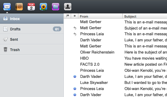
The claustrophobic top bar does little in the way of providing a user with orientation within the overall site structure; it is exemplary of uninformative fanciness. Let’s take a look at another example:

We’re in Mail (probably), in the Inbox (most likely), and there’s not a whole lot of indication of what would happen were we to click a message.
Reducing uncertainty and improving understanding are critical components of good Web design. Unintuitive information can be made clear and accessible by thoughtful structuring and visual manipulation of that information, but that’s not being done here. The colors, background images, and various other graphic elements hinder the information; they don’t serve or support it:
- The sidebar does not visually relate to what it represents.
- The absence of dividing lines between messages visually “cleans-up” the listing, but as a result there is no clear delineation between unique messages which may otherwise be obvious.
- The message list attracts the eye, but there is no visual trail to lead one back to an overall description of what the message list is actually a listing of.
- The buttons are styled.
- Form fields are manicured.
- Hover states and cursor changes are unexpected and inconsistent.
- Menus are MobileMe-dependent.
Design for the Brain: Gmail

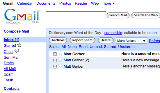
Several things are immediately clear:
- We are looking through the Inbox and there is one new message (and two old messages).
- Our eyes carry from the message listing to the “Inbox” tab, indicating our overall location.
- New messages are highlighted by contrasting color (white background) and font weight (bold), while old messages are dropped a hierarchical level by the same means.
- Unique messages are delineated by lines and there’s a number of obvious options for each message (Archive, Report Spam, Delete, etc.).
- The buttons are default form buttons.
- Text can be selected.
- Links have understandable hover states and cursor changes.
- The menus are consistent with those of other sites
- Inputting text behaves as expected.
GMail’s interface feels “safe.” There is noticeably less uncertainty. It’s clear what most things actually do. The logical ways are short and cause-and-effect is obvious. GMail maintains the look, feel, and interface of a website by using the commonly accepted interface elements of a Web browser. 2:0 for Google.
Responsiveness
The most noticeably frustrating characteristic of MobileMe is its slowness. Excessive load times, when expected, should be accounted for in an interface, and feedback should be provided for users. Web browsers, by nature, have means of handling load times by showing users a loading icon in a tab (as with Firefox). GMail relies on this functionality to inform users of long waits.
The skinning cannot be blamed for excessive load times. But not accounting for unresponsive interfaces is negligent on the part of an interface designer. MobileMe assumes the flash-site approach and forces their users to learn and adapt to an entirely new and oftentimes unintuitive interface—an application best kept off the Web and left on the desktop where it belongs. 3:0 for Google.
Conclusion
The media-appropriate approach of Google shows that the interface is not a matter of graphic design, it’s a matter of how it works. With all the glitz Apple brings to the Web in an attempt to win a beauty contest, they lose the true contest: the beauty of usability. But that doesn’t mean you shouldn’t give your Web app a manicure.
Apple’s attention to graphic detail usually leads to astonishing results. Yet what makes or breaks a Web app is not its shapes and colors: it’s the logic that drives them. And that logic is defined by the media and not by aesthetics.