Defining the identity of iA Presenter next to iA Writer was a three-year process that went hand-in-hand with the UI development. Design takes time. Here is how it went, what we learned, how far we got, and what you get in return.
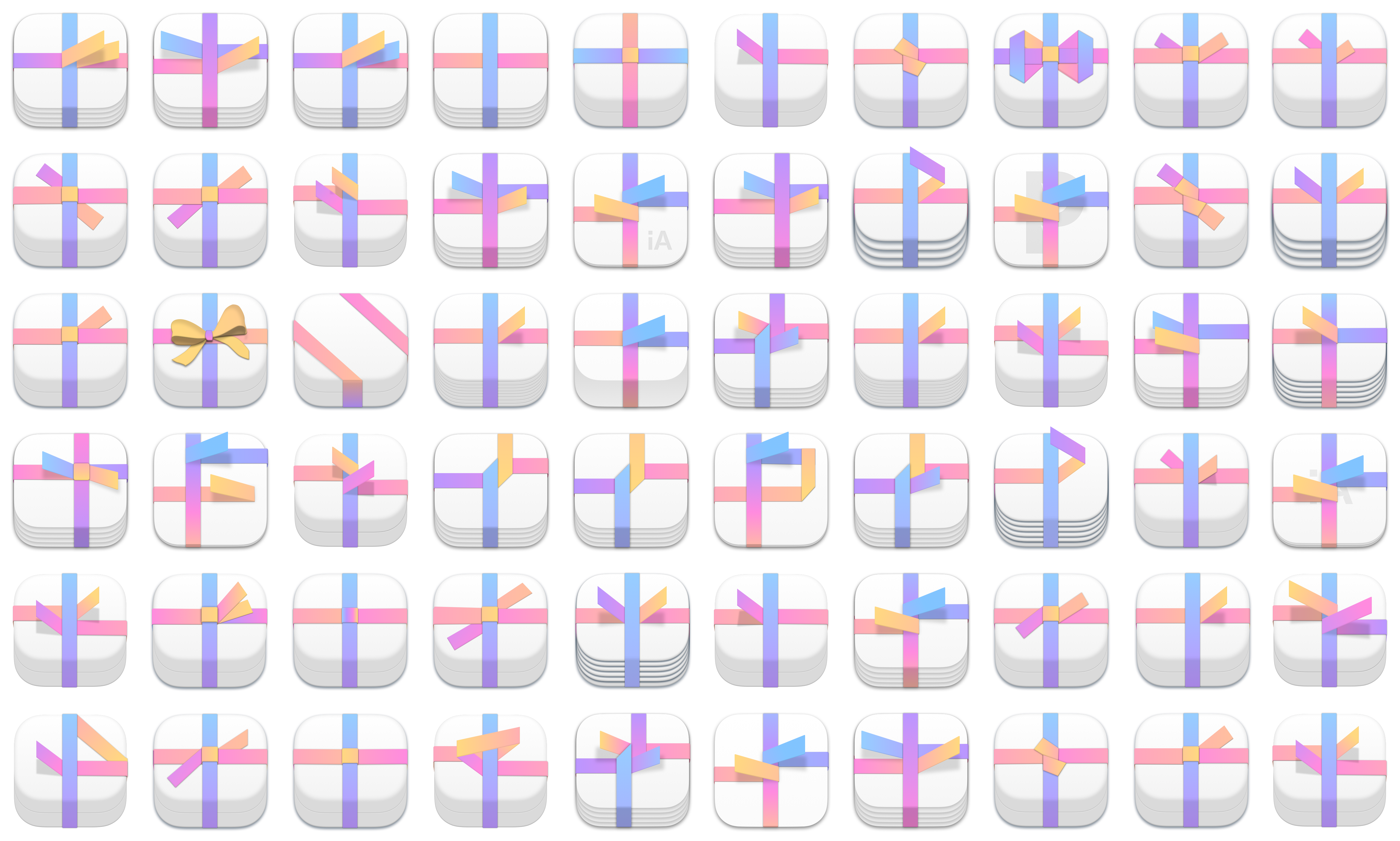
The video above is a time-lapse of the whole design process. These are all the variations that we could find. The order is more or less chronological. They represent about half of the designs that we created over the last three years. The following article explains the process.
1. The First Idea
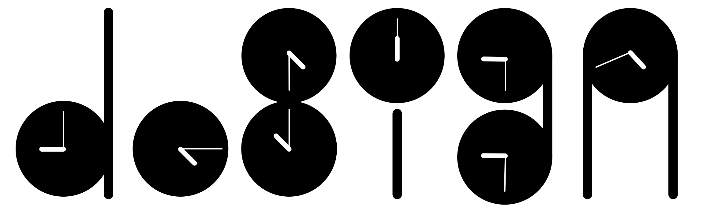
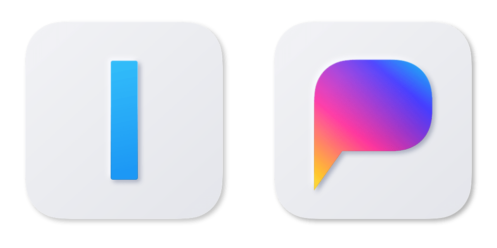
Currently, iA Writer uses the letters “iA” and a caret symbol as its basic elements. The caret represents the word “Writer”. It quickly became clear, that using two iAs in the icons for iA Writer and iA Presenter would make them hard to discern.
The central idea of iA Presenter is focusing on the story. Using speech bubbles instead of a caret in the icon seemed like a given. Using speech bubbles in the app came out of thinking about the icon.
A darker blue color could give the icons more contrast. Splitting the iA Writer logo into two was the next logical step. Use a caret that reads as “I” and lowercase “a” that resembles a speech bubble.
We had used that caret-only logo for iA Writer before. It felt clever. But no one knew what it meant. It was too clever. Together though these two icons would read as I and a, with inverse capitalizations. What is more clever than too clever? Way too clever?
Now the two app names would appear to start with the letters “I” and “a”. Not so clever. Internally we have been calling iA Writer iAW for years. If iA Writer were to have its own letter, it would be “W”. And the other app should get whatever letter the final name would suggest. How did we decide on the name?
2. No Name, No Icon
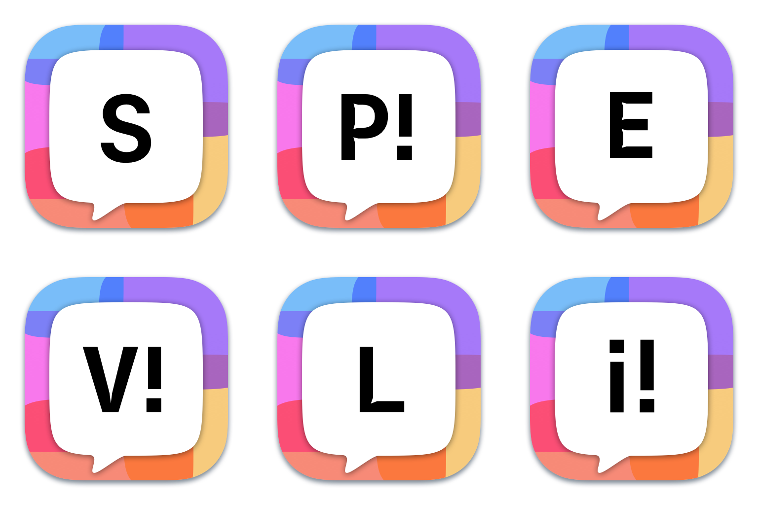
The changing letters in the initial animation above already foreshadowed that the app’s name had changed a lot during its development. At different stages, we experimented with iA Verve, iA Speaker, iA Explain, iA Express, iA Stories, and many other fancy, cool and silly names.
At the same time, we wanted to maintain the generic naming that iA Writer used. “Writer” describes both the app and its target audience. As a sister product, it was clear that the new app should be named iA “Something”. Ideally, the word “Something” should be as direct as “Writer”. Instead of just calling it what it was, “iA Speaker” took the pole position.
The name you give to a product always has an impact. Calling the app “Speaker” made us think about music and concerts. We started using song titles and lyrics from famous pop songs in internal communication. This idea survived the naming and design changes. Looking at iA Writer communication you’ll find a lot of musical references.1
3. Test Name And UI Together
We worried that the word “Speaker” in the app’s name might be misunderstood as a reference to a loudspeaker. This concern proved to be unfounded during user testing. We tested the name and app together. You can’t test an app’s name without letting people use the app. This seems obvious in retrospect, but it took some time to realize it, as naming and name testing is usually done independently.
In context, it was clear that “iA Speaker” cannot be a loudspeaker. Apps can’t be loudspeakers…
There was another problem, though. While testing the app, we discovered that people perceived “iA Speaker” as an app for making speeches. We wanted to offer a better way to create presentations in general. Emphasizing speech would communicate that the app focuses on what you want to say, as opposed to how you illustrate your message.
The name led to misunderstandings and skewed feedback. Most testers assumed that the app was only for TED-style talks and interpreted every feature and label accordingly. Testers felt differently despite our efforts to explain that the app would be used primarily for traditional presentations and that the teleprompter was optional. We examined how much the name had to do with it and tried new names:
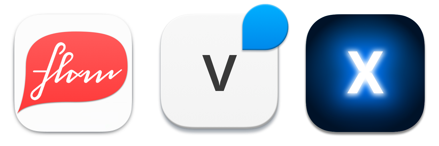
When you make a new app you want it to be cool and special so you want a cool and special name. Something like “iA Verve,” “iA Flow,” or “iAX” and whatnot. Why X? “We could name our products iAV, iAW, iAX, iAY, and iAZ.” However, cool and special ideas, are not always clear ideas. People frowned and rejected them like you’d reject a quicksilver cocktail. Yeah, “iA Quicksilver” crossed our minds as well. “Verve” was particularly hated.
Testing incomprehensible names had an interesting secondary effect. Without mentioning “Presenter”, a lot of people started referring to it as “Presenter” or “Presenting app.” Even people that didn’t know “iA Writer” sometimes chose “your Presenter” when talking about it. This had also happened with “iA Speaker”!
The idea to just call it “iA Presenter” had crossed our minds many times before. It just seemed a bit too simple, and too long and bumpy. “How about ‘iA Present?’ It doesn’t need to be another -er name.”
We liked the multiple meanings of the word “present” in the name “iA Presenter” or “iA Present”. The word “present” could refer to a presentation, a gift, the speaker’s and the audience’s shared presence, or the time we share while we speak and listen. A good presentation feels like a gift. A bad presentation, on the other hand, as we all know, steals our time.2
The icon for “iA Present” captures the idea of a presentation as a present. The icon is designed to change shape slightly every time the app is loaded, adding an element of surprise and change. Presentations made with our app should have the quality of a precious gift worth the time and attention that your audience gives you.
Unfortunately, at this point, the icon has nothing in common with iA Writer’s identity anymore. Nevertheless, we tested the app together with the new name. We observed carefully if and how our users’ understanding of the idea and features changed with the new name. Working titles influence how we think about our product. The name of an app influences the way you perceive and use it. Even more so if it is a new app you haven’t heard about before.
Using the name “iA Present”, test users opened the app expecting a simple and straightforward presentation app. This was exactly what we were aiming at.3 The name “iA Present” worked well for the app, but many people still referred to it as “iA Presenter”.
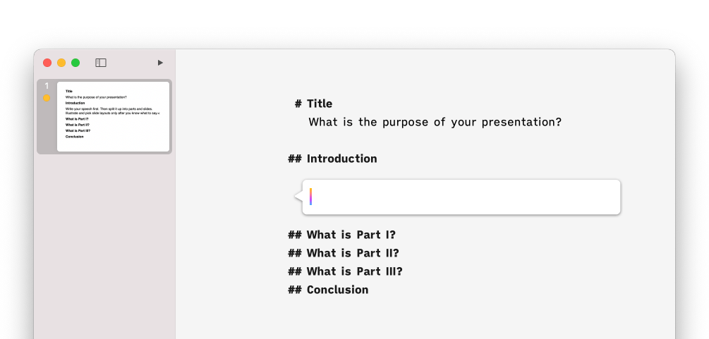
4. Coordinate UI and Icon
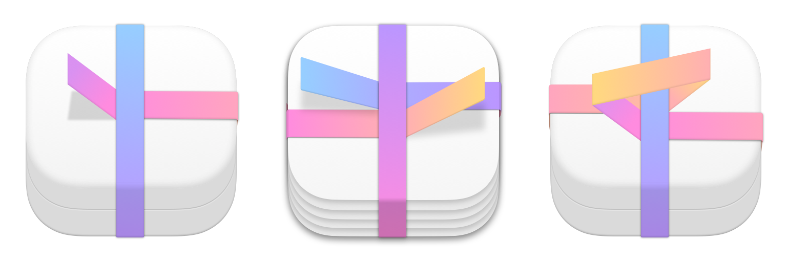
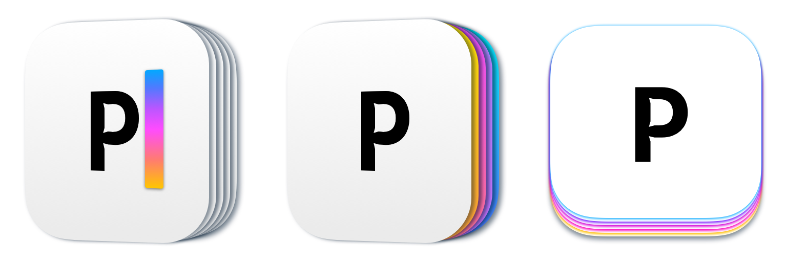
Since it was an app with slides, we experimented using different layers:
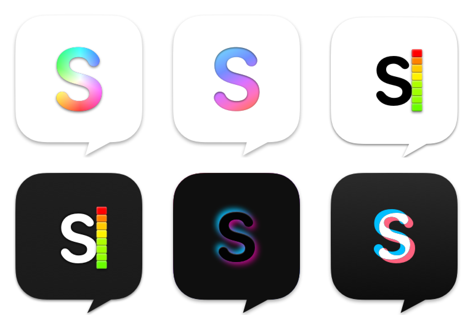
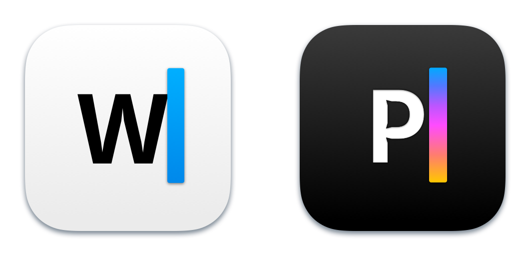
Instead of using “iA” as a common identifier, the caret would now function as a unifying element between iA Writer and iA Presenter. Presenter is a more visual app than Writer. We thought that a multicolored cursor with a gradient would communicate that clearly. The next thought was: “But if we use it in the icon it has to be in the app as well!” Yes, indeed. This is how we started experiments with a multi-colored caret and colored bubbles inside the app.
The idea for this crucial UI element came out of the design interations for the icon. We tested the idea using a gradient cursor in the app. In practice people found it to be mostly irritating.
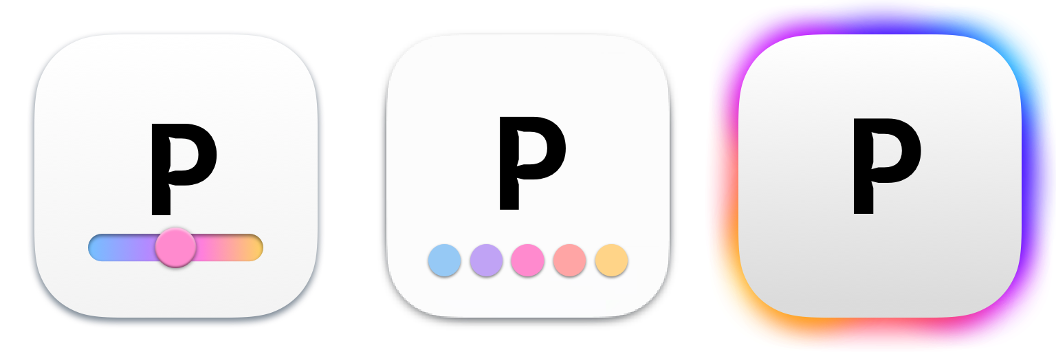
Next, we tried gradually changing the cursor and bubble colors as the one progresses in the presentation. Start cold (blue), heat up until the climax (red), then finish with a golden glow (yellow). The idea proved to be technically challenging. But the idea worked. Ultimately it was only a technical challenge. Explaining the exact way the dynamic cursor color and speech bubbles came to be is a separate, very long story.
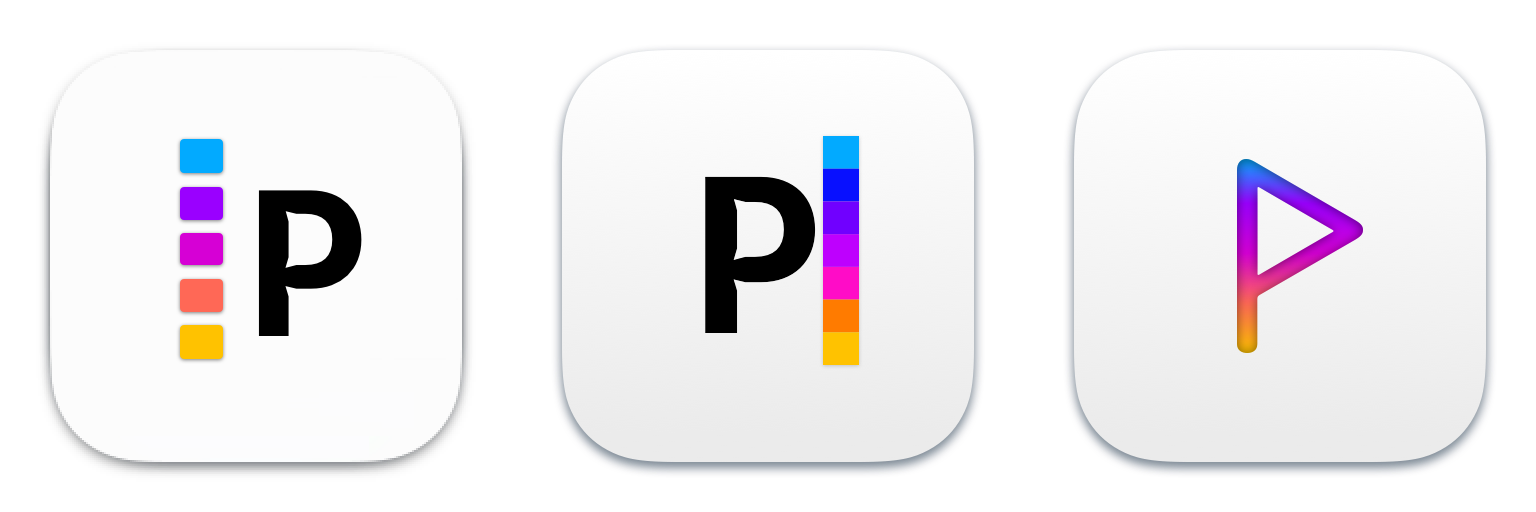
We ended up still using the gradient caret in the icon. It communicates the visual nature of the app and reminds you that the cursor changes color as you progress.
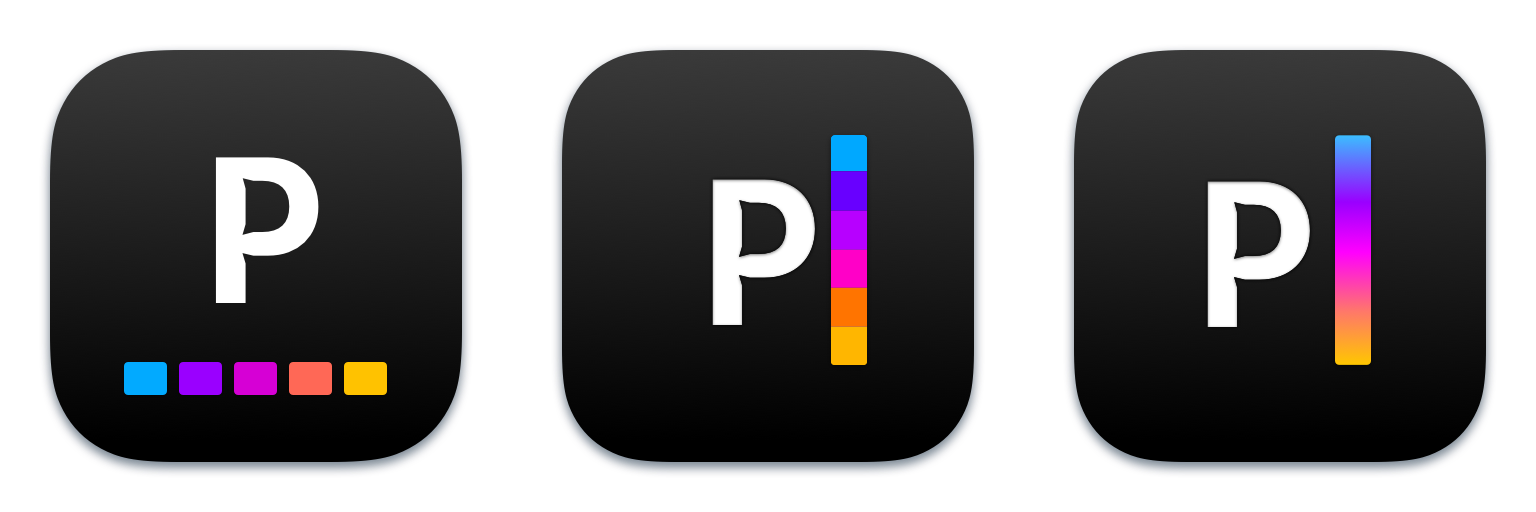
The gradient conveys the visual nature of the app and metaphorically reminds the user that the cursor changes color as they progress.
It is not yet certain whether or how we will change the iA Writer icon. Consistency is key for a strong brand identity. But building brands is not as simple as following a strict set of rules. Brands evolve and grow organically, and some inconsistencies are even desired. The process of reevaluating iA Writer’s icon is not yet complete.
Often, you end up with a variation of the very initial design. Reconsidering iA Writer for our next version, iA Writer 7, planned for next year, we might as well end up where we started.
5. Conclusion
Designing an app icon is an intertwined complex process. It should not be rushed or lazily outsourced. Ideally, you integrate it into the overall development of the app. User interface design can take inspiration from it and the other way around.4 Ideas for naming and icons can be tested to ensure they are understood and effective together with the app.
Good design takes time and effort, but the time used to understand and clarify a design is not wasted. While design takes time to get it right, it will lead to a more efficient product and ultimately save time for the users of the product or service. Even though a small group of designers may spend a few months carefully thinking about the product, the end result can be a product or a service that, for many years, saves time for hundreds of thousands of others.
We invested a lot of time into designing a simple and efficient app. The icon wasn’t a separate side track but an integral part of the whole process. By developing icon and UI together, we have created a more efficient product that saves both time for the presenting individual and their audience. We didn’t think about this when we started off. But it became evident from the feedback we received from you that this is the most striking character trait of iA Presenter. Again and again, we hear from you just how much time the app saves you compared to traditional presentation apps.
-
It’s not always straightforward, but usually quite clear: “Write it. Show it. Rock it.” is a Daft Punk reference. Designers usually listen to monotonous electronic music while working. The most played song while working on iA Presenter was probably Rage Against the Machine’s “Maggie’s Farm”. It matched and amplified the basic sentiment: rage against the unhealthy way presentations are made and held. The line “I got a head full of ideas, that are drivin’ me insane” also matched quite well the feelings we shared about how to do things better. There were so many ways we could improve presentation apps. Seeing at the design process of the icon will give you an idea of how mad the design process was for the UI. ↩
-
As we thought about the name “iA Present”, we came across the idea of “the present of time”. The expression “the present of time” sounds like something a French Postmodernist could annoy us with. After all, life itself is “the present of time,” n’est-ce pas? The expression can be understood in a less flowery, more direct way. People paying attention to us give us their time. In return, the time we invest in making and rehearsing the presentation should honor the time that people give us when they listen to us. ↩
-
We also liked the curious fact that the original name of PowerPoint was Presenter. iA Writer wanted to be what Word should have been: An app for writing. iA Presenter wanted to be what PowerPoint should have been: An app for presenting. That they might use the same initials as Word and PowerPoint in the icon is somewhat ironic. ↩
-
We also develop our videos in parallel and they also give and take input to the UI development. ↩