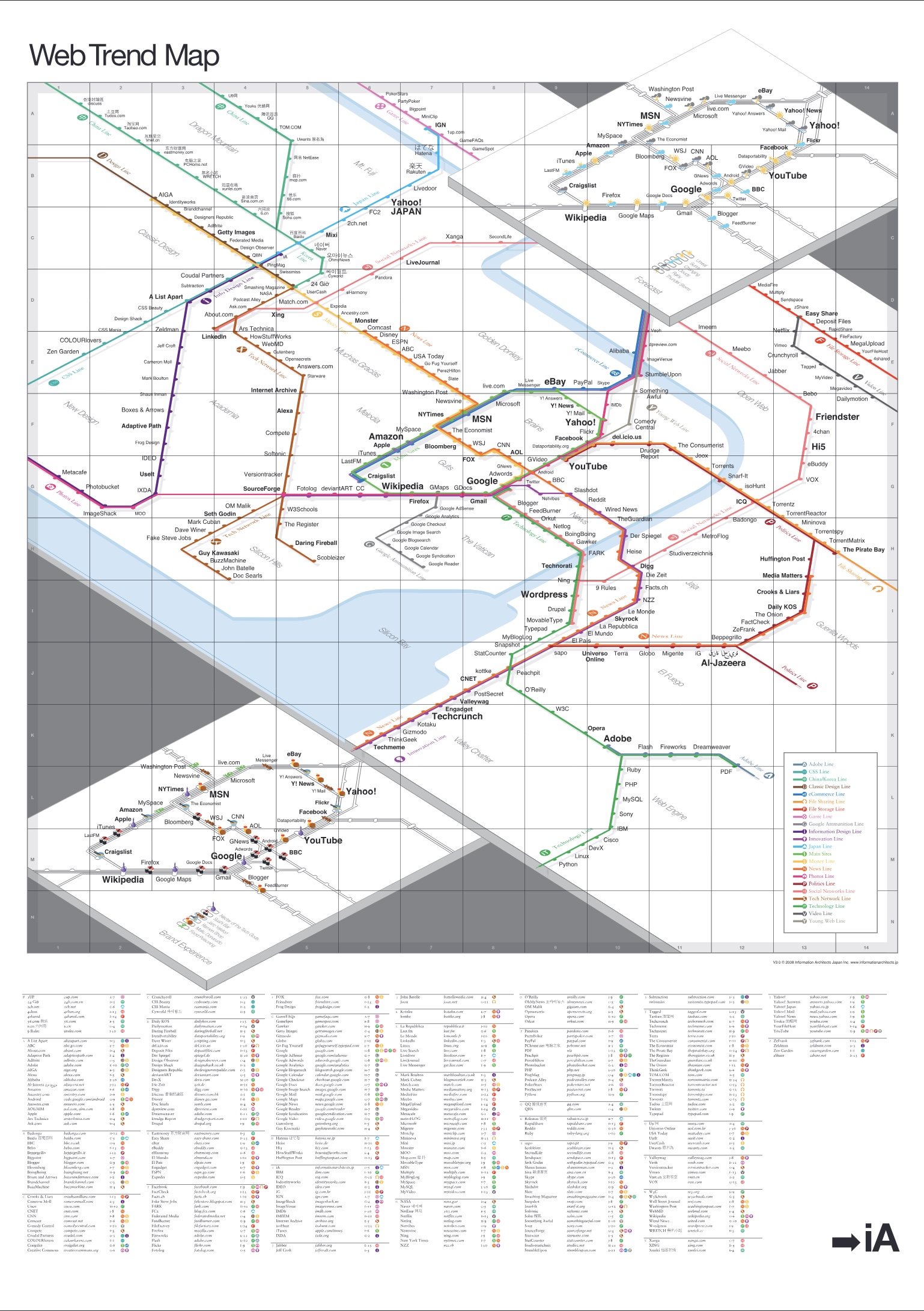
Those familiar with the new Swiss train station maps may recognize one source of inspiration. After meeting with our good friend Adrian Schaffner from evoq over the holidays, we studied his impressive work with mapping the Swiss train stations and adopted a few of the concepts ourselves.
Instead of cluttering the main stations with additional information, we elaborated on their trends by adding two new layers: brand quality and interface quality.
Brand Experience
We named the brand quality layer “Brand Experience.” It illustrates our perception of user experience and brand management of the main stations. We studied the usability, user value, and interface (simplicity, character, and feedback), and rated each site on a scale of eating at various types of Japanese restaurants.
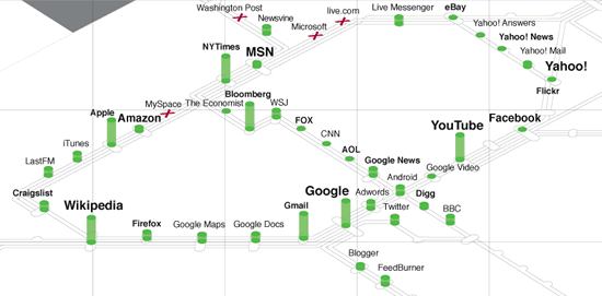
We chose restaurants as the metaphor for brand experience because, from an interactive branding point of view, a visit to a website is like a visit to a restaurant in terms of service, feedback, content, pleasure, character, and memorability. And also because Tokyo has the highest density of good restaurants in the world—even the cocky French have to admit that now.
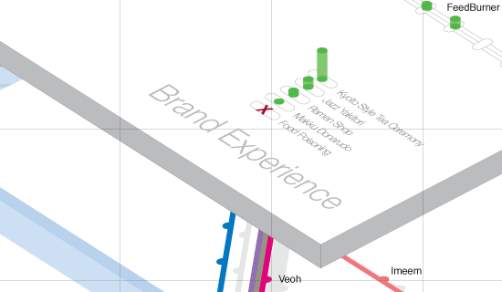
- Kyoto-Style Tea Ceremony: The best grade. The user experiences maximum care in every detail of their experience. The New York Times is a well-designed and well-thought-out news site. Google continues to set standards. Bloomberg impressed us by sticking to its classic style, despite IDEO’s offer of a very convincing redesign. YouTube improves a step at a time with its tight and clever redesign cycles. Wikipedia can be difficult to use, but the pleasure it provides can’t be beat. Apple scores repeatedly with its innovative, user-centered interfaces. You can hear the soft pluck of a koto in the background.
- Jazz Yakitori: very cool. Japanese yakitori (grilled chicken) is as good as chicken comes. There is one yakitori place in Shibuya we especially like. They serve cold beer that is as delicious and soothing as the smooth jazz that fills the restaurant. Most Google products qualify, but also iTunes (of course), LastFM (applause), Craigslist (fantastic service and still a great interface), Newsvine (has its flaws, but still a great product), MSN Messenger, and of course, Twitter due to its superb simplicity.
- Ramen Shop: As the quality of ramen shops varies greatly, so do the websites in this category. But—in the words of Larry David—they are all still “pretty pretty good.”
- Maku Donarudo (McDonald’s): They serve you like a Japanese McDonald’s. In other words, the food is okay, but you know exactly what to expect and they bow after you pay.
- Food Poisoning: Don’t go there. There are so many good restaurants in Tokyo that you really have to be unlucky to find a bad one. Websites on the main line that provide a bad brand experience are either stow aways, or managed to get where they are due to the power and money driving them. If Microsoft Live starts whining, “why do we get such bad grades? We do exactly what Google does,” we’d echo, “exactly“. A strong brand has character and class; Microsoft does not. Neither does The Washington Post. We’ve said it before and even showed how to do it, and even cellulose designers know there’s something wrong.
Momentum
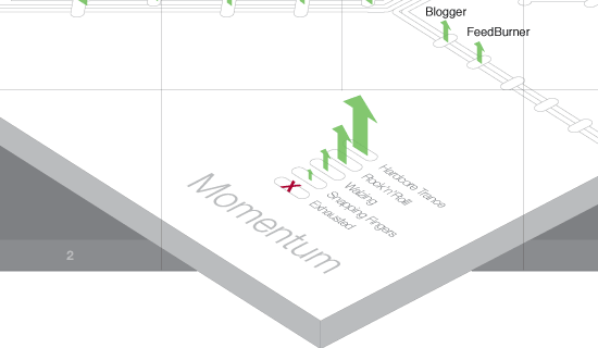
In addition to excellent food, Tokyo also sports a wild party scene. We rate the main sites in terms of interface quality. A website’s momentum is comparable to the momentum of a dancer in action—or exhaustion.
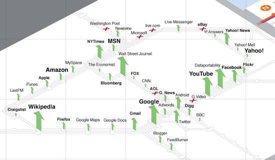
- Hardcore Trance: With a strong, fast beat upwards of 140bpm, hardcore trance is enough to get your blood pumping on the dance floor. In addition to Google, Youtube and Dataportability.org are the hottest dancers right now.
- Rock’n’Roll: Websites that promise to rock the boat receive the Rock’n’Roll rating: Facebook (boring, but they have momentum), Yahoo News (recently grabbed 250 local newspapers), The New York Times (strong strategy, brilliant creative director), Twitter (big year ahead), Android (whop, babba lula), and Gmail (steady growth) make the cut.
- Waltzing: There is no better music when driving a car than a good, old Vienna Waltz. If your website is waltzing, you are in the zone. Waltzing websites are the ones that run smoothly and have good prospects in continuing at the same pace. If you’re on the main line you should be waltzing, otherwise…
- Snapping Fingers: …you’re just snapping fingers. But at least you can feel the rhythm. Websites that are snapping fingers still have energy, but they show signs of exhaustion and need a push back on the dance floor.
- Exhausted: Dancing is for young people with lots of energy. Some sites show clear signs of getting old. It comes as no surprise that most exhausted websites deliver a bad brand experience. Bad branding is not a sign of aesthetic deficiency, it’s a sign of bad management.
