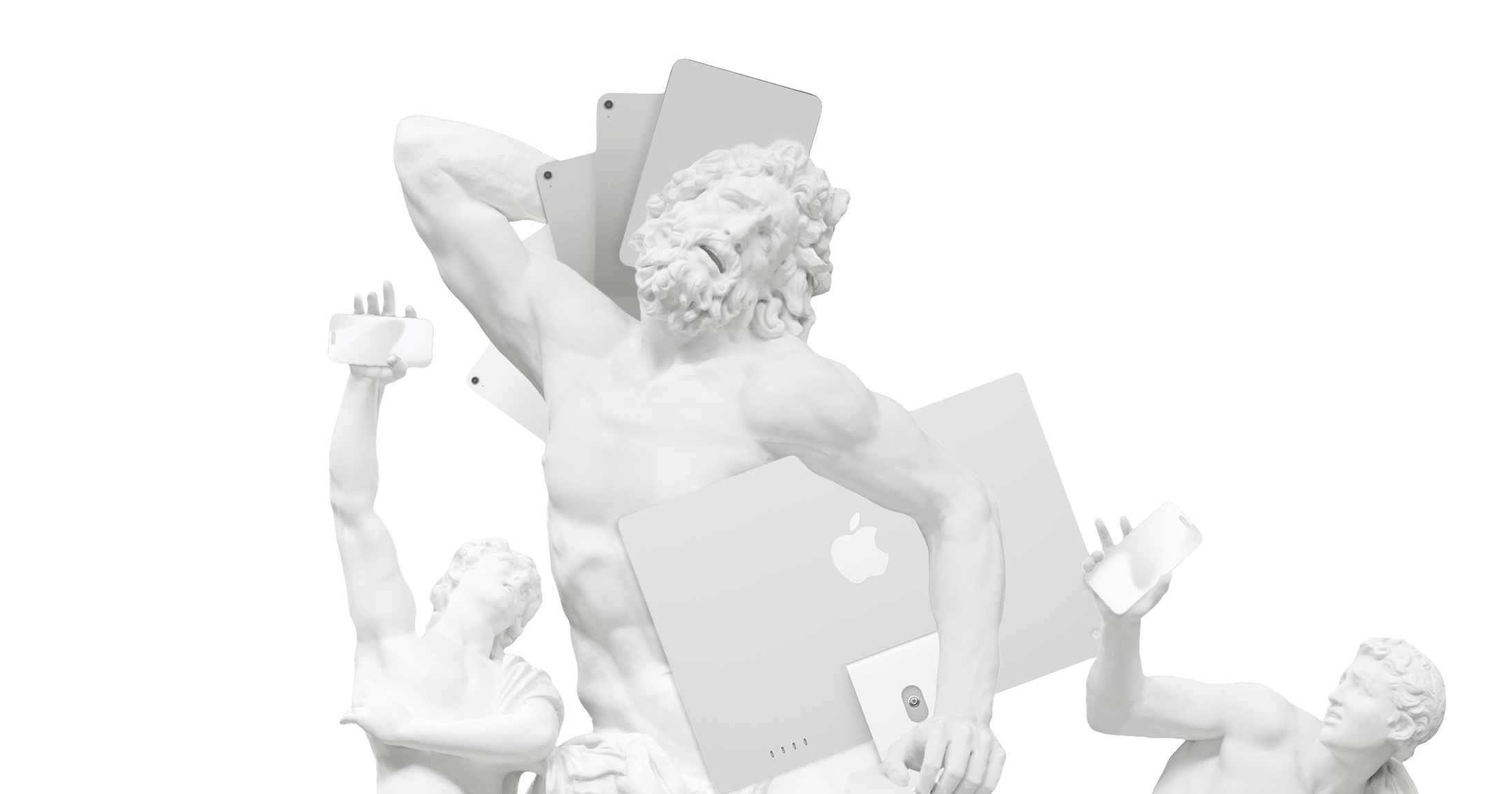
The phrase a picture is worth 1,000 words is a well-worn cliche in visual storytelling. Is it true? Where does it come from? And why do we still use words? A critique of the pure stock image.
Research in visual perception suggests that humans may process images up to 60,000 times faster than text, a concept leveraged in advertising and media.1
And yet, sometimes, words themselves can paint the most vivid picture. Words can express complex or abstract information in a way images cannot.2 Sometimes we need both.
If any picture was always worth 1,000 words, we wouldn’t need to write much to create our presentations. We could just collect pictures and nod along. Obviously, words, spoken or written, do have a power that pictures lack.
To delve deeper into the interplay between images and language, we need to understand how they collaborate to express emotions and convey narratives. Specifically, we will explore when to use pictures, when to use words, and when it’s effective to use both.
The Origin and Myth of the Thousand-Word Picture
The phrase a picture is worth a thousand words has two popular origin stories. One version credits advertising executive Frederick R. Barnard, who attributed the phrase to an ancient Chinese proverb.
The closest Chinese equivalent translates to “Hearing something a hundred times isn’t better than seeing it once.” In other words, the Chinese Origin was made up:
“…the Chinese derivation was pure invention. Many things had been thought to be ‘worth ten thousand words’ well before pictures got in on the act;” –The meaning and origin of the expression: A picture is worth a thousand words
The fact that he did so in a piece he wrote about the effectiveness of graphics in advertising is deeply telling. Indeed, the true origin of the proverb is not Chinese but adspeak.3 It shows how the phrase has morphed into a commercial, facile cliche.
Today, this cliche is conventional wisdom in journalism and social media marketing. It’s so driven into our cultural psyche that no one ever questions it. What if we were to examine it more closely? Does the adage still hold up under scrutiny?
Ironically, the phrase itself has become a kind of picture - a snapshot that shows one aspect of a much broader, much more nuanced reality.
The Power of Visuals
Strong visuals have an undeniably powerful impact on presentation and storytelling. Meaningful images grab your attention and evoke strong emotional responses. Today, it’s easy to snap a clear photo and make it look good in Photoshop. What makes a good image is still not mainly a technical matter. Even grainy or blurry shots can tell a strong tale.
The issue with saying “a picture is worth a thousand words” is it sets up a false battle between words and images. It suggests one image can match, replace, or outdo the impact of words. A claim that compares apples and oranges and contradicts our daily experience.
- We all know the power of words.
- We know that a handful of well-chosen words will say more than a waterfall of clichés.
- We all know that one precise word can say more than 1,000 stock images.
Letting images and pictures compete for supremacy reduces the complex relationship between images and words into a direct, quantifiable comparison. Words and images function differently; they communicate in distinct ways and have their unique capacities for conveying nuance, detail, and emotion.
The Relationship Between Text and Visuals
While images can instantly evoke feelings or set a scene, they lack the specificity and explanatory power that words can provide. While words can be precise and informative, they might not capture the immediacy or emotional resonance that a well-chosen image can deliver.
Instead of pitching images and text against each other, we need to learn when to use which, and how to use both images and words to strengthen each other. Using your text and visuals in a way that complements each other can make or break the story you’re trying to tell.
Images and words are different forms of language. One can express that which the other cannot. The key to a strong presentation is to use them together and complement their strengths.
Minimalism in Storytelling
Effective storytelling, in text or visuals, says more with less. Using clear, focused messaging that focuses only on what’s important is key. In visual storytelling, presentations use meaningful, clear, focused images to guide the audience’s attention. Visuals grab your attention and directly impact your emotions.
Now, Martin Luther King Jr.’s iconic “I Have a Dream” speech. The image of Dr. King standing before the Washington Monument delivering his speech in front of a sea of people captures the intensity of the moment.


Consider Apple’s “Think Different” campaign, one of the most iconic marketing campaigns in history. The simple visuals made the slogan even more memorable and gave them staying power.


The Think Different ad uses words and images together in an energizing way. The image lends power to the text. The text lends power to the image.
Dos and Don’ts for Achieving Balance
Here are some practical tips you can keep in mind as you seek to activate the power of text and visuals.
1. Prioritize Information
What is the overarching message you’re trying to say with your presentation? If your audience never hears another word you say, what is the one thing you want to leave them with? Which language do you use? Visual, Verbal? Spoken or written language?
A few carefully chosen words can say what 1,000 stock images cannot. The right image can counter cynicism, closed-mindedness, or an automatic dismissal of a convincing argument. Now, think about how the images and text come together to prove your point. Image and text can convince in a way that they couldn’t on their own.
- Don’t read text from your slides.
- Don’t write next to the image that people already see.
- And don’t repeat in spoken words what your image shows.
Use words and images to enrich each other and move the story forward. Tell your audience how you interpret the image. What the image means.
2. Choose visuals that tell a story
Visuals are powerful, but overusing them can clutter your narrative and distract from your message. Use images to complement, not repeat or overshadow, the text. Get rid of images that are just there to add color.


To understand what story a picture really tells, take a step back and try to verbalize it. Verbalize what it is supposed to say and then compare that to what it really says. Pay attention to using image material that doesn’t communicate that you live in the past.


Stock images are clichés. Clichés can be easily turned on their head because of their simplistic topic. You want to communicate that you’re diverse and you end up telling people that you’re a company run by a minority. Or you want to communicate success, but the focus on two middle-aged white people ends up communicating their privilege.


Good pictures are just as rare - and as valuable - as anything good. TIME’s Best Photojournalism of the Year articles capture the essence of global events to explore larger social issues and trends. Very few images have that quality. If you’re honest with yourself, you have to admit that the probability that you find a stock image that tells a good story is very low.


We usually find faces the most interesting, then whole people, then animals, things, and finally places. Not all face pictures beat a beautiful view, though. For example, NASA’s moon landing photos might captivate more people than someone’s wedding photos. Generally, we prefer looking at faces over silhouettes, and people over plants. On the internet though, cat pictures are way more interesting than faces. No rule without an exception. Showing just a hand might be less interesting than nothing at all.


3. Be careful when adding one picture after the other
Make sure that your text and images speak the same language. Be especially careful which pictures you put next to each other. We inevitably read pictures next to each other as comparisons. When you use images next to each other, make sure they don’t clash in colors, style, or resolution. If they do, then put a text slide in between. Otherwise, people will pay attention to the contrast of the images, rather than their content.

The two pictures above each have their own issues. You add another layer to their story when you put them next to each other. By themselves, they are equally meaningless, but the color tone and lightning are different. Next to each other, that difference in style takes center stage: you make us focus on the color difference. Comparisons and sequences can also be used consciously to tell a compelling story:


4. Rehearse to Get a Feeling for the Impact of the Images
Practice your presentation by yourself. Treat your images with the same critical eye that you treat your speech and your text slides with.
Observe the relationship between the different forms of language you apply. Is it just technically good or does it say something? Is the image in the right place? Does it add to the meaning of your message, or is it just decorative? Does it need to be there, or is there a better image that says what I want to say?
5. Ask Others How They Feel About Your Visuals
It never hurts to have a fresh set of eyes and ears check out your presentation. Get a second opinion from someone - or multiple someones - before you finalize your images and text.
We tend to overestimate the meaning and the effect of our images. What may look meaningful to us can be just an image to someone else. Rehearse in front of others, see how they react, if they pay attention, and have them give you honest feedback on what you say, and what you show.
Take notes on how you feel as you go through your presentation, and how others react to it. Does it flow well, or does something not feel quite right? Do the images distract from or reinforce the message?
The Art and Science of Balanced Storytelling
Ironically, the phrase “A picture is worth 1,000 words” doesn’t come close to showing the whole picture. Text and image content both have their strengths and limitations.
Pictures have an impact when they tell a story that only a picture can tell. Ideally, you find the right words to enhance the said impact. Choose your images as carefully as you chose your words. If you don’t have a meaningful picture, don’t use a placeholder just to add color. You dilute your message, distract from what you want to say, and choose anything but the best means to communicate disrespect to your audience.
One carefully selected photo is more powerful than 1,000 stock images, just like three carefully considered words say more than 1,000 words of fluff. That’s why you should use fewer pictures but better ones when you present. In both cases, less is often more. But does all of that even matter in the age of AI? Isn’t making and choosing pictures passé? Well, maybe not quite yet.
-
“Visualization works from a human perspective because we respond to and process visual data better than any other type of data. In fact, the human brain processes images 60,000 times faster than text, and 90 percent of information transmitted to the brain is visual. Since we are visual by nature, we can use this skill to enhance data processing and organizational effectiveness.” Humans Process Visual Data Better ↩︎
-
“Based on the empirical analysis, we find that both image-based and text-based information influence consumers’ purchase decisions, but the former is more important for ‘search goods’, whereas the latter is more influential for ‘experience goods’.” Image or Text: Which One is More Influential? A Deep Learning Approach for Visual and Textual Data Analysis in the Digital Economy ↩︎
-
“The earliest example I can find is from the text of an instructional talk given by the newspaper editor Arthur Brisbane to the Syracuse Advertising Men’s Club, in March 1911: ‘Use a picture. It’s worth a thousand words.’” –The meaning and origin of the expression: A picture is worth a thousand words ↩︎