AI images are quick and easy to make. They look great at first sight, and they quickly replaced the use of stock images. But, like everything cheap and easy, they come with trade-offs. A short critique of the pure AI image.
Using AI well can lead to great visuals. But, quick AI shots often miss realness, depth, and originality. They can hurt your content’s quality and trust. Here are five times two AI clichés, why we should avoid them, and what we should do instead.
1. We recognize them
When Jurassic Park first hit the cinema, we had a hard time spotting CGI. These days, Jurassic Park looks like a practical joke. People can usually tell when an image is AI-generated even with the most advanced CGI. There’s always an air of PS5 game cinematics.


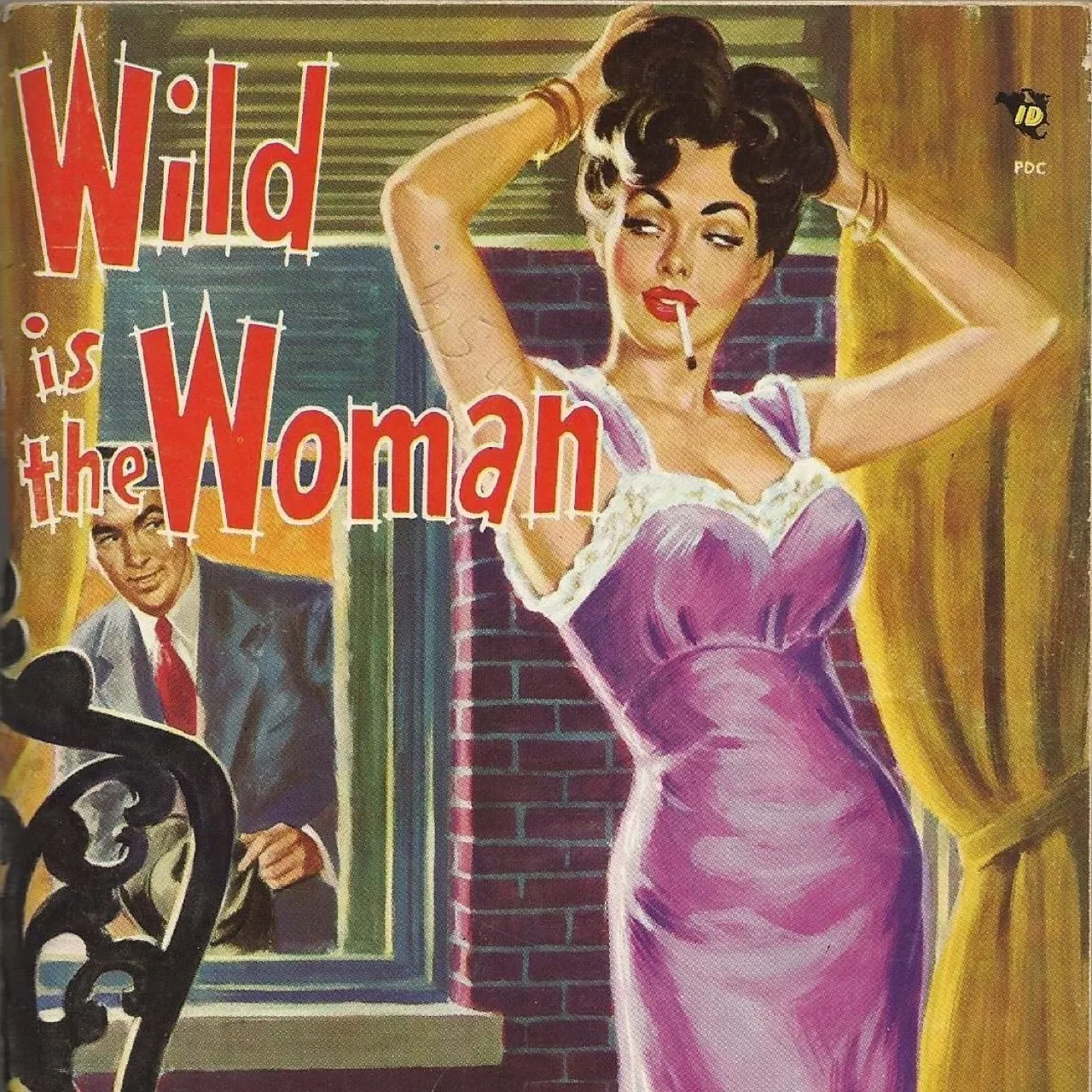
In 2024, freaky collages don’t make you look like a music artist with visionary ideas, way ahead of his time. This type of imagery is just ordinary cheap AI crap. It got old real quick.


Average AI images drag down everything around them. An AI hero image is a comedian opening the show with a knock-knock joke. Good images enrich your article, bad images steal its soul.
AI images make your audience think: “If they use cheap AI for images, they probably use it for the rest, too.” It raises questions about the authenticity of your content and your character in general.
“AI Art” escalated quickly. It’s January. While some executives in Davos may get excited about its infinite possibilities this week, to a younger consumer AI Art is already ‘a bit cringe’.
2. They all look the same
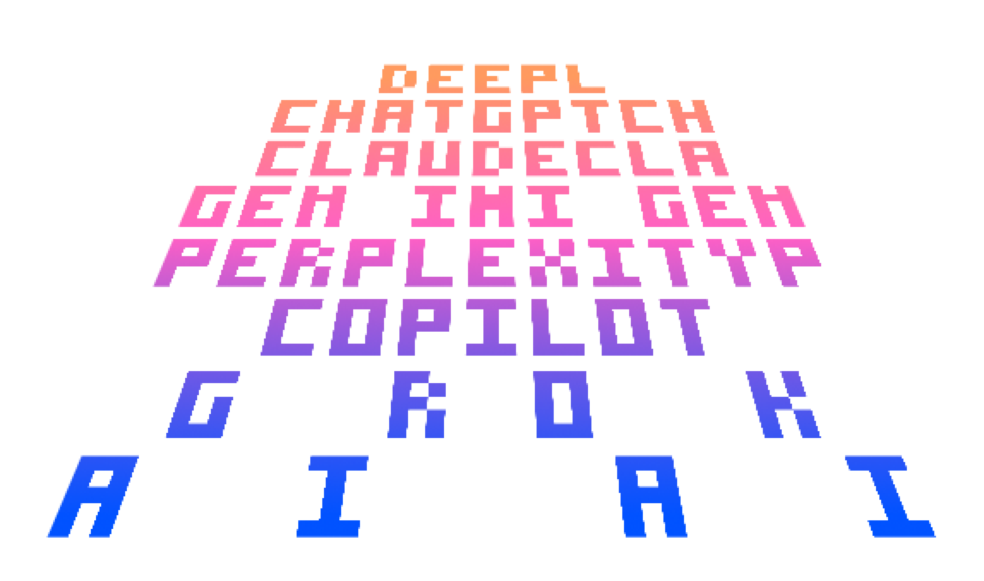
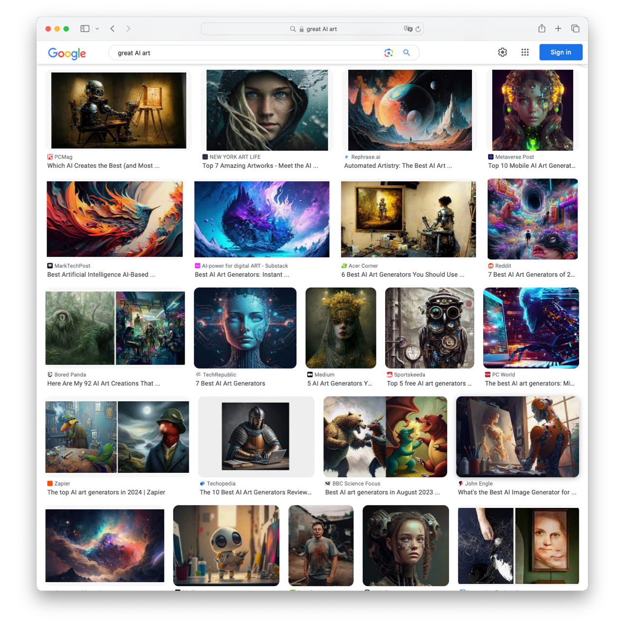
If you have the slightest sense of visual language at all, most AI images now look the same to you. They may still seem aesthetically appealing, somewhat, technically, at first, but they are still quickly recognizable as AI images. And then that’s all they communicate now: “I.M.A.I.”


Using AI images makes you drown in a sea of sameness. So, to stand out, rather use a grainy self-shot image? The question is: Do you always need an image? The use of images shouldn’t be an unconditional “always.” Instead, it should be a deliberate choice, driven by the specific needs and objectives of your content.
3. They lack emotion
AI images can miss the emotional or detailed touch that real photos or custom graphics have. Often they just feel outright creepy.


Images are not just a splash of colors. They tell a story through the objects and their arrangement, and they tell a story through the style and tone. Every detail matters. If the creepiness oozes out of the image, it will affect everything in your communication.
4. Ethical issues
Using AI images can raise questions about cultural bias, authenticity, and copyright. You may or you may not care about those. They are nevertheless very real legal and ethical matters worth thinking about.


AI images might look technically appealing at first sight, but they fall apart on closer inspection: AI doesn’t know what it does. If you don’t curate your prompts like Shakespeare wrote his sonnets, you’ll end up with images that don’t say anything but: “I used AI to add color.”


5. What about the future?
At this point, our average AI bro, reborn from Cryptohell, will chime in and teach us that this is just the beginning and that very soon, we won’t be able to tell the difference anymore. Well played, AI bro! But you’re off-topic. We can tell now and we need to not fool ourselves that others won’t notice.

Even if AI improves and we can’t tell the difference, we still need to put effort into choosing images that work with our message. This shows that AI, like stock images, can’t replace thoughtful selection in communication.
Now what?
While an obvious stock image says “I’m a cliché”, there is not a lot of Art in most ‘AI art’ either. A directly recognizable AI image just says “R.O.B.O.T.” Obviously, there are hypnotizing and sad stock images, amazing and horrifying AI renders. AI images are generally easy and quick to make but have significant downsides. However, it’s not about whether stock images are generally better than AI. It’s about how quickly AI images have become old and made stock images look even older.
The advent of AI should not be seen as a challenge. AI Art has shown that if we want to be heard and seen we need to show that we care for humans as humans. This has happened before. It was the invention of photography that made us come up with impressionism and, in consequence, modern art. Photography has made us question traditional art. Similarly, AI can make us question empty off-the-shelf communication. Ironically, machine-generated content might catalyze a fresh wave of humane creativity and hand-crafted innovation in verbal and visual storytelling.
Conclusion
AI or not, images should be given the same attention as text. Choose each visual carefully and place it in the right context. Don’t let AI do your job, use it as a tool. Ask yourself what your image means and how it adds to your message. This balance ensures both your words and visuals are powerful and meaningful. Images tell stories. Bad images tell lame stories. A good image tells a good story.