iA Writer and iA Presenter have new icons. We all get attached to what we know, so this double change can come as a little shock. We’d like to share the thought and work we put into it, so you see the full picture.
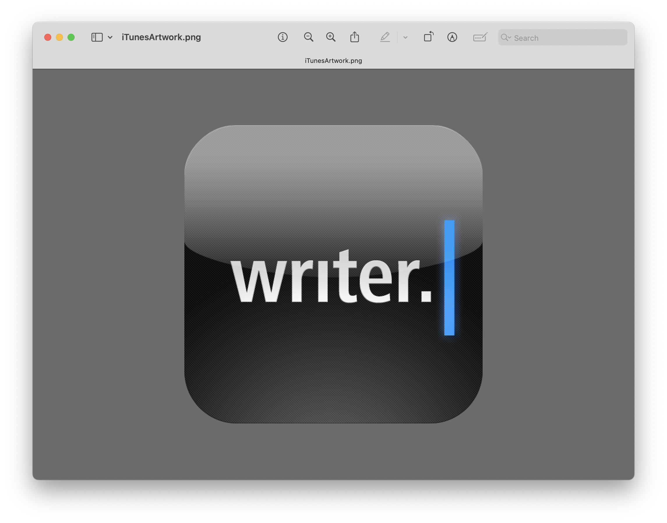
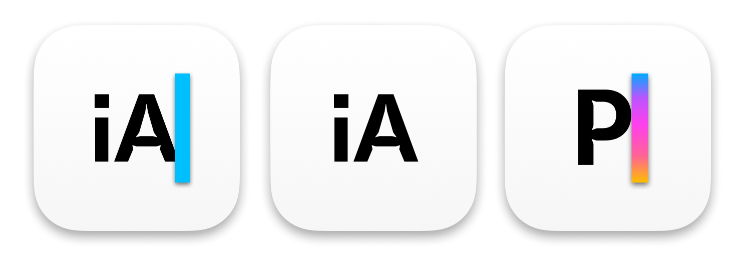
Over the last 13 years, we went through a few icon iterations. For nine years now, iA Writer’s icon was our company logo with a cursor. For the last four, the proprietary iA Sans with its exaggerated ink traps, the dot of the i which was lowered to fit the A, and the blue cursor. We all loved it—and still do.
This is not our first change. Here is a short evolution of the iA Writer icon:

The transparent version was short-lived:
But it wasn’t the last change that year:

It held strong for four years, until:
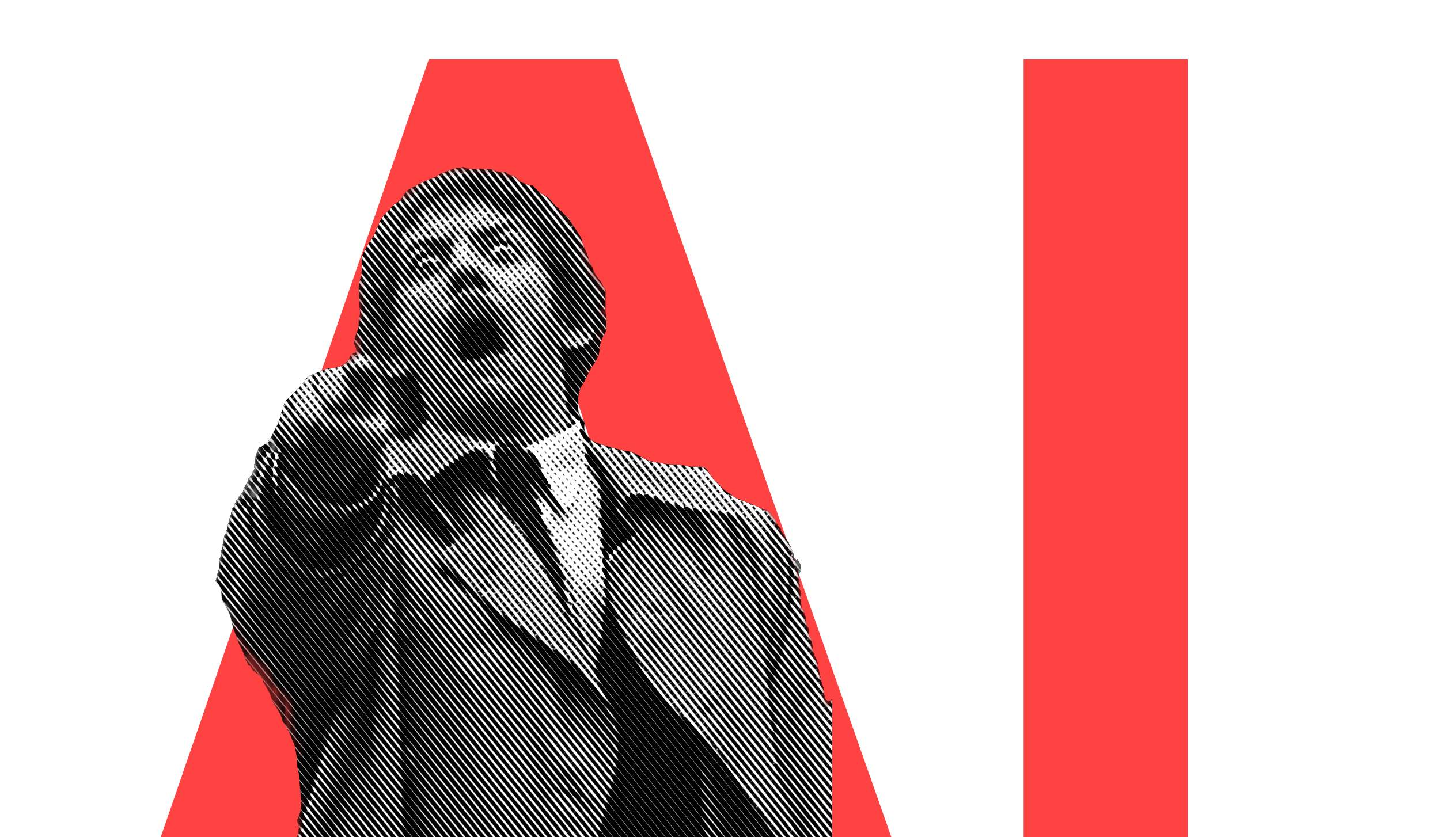
As you can see, the iA Writer branding was always about a clean slate with the blue caret. We put a lot of energy into making a blue wider caret in a time when all text views (Mac and iPad) had black hairline carets. That’s why we identify iA Writer so much with that one blue caret.
Enter Presenter
And then we built a second app. Choosing the icon was a puzzle that took far longer to solve than we expected. We wanted our app icons to look similar, but they still had to communicate the difference in purpose. We designed the new Presenter icon together with the next iA Writer logo. Here are some of the initial variations:
![]()
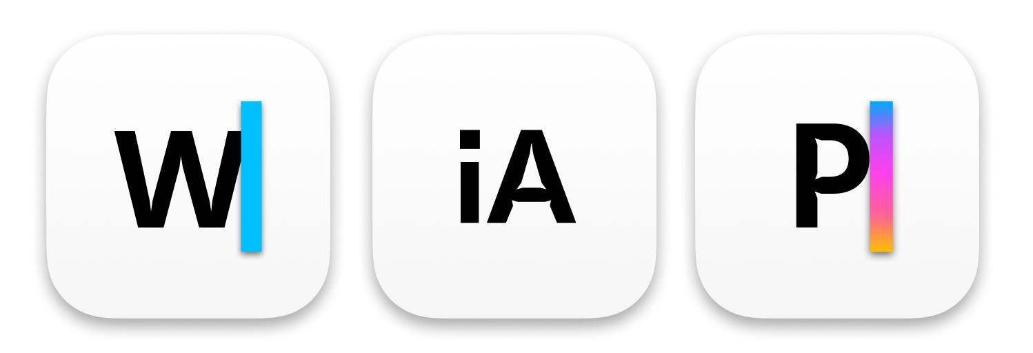
We settled for a similar approach using a P with a colored cursor. This post explains part II or II. At the end of Part 1, illustrated in a blog post called Design Takes Time, we had planned to change the iA to a W in iA Writer, too. Eventually. Maybe. Possibly.
The Trouble with the W|
We didn’t change iA Writer to W| when we launched Presenter. Changing an established icon is something you don’t do without careful thought and testing. And, as we said already, we were very attached to it (and still are). That change was much more painful than we expected. Letting go is never easy. But it had to happen.
The iA next to the P just didn’t look right. The colored cursor alone would double the iA in the dock. It looked really wrong and too cramped. And then there was the whole AI iA thing that created confusion… We had to do something. So, why not…
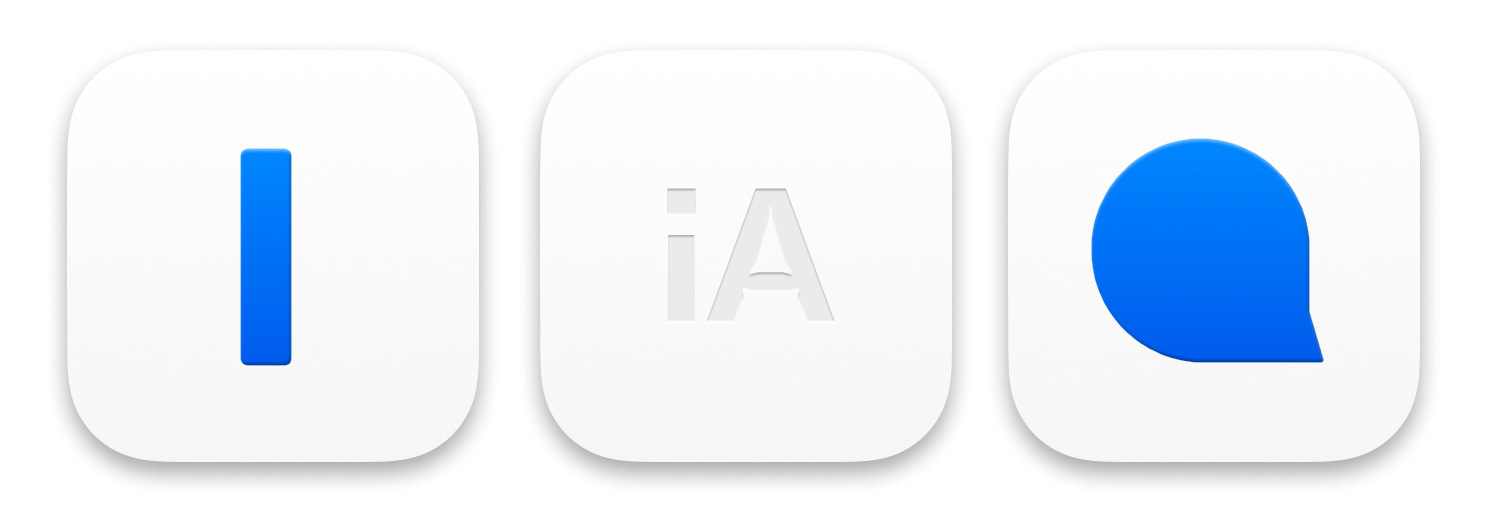
We tested different designs with a W plus caret internally. Now, lots of companies use single letters for their icons: Skype, Gmail, Instapaper, Goodreads, Netflix, Skype, Facebook, Pinterest. So, why not?
![]()
![]()
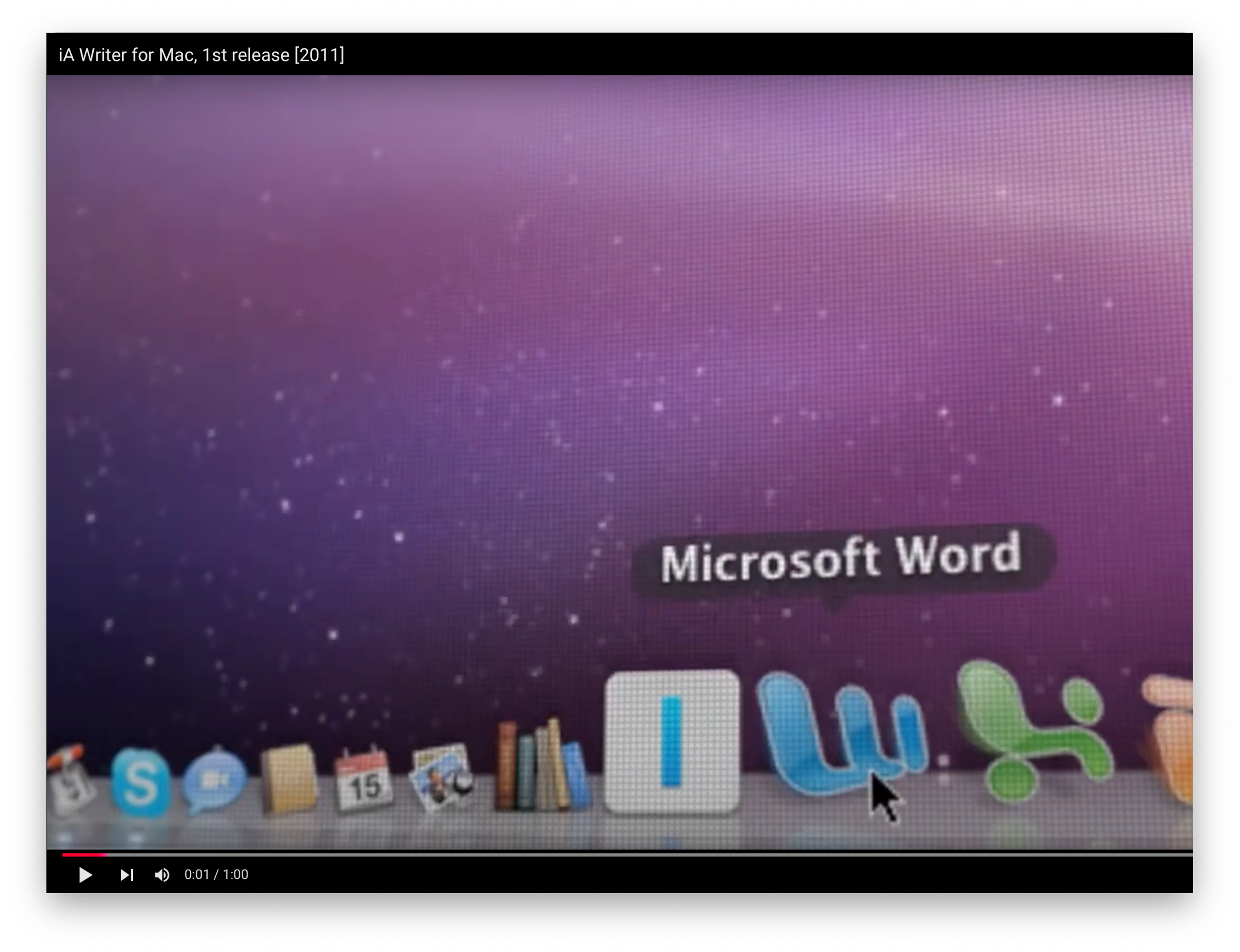
There are three prominent ones with a W: There’s Wikipedia and WordPress. And then there’s our old nemesis: Microsoft Word. We always played coy with Microsoft naming: MS Word vs iA Writer. MS PowerPoint vs iA Presenter (fun fact: PowerPoint was originally called Presenter). But W and blue get a bit too close…
![]()
There are millions of apps in the App Store now. It’s nearly impossible to be completely original without getting weird and freaky. And then other Markdown apps, some inspired by iA Writer both in name and design, use a W with a caret too.
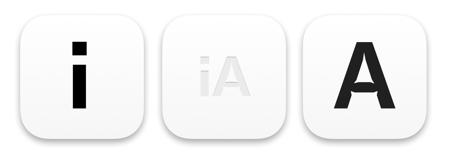
We needed to do something. Something different, characteristic, and consistent across both apps. We needed something fresh. Our very first idea in the already mentioned Part 1 of this adventure was to split the i and the A into two apps.
We abandoned the idea when we changed the name from speaker to presenter. The lower case A just didn’t work as well as we wanted it to work. And using i and A when one was called Writer and the other Presenter was more than a bit too clever. But looking back, we felt that there was something to the splitting idea. Now that the app was named, and used, had a look and feel and a characteristic color scheme, we decided to give the splitting idea it another go.
Symbols for Writing, Presenting?
Imagine a simple shape, flexible in its use, but easily recognizable. Imagine a symbol for writing on the screen—and one for presenting slides. What looked like a simple, logical one-two-three process, in fact evolved over weeks and months and years.

We could do something fancy and build the letters out of these components, like a Warner Bros logo and a golfer P. We tried plenty of things in that direction before. Like this one:

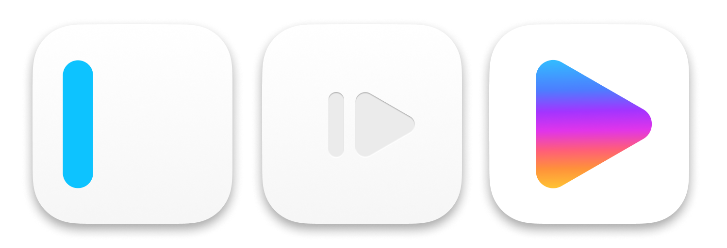
But we wanted to simplify and get to the essence. Okay, now, let’s see… For writing, there’s the caret. What about presenting? You start presentations by pressing the play button… Ha!

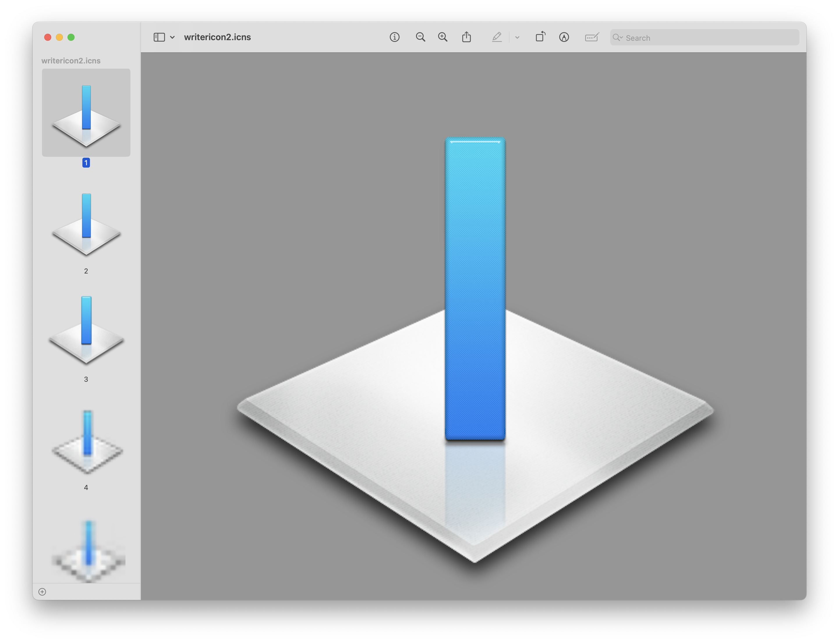
We had that icon for iA Writer before. It was too simple, it had no tension. And it sort of looked like the old Mac shutdown button. So we moved it to the left to give it some tension and character.

So Writer’s caret inherits the i and the caret (I). The A turns into the play triangle that you press when you enter Presentation Mode. The colors come from the original Writer Blue. The color scheme for Presenter goes back to the color scheme of the changing cursor and slide colors. The Hundreds of iterations and dead ends later things started taking shape.
iA Writer needed some depth. Finding the right shadow lights was more difficult than we expected. Carets are too small and simple for 3d tricks. Shadows around blue objects look smeared.
![]()
Presenter required a bit more work on the color. We built the light switch in different grey shades to first understand how the physical object looks and works.


We discussed metaphysics like… how it felt to tap them, with and without shadow. We endlessly fiddled with shadows, geometric and visual sizes, gradients, colors, border radii, and lighting concepts. Our obsession to get them just right went far beyond reason.
Simple is Never Easy
We designed and tested every major iteration in different contexts. We placed the icons in springboards, docks, in light and dark mode next to each other and alone—in our Figma files, and on our devices. We revisited the design principles behind Apple’s latest, strongest, and weakest icons. The following comparison shows how iOS icons are generally simpler, and flatter, but not completely flat. Notice how the latest Apple maps icon has a subtle shadow on iOS as well:
![]()
![]()
We studied and compared. We made sure that they both stood out and fitted with the general design of the major platforms they would be used on. Look at the core Apple icons as if you had never seen them before. What do you notice? Yes, they are very very simple.
![]()
Apple’s often raw simplicity is intentional. Apple’s iOS icons tell us clearly: This is the phone, task, health, notes, book app. It may sound a bit bold, but, truth to be told… we’d like that for our own apps as well. To be the default writing app, and the default presentation app.
![]()
Making ours icons as simple as Apple’s core apps took a lot of restraint and courage. It’s easier to add a lot of glitz, shadows and blurs than taking them away. :-)
![]()
We tested our icons locally in a great little testing app called Icon Slate. And we tested major iterations with our 900 beta testers back and forth—a big thank you to you all. Meanwhile, iOS with its new dark and monochrome version also had a couple of surprises…
![]()
![]()
The new icons are flexible in their use of color and backgrounds. Presenter’s backlit triangle can change colors across different versions and contexts. Writer’s icon is so strong that it becomes easy to brand visuals by just adding the caret.
The object models: The Writer caret is a physical object. Presenter is a light switch. Lights on, you see the switch. Lights off, the switch glows. The colors are faintly visible when switched to “on”.

![]()
Yeah, Apple Intelligence and a lot of AI apps have it. Yeah, but Presenter had that particular blue-to-yellow color spectrum years ago. And with good reason. There’s no complete originality in app icon design to begin with…
Taste, Test, and Then Judge
We wanted to launch both icons in the same week so they wouldn’t clash when you see them next to each other. Ideally, we’d reveal the new icons with two major upgrades, at the same time. But, then again, one major upgrade is already hard to coordinate so, at some point, we just had to take the leap.
It’s a big change, but we hope that you understand that it was as necessary as it was careful. So, if you’re new to the icons, take your time tasting them—like you would with a carefully prepared dish. Then let us know what you think at [email protected].