When I read this morning that USA Today “refashions itself as a social network”, I got a little shock as I was worried that they are going to eat our client’s lunch. Fear nothing, client. Among information designers the USA Today redesign is a laughing stock.
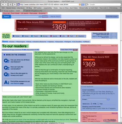
- Blue: Navigation
- Red: Advertisement
- Green: Content
- Yellow: Brand elements
- White: Passive whitespace
Ads dominate, navigation is scattered, the brand is weak, content elements look like advertisement. The User needs to invest a lot of attention to understand what is what. In short: Fire your designer.
Social Is Not the Story Here
I know from my own experience that whoever redesigns a major site gets under heavy fire attack from the whiny dumbass I-liked-it-like-it-was users. But this is really another story. This is objectively bad.
Apart from Edelman’s Mr. Nice Steve Rubel, who always has a good word for everyone—even for us—, no one can seriously find a good word about USA Today’s redesign, unless they’re drunk or paid to do so. Yes, it’s good to be positive, and certainly, to open up is a necessary and obvious step for newspapers, but if you look at what they did wrong with this one, social is not the real story here. This design is crap.
- They plastered the site with advertisement
- Navigation is a scattered bunch of words
- Navigational elements are not properly grouped
- Involuntary white space blows the grid into pieces
- No consistent link definition
- No visible horizontal or vertical structure
- Use of left, center and right align is random
- No leading of the eye from top left to bottom right
- Content elements look like advertisement
- Advertisement looks like content
- Brand hierarchy: Is this an affiliate site of Yahoo?
- The Yahoo bar suggests to “subscribe to paper”
- Popups all over the place
- The code is an embarrassing mess
- The first word top left is “buy a car”
- Browser windows get resized
etc etc etc
Long story short: It’s useless, it’s impolite, it’s nonsense. And we wonder: How is this possible? Who designed this? Who hired these guys? Don’t you know that you ruin your brand with a bad user experience? Don’t you know that bad information design is perceived as a lack of manners?
How to Do It Better
It’s always easy to complain, but then when it comes to advice, people usually don’t really know. We have been lucky to be able to work for two months on a newspaper research project, so we are able to give out some free advice:
Newspapers currently have two interfaces: One is made out of paper and one is made out of light. The real challenge of a newspaper redesign is to connect those interfaces. And we are not talking about e-paper or any other Zukunftsmusik. We are talking about understanding the media and melting the media. Ask yourselves: How does print work? How does online media work? How can we connect and join them?
- Make your site readable, scannable, usable.
- Read this for heaven’s sake
- Pay your users for content contribution
- Make your paper scannable, usable, interactive
Unfortunately we have to keep secret on how to do all these things, as we don’t want any competitor of our client to eat our client’s lunch. Just one more word on technology: SNS and blogs are NOT the way to go. There is a much more obvious methodological approach and it is strange that so far no one noticed what kind of publishing technology newspapers should use. Enough said.
Do Newspapers Really Need to Change?
That newspapers have to change is obvious. Don’t believe that staying as you are is going to help you in any way. I’d even say that the Economist’s approach to the problem, to call the current downtrend of printmedia “A cause for concern but not for panic” a rhetoric misconception.
You don’t need to be a tech prodigy or visionary to understand that newspapers need the web: “A good newspaper, I suppose, is a nation, talking to itself.” said Arthur Miller back in 1961. What you think is the appropriate technology for that conversation nowadays?


