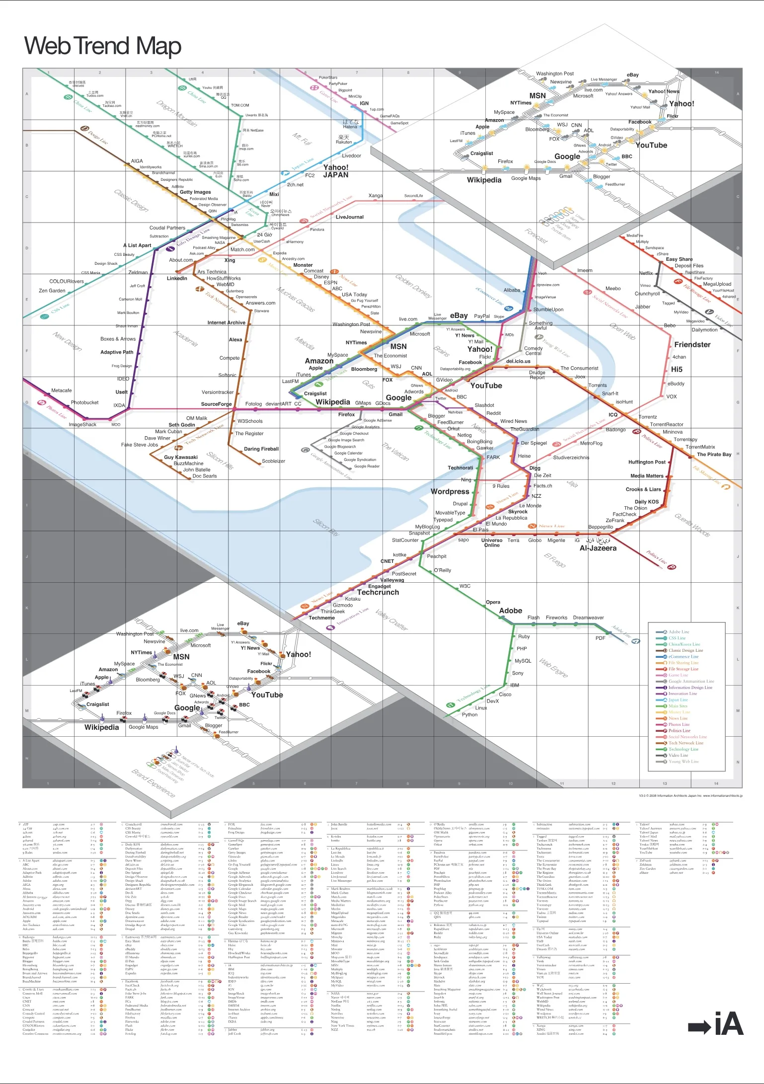
It was featured by The Guardian, WIRED, Corriere, kottke, Boingboing, Techcrunch, Mashable, and literally thousands of blogs. We are happy to announce that the coolest gift for geeks, the A0 poster of the 2008 Web Trend Map (841mm × 1189mm / 33.25in × 46.75in), is now up for grabs.
Of course, we’d like you to enjoy our hard work in a format that suits you best, so we offer the map in the following formats for you to download and enjoy for free:
The map pins down nearly 300 of the most successful and influential websites to the greater Tokyo area train map. Different train lines correspond to different web trends such as innovation, news, social networks, and so on.
We’ve brought back the weather forecast from version 2 and incorporated it along the main Yamanote train line. The bottom layer includes a rating of brand experience analogous to restaurant experience. It illustrates our perception of user experience and brand management of the main stations. We studied the usability, user value, and interface (simplicity, character, and feedback), and rated each site on a scale of eating at various types of Japanese restaurants.
