After 15 years in the App Store, iA Writer is a finalist for an Apple Design Award. That’s amazing for two reasons.
Obviously, it’s amazing to be picked among millions of apps and hundreds of thousands of developers no matter what. But getting picked after 15 years is unusual and meaningful.
As a common notion, design is tied to novelty. If it’s not new, it’s not exciting. If it’s not exciting it’s not “design”. So design awards usually go to what’s new. But here’s the paradox: The only way to tell if a design is really good is if it stands the test of time. So getting picked after 15 years is good news for good design. For ideas that hold up. For products built to last.
Design award usually means new, but…
Creating something innovative, simple, functional, and joyful once is hard. Maintaining that standard—over 15 years and 1,745 updates—is even harder. It takes restraint. Patience. Care.
That’s why this nomination means something different than it would have meant 15 years ago. An app launched in 2010 is being recognized in 2025 for setting the standard. Whether it wins gold, silver, or just a handshake—we celebrate this as a win for true, lasting quality and dedication.
Imagine, if design awards would only be given out if a product’s design has proven itself for over 15 years… The industry doesn’t work like that, but in terms of sustainability and true quality, it would raise the bar. The recognition you get after 15 years of dedication is truly earned.
1.0 was packed with innovation
iA Writer launched in 2010 with a single idea: a writing app that gets out of the way. No tabs. No toolbars. No chrome. No settings. Just you, your words, an easy-to-spot cursor of full focus. That sounds obvious now. It wasn’t then. We built a lot that didn’t exist:
- Reading time: now everywhere from Medium to Kindle
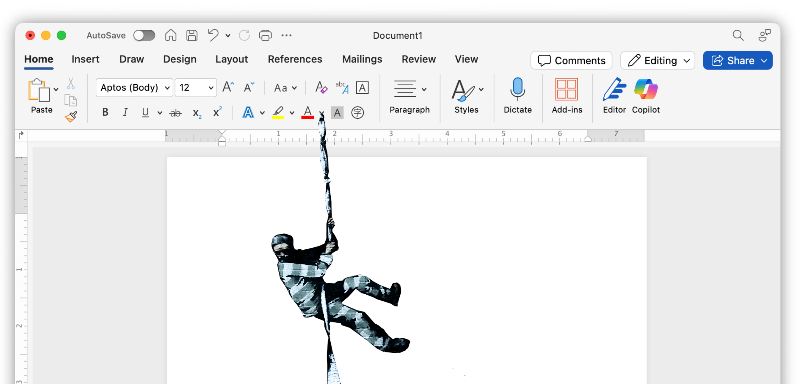
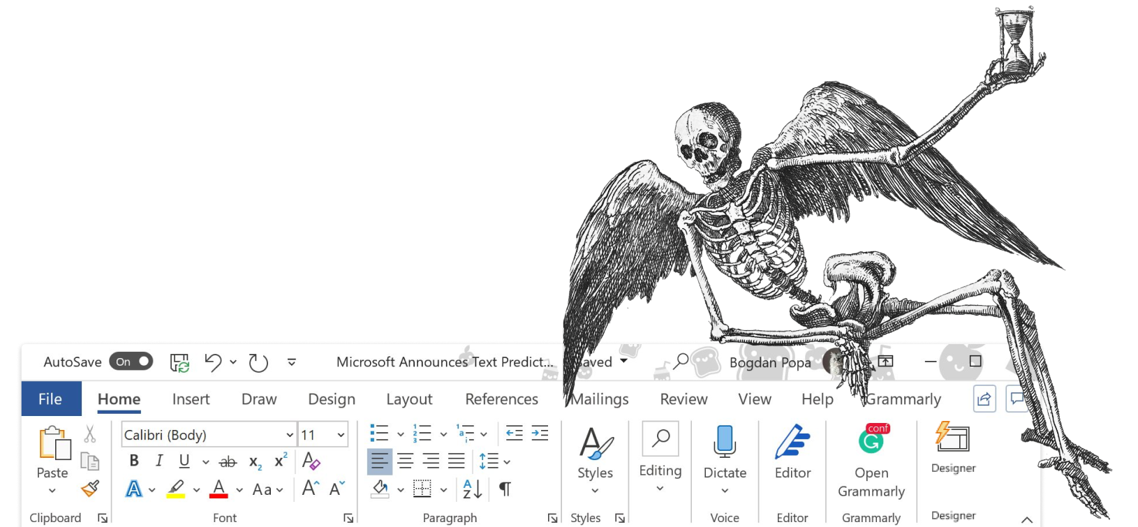
- Focus Mode: since copied badly by many, most notably Microsoft
- Keyboard extension: back when keyboard extensions didn’t extend
- On Mac, a colorful, wider magnetic cursor: long before Apple added color cursors
- On Mac, we hid the title bar when you typed; inspired by QuickTime, still a signature feature
- No settings: we wish that we could still do that, but no settings only works up to about 50,000 users
We were early. So early, that we had no other choice than to print out the first designs at 1:1 scale with an iPad frame. There were simply no iPads available in March 2010.
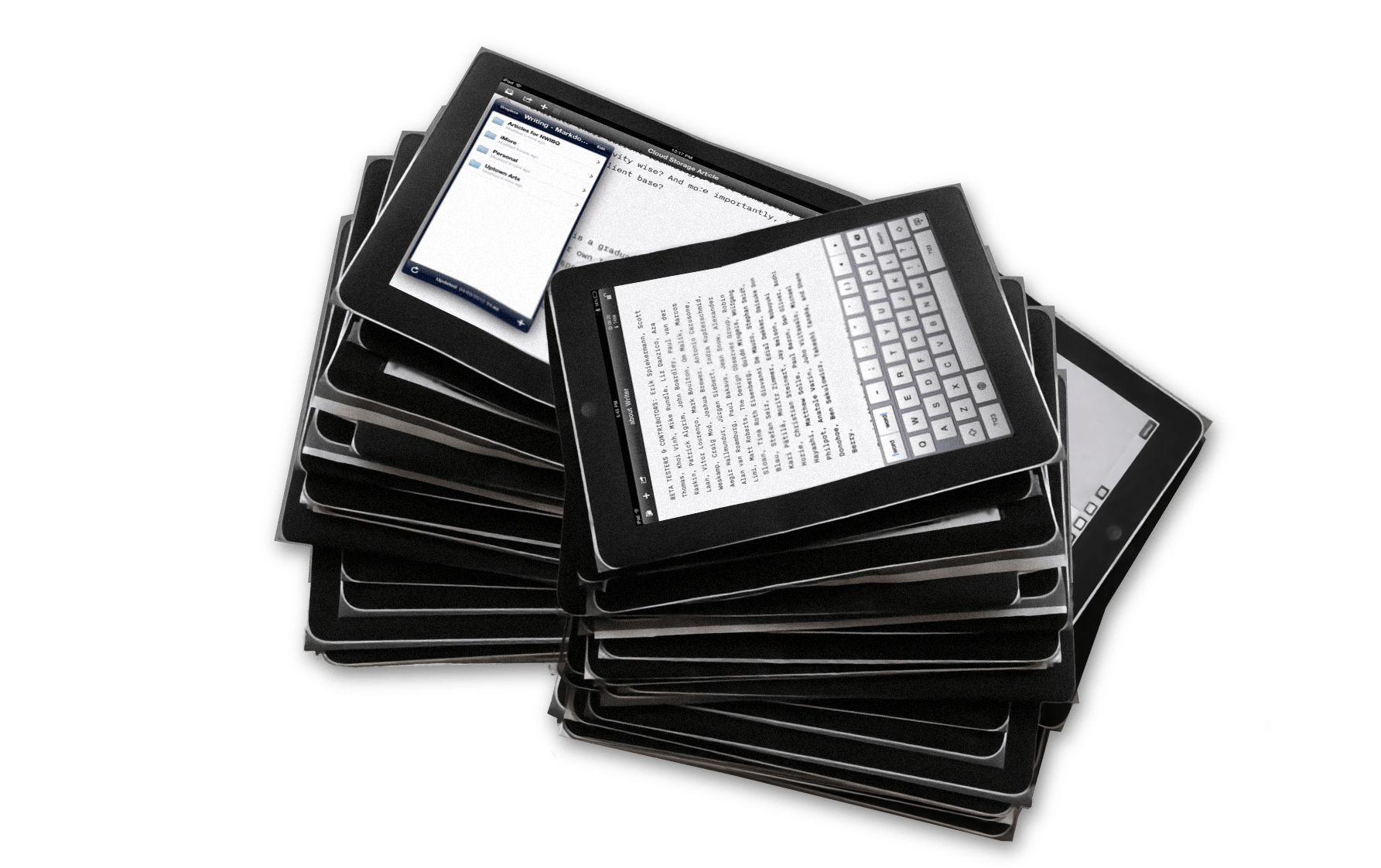
We launched in September 2010. But we didn’t stop there. We couldn’t. But we had to pay attention to not go down the path of most apps.
Evolving without feature creep
Apps keep adding features, because, like it or not, new features get new attention and more attention sells more. If you keep adding features, your app becomes bloated, farty, buggy, and slow. Shiny features will distract, and eventually completely destroy the focus of the user and the focus of your app. Most successful apps are headed for the eventual feature heat death. We tried to get around the issue by adding features that offered more, not less focus:
- Responsive typography with custom fonts that adjust across screen sizes, weights, and columns.
- Syntax Highlight and Style Check to help you see—not just read—your writing.
- Authorship: An AI feature that doesn’t write for you, but keeps track of what you wrote and what you pasted. (We think that machines should serve people, not the other way around).
Good design lasts
Apps age. Trends change. New tech changes the game. How do you stay consistent without going stale? It takes more than a good idea and skills. It takes character. Restraint. Nerves.
We’re proud to be a finalist. We are proud of our work, with or without a medal. But, just as with the Red Dot Best of the Best Award we won this year, we’d be lying if we said that we didn’t care. We care. And when that care gets noticed, we feel recognized. And that touches us.
We care
When you keep taking care of your product—against trends, against the flattening boredom of AI-everywhere, against the push to monetize every fart with a subscription, against the constant pressure for “just one more feature,” and yes, even against Apple itself—it feels miraculous to get recognition for all the time and thought we put into our product.
You don’t need a trophy to know your work is worth it. People using your product will tell you loud and clear. But after 15 years of saying “no” more than “yes,” staying focused, staying true, staying honest—this nomination hits deep.
Thank you, Apple. This feels good. And congratulations to all the nominees and winners. It’s a pleasure to be in your company.
WWDC25
We’ll be at WWDC25. If you’d like to say hi, send us an email.
