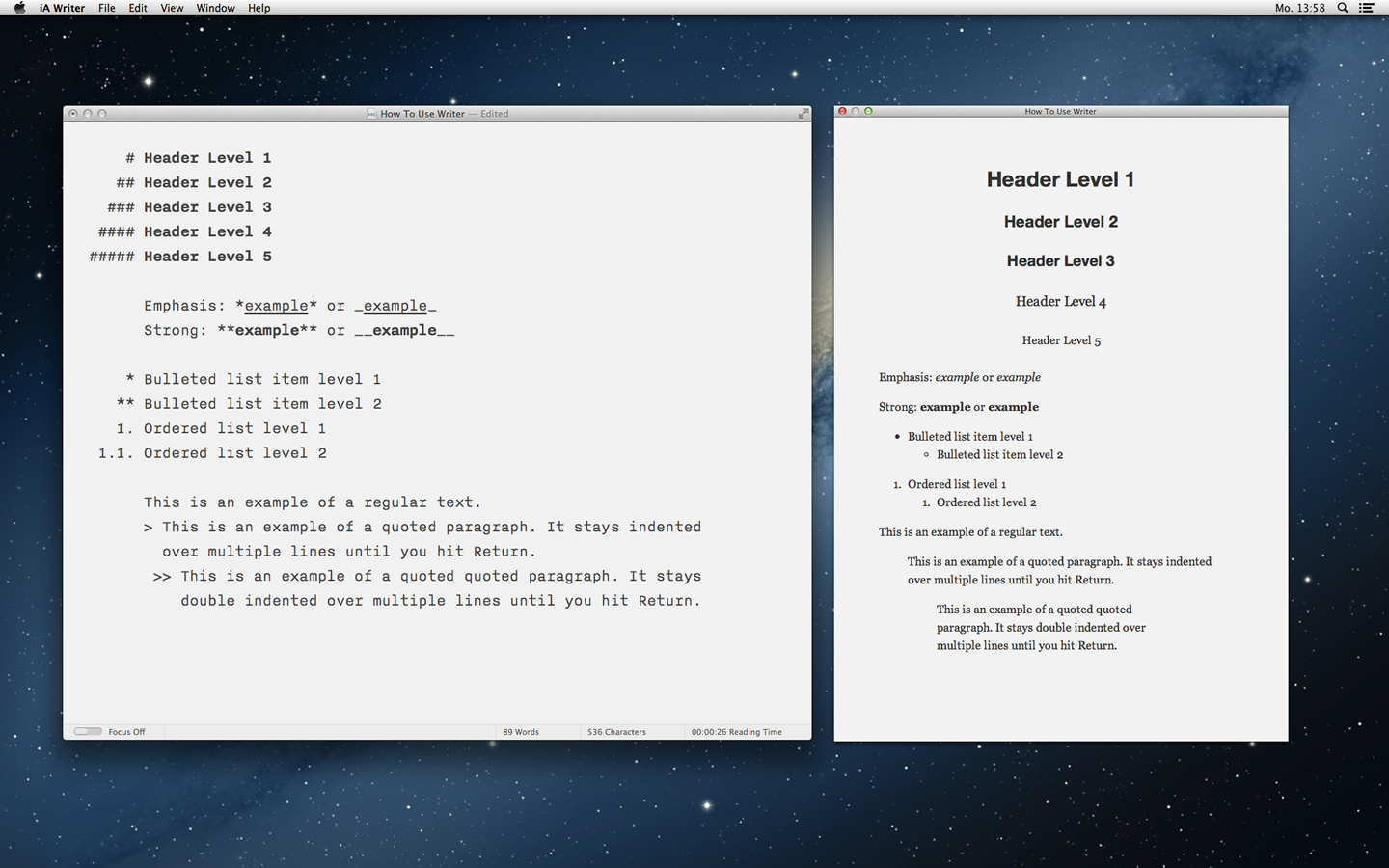
iA Writer for Mac is the first native text editor that uses a responsive design. Why did it take so long?
One of the main request we’ve heard for iA Writer for Mac from customers is the ability to change font size. This would be a simple feature to add, but we didn’t give in. Why?
Arrogance!
While some critiques suggested Writer’s typography was due to our preposterous arrogance, our reasons why Writer had one typeface and font size were:
- One of the main procrastinations in text editors is fumbling with fonts. Despite varying preferences and a legacy of over-small type from 20 years ago, defining typeface and text size is not a matter of taste.
- Smaller font sizes are useful for reading and editing, but seeing the text up close helps you focus when you’re crafting your prose sentence by sentence.
- The font size we chose was not ideal. It was a compromise—a size that would deliver good results on most Mac screens. We were aware that on some screens the font would seem bigger, while on newer screens it would seem smaller than perfect.
We knew there was room for improvement. We have spent a lot of time thinking about a solution that keeps Writer’s simplicity and allows different font sizes. We tried to find a technical approach to check resolution and pixel density, changing font sizes for different screens.
The Solution: A Responsive Design
Inspired by our deep experience designing for the web, we’ve given Writer for Mac a responsive design, changing the font size based on window width. This maintains the text’s typographic proportions, zooming in and out without reflowing the text.
I don’t know why it took us so long to find this obvious solution. However, given that no one else has done it, responsive design in native apps is perhaps not as obvious as it seems in hindsight. With the custom features built into Writer for Mac, like Focus Mode and Auto Markdown, it was not as easy to implement as you’d expect. But we’ve taken the time to address these details, to make this new feature feel as obvious and natural as possible.
While we experimented with liquid resizing, we decided to go with a three-step adaptive layout. This is why:
How We Write with Writer for Mac
We’ve been testing prototypes for months, and this simple change has changed the way we write. Here is how we use the three font sizes:
- Big size for difficult writing: Seeing your sentence from close slows down your pace. This is particularly helpful if you have a tough subject to write about, that requires you to take one step at a time. Especially when paired with Focus Mode, this helps you write that difficult scientific paper, poem or philosophical text.
- Medium size for Writing and editing: This works well for quick, easy writing and editing.
- Small size for reading: Some writers like to use a small font size to write because it allows them to see the surrounding text. However, sometimes a small size reveals too much text. Seeing too much text can lead to fast typing, careless thinking, and the temptation to stop writing and start editing. Some texts (and some writers) will benefit from this, but we find the small size works best for moving text around, “big picture” edits and reading what you’ve written.
Another way to use the different font sizes is to order open documents by importance. Resize the window to the small size before putting it into the background, and make the text bigger for the window that you are working on. Use a medium size for secondary texts.

While we think responsive design is the stand-out feature in this version, Writer for Mac now also has selection-sensitive word count, a powerful find and replace, and an HTML preview panel.


