The following Interview on iA Writer and the secret of its success has appeared in Business Insider, who reached out to us, “to get the story on where his app came from, where it’s heading, and what’s wrong with contemporary text editors.”
What motivated you to create iA Writer?
My first computer was a Dragon 32. It had a resolution of 256×192 pixels. One of the first programs I wrote for it was a text editor. I created a pixel font and drew text as graphics, so I could fit more text on the tiny screen.
During my studies I used a mechanical typewriter; experimenting with it I noticed that I write better texts with it than with my PS2. And there, I thought: Someone needs to write a text editor that produces results as focused as a mechanical typewriter with all the advantages for digital text.
When I got more heavily involved with writing on my blog, again, I wished I had a better program.
From its beginning, iA focused on screen typography. Along the process, I discovered a world of beauty that just does’t want to let me go since then. I thought: I have to design a text editor with better typography.
In 2008 I had a contract for a book. I blew it because I didn’t know what to write. I blamed it on the program. At the same time, I thought: A better program won’t make me a better writer.
Better writing tools won’t make you a better writer, but they will make working more fun. They help you get into the flow if they are simple enough to not make you think about how to use them but for what to use them for.
What’s wrong with the major text editors today?
Current text editors are like Swiss Army knives. They have drafting modes, editing modes, formatting modes, you can do all kinds of fancy stuff, but the main thing, writing, is lost.
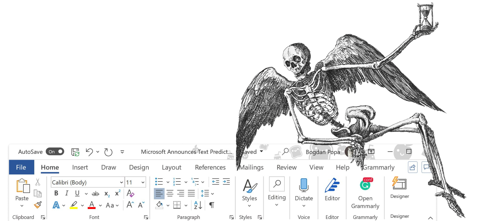
With all the formatting features, none really work as expected and when, as a professional typographer, you look at people’s choices in font choice, line height, type size, you quickly realize that people that write are not supposed to know how to format text. While many demand those features and enjoy playing with them, it actually holds them away from writing. A typical page in Word, formatted in a 12px Times with a line height of 1 is a desert of distraction in itself, even if you strip off all the crazy toolbars that surround it.
A professional writing tool is like a scalpel, not like a Swiss army knife. What a writer needs first of all is a program that lets him get his thoughts out.
The main problem with current text editors is that they were written by programmers. The requirements for writing code are similar in some ways, but in others they are completely different. You need to love writing to get an idea that is really needed. You only feel whether what you have built feels good if writing is something that you do passionately. The UX people on Writer are all passionate writers and you can feel that using the program. It looks nice, but the true beauty of it reveals itself only in its use. It is very close to a mechanical typewriter without the hurting fingers and all the writing specific benefits of the digital medium.
Is “focus mode” something you came up with, or is it implemented in other editors?
Focus Mode, as well as Reading Time and the disappearing top bar (Mac only) are our inventions.
It took a long time to figure out all the details (what happens when you scroll? When does it get activated/deactivated, how does auto markdown behave, etc.). While feel that Reading Time should be a common standard for everybody (other text editors and Websites started using it now as an indicator of text volume), we have a patent pending for Focus Mode. Some people criticized us for that. But we don’t make the rules of the industry. We follow them. Dealing with copycats is not all sunshine and rainbows. And if even bigger companies start copying us (the latest version MS Word now suddenly has a blue focus optimized cursor, just like Writer), we better have something to prove that this was our idea and not Microsoft’s or Apple’s.
With what we are currently developing for the editing/reading mode, I think we have more material for patents. The next features are going to be even further ahead in terms of innovation than the first features we introduced. Innovation in interaction design is extremely hard. Innovation only works if it fulfills all expectations and—at the same time—exceeds them in a way that gets people to do what they hate most: Changing behavior. It’s close to impossible, but we have done it before and we will do it again.
How important was simplicity when you were designing Writer?
Simplicity and speed are the top priorities. We are only adding functionality if it simplifies the whole process. Adding iCloud for instance created a lot of friction, but overall, it made the program easier. With iCloud your document gets automatically updated. And that is easier and faster than versioning through file names and copy-paste-send-copy-paste.
Our goal was always to produce a writing divide where all your thoughts go into the text—instead of the program. It has been a tough battle, for instance, to design it without any settings. Writer has no option for choice of typeface, font size or color. But observing writers in the research phase we found that the main procrastination in writing apps was just that: Settings, formatting, typography. Some people complain that the font is too big (it maybe a tiny bit too big on some screens) or that the font is ugly (it is not!), but that is a complaint I can live with, given the feedback we get.
Have people reported being more productive with their writing since iA Writer doesn’t have any distractions?
Oh, yes. It is amazing how many professionals love the program. A lot of good writers are using it, among others Tim O’Reilly, Stephen Fry and the NYT bestselling author Augusten Burroughs. Some of them write us love letters. Burroughs, for example wrote this:
Hi, I’m an American author and I have been wondering—truly—if I might be losing my mind. Because I buy laptops as if they were wrapped candies; so far this year I’ve purchased around a dozen of them; I’ve tried and used numerous operating systems. All because I haven’t been comfortable writing. And yes, I have tried every “distraction free” writing application I have found. But they have seemed to me more of a gimmick; a way to waste yet more time. I use mainly Linux and though I once used Mac I don’t now. Except I bought an iPad the other day because I had to take a flight and it was on one of those awful small planes with no overhead storage. So I bought the iPad knowing I would loathe it and find it useless but I could give it to a friend when I was done with the trip. I downloaded your program and I wouldn’t have even tried it except that as I was sitting there on the runway waiting for the plane to actually move, something came to mind and I needed to write it down. I launched your program and wrote my one-line note. That was two days ago. I’m well into the book I was supposed to be writing but have not been writing. Your program is the single most useful and remarkably clever—invisibly so—device for writing that I can name. Only at first glance does it appear to be an ordinary text editor. Once in use, I discovered that while it has only a tiny number of features, each is just the one you want. And somehow, this application turns this flat thing on the lap into the most efficient tool for writing that I know of. I guess I paid a dollar for it, maybe two or maybe it was $10; I don’t remember. But I will tell you this: Knowing what I know now, I would buy an iPad if the only application on it was yours. You have created a truly beautiful and insightful and respectful and elegant application. It is tiny but it is huge.
This letter gave me goosebumps. I cited it in full, because it mirrors exactly the vision we had for Writer. I can’t say it better than Mr. Burroughs. (I’m not a professional writer). Giving writers what they deserve: The pleasure of the text on a digital device.
I know that it works because I use it all the time. I have never experience so much pleasure working with a text editor. And we are not even half way there. The vision for Writer is much bigger than what you currently see. I have to keep the next steps secret though.
Any notable people using iA Writer that you’re aware of?
Some names from the top of my head are: Tim O’Reilly, Stephen Fry, Augusten Burroughs, Om Malik, Erik Spiekermann, and Mike Monteiro. We’ve almost sold 400,000 copies, but it has not fully reached its target audience (writers outside the tech design world) just yet, but we’ll get there with the next big update.
Any difficulty with the App Store approval process?
We have designed desktop and mobile apps before but we were never involved in the approval process. Overall, Apple has been extremely helpful. They even invited us to Cupertino to help us with some engineering issues concerning iCloud. This might be in part because we are one of the top earning apps in the productivity category for 1 1/2 years now.
Apple’s strictness also helps testing the app thoroughly before release. With almost 400,000 users and the many configurations our app has to run on, there are so many eventualities that there are always bugs. If you have a bug that appears only on 0.1% of all devices, that’s 400 people that write you angry tweets and mails. So, in the end, as annoying as it may be at times, Apple is right to make it a little harder to update. I sometimes wished that they are a little but faster and more consistent in their requirements. But, to be honest, if you have an app that is as successful as ours there is not much to whine about. I still whine sometimes, hoping that they hear me and move faster. I’m impatient. Luckily whining does’t really help with Apple.
Source: Business Insider


