iA Writer started off with one font. The classic Nitti, designed by Bold Monday. Last year we added iA Writer Duo, a two-spaced typeface that gives a bit more room to W’s and M’s, based on IBM Plex. This year, we add a third font with four character sizes, called iA Writer Quattro and unify the designs.
Three Variable fonts
Quattro shares similarities with a proportional typeface. At the same time, it retains a lot of the technical virtues of the classic typewriter fonts using wider gaps between the words and giving each letter more room than a classic, fully proportional face.

We kept large word spacing and monospaced punctuation. Quattro saves space on small screens. And it looks beautiful offering a cleaner, more regular text image. Changing the width of a few letters makes a huge change:

The fonts have all been redesigned. iA Writer Mono, Duo and Quattro were built upon IBM Plex. In the latest iteration, we have eliminated the IBM brand-typical features and made look more characteristic. Using square dots instead of round ones, adjusting the swirls and curves on a, j, f, l, t, y, Q, and lots of non-latin characters, we unified mono, Duo, and Quattro under a common look. This was a lot of work.
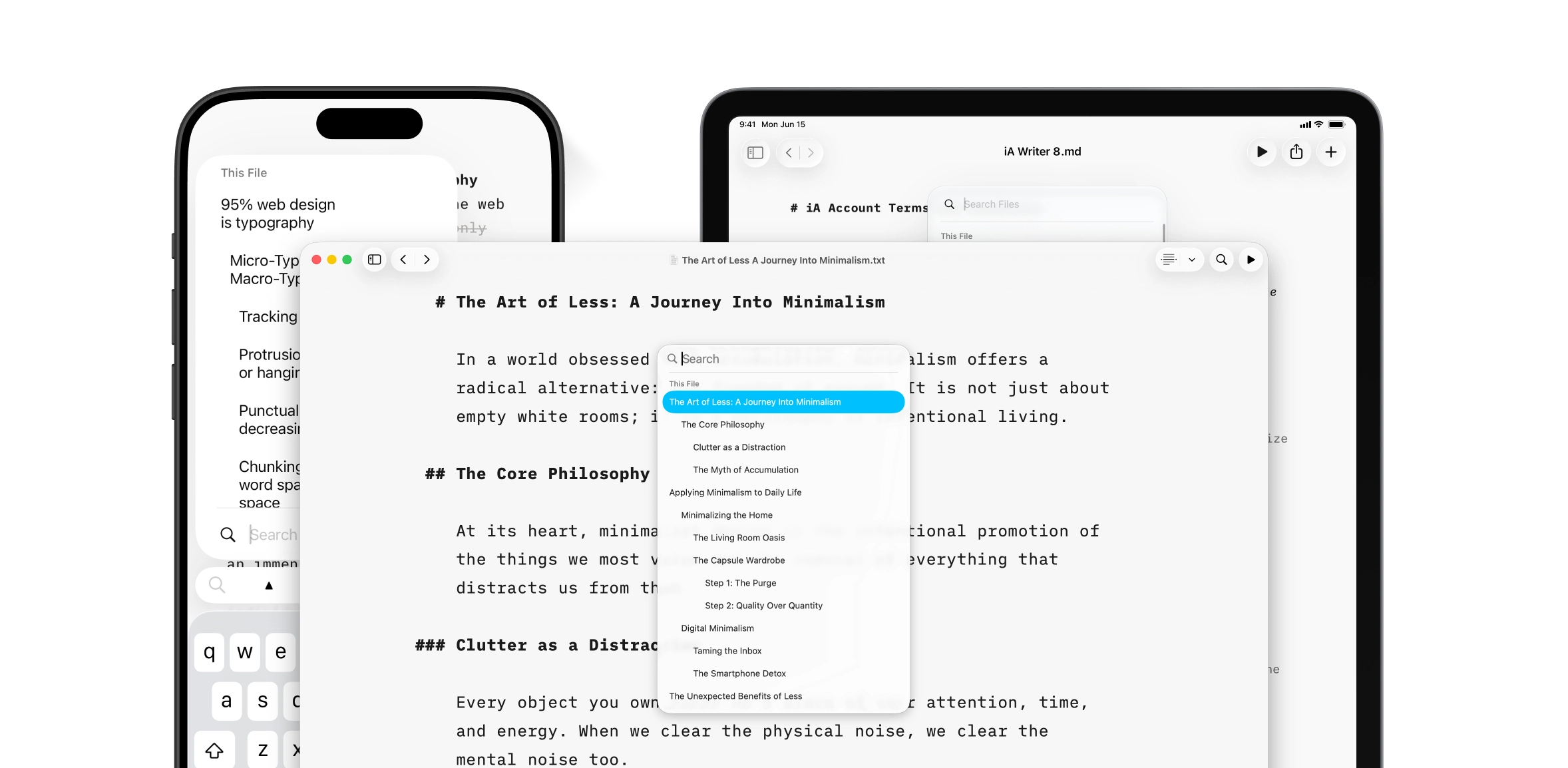
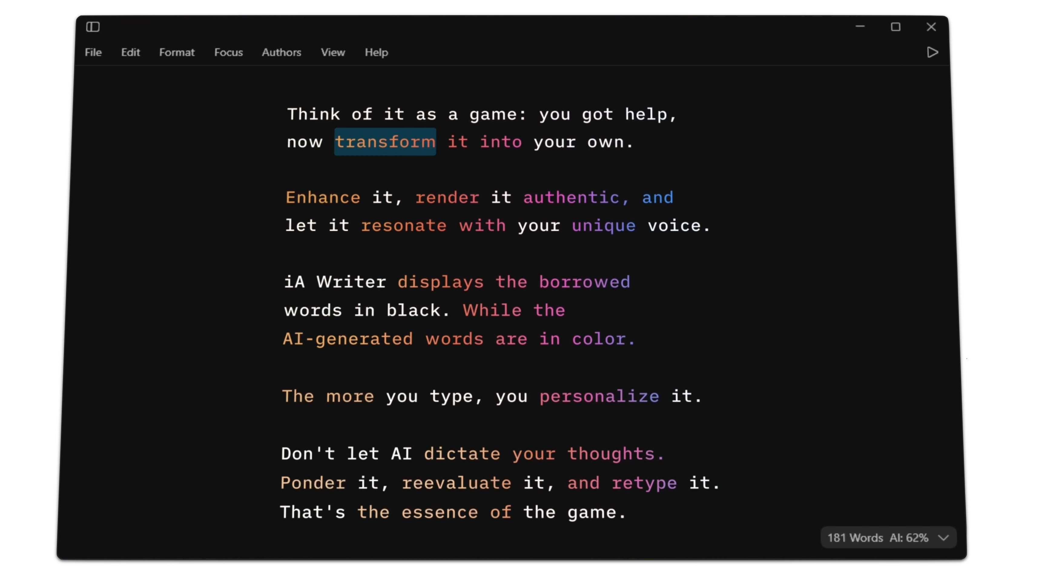
You can get the new iA Writer fonts on GitHub. Don’t recreate iA Writer or iA Writer Themes. Use them creatively.