Brands make us associate positive values and positive experiences with the products they mark. Brand values are defined by the senior management in the “Brand Matrix”. Coca-Cola recently changed their brand matrix. Are we soon going to associate other things with Coca-Cola?
Ugly Logo, Strong Logo
Brands are signals and signals work best if they’re bold. Recently, one of the strongest and boldest brands, Coca-Cola, changed his appearance and became nice, hip and delicate. Is Coca-Cola changing the rules of branding?

With its iconographic bottle, Coca-Cola has an appealing and typical interface, overall it has a loud and bold appearance and it has established the prototype of an ugly logo. Yes, ugly logo. An amateur designed it, and a professional should be able to see it. Of course it doesn’t really matter if it’s pretty or not. It doesn’t need to look nice. A mark is not a decorative element. It needs to work. And it does work:
- Coca-Cola’s yearly revenue: 23 Billion USD
- Coca-Cola’s brand value: 67 Billion USD.
- “Coca-Cola” is—after “okay”—the second most known word on the planet.
What I usually hear after this is: “Ugly, ugly not nice… Well that’s just like your opinion, man. I like the logo!” — Okay, so you like the logo, fair enough. But what if what you like is not what you see?

The Brand Matrix
You judge what you see by what you feel when you see it. The Coca-Cola mark makes you feel good, hence Coca-Cola looks good. Weird talk? Philosophy? Speculation? No, that is exactly what brands do. They make us associate positive values and positive experiences with products. Those values (brand values) are usually set beforehand in what some brand agencies call the Brand Matrix:
The Brand Matrix emphasizes that internal corporate branding, part of PR’s employee communication discipline, must be an integral part of a company’s everyday business activity, culture and infrastructure. […] Management of information flow attracts investors, reinforces market leadership, and persuades the desired investing constituencies.
So what is the Brand Matrix?
The brand matrix is an excel sheet listing the (often secret) brand values. Top secret values like: Young, innovative, fun. Sounds silly, but it works. Magic only works if the trick is kept secret. We, the customer, associate those secret values with the product we see. If we want to or not. And because we feel good when we see the product, we then believe that we see something nice in shape. Need more objectivity to prove that it works?

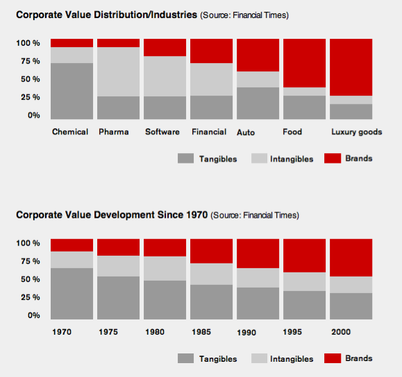
Brands trick our perception, and the tricking obviously works. The corporate value of companies selling luxury goods is 75% brand, 25% rest. Looking at the total corporate value development since 1970 reveals an even more astonishing number: Since 1970, the percentage of the total corporate value attributed to the brand has grown from 15% to 45%.
Break the spell of the brand
Brands are magic. And that magic is worth a lot of money. Of course that magic works better if the mark is strong and the values are anchored in your subconscious with early childhood memories. That’s why Porsche advertises to little boys. And that’s why—on the very long-term—advertisement still pays off.
Again: Good branding is not pretty; it’s bold, sweet and simple. The stronger it is the better we remember it. And the more positive values we associate with it, the better it looks. So take a step back and try to look at this as if you’ve never seen it, judge color, shape, spacing, balance, as you never had that zip of sweet lemon ice cube rattling Coca-Cola, twenty summers back in time:
Hacking Coke’s Brand Matrix
It’s a seeing test, pretty difficult, that I first took when starting my job at a major branding company back in 2000. If you fight against your feelings you’ll see: Aesthetically, typographically, colorwise the Coca-Cola logo is quite dubious:

- The handwritten mark is obviously handmade, like some school kid trying out a new cool signature for himself.
- It’s hard to read. “Loca Gola”? “Loca Lola”?
- Do you see how the grey outline around the Coca-Cola makes the logo all fuzzy?
- Isn’t the yellow and the grey taking away the main quality it has (reduction to red and white)? Doesn’t the yellow line clash with the rest?
- The lower end of the first C almost touches the A of the too small centered “CLASSIC”.
- What’s with the smiley shaped caught up space between the Coca-Cola and the wave?
- The overall impression is that of a hysteric mess
Can you see that? Try. Well, if you like it or not, technically, that’s bad typography. But it is good branding. Because it looks typical. And it makes you believe it’s pretty. The associations with the typical mark are so powerful that it alters your perception, your judgement, aesthetic as well as moral: “It’s not about good or bad, […] it’s the Coca-Cola logo.”
Hire a Superhappybunny
Now, in order to bring back the simplicity to the brand, Coca-Cola hired an agency called superhappybunny and a couple of super hip agencies to redesign the bottle. Among others, one of my long time favorites: The Designers Republic. A razor sharp and hyper aesthetic agency, doing the coolest stuff like Aphex Twin album covers and such. As it turns out Superhappybunny reduced the bottle design to its basic elements, to the coca-cola essence: Bottle shape and logo mark. Brilliant.
Brandeins, an excellent German magazine focusing on business and design, stated the unofficial official reason for the redesign: the previous identity looked too dominant. Coca-Cola looked too powerful, which in the light of the current groundwater discussion in India was too obviously evil. That makes sense and, from a graphic point of view, the old ugliness also reflected ugly practices more than any sweet sensations.
Of course, superhappybunny’s and The Designers Republic couldn’t resist and give the Coca-Cola bottle a superhappydesign. After all, that’s what they’re famous for. They had to go pretty far and make the logo pretty small to make Coca-Cola look so uber stylish. Now there is a lot of lifestyle on the bottle and it just looks amazing.
If an uber stylish Coke brand works better than bold and ugly Coke—who knows? If the reduction is not too sublime for the general public it will. It’s hard to say if you have an eye that likes design. We are sure happy we don’t need to see that previous red grey yellow water-dripping nightmare anymore. That is for sure. Still, to me it all looks more like a campaign than a brand identity. And maybe it is. It’s just too cool for a global brand.


