All things have an interface. Shaping interfaces is shaping the character of things. The brand is what transports the character of things. When looking at McDonald’s, iPod, or Nintendo DS it becomes quite obvious that the interface is the brand.
A 16 column horizontal submenu, I think, standing at the counter at McDonald’s. I scroll left and right and put a simple cheeseburger in my mental shopping basket. 16 columns, yet so usable. “Cheezubaagaa kudasai” I hear myself say, and glancing at the cashier display and the French fry machine interface, I hold my breath: Wow. Why did I never realize? Being a foreigner in Japan, I come here because at McDonald’s I don’t need to deal with language. I could get much better food in a similar price range if I were ready to think, read Kanji and explain myself. But I’m not, as I’m hungry.
I’ll Fill You Without Any Brain Stress
McDonald’s is very easy to use, I then think, and the McDonald’s interface looks the same all over the world. Yes, that is why it is so successful. A simple interface. I don’t need to think when entering, ordering, paying, eating at McDonald’s. McDonald’s doesn’t make me think. That’s what the McDonald’s brand promises the hungry stomach: We’re sweet and we’ll fill you without any brain stress.
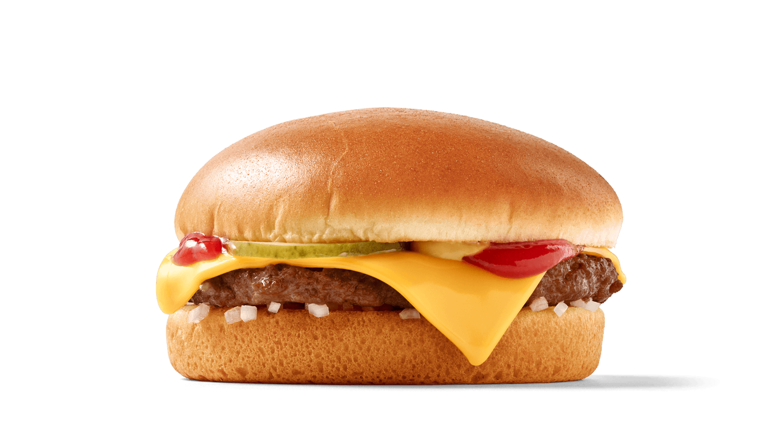
Sandwiches can be complicated. While checking out (paying), I decide to go through with this thought, and look closely at the cheeseburger, and yes, indeed. The cheeseburger has the easiest food interface one could think of. No forks, no knives, no spoons, no plates, no chopsticks. Like a sandwich, but softer and sweeter and above all: Standardized. No alarms and no surprises when eating a cheeseburger. Almost as simple as “the only intuitive interface”—the nipple. Sandwiches can be complicated.
Standardization makes the cheeseburger’s interface a branded one. Only a McDonald’s cheeseburger looks like a McDonald’s cheeseburger. I unwrap it and look at the bread and the meat and the ketchup mustard color pattern: McDonald’s cheeseburger it is.
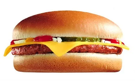
And while I chew, and the sugars start tickling my synapses, I think that I should print this cheeseburger on the back of my business card with a punchy new claim. I walk home and start typing this article on my cell phone, going over that claim and reducing it to two words and a symbol, now, standing in front of my house door, I nod, looking at my nifty new claim:
Interface=Brand
In the meantime, sitting at my laptop going over that little article, I think: Maybe it is just a déformation professionnelle, as I deal with interfaces, usability issues and branding all day long. I just can’t help seeing things that way. But then again, if you can see the interface as the brand, the brand being the interface: You might understand the success of modern branding concepts.
The superficialists might say that brands create identity through consistency, which creates trust. Sounds logical, but brands are not logical, they’re emotional. If you see a brand as an interface it allows you to explore the notion of brand experience being user experience. People don’t analyze usability, they enjoy it or suffer through it. Good usability means not needing to think in order to act.
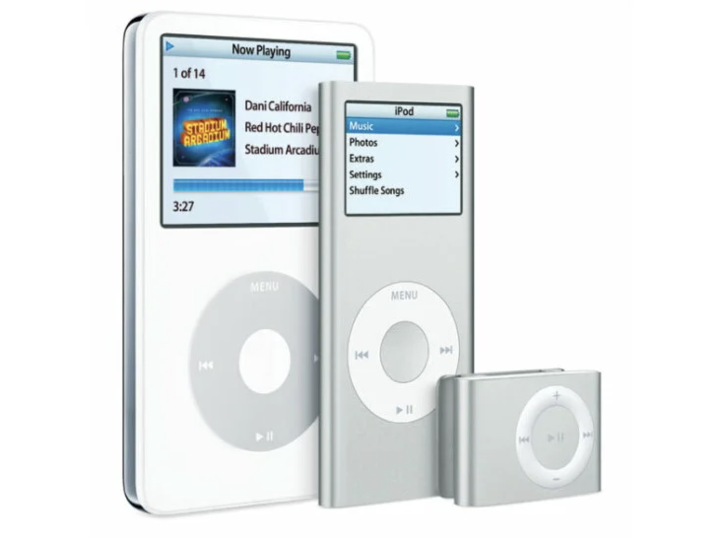
The iPod was successful because it’s pretty easy to use. But then: Where is the iPod logo? On the back! The interface makes the brand. The owner identifies their iPod through its typical interface (click wheel plus screen), others identify the iPod through the white earbuds.

And that’s one more reason why the Zune is basically a copy. No matter how many features it counts, the Zune doesn’t have its own interface. Not from a 1st or 3rd person perspective. It looks like an ornamented iPod with random ear plugs. Copies can’t “kill” the original if the original is so prototypical.
Simpler doesn’t necessarily mean less. Look at the Nintendo DS and its two screens. When I first saw it I was irritated—we’re back to Donkey Kong multiscreen? What’s going on?

Not quite. It’s a different, particular, simple, and extremely usable concept. Play in the upper screen, deal with the options in the lower screen. The DS beats the Playstation Portable in terms of interface. And don’t even get me started on the Wii against Playstation3 when talking about interfaces…

The list goes on and on: Look at the Dyson vacuum cleaner against the rest of the world. Apart from being a great performer, it has a unique, very usable interface. Starbucks against suck ups. It’s a perfect WYSIWYG (what you see is what you get). Lego against the wannabes. Coca-Cola against Pepsi (compare the bottles).
Compare Google Search with its twin Yahoo Search. Who wins? The original. Strong online brands, such as Flickr, Craigslist, eBay, Youtube developed a unique, simple recognizable interface. And they’re hard to beat as their face is not a surface, it is interactive, it is an interface, it is the product itself. Copying it won’t work.

You can establish yourself with a bad interface, if you’re early and lucky or if you have the market power to force people to use your product. See Myspace, Amazon, MSN, Windows, QuarkXPress. Once you get to be the market leader with a typically complicated interface, you actually have a good shot at keeping your users, as they’re so traumatized they wouldn’t want to go through another painful learning process. Nowadays you have a better chance to become successful if you go for simplicity and usability. And you have a good chance to develop a strong brand by just doing that.
Usually strong usability, simplicity and a clear focus automatically lead to a strong identity. Here’s a shocker: Internationally acclaimed usability guru Jakob Nielsen’s totally anti-graphic website with all its geeky flaws and absolute usability approach had a strong identity. Neglecting all notions of good taste, it looked extremely typical. And that is branding. Branding is not pretty, it’s strong. Take Craigslist for example. Their standard link colors are not pretty, but they’re strong through functionality. Facebook is maybe an example of a very usable website that might go for a more audacious interface/brand identity.
In the mean time, I should print a Lego brick on the backside of my business card. Or glue one to it. With the claim “Interfaces make brands”. Or maybe I should print that cheeseburger on the back and a little red box on top that says: Interface=Brand. While we’re at it, you might as well teach this non-native speaker which one works well as a claim:
- Brand = Interface
- Interface = Brand
- Interface Creates Brand Experience
- Interface Defines Brand Experience
- Interfaces Make Brands
- UI=Brand
- Interface=Identity
Brand Equals Interface Not Surface
That branding doesn’t equal creating a logo is a simple truth that brand consultants have been fighting for a long time. Yet it’s never been so clear: Brand equals interface, not surface. Recently, products are getting progressively easier to use. And if you ask an information designer, this is happening because consumers are now Internet users. The web teaches us consumers to consider usability when buying a product, it teaches the R&D department how successful a good interface is, it teaches Finance how profitable usability is, and it teaches the Marketing department that mere exposure is just a charlatanry that won’t sell products anymore.
