The next update of iA Writer does some extreme typographic acrobacy. It comes with three variable fonts which give us 1000s of grades. This allows us to adjust the weight of the font depending on size, device and background color. Additionally, we adjust the line height and spacing depending on column width and type size. The crazy part is that you probably won’t see any of this. But you might feel it.
Three Variable fonts
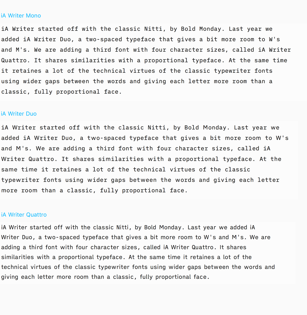
iA Writer started off with one font. The classic Nitti, designed by Bold Monday. Last year we added iA Writer Duo, a two-spaced typeface that gives a bit more room to W’s and M’s, based on IBM Plex. This year, we add a third font with four character sizes, called iA Writer Quattro and unify the designs.
Quattro shares similarities with a proportional typeface. At the same time, it retains a lot of the technical virtues of the classic typewriter fonts using wider gaps between the words and giving each letter more room than a classic, fully proportional face.
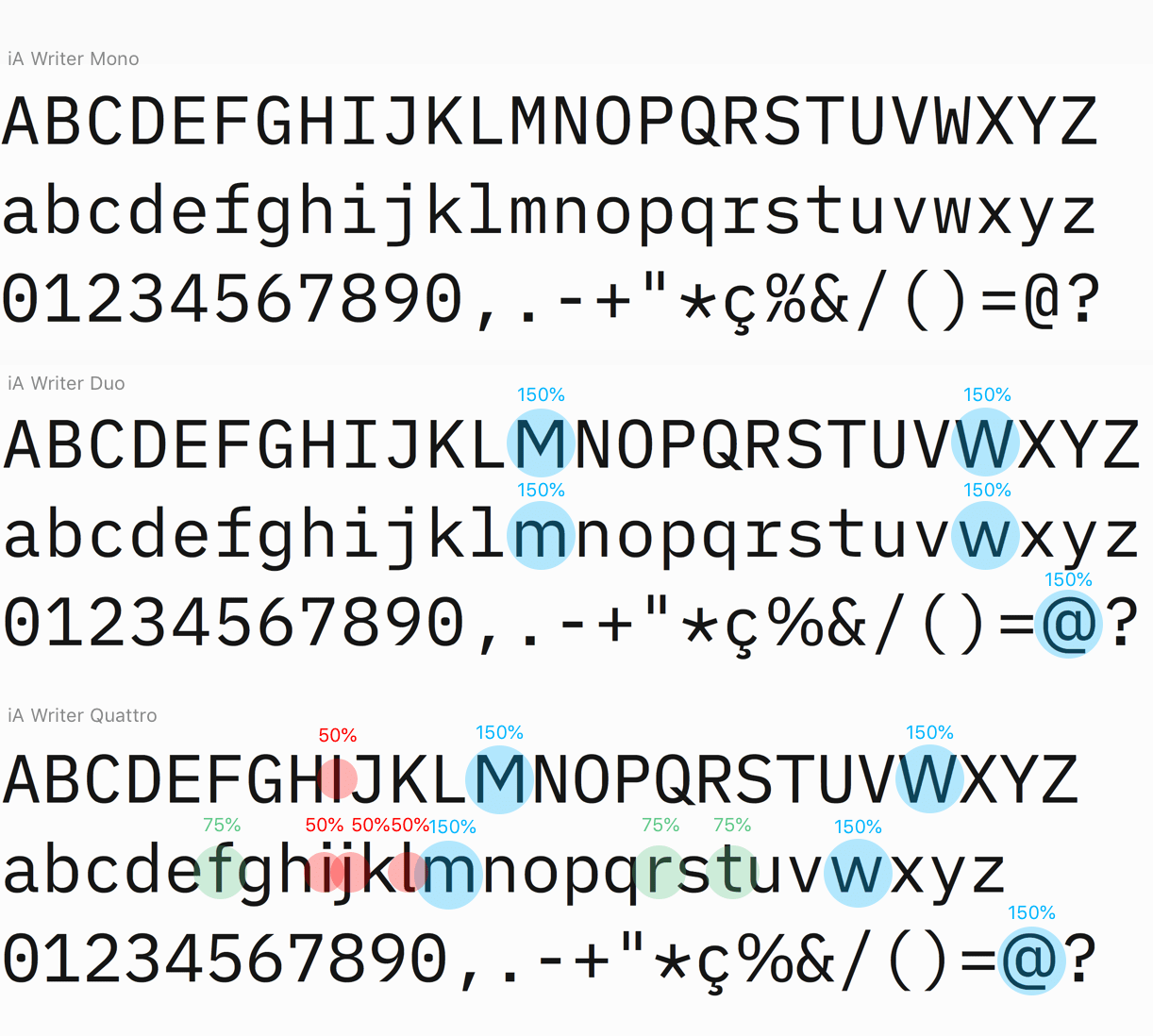
We kept large word spacing and monospaced punctuation. Quattro saves space on small screens. And it looks beautiful offering a cleaner, more regular text image. Changing the width of a few letters makes a huge change:
The fonts have all been redesigned. iA Writer Mono, Duo and Quattro were built upon IBM Plex. In the latest iteration, we have eliminated the IBM brand-typical features and made look more like the classic iA Writer font. Using square dots instead of round ones, adjusting the swirls and curves on a, j, f, l, t, y, Q, and lots of non-latin characters, we unified mono, Duo, and Quattro under a common look. This was a lot of work.
Optical Weights
The three new type families come as so-called variable fonts. While traditional fonts offer a limited number of weights, variable fonts offer an infinite scale between the weights and features. We are already working on an update, unifying all three in one font:
One of the advantages is that variable fonts allow us to use different optical weights for different sizes, screens and backgrounds.
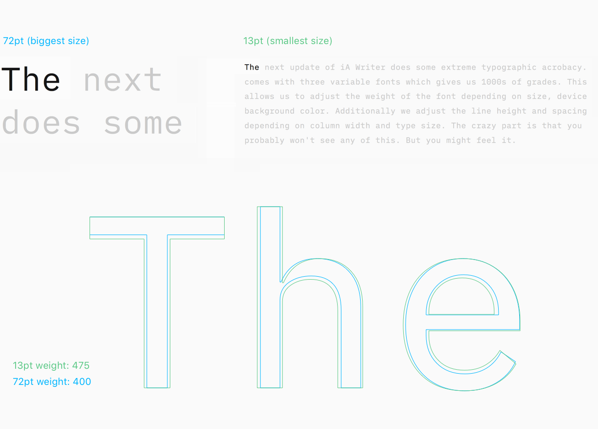
Optical weights have been used in printing for a long time. To make sure fonts are readable at different sizes, the shape needs to slightly adjust. Generally speaking, the smaller the font, the bolder and wider it should become. Here is a classic example:
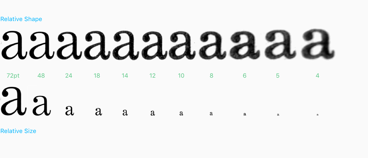
“Each size of Century Expanded as it existed in analog metal form had design variations to maintain stylistic traits at different sizes, compensate for technical printing issues, and improve readability.” Font Hinting and the Future of Responsive Typography
In iA Writer 5.2 we automatically adjust the optical weight depending on the type size you use. Weights change depending on size. The font is getting thinner and tighter spaced as we increase the type size. This has not been possible in the past.
Not just size, but different screens demand different weights, too. Fonts look different on screens; some screens have more or fewer pixels, like retina and high-density retina. Depending on what device you use, we apply different gradings.
Our job would almost be boring if type size, pixel density, and screen type were the only challenges of modern typography. As you might have noticed, dark backgrounds make white text shine brighter. That’s why iA Writer 5.2 tones the optical weight down another 5% for night mode. Who does such crazy things? Crazy people.
Dynamic Line Height
Another typographic rule to follow is that you need a higher line height, the wider the column width. This makes sure that the eye can still easily jump to the next line, even with long lines.
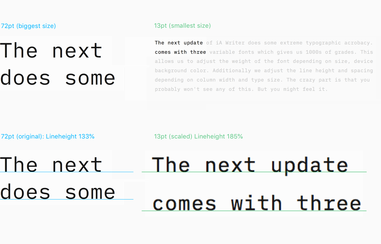
Depending on how large your type and wide your text columns are, we calculate the appropriate line height. We also take in account that small fonts need more line height than big fonts and that line height for non-proportional fonts requires to be a bit bigger than for proportional fonts (due to differences in gray value). The spacing changes as well. Smaller fonts get heavier and need a bit more room:
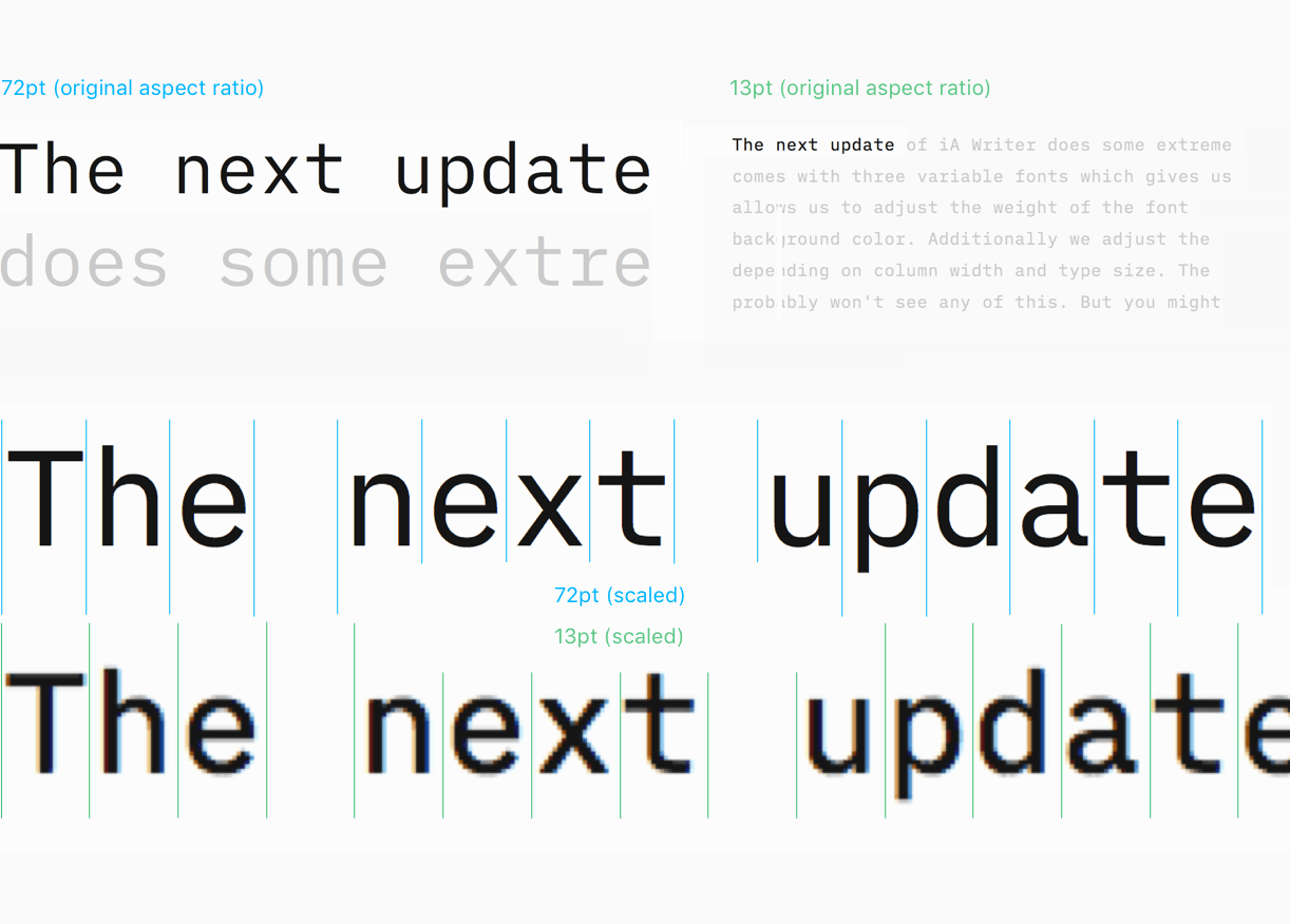
iA Writer supports up to about 64, 72 and 80 characters per line. Mono will always match limit, Duo will often fit less due to wider M and W. Quattro will fit more with its narrower characters.
Typographic Localization
People were complaining about CJK typography in iA Writer, and they were right. We went crazy here, too. Your preferred typography can now be chosen independently of system language in Editor preferences.
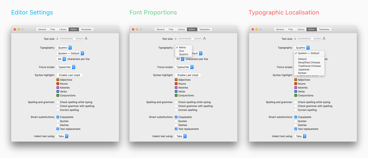
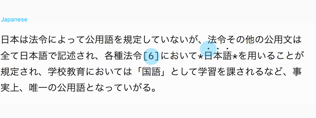
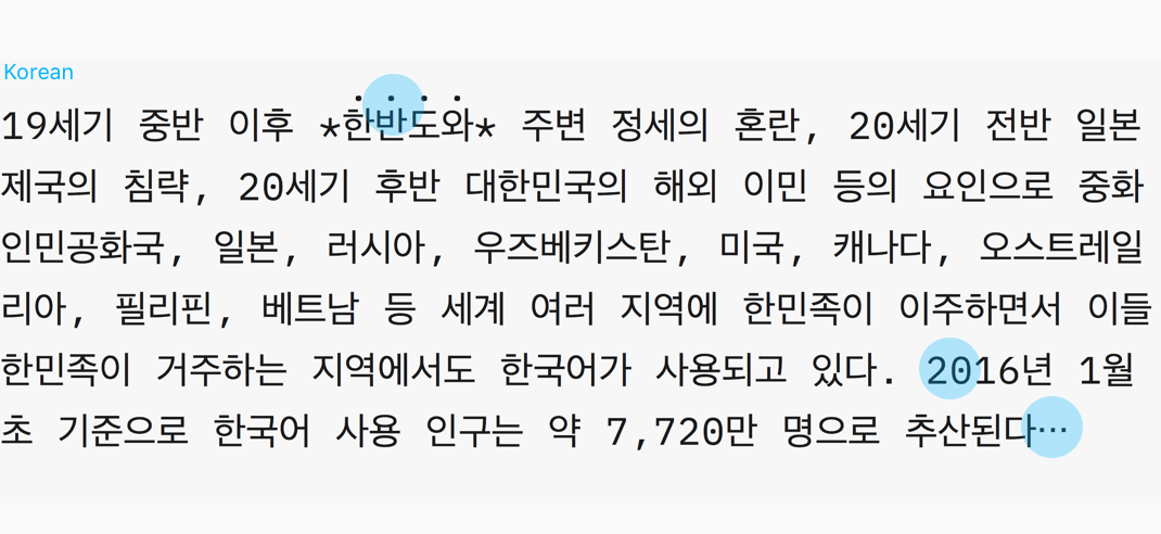
Chinese, Japanese, and Korean fonts are combined with characters, punctuation, and numbers from iA Writer’s Mono, Duo, or Quattro.
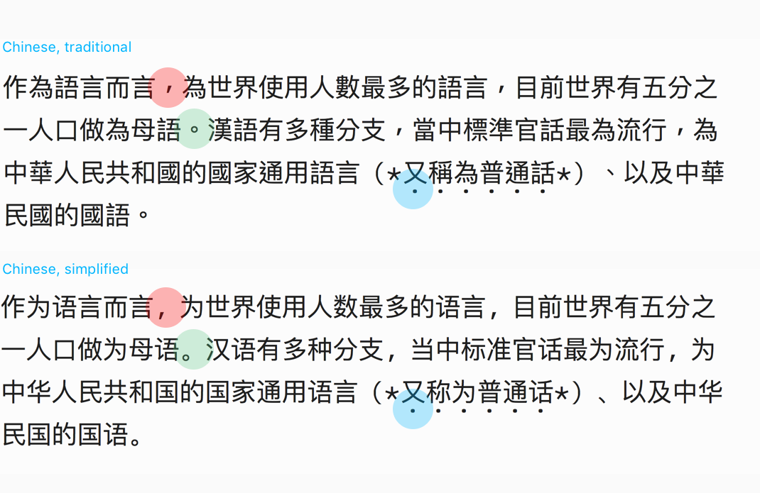
We replaced faux italic (which made text harder to read) with emphasis dots, below text in Chinese, above text in Japanese and Korean.
We completely redefined the Korean typography and localized the UI.
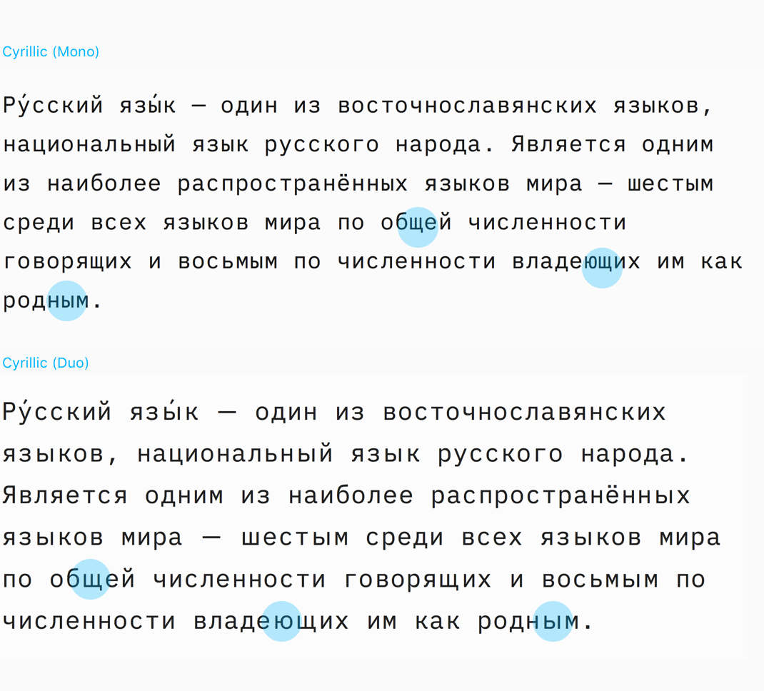
All fonts and templates now support Cyrillic and we have Russian localization.
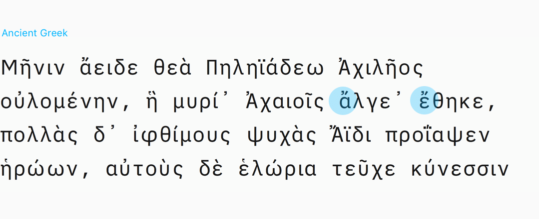
We added Greek and Ancient Greek, which is currently not available in IBM Plex. Since we have a lot of academic writers this was not just a nice to have.
All of the changes made it into our templates. With the jungle of languages and diacritics, maybe one or the other mistake has crept in. Please report if you find any.
Wait! More presents!
These are just some of the typographic changes. We’ll write a second post explaining all the other improvements, including a big Word export update on launch day.
Oh, and, of course, you can get the new iA Writer fonts for free on GitHub. We want you to use them everywhere you write.