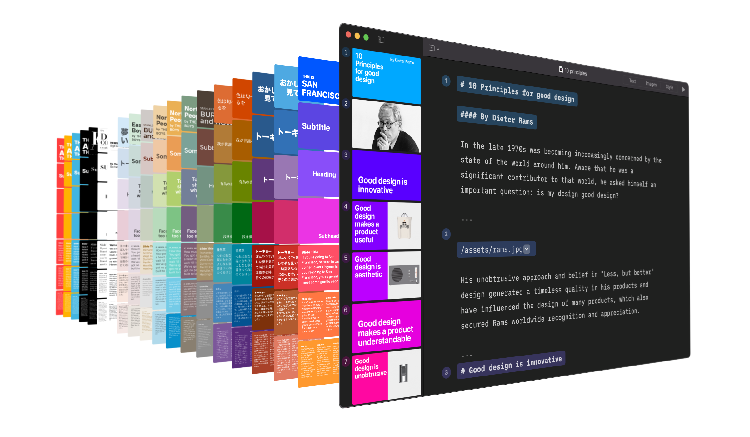
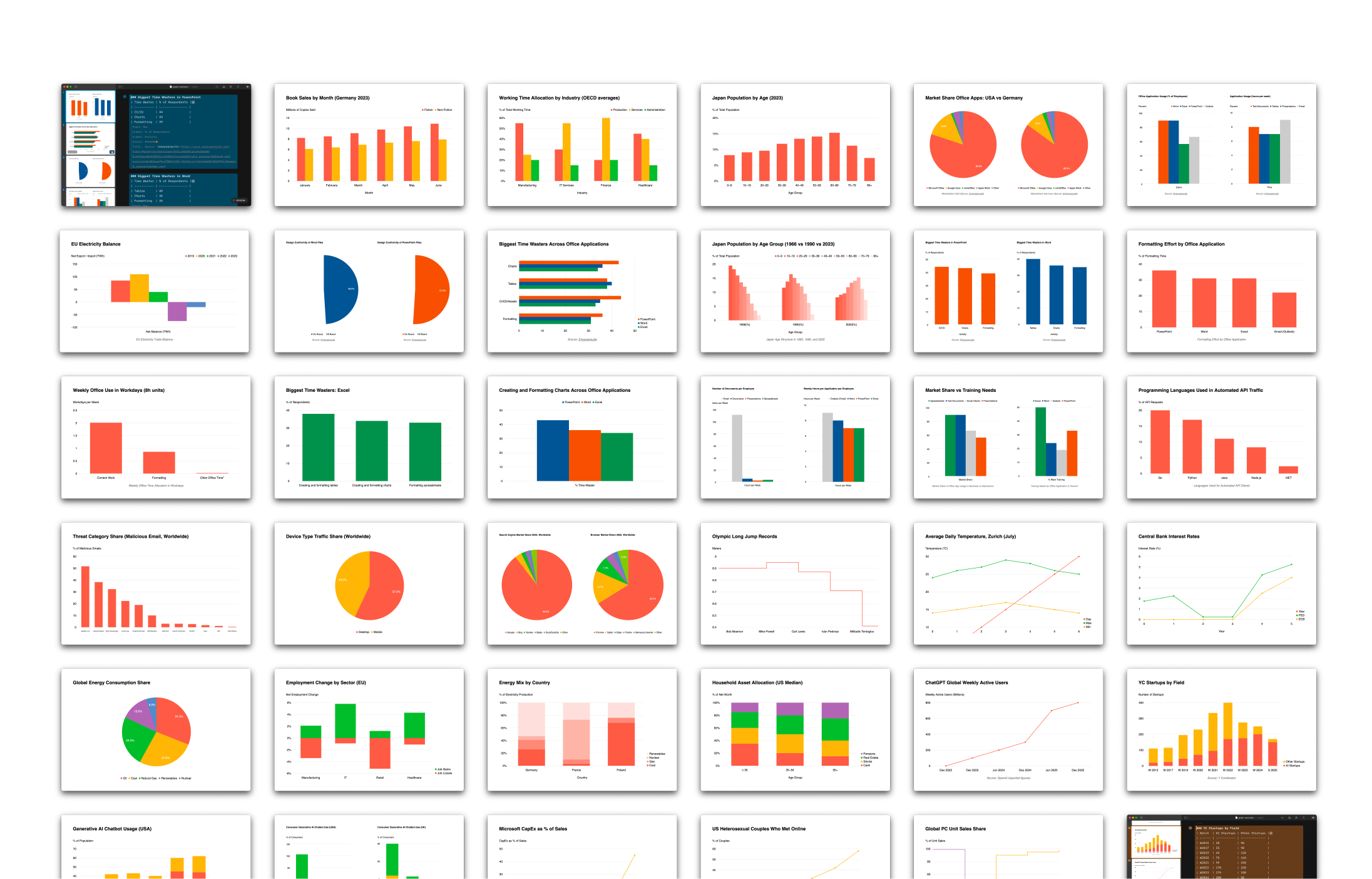
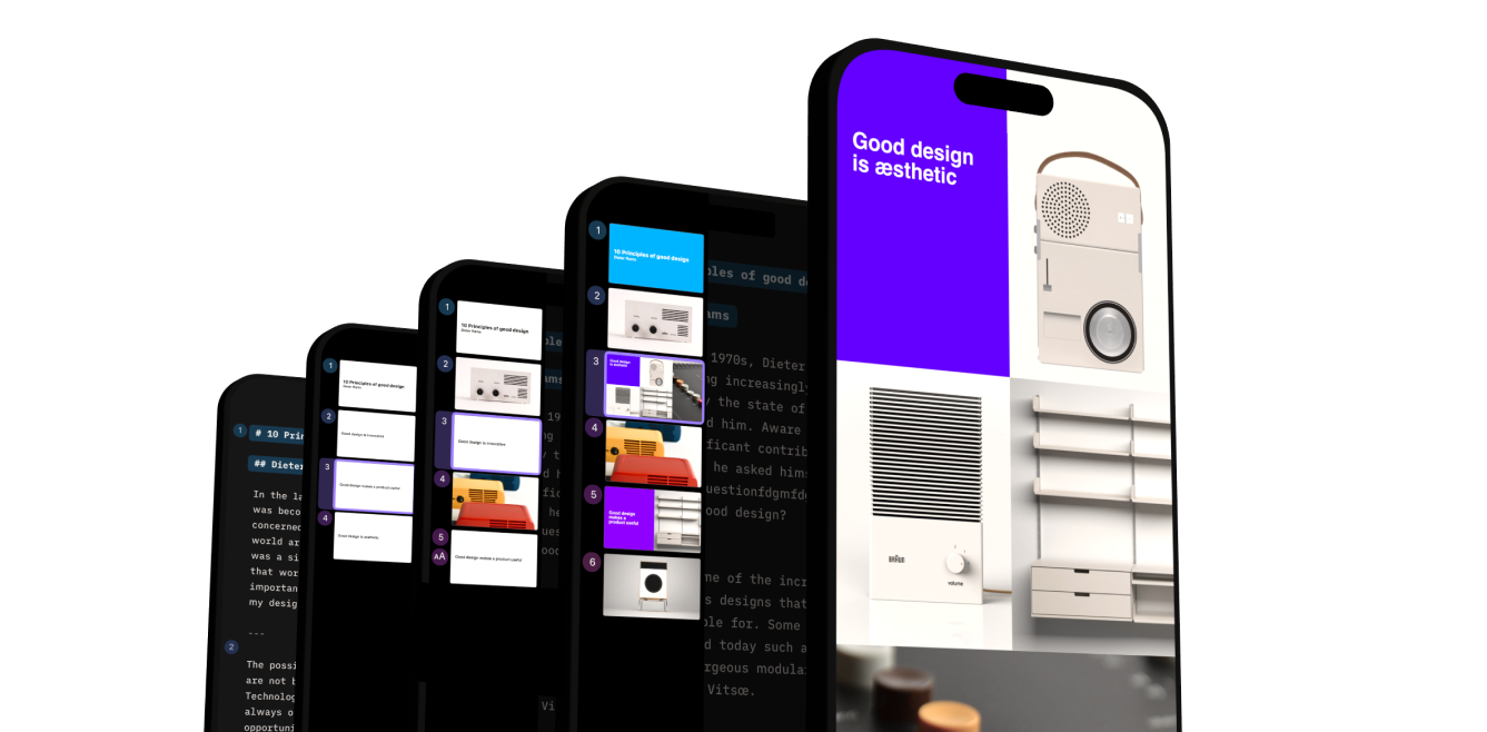
iA Presenter turns presentations on their head. Its text-based interface cuts creation time to a minimum. The design engine automatically adjusts the design of your slides to your phone, PC, or projector aspect ratios. Presenting itself is fun, like Karaoke.
Focus on crafting a compelling story instead of designing fixed slides. Nudging text boxes and pinching in and out on your phones are a thing of the past. Tell a convincing story and use your words to move people. The design happens automatically.
- iA Presenter Trial for Mac
Our starting point
In Part I we looked at the presentation challenges that we’ve been dealing with. The struggle of getting started. Understanding the old-fashioned and time-consuming format of static slides. The procrastination. The obsolete static format. The difficulty of remembering what we want to say and how it leads to reading from slides. The worry of getting heard and being engaging and how it leads to the use of boring stock imagery and meaningless charts.
In Part II we found that boredom eats our business from within. Being bored costs time and energy. It kills the excitement and creates confusion. Being boring tarnishes our reputation with our peers. It lowers our status, and it robs us of the power to change things.
We looked at how presentations should be. We found that to make an impact, we need to move people to take action. Our audience needs to hear the certainty in our voice. They need to feel our passion and get inspired.
Today we’re going to share with you what we made and invite you to try it out for yourself.
Great presentations tell great stories
When you first open iA Presenter, you’ll notice a text-based interface. By default, the focus is not on what your audience is going to see. The focus when making a presentation is on what you are going to say. First, write your story. The visuals are added later.
Deciding what to say and making a cohesive argument across slides is challenging. Starting with an empty set of slides upsets us more than necessary. PowerPoint pretends to help us by directing our attention to design things instead. What feels like a welcoming hand promising fun with stock images, fonts and colors only make things more difficult. Instead of making us focus on what we want to say, it invites procrastination and visual bricolage.
Okay, but where do you begin? How about using what you have already?
Ironically, most of the time, we’ve already worked out much of what we need to say in another text document. We don’t need to start from scratch every time we make a presentation. We know our topic. We’ve done some work. We have thought and written about it before. We usually have a note, tweetstorm, messenger thread, email, or blog post that can get us started. PowerPoint’s design-based approach consistently invites us to start from scratch and then leads us directly into distraction. Why waste all that time?
With iA Presenter’s text based editor, you can start with any existing piece of writing. Copy and paste. You’ve saved time and avoided the pain of starting a presentation.
Turning our text into speech and only showing titles, iA Presenter does a lot of the hard work to get us started.
Your script: Why hide from the audience?
Reading from a slide is the fastest way to lose someone’s attention. We all know that. How come we still keep doing this? What are we missing?
On average, we read 250 WpM (Words per Minute) while we speak at about 150 WpM. If you project what you are about to say on a screen, your audience will read ahead and cap the connection to your voice. You’ve lost them. Soon, the audience knows what you are about to say. You want them back? Well, they already know what you are going to say. You have spoiled them. No matter whether it’s verbal or visual information, we do not want to hear again what we already understand. It’s your job to keep their attention. If you want people’s attention, avoid spoilers.
This is why in iA Presenter what you say is only visible to you. Is the idea to read everything from the teleprompter? No. You can use the Presenter’s view like Karaoke subtitles. You know your favorite song by heart. But in case you get lost, it’s there to get you back on track.
Focusing on the story makes for a swift drafting process and a sharper argument. Markdown commands make the process even faster. Once we are happy with what we are going to say, we can think about what our audience is going to see.
Visuals: Tension and Attention
It’s boring to read from the slide. It’s as boring to explain what everybody sees. Do not show the picture of a dog and say “This is a dog.”
Not every image is worth 1000 words. Stock imagery can be outright insulting to your audience’s intelligence. When you talk about a dog, using a meaningless stock image tells us that you don’t trust our basic imagination.
Inexperienced presenters choose pictures that duplicate or reinforce the message. This is boring. Visual storytelling is as hard as text-based storytelling. You need the same care and skill to pick images that you need to pick words.
Experienced visual storytellers create tension between the text and the visuals to get their audience’s attention. They choose imagery that raises questions. They use images that make us watch and listen.
Skillful visual storytellers build tension between what they show and what they say. They use images that direct the attention to the speaker’s voice. We listen when we see something surprising and exciting. We listen when we discover something in the image that we oversaw. We listen when the image carries new information. We don’t listen when you explain what we all already see.
A visual presentation tool suggests that by using enough colors and images, you automatically produce meaningful, interesting effects. In reality, the efficient use of visuals requires a lot of visual skills that only very few visually trained people have.
iA Presenter is a story-based presentation app. It offers visual tools to attract your audience’s attention. Images, videos, layouts, tables, and templates are all available when we need them. It comes with an image library that gives you a separate overview of the visual assets you use. Its focus on storytelling encourages the conscious use of fewer but better visuals.
Nevertheless we gave our best to make the design of the templates as beautiful as possible. Our vision was to create a contemporary, fresh and professional typographic experience like you have never seen before.
Design: Colorful, dynamic, typographic
iA Presenter comes with a palette of colorful templates with great care for typography. The default template changes the background color as you progress. It’s a new type of presentation design that dynamically creates a scale of background colors. It shows that you are moving forward and makes every new slide look fresh and fun. It would be tedious to do that manually in PowerPoint.
When working on the design of the app, we found it pleasant, orienting, and refreshing to change the color of the cursor as you move from top to bottom. From there, we found that it would be great to change the background color.
The cursor starts out in the Writer blue because writing is what you do first. As soon as you start making slides, additional colors will appear. The standard palette goes from Writer blue to purple to red, indicating the highlight of the presentation. It finishes with a golden yellow.
You can pick between the standard templates or create your own design with a few clicks. Font, colors, header, footer, etc., are all very easy to customize. The best thing: they are responsive. They automatically adapt to the screen resolution. So no more pinching in and out when you look at a presentation on the phone.
You can also create your own template, but that requires some CSS skills. If you want to buy iA Presenter for your organization and you get more than 50 copies, we will help you with that.
Fun like Karaoke
It’s much faster to create presentations with a text interface. We can devote more time to practice. Practice helps with our confidence and our delivery.
You should put all your energy into what you are going to say and take some time to prepare and simplify. It’s important that you stay relaxed and calm, even under pressure.
This is our evolution of the speaker notes screen. We call it the Speaker’s View, an experience more akin to a teleprompter with bold, clear dialogue cues. A safety net that gives you the confidence to deliver an unforgettable presentation.
But what if you don’t have anything interesting to say? Is this a presentation app for TED-like speeches? Everyone demanding someone else’s time should have something to say. If you use iA Presenter and find out that, this time, you don’t have anything interesting to share, even better. You don’t need to fill your void with empty charts and stock images. If you admit when you have nothing to say, we will love you for saving our time.
Handout: An easy-to-read text document with images
Since the meat and bones of your presentation is in what you say, you can export it as a simple text document.
iA Presenter ends the quirky six slides on 20 A4 papers and puts everything back into a simple, easy-to-read-and-follow text with pictures.
Summary: Fast, clear, confident
iA Presenter turns presenting on its head with a text-first interface. This helps us focus on what matters, our message. It helps us save time by using our existing work as the obvious starting point. Once we’ve created a compelling script, we can focus on what our audience is going to see, with all the usual options. Add visuals to direct the attention of your audience to your voice. The design is done automatically, adapts to devices and saves you a ton of time. Use the time you saved to practice and improve your delivery until you know by heart what you want to say. Never worry about forgetting the script. We have a relaxing, Karaoke-like speaker view. A powerful safety net that leaves us free to tell our story and move our audience to act.
Try it
As long as iA Presenter remains in public beta, it is free to use. Down the road, we will offer the choice between buying or subscribing to the app. You will have a word on the pricing. We will conduct a series of interviews with users of our app to determine a fair price.
