カスタムテーマ
iA Presenter の標準 Themes を選ぶだけでなく、自分だけのカスタムテーマを作ることもできます。
プレゼンの見た目は、次の方法で変えられます。
- 特定の theme とその CSS を使う
- presets を使う
- スライド内容に応じてレイアウトを切り替える(auto-layout)
- Style Inspector で CSS variables を定義する
💡 カスタムテーマの作成には、HTML と CSS の知識が必要です。
テーマの構造

どのテーマも、次の要素で構成されています。
- Theme assets
- Presets(あらかじめ定義された CSS variables のセット)
- Custom fonts
- Theme CSS definitions
- Theme thumbnail
- Theme definition
スライドの HTML 構造
- 1 つのプレゼンには、slide containers の集合と slide backgrounds の集合があります
- 各スライドは slide container DIV と slide background DIV を生成します
- slide background には slide container と同じレイアウト用 CSS class が付きます
- footnotes がなければ、footnotes DIV の高さは 0 になります
- header と footer がなければ、スライド内容は利用可能な空間をすべて使います
- レイアウトごとに header / footer を非表示にすることもできます(下の class 一覧を参照)。たとえば
.cover-container .header{ display:none;}のように指定します

レイアウト
Cover
- Container CSS Class:
.cover-container - Slide Content CSS Class:
.layout-cover

Title
- Container CSS Class:
.title-container - Slide Content CSS Class:
.layout-title

Section
- Container CSS Class:
.section-container - Slide Content CSS Class:
.layout-section

Split
- Container CSS Class:
.v-split-container - Slide Content CSS Class:
.layout-v-split

Grid
- Container CSS Class:
.grid-container - Slide Content CSS Class:
.layout-grid

Grid レイアウトでは、スライド内容の DIV にグリッドセル数を示す CSS class も付きます。たとえば grid-items-2、grid-items-3、grid-items-4 などです。
Caption
- Container CSS Class:
.caption-container - Slide Content CSS Class:
.layout-caption
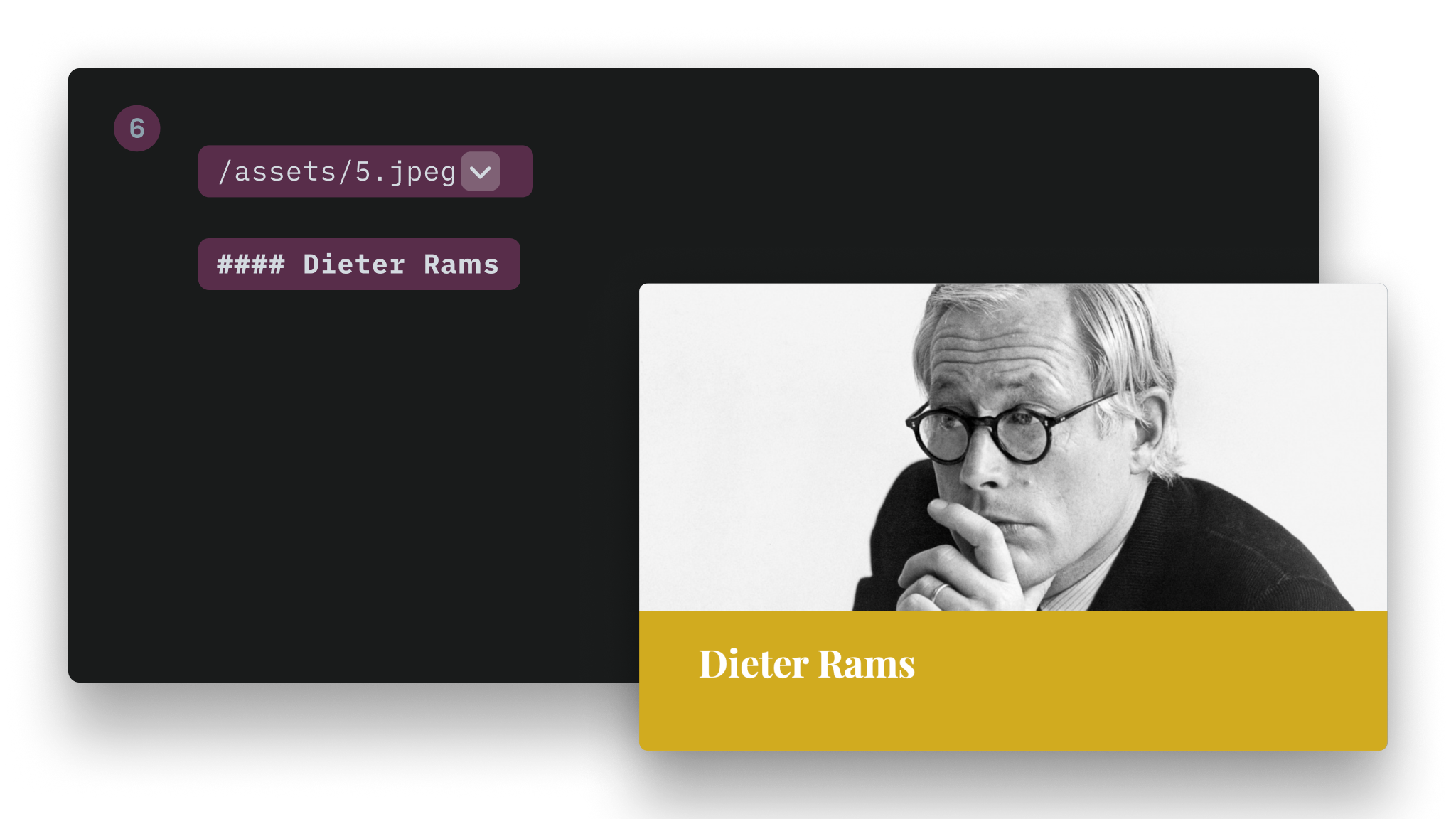
Image Title
- Container CSS Class:
.title-image-container - Slide Content CSS Class:
.layout-title-image

Default (Text)
- Container CSS Class:
.default-container - Slide Content CSS Class:
.layout-default

カスタムフォント
テーマにカスタムフォントを追加するには、次の手順で進めてください。
1. フォントファイルをテーマフォルダに追加する
Roboto-Slab-Regular.woff2
Roboto-Slab-Bold.woff2
2. CSS の先頭でそのフォントを参照する
@font-face {
  font-family: 'Roboto Slab';
  font-style: normal;
  font-weight: 400;
  src: url(Roboto-Slab-Regular.woff2) format('woff2');
}
@font-face {
  font-family: 'Roboto Slab';
  font-style: normal;
  font-weight: 700;
  src: url(roboto-slab-Bold.woff2) format('woff2');
}
3. Metadata を設定する
a. template.json で
"TitleFont": "New York",
  "BodyFont": "New York",
ここではカスタムフォントの display name を指定します。Style Inspector に表示される名前です。
上の例は New York フォントの場合です。
b. presets.json で
"TitleFont": "-apple-system-ui-serif, ui-serif",
"BodyFont": "-apple-system-ui-serif, ui-serif",
ここではカスタムフォントの CSS name を指定します。
上の例も New York フォントのものです。display name とは名前が異なることに注意してください。
💡 カスタムフォントを CSS に直接書くこともできますが、その場合 Style Inspector から上書きできなくなります。
テーマ内の画像を CSS から使う
カスタムテーマをインストールすると、iA Presenter はそのディレクトリ構造を保ったまま扱います。
そのうえで、url(...) 関数を使って画像を参照できます。たとえば次のようにします。
.backgrounds .default-container{
  background-image: url("image1.jpg");
  background-size: cover;
  background-position: center;
}
配置
各レイアウトの内側にある div を対象に指定してください(上の一覧を参照)。
例:
.layout-cover > div {
    justify-content: flex-end; /* vertical alignment */
    align-items: flex-start; /* horizontal alignment */
}
横方向の配置
プロパティ: align-items
| 配置 | 値 |
|---|---|
| Left | flex-start |
| Center | center |
| Right | flex-end |
縦方向の配置
プロパティ: justify-content
| 配置 | 値 |
|---|---|
| Top | flex-start |
| Center | center |
| Bottom | flex-end |
背景
- 通常のビットマップ画像(
.jpg、.png)も SVG も背景として使えます - 背景画像は、下の例のように CSS に直接インラインで書くこともできます
- 特定のレイアウトだけを対象にすることもできます
.backgrounds .v-split-container{
  background-image: url('data:image/svg+xml;utf8,');
  background-size: cover;
  background-position: center;
}
CSS ファイル内で inline SVG を URL として直接使う場合は、色の指定方法に注意してください。16 進カラー(#FFFFFF のような形式)を使うと CSS が壊れます。代わりに rgb(0,0,0) 形式を使ってください。
レイアウトに関係なくすべての背景を対象にしたい場合は、.slide-background class を指定します。
グラデーション背景
- 2 種類のグラデーションを定義する必要があります。appearance(Light / Dark)ごとに 1 つずつです
- これらのグラデーションは
presets.jsonに定義します
例:
{
  "Presets": [
    {
      "Name": "Default",
      "TitleFont": "system-ui",
      "BodyFont": "system-ui",
      "Appearance" : "dark",
      "DarkBodyTextColor": "#000000",
      "LightBodyTextColor": "#ffffff",
      "DarkTitleTextColor": "#000000",
      "LightTitleTextColor": "#ffffff",
      "DarkBackgroundColor": "transparent",
      "LightBackgroundColor": "transparent",
      "Accent1": "#f94144",
      "Accent2": "#43aa8b",
      "Accent3": "#f9c74f",
      "Accent4": "#90be6d",
      "Accent5": "#f8961e",
      "Accent6": "#577590",
      "LightBgGradient":[
          "#c7e7ff",
          "#f0c8ff",
          "#ffdada",
          "#ffebb2"
      ],
      "DarkBgGradient":[
          "#15354c",
          "#3e154c",
          "#4c2828",
          "#4c3900"
      ],
    },...
Appearance
iA Presenter では .dark と .light の CSS class を使います。これらの class はレイアウトごとに設定されます。特定のレイアウトに対して appearance を固定したい場合は、カスタム Theme の template.json で指定できます。たとえば次のようにします。
{
  "Name": "New York",
  "Version": 0.1,
  "Author": "iA",
  "ShortDescription": "Stylish, bold, classy.",
  "LongDescription": "Stylish, bold, classy\
- Different sizes for headlines\
- Simple color background\
- Default white on black\
- Default font: New York",
  "Css": "newyork.css",
  "TitleFont": "New York",
  "BodyFont": "New York",
  "Layouts":[
     {
          "Name": "Cover",
          "Classes": "invert",
     },
     {
          "Name": "Title",
          "Classes": "invert",
     }
  ]
}
レスポンシブ対応
iA Presenter のテーマはレスポンシブです。初期状態では CSS はモバイル端末向けに適用されます。モバイル以外のデバイスを対象にしたい場合は、次のように書きます。
@media (min-width: 768px) {
...
}
たとえば viewport サイズに応じてフォントサイズや余白を変えたいなら、追加の breakpoint を入れることもできます。ただし iA Presenter 側にもすでに独自のロジックがあるため、通常はデフォルトで十分です。
カスタムテーマを作る
1. 新しいテーマを作る
Settings → Themes に進み、+ → Create Theme をクリックして名前を入力します。
2. 新しいテーマのファイルを開く
Reveal Themes folder in Finder ボタンをクリックし、新しく作成した Theme のフォルダへ移動します。
3. 新しいテーマを使う
プレゼンを開き、Inspector の Theme and Style タブで、新しく作成したテーマを選びます。
4. 変更を加える
お好みのエディタで Theme.css を開き、独自の CSS を追加してください。
7日間無料トライアル
今すぐダウンロード。
クレジットカードは不要です。
Mac
クレジットカード不要