Custom Themes
Aside from choosing from iA Presenter’s default Themes, you can create your own custom themes too.
You can change your presentation’s style by:
- Using a specific theme and its CSS
- Using presets
- Selecting different layouts, depending on your slide content (auto-layout)
- Defining CSS variables in the Style Inspector.
💡 Creating custom themes requires some knowledge of HTML and CSS.
Theme Structure

Every theme consists of:
- Themes assets
- Presets (predefined sets of CSS variables)
- Custom fonts
- Theme CSS definitions
- Theme thumbnail
- Theme definition
Slides HTML Structures
- A presentation has a collection of slide containers and a collection of slide backgrounds
- Each slide generates a slide container and a slide background DIVs
- The slide background has the same layout CSS class as the slide container
- If there are no footnotes, the footnotes DIV has 0 height
- If there are no headers and footers, the slide content occupies all the available space
- You can choose to hide headers/footers on a per-layout basis (see below for list of classes):
.cover-container .header{ display:none;}for instance

Layouts
Cover
- Container CSS Class:
.cover-container - Slide Content CSS Class:
.layout-cover

Title
- Container CSS Class:
.title-container - Slide Content CSS Class:
.layout-title

Section
- Container CSS Class:
.section-container - Slide Content CSS Class:
.layout-section

Split
- Container CSS Class:
.v-split-container - Slide Content CSS Class:
.layout-v-split

Grid
- Container CSS Class:
.grid-container - Slide Content CSS Class:
.layout-grid

The Grid layout also has a CSS class indicating the number of grid cells at the slide content DIV level: grid-items-2 , grid-items-3 , grid-items-4 , and so forth.
Caption
- Container CSS Class:
.caption-container - Slide Content CSS Class:
.layout-caption
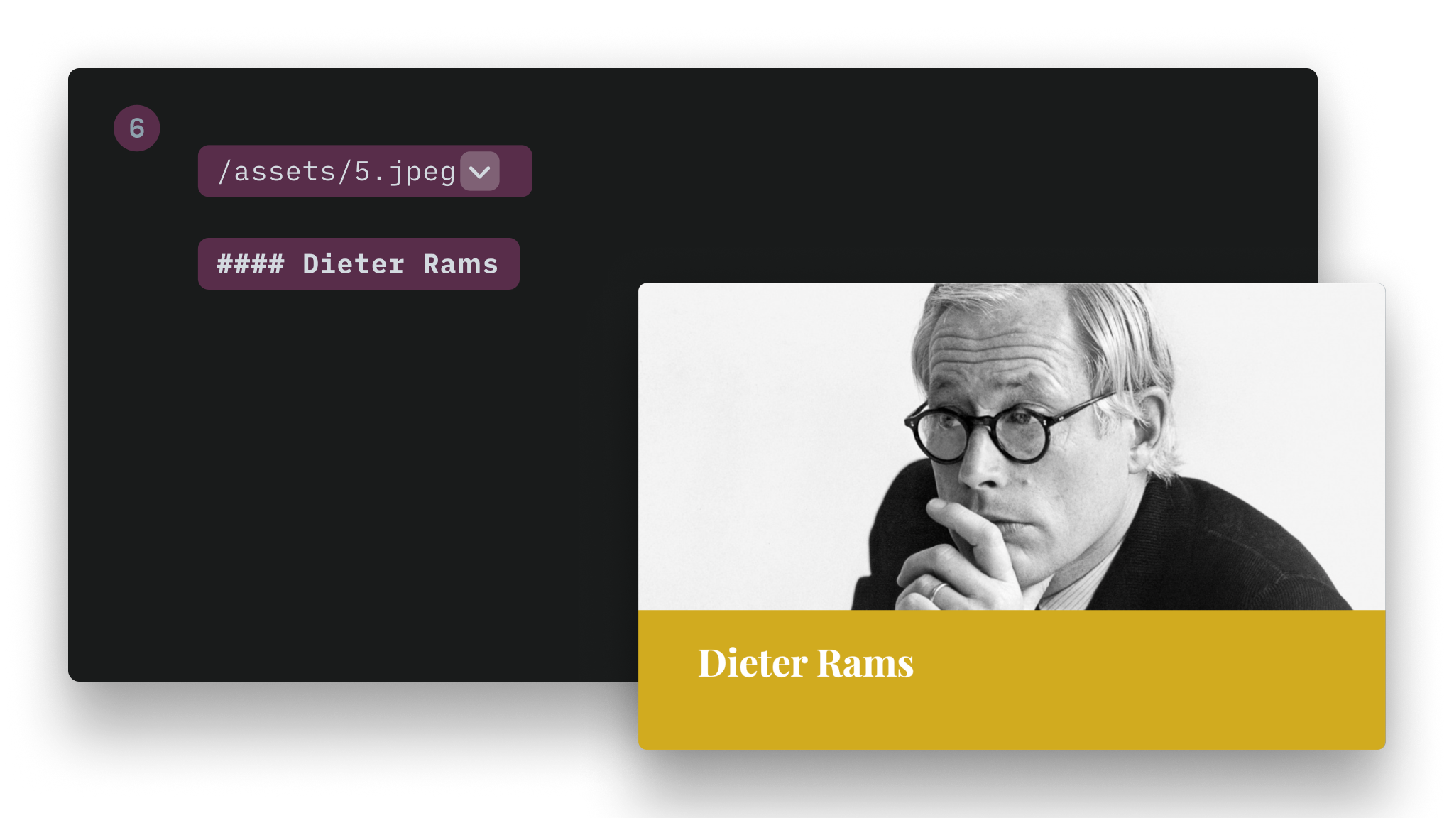
Image Title
- Container CSS Class:
.title-image-container - Slide Content CSS Class:
.layout-title-image

Default (Text)
- Container CSS Class:
.default-container - Slide Content CSS Class:
.layout-default

Custom Fonts
Follow these steps to add a custom font to your theme:
1. Add the Font Files to Your Theme Folder
Roboto-Slab-Regular.woff2
Roboto-Slab-Bold.woff2
2. Reference these Fonts at the Beginning of Your CSS
@font-face {
  font-family: 'Roboto Slab';
  font-style: normal;
  font-weight: 400;
  src: url(Roboto-Slab-Regular.woff2) format('woff2');
}
@font-face {
  font-family: 'Roboto Slab';
  font-style: normal;
  font-weight: 700;
  src: url(roboto-slab-Bold.woff2) format('woff2');
}
3. Inform Metadata
a. In template.json
"TitleFont": "New York",
  "BodyFont": "New York",
Here you need to inform the display name of your custom fonts. That’s the name that will appear in the Style Inspector.
Above is an example for the New York font.
b. In presets.json
"TitleFont": "-apple-system-ui-serif, ui-serif",
"BodyFont": "-apple-system-ui-serif, ui-serif",
Here you need to inform the CSS name of your custom font.
Above is an example for the New York font. You will notice the name is different from the display name.
💡 You could directly set your custom font in CSS, but would lose the ability to override it using the Style Inspector.
Using Images From Your Theme in CSS
When your custom theme is installed, iA Presenter preserves the directory structure.
You can then reference an image using the url(...) function. Example:
.backgrounds .default-container{
  background-image: url("image1.jpg");
  background-size: cover;
  background-position: center;
}
Alignments
You need to target the inner div of each layout (see table above).
Example:
.layout-cover > div {
    justify-content: flex-end; /* vertical alignment */
    align-items: flex-start; /* horizontal alignment */
}
Horizontal Alignment
Property: align-items
| Alignment | Value |
|---|---|
| Left | flex-start |
| Center | center |
| Right | flex-end |
Vertical Alignment
Property: justify-content
| Alignment | Value |
|---|---|
| Top | flex-start |
| Center | center |
| Bottom | flex-end |
Backgrounds
- You can use regular bitmap images (
.jpg,.png) as well as SVG backgrounds - Background images can also be inlined directly in the CSS, as shown below
- You can target a specific layout:
.backgrounds .v-split-container{
  background-image: url('data:image/svg+xml;utf8,');
  background-size: cover;
  background-position: center;
}
If you use inline SVG as the URL directly in your CSS files, you need to take care of how you declare colors. Colors in hexadecimal format (like #FFFFFF) will break your CSS. Use the rgb(0,0,0) format instead.
If you want to target all backgrounds regardless of the layout, target the .slide-background class.
Gradient Background
- You need to define two different gradients: one per appearance (Light/Dark)
- These gradients are defined in the
presets.jsonfile
Example:
{
  "Presets": [
    {
      "Name": "Default",
      "TitleFont": "system-ui",
      "BodyFont": "system-ui",
      "Appearance" : "dark",
      "DarkBodyTextColor": "#000000",
      "LightBodyTextColor": "#ffffff",
      "DarkTitleTextColor": "#000000",
      "LightTitleTextColor": "#ffffff",
      "DarkBackgroundColor": "transparent",
      "LightBackgroundColor": "transparent",
      "Accent1": "#f94144",
      "Accent2": "#43aa8b",
      "Accent3": "#f9c74f",
      "Accent4": "#90be6d",
      "Accent5": "#f8961e",
      "Accent6": "#577590",
      "LightBgGradient":[
          "#c7e7ff",
          "#f0c8ff",
          "#ffdada",
          "#ffebb2"
      ],
      "DarkBgGradient":[
          "#15354c",
          "#3e154c",
          "#4c2828",
          "#4c3900"
      ],
    },...
Appearances
iA Presenter uses the .dark and .light CSS classes. These classes are set per layout. You can force the appearance for a specific layout in a custom Theme, in the template.json file. For example:
{
  "Name": "New York",
  "Version": 0.1,
  "Author": "iA",
  "ShortDescription": "Stylish, bold, classy.",
  "LongDescription": "Stylish, bold, classy\
- Different sizes for headlines\
- Simple color background\
- Default white on black\
- Default font: New York",
  "Css": "newyork.css",
  "TitleFont": "New York",
  "BodyFont": "New York",
  "Layouts":[
     {
          "Name": "Cover",
          "Classes": "invert",
     },
     {
          "Name": "Title",
          "Classes": "invert",
     }
  ]
}
Responsiveness
iA Presenter themes are responsive. By default, CSS applies to mobile devices. If you want to target non-mobile devices:
@media (min-width: 768px) {
...
}
You can add additional breakpoints if, for instance, you want to provide different font-size/margins depending on the viewport size. However, iA Presenter already has its logic, and defaults should be enough.
Developing Custom Themes
1. Create a New Theme
Go to Settings → Themes. Click on +, Create Theme and enter a name.
2. Navigate to the New Theme Files
Click on the Reveal Themes folder in Finder button. Navigate then to the folder of the newly created Theme.
3. Use Your New Theme
Open a presentation, go to the Theme and Style tab in the Inspector, and set the newly created theme.
4. Bring Your Modification
Open your Theme.css in your preferred editor and add your custom CSS.
Visuals
Design
Select a theme and slightly tweak it from the Design Menu
Layouts
Add your text and images, and Presenter picks the right layout for you.
Images
Adding images to your presentations is as simple as a drag and drop.
Videos
Learn how to link to YouTube and add local videos to your presentation.
Themes
Explore the variety of themes offered in the app and the design principles that shaped each of them.
7-Day Free Trial
Download now.
No credit card required.
Mac
No credit card required