To spice up our monster essay on icons, we created an icon monster shooter arcade game. Planned as a one week hackathon, it turned into an amazing one year adventure. Here is what UX designers learned creating an arcade game.
About a year ago, we had some great material for an article on the use of icons in user interfaces. The article’s punch line was borrowed from Dieter Rams: “As few icons as possible but not less.” So we thought: let’s make a quick, simple, free, kick-ass game to train a designer’s icon killing instincts. An article with a Gimmick. People will check out the game because of the article and the article because of the game. We called it the “Yps-Approach.”1
A lot of our friends were scratching their heads: “You write a game for an article? Shouldn’t it be the other way around?” We knew that it was a long… shot. We thought: It’ll be quick. It’ll be kick ass. It’ll be simple. And we’ll learn a lot. What could go wrong? Well, “quick” turned into half a year of design and half a year of development. “Simple” turned into rocket science. The backside that got “kicked” was mostly our own: the project cost a lot of time and nerves. But we did learn a lot.
1. The Story
Assumption: Initially, creating a compelling game narrative seemed secondary. Most games have lame dialog, cheap humor, and the overarching story they tell is so painful maybe it ~~can~~ should be skipped completely.
The Princess (Back then known as Princess Toadstool and not Peach) gets kidnapped by a lizard named Bowser… and, well, that’s it. As a plumber, you have to go rescue her again, and again, and again. Because apparently, she likes being kidnapped (Where are her precautions?). For a world as bizarre as the Mushroom Kingdom, you’d think there be some more explanation to it that that, but nope, that’s it. It’s the classic damsel in distress story, and it’s also lazy, making it the weakest video game “story” in history. Your plot is in another castle.2
We figured that most games are either first-person shooters or some form of revival of an Eighties game, so there’s no need to waste much time on the story. It’s enough to copy a successful game, make it look cool, and skip all the phony pseudo-story nonsense. Oh, how wrong we were.
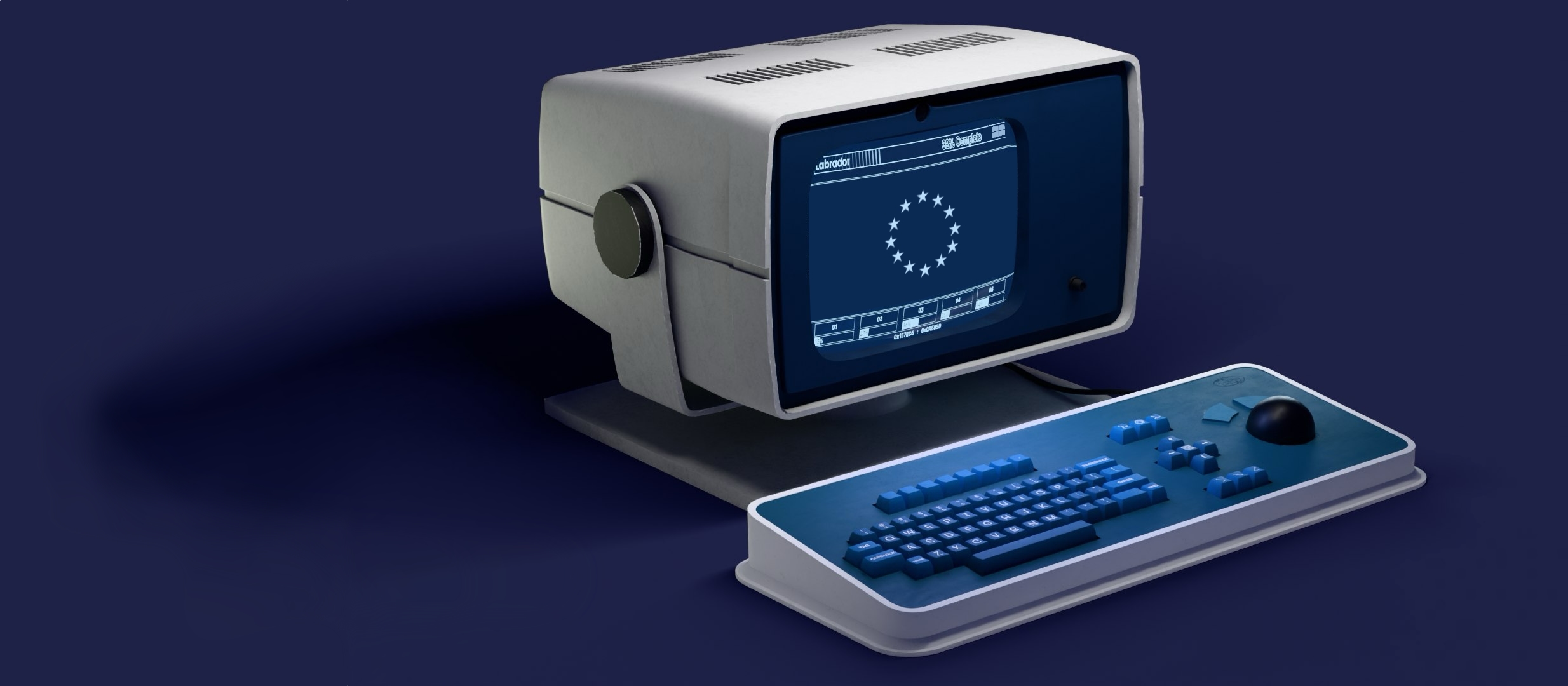
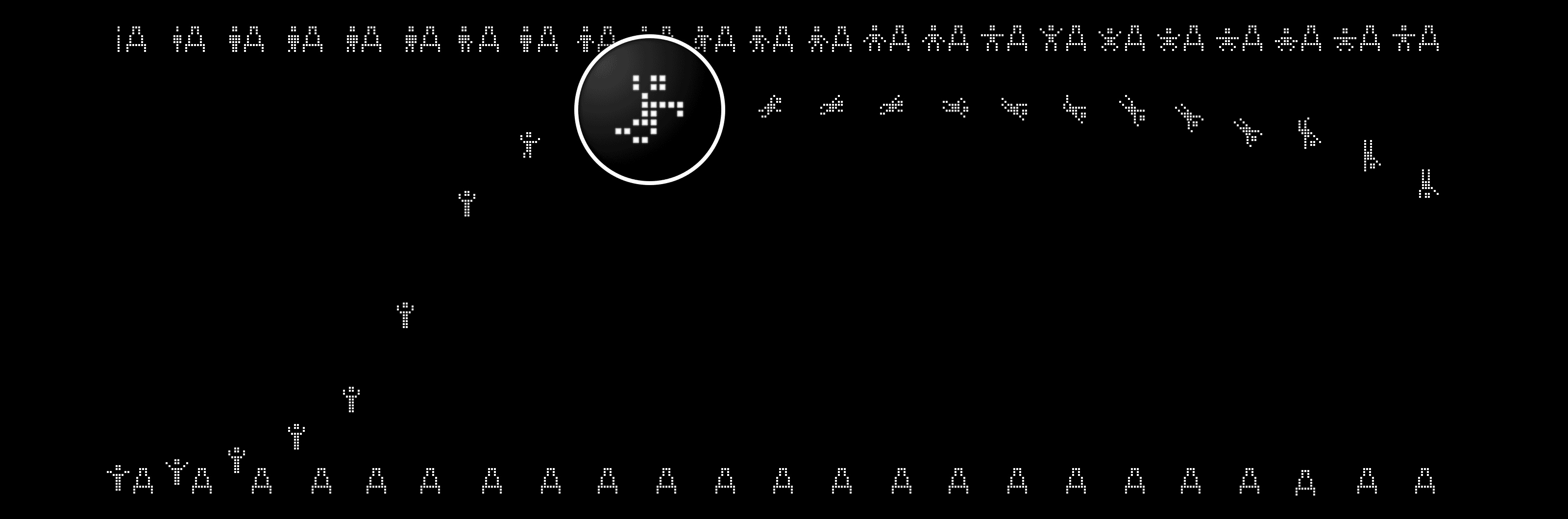
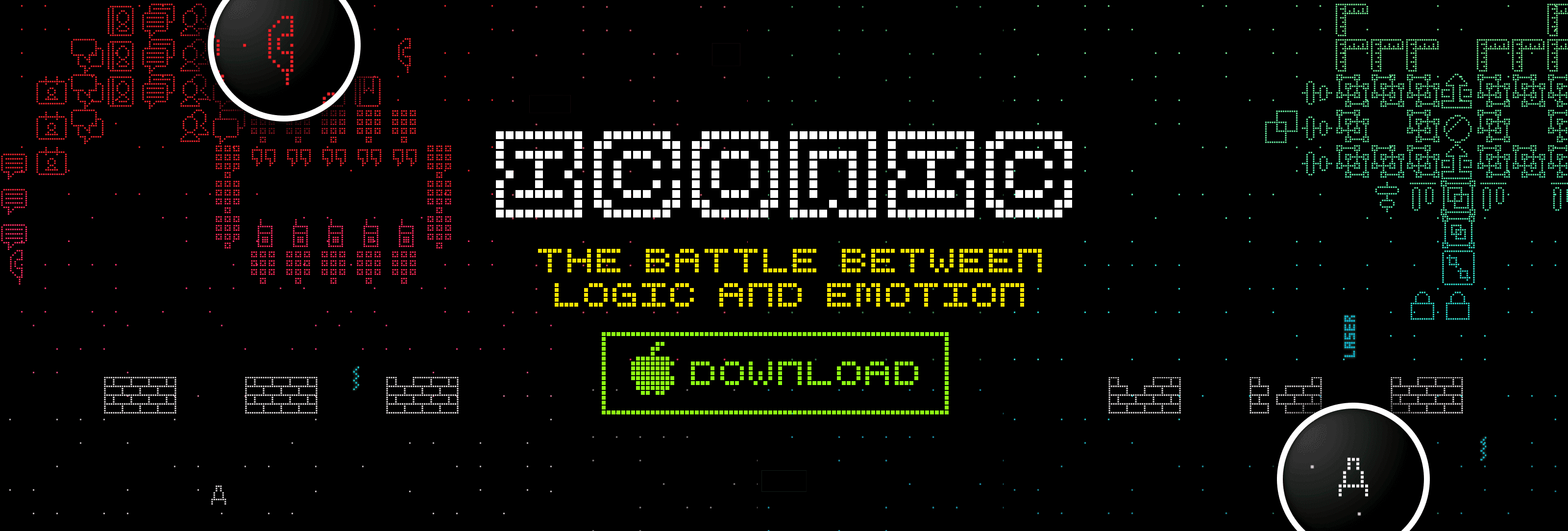
Reality: At first, we just did Space Invaders with a nicer design.3 The start screen was simple and offered just “Play” and “Hi-Score”. We soon felt that, for some reason, it needs an intro. But what kind of intro? At first, we added an iA logo. We zoomed in and out, faded it, did some of the usual tricks—that helped, but didn’t cut it either. As the idea of a “fight between words and icons”, or as we later put it “between logic and emotion” took hold, the intro started to take shape. We created an 8-bit iA logo morphing into a little person (i) and a Ship (A). The person would jump up and into the ship, and the ship would shoot off screen. This set the stage. Here is about half of that animation:
After we had this little preliminary little story, three months into development, something funny happened. The game started to live. It was only when we realized it was not finding the right words to tell the story, but the right drama, that the game started to feel like the real thing. We worked on a story board with Intro, Start Screen, Screens for each Stage, and End. Aligning, fine tuning and realigning these drove us nuts.
Learning: Immersion is key. In order to get us to fully identify with the character we’re playing, there have to be scenes and a curtain, and you need to tell a compelling visual story. The classic dramatic relation between Curtain, Beginning Middle, End, and Applause translates into Intro, Start Screen, Level Screens, Game Over. Aligning the parts with the whole requires a lot of patience and fine-tuning. Words may not be as important as in traditional information architecture, but that doesn’t make things easier.
2. Logic and Emotion
Assumption: We figured that if we just take a known game idea, create great-looking graphics with a lot of color, cool sound, big explosions, and the game will almost create itself. Games are less analytical, so it can’t be that hard, right? Also, we’re all gamers, so we know what matters. Wow, how silly that sounds now. And how familiar! How many times do we hear that from people about our own profession? Knowing how to use things doesn’t mean that you know how to build things. But “For the audience, what’s happening on the stage is all there is.”4. Just as any other form of design we soon learned that “Game design is a process of abstraction,”5 that requires vision, a strong concept, a method, a lot of patience. And experience. When we started, had no experience.
“When representational “worlds” are interactive, whether they be avant-garde theatre productions or virtual offices, how people find the edges of the universe—discovering the limits of what is possible—is a central issue in design.”6
Reality: Along the first 95% of the project, the game just didn’t feel as we wanted it to feel. Changing the aesthetics, adding lots of color and cool sounds didn’t have the impact we expected. We realized that games require much more attention to detail than we were used to (and we are used to a lot!). Whenever we changed anything in the sensory layer7 of the game, we had to adapt the structure. To our surprise, there was no such thing as a tangible separation between form and content, HTML and CSS, Front-end and Backend that we are used to in Web and App development.
Learning: In Web and App projects we spend the largest amount of time getting the structure right. The visual design slowly falls into place as the wireframes take on more shape. In the end, the visual style seems almost inevitable. As we were learning by doing, we started to realize that we couldn’t separate form and content and identify structure, simply because of our lack of experience. The more you design the more you are able to see structure where before you only saw shape. Just getting the start screen to work well required over 100 playable beta iterations.At the same time, developing the game made us realize how thick and important the sensory layer of any design is. UX designers tend to forget that sometimes.
3. User Experience
Assumption: Before starting we thought that developing a game UX would be easy, because we were under the impression that classic usability in game development just generally sucks. Every game seems to have a different menu logic. The settings are an overdesigned mess, and most of the time the settings offered seem completely superfluous (just go with the defaults). The amount of splash screens and clicks needed until you can start playing a game would be a total killer in Web design (only amateurs do that). And the worst thing are those “how to play” intros (a taboo in our realms). So how hard could it be for us—with all our years of experience creating news sites, online shops, banking software, text editors, and internet security UIs—to create a great user experience around a simple game based on Space Invaders?
Reality: The challenge in creating a great user experience for a game is not so much a matter of getting menus, and the user flows around menus and settings, in order. The really big challenge is the gameplay itself. The gameplay needs to be instantaneous and seamless. Splash screens are important for immersion and creating tension. We spent weeks working on ways to make it possible to steer and shoot that little ship on different viewports. In the end we went for a mechanism where you put your thumb on the HUD and roll the thumb back and forth to move, and you shoot by tapping on the fire button. Tilt also works to move the ship, and tapping anywhere shoots as well. Our army of 200 dedicated beta testers found this the perfect combo. It works great once you figure it out… but outside the beta tester world a lot of players give up before finding that “obvious” technique. It seemed that we needed to do what for UX designers is an absolute taboo: Add a tutorial at the beginning of the game (This is how it works), and offer a bunch of settings to personalize the controls.
Learning: The interface in games is not limited to “how the user completes a task with a product”, the real challenge is to get the player to actively identify with the main character in the game and not tune out for a single millisecond. While web and app design can live with a degree of passivity, games need to be designed in a way that gets our full attention and sucks us in completely. Games are played leaning forward. Websites should work in a comfortable physical position. Then the game play needs to be hard enough it keeps you hooked but not too easy either. Finding the right balance there is alchemy. Achieving this degree of game play difficulty and achieving full immersion is an art we’ve gained the highest respect for.
4. Differences
Having designed websites for almost twenty years, we didn’t think this was going to be that different. And indeed, a lot of the challenges we encountered were familiar. The shocking realization we had was: Usability in games can be strikingly, emotionally different from other digital products. Good arcade games are high pitched dramas, dense, like poetry.

Designing a game is in many ways similar to designing websites and apps. All major UX skills are required. But there are differences: User Experience Design in games is a much more intense challenge, as it focuses on seamless immersion, full real-time control, and character identification.
The story is not primarily a verbal, intellectual challenge, but a nervous funny drama that ironically lets you forget who you are. You need drama, pure drama, but not Hamlet, you need Super Mario. As you can tell, we still do not know how to describe it as we do not fully understand how it works. The overall dramatic arc is central to the credibility of the gameplay. Compared to getting game play and drama right, creating a new game font was a piece of cake.
Intro, Start Screen, Level Screens, Game over and Final Screen need to work together. A well done arcade game plays out like a theatre piece, with opening curtains, beginning, middle, end with applause. Getting the different parts of the story to work so nicely with each other that you want to play it again and again, this is a form of art peculiar to game design. The goal of the game designer is that we playfully identify with the hero. It is closer to drama than web or app design, and yet it is completely different. The relationship between logic and emotion in a game is highly complex, and seems much more tightly intertwined than in a traditional web or app project. It’s mesmerizing. It is similar but different. Boring UX designers like us can learn an awful lot from it.
Conclusion
Our plan was to create a gimmick to help promote an essay. The notion we could “just make a quick simple game as a gimmick for the article” was a beginner’s dream. It was hard work and it drove us to the edge. After the first few weeks we realized that in game design—as in any form of design—there are no cheap tricks and short cuts. Either you do it right, or you let it be.
Downloads started off at 1,000 copies per day, and have now grown to over 6,000 per day. “On Icons” article was one of the most successful post since “Web Design is 95% Typography”, and there are significant cross-sales to iA Writer from within the app store. So we are happy already. There are a lot of things we skipped in this little report, like the end screen exploration, the Benny Hill like back and forth with the start screen variations, all the game fonts we have made, the testing challenges, all the new pixel philosophies and the technical challenges of developing one control for different device sizes. Tell us if you want to hear more about one or the other aspect.
Naturally, there is a pile of cool design ideas we had to cut out of the game, like this evil Game Over approach:

Right now a lot of hard and soft core gamers really love to play Iconic, and we can’t get enough looking at the daily changes in the Game Center Top Charts. We don’t know how long the 6,000 downloads per day will continue. The feedback is split, either ice cold or red hot, love or hate. It’s an arcade game, after all. We are not quite done. It’s software, so, we’ll never be done.8
Designing a game is in itself an addictive endeavor. The most valuable takeaway is our transformed perception of our daily work. If this short round-up caught your interest as a traditional UX designer, we strongly recommend giving game design a try. For us, it turned into a fundamental study for our daily job: User Experience Design at an extreme. Designing a game is a great training ground for the more analytical web designer, as we can learn how to recognize, understand and shape the emotional layer of a product that often gets too much room at the beginning and not enough room at the end of a design process.
There is much more to say about this, but you should now go and try the game. It’s free.
- Yps was a German magazine based on the French Pif Gadget. It was a comic magazine for children that was popular in the seventies and eighties because of its “Gimmicks.” Gimmicks were strange toys like a “Powder that turns into crabs” or a “machine that makes square eggs.” These days, of course, a lot of magazines around the world sell themselves like that. ↩
- From The 10 Worst Storylines In Video Games ↩
- Being busy with client work and iA Writer, we got Hawken King, an old friend and experienced retro game designer, to do the first design iteration: he came up with a really cool retro vector style. The programming of the first prototype was done by Tacchi Studios in Tokyo. The prototype was already pretty cool, but it didn’t feel like an iA product. So we took design and code in our hands and took a dive into the rabbit hole. ↩
- Excerpt From: Brenda Laurel. “Computers as Theatre, 2/e.” ↩
- From Ian Bogost, Video Games Are Better Without Characters ↩
- Excerpt From: Brenda Laurel. “Computers as Theatre, 2/e.” ↩
- The game wouldn’t be half of what it is without the amazing work from Kiwi System that has provided us with a trippy Goa Trance soundtrack and great sound effects. ↩
- For now, we don’t plan to make other games for ourselves; there is still enough work to improve the existing one (better controls, more settings, more weapons). But if you are interested in working with us on your own epic ego shooter, give us a call. We know much better how it works now, and we’d love to do it again. ↩