Our meetings take too long, our presentations feel empty and no one pays attention. Tools like PowerPoint and Keynote shape the way we live and work, and boring slide presentations are part of the meeting theatre. Could better presentation tools help change the culture of never-ending boredom?
Business culture is riddled with bullshit and one cannot just blame Microsoft for the mess we are in. It’s not PowerPoint’s fault that we spend half our lives pretending to speak and pretending to listen. At the same time, PowerPoint is not entirely innocent:
“…responsibility for poor presentations rests with the presenter. But it is more complicated than that. PP has a distinctive, definite, well-enforced, and widely-practiced cognitive style that is contrary to serious thinking. PP actively facilitates the making of lightweight presentations.”1
As designers, we are aware of how much our tools influence our behavior. Could we create a presentation tool that made us say something that is worth listening to?
PowerPoint is boring. People do learn in lots of different ways. And PowerPoint is not designed to make and hold captivating presentations. It’s designed to make us design slides, pretend that we know what we are talking about, and make others accept boring, empty speeches as normal.2 Why does no one stand up and stop these boring bullet-point bonanzas? Why are we still using it ourselves?

Getting started is hard
The first challenge is always getting started. Even more, when it comes to presenting. There’s a natural resistance to beginning a task that will end in people judging us. We are going out on a limb and sharing a point of view. All eyes are going to be on us. Sometimes our audience will agree with us, and sometimes they won’t. That can make us feel insecure and full of self-doubt.
- How many holes will they poke into my argument?
- Do I have anything worth saying?
- What if people think I suck?
Left unchecked these fears can turn into procrastination, and then frantically working on our presentation the night before we have to deliver it. PowerPoint gets us started—with a procrastination bonanza, by delaying the decision on what we want to say and how we structure it in favor of picking fonts and colors.

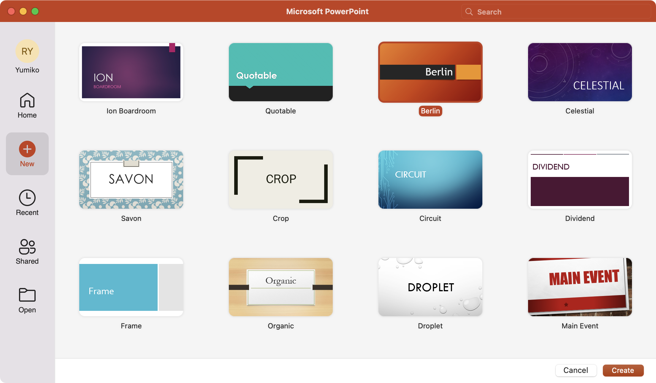
Common presentation software gets you over the fear of starting by letting you choose a template. Picking templates feels nice. Suddenly, starting looks like fun. At the end of the day though it just delays the pain of asking yourself what you want to say. It invites procrastination.
Slides are weird and take ages to create
It doesn’t help that presentations have to fit into slides. What are slides anyway? They seem like a hangover from the days of overhead projection. A way for teachers to save on chalk, and elbow grease, long before we all had computers.
No matter how experienced you are as a speaker, designer and typographer, you will never quite know what you’re supposed to do with a slide. Is it a picture? Is it an index card? Is it a page? Outside of presentation apps we don’t use slides to communicate, so they feel a little awkward and unfamiliar.
The first slide is usually a title slide. It looks easy, almost asif you just need to fill out a couple of forms, and you’ll be done. The focus is still on the design. Instead of writing content, you are invited to click and move boxes. More procrastination.

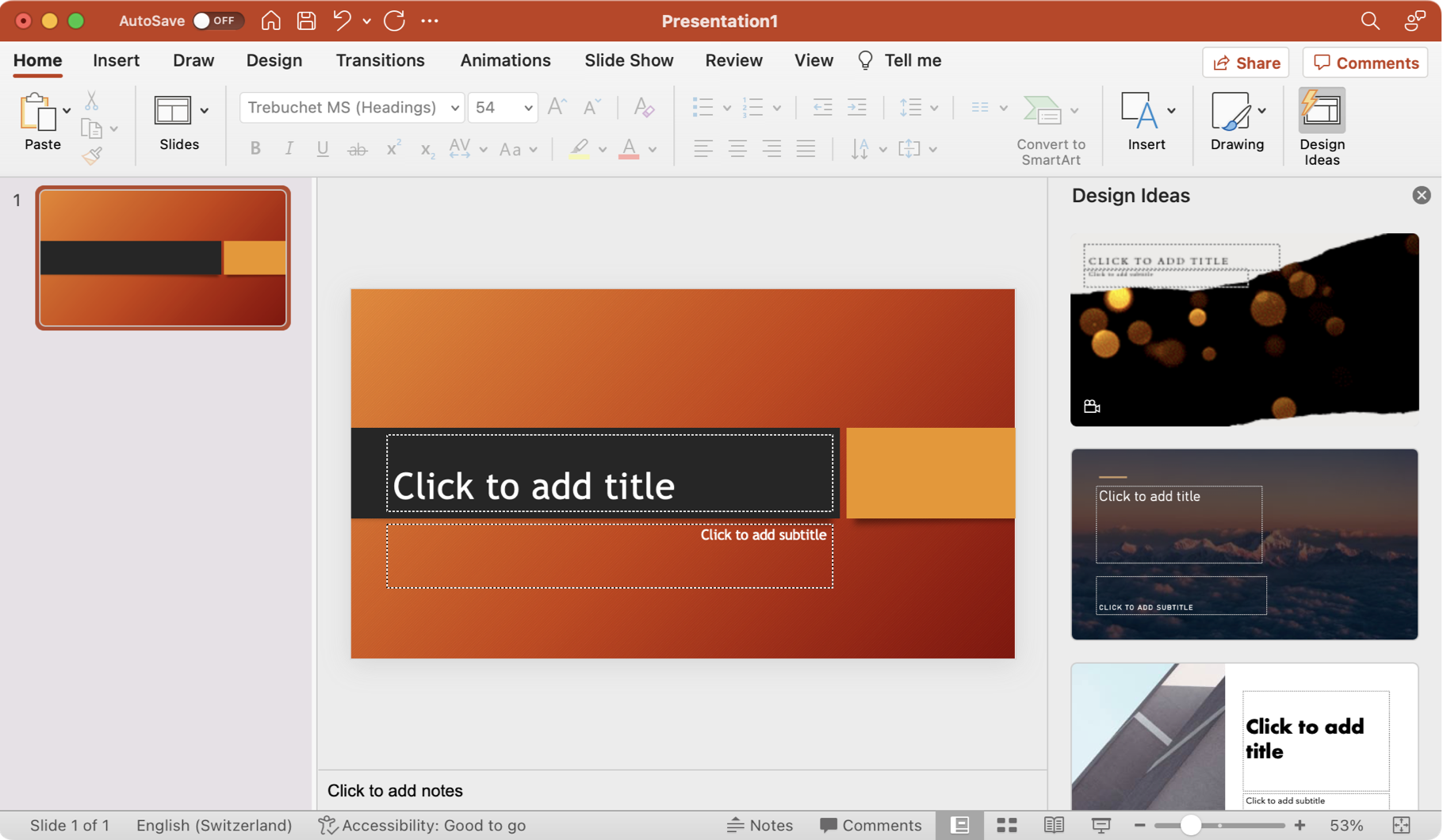
Slide apps encourage us to play, to focus on the visuals, the layout and the fancy transitions. To create “beautiful, dazzling, stunning” presentations. This is well intentioned, it helps us get started and it makes us feel creative, but the result is often a chaotic delivery that fails to connect.
Because slides are awkward, our presentations often feel like a major production. We have to start from scratch and invest a lot of our limited time to put them together.
In the real world, we send text messages, emails, tweets, we write a blog post or we talk. Now and then we might share a photograph or a video, but mostly we use our words to communicate, and we do it quickly.
Forgetting what we need to say: the stuff of nightmares
One of the great fears associated with presentations is that we’ll go blank on the day. And it’s a valid point. A picture is worth a thousand words. Until the heart is pumping, everyone is staring at you, and you completely forget all the clever things you had to say about that picture.
Speaker notes are supposed to help, but they can be hard to read with “adrenaline eyes”. That’s why the bullet points sneak into our slides. Bullets are great in theory, but in practice, they trigger a lot of umms and errs as we fumble to expand them. And they are hard to process for spectators, too.3
Olivia Mitchell New evidence that bullet-points don’t work: “The auditory cortex and the areas around it are involved in processing language – both spoken and written. When a presenter uses bullet-point slides, they’re not using both pathways as effectively as they could. The audience member has to read the words on the slide and listen to the presenter at the same time, leading to overloading of the language areas whilst leaving the visual cortex with very little to do…”
Gina Trapani Take your PowerPoint slides Beyond Bullet Points: “Bullet points on a screen make information harder to understand, not easier. […]Bullet points can do many things, but they do not cohere information. In fact, they do the opposite—they fragment understanding into little pieces. Break any topic into a title, sub-headings and bullet points, and you’re de-communicating, because you’re not helping to bring a single idea together.”
Jeffrey W. Paul & Jillian Seniuk Cicek The Cognitive Science of PowerPoint: “…dual-channel theory shows us that working memory is made up of distinct verbal and visual channels. Both have their own independent limits. Care must be taken to ensure not to overwhelm an individual channel (such as speaking while students are reading) to prevent cognitive overload.”
Annalee Newitz How Cognitive Science Can Improve Your PowerPoint Presentations: “the brain can generally hold only four pieces of visual information simultaneously. So don’t ever present your audience with more than four things at once.”
By Dr. Ken Broda-Bahm Ban the Bullet (From Your Slides): “Beyond the simple advice of ‘just don’t do it,’ here are a few best practices for keeping presenters away from that temptation: 1. Start With What You’re Going to Say, 2. Transfer Your Bullets Into Your Notes Field, 3. Be Creative, and Not Stock, in Your Graphics Selections”
Bullet points also seem to be a gateway drug to slides stuffed full of text. One bad presentation and the next time you’re up there you want to put everything you need to say onto the slide.4
“Subjects who were exposed to a graphic representation of the strategy paid significantly more attention to, agreed more with, and better recalled the strategy than did subjects who saw a (textually identical) bulleted list version.”5
What seemed like a good idea can get really uncomfortable. When we start reading from the slide, while our audience is trying to do the same, our voice clashes with their internal dialogue and for them, it’s like listening to two people at once.
Boredom, the silent career killer
What’s worse than the fear of blanking—and this is possibly the biggest problem with presentations—is the boredom of sitting through them. Boredom can be more damaging to our careers than we might imagine.
Jenna Goudreau, Forbes, Bored In The Office: Is It The New Productivity Killer?: “‘When people get bored they become disengaged,’ says Richard Chaifetz, a neuropsychologist and the CEO of ComPsych, a provider of employee assistance programs. ‘The costs can be extreme—lack of productivity, significant errors and catastrophic accidents.’”
Rose Hoare, CNN, Is workplace boredom ‘the new stress?’: “We seem to be in a culture of having meetings, which a lot of people find boring. There are a lot of automated systems now, so a lot of the things we do are quite remote. We have more people working night shifts, which are more boring because you’ve got fewer people to talk to.”
Gallup, Majority of American Workers Not Engaged in Their Jobs“…business and psychological researchers — including Gallup — have identified a strong relationship between employees’ workplace engagement and their respective company’s overall performance. It is likely that organizations with engaged employees experience positive business performance, while workplaces with not engaged or actively disengaged employees are more likely to experience lower productivity.”
Ellen Scott, Why boredom, not stress, will make you quit your job: “Those who find their work boring are four times more likely to leave than those who are stressed. And while 61% of stressed workers still feel productive, just 29% of bored workers can say the same.”
Huileng Tan, BusinessInsider, Boredom is a motivation killer: “83% of workers who resigned last year reported feeling stagnant in their role.”
The audience gets bored when our presentation isn’t moving them towards their personal goals. If we were being boring in a conversation, they might just interject and change the topic. But in a presentation, audiences have been conditioned to sit quietly until the end, and this just makes things worse. It turns the room into a prison.
An audience that feels bored, but can’t do anything about it, quickly becomes resentful. And that resentment is aimed squarely at us. They might not come at us with pitchforks, but they will remember how we made them feel, and, generally speaking, they won’t want to repeat that experience.


Boring presentations lower our status and leave us on the sidelines, watching others playing the game. We lose our credibility and the opportunity to influence people in the future.
Boredom, the silent business killer
Business culture has evolved in a direction where it is expected that we bore each other for hours without protesting. You’d think that “if companies would have as little respect for business as they have for presentations the majority would go bankrupt.”6 In fact, if boredom is damaging your employees, it is damaging to your business. How could boredom ever be beneficial for your company? The reality is dire:
- 37% of our time is spent in meetings and presentations7
- 91% of listeners at business presentations admit to daydreaming8
- 39% of listeners at business presentations even fall asleep at some point
- 90% of the presented information is forgotten
If your employees bore each other, how is your business going to create exciting products? Boredom is one of the main reasons why people quit their jobs.9 And since slide presentations are one of the main bores, maybe it’s time we all do something against it.
What’s Next?
Those are the challenges that we’ve been dealing with around presentations: Getting started, understanding the weird and time consuming format of slides, remembering what we wanted to say and not being boring. In Part II, we discuss how we think these issues could be solved. After that, in a third post, we’ll show you our solution: iA Presenter.
- iA Presenter Trial for Mac
-
Edward Tufte, The Cognitive Style ofPowerPoint: “In day-to-day practice, PowerPoint templates may improve 10% or 20% of all presentations by organizing inept, extremely disorganized speakers, at a cost of detectable intellectual damage to 80%. For statistical data, 1011 the damage levels approach dementia. Since about 1O to 1O PP slides (many using the templates) are made each year, that is a lot of harm to communication with colleagues. Or at least a big waste of time. The damage is mitigated since meetings relying on the PP cognitive style may not matter all that much.” ↩︎
-
ibid. “By playing around with Phluff rather than providing information, PowerPoint allows speakers to pretend that they are giving a real talk, and audiences to pretend that they are listening. This prankish conspiracy against substance and thought should always provoke the question, Why are we having this meeting?” ↩︎
-
Chris Atherton Visual attention: a psychologist’s perspective: “Having anything on a screen invites people to look at it, the same way their gaze would keep returning to a TV screen in a pub. Since you can’t control the audience’s visual attention, it’s all about controlling what visual information you make available at any given moment, and minimising what is there so it’s not distracting from the spoken narrative, while also ensuring that it is congruent with what you are actually saying.” ↩︎
-
Yousef Abu Ghaidah, Here’s Why Bullet Points Have No Place In Your Presentations: “Whenever a slide is full of lists of text or numbered items, the audience won’t pay much attention to the message being communicated, let alone process it. Think about it – go back to a time when you were witnessing a presentation that was slathered in bullet points. Do you remember anything at all?” ↩︎
-
Kernbach, Sebastian; Eppler, Martin J. & Bresciani, Sabrina The Use of Visualization in the Communication of Business Strategies: An Experimental Evaluation: “An experiment was conducted to gather empirical evidence regarding whether the use of visualization is better than text in the communication of a business strategy. A total of 76 managers saw a presentation of the strategy of the financial services branch of an international car manufacturer. The visual representation of the strategy was chosen as the independent variable, and the effects on the audience were measured. Three types of visual support were chosen as conditions: bulleted list, visual metaphor, and temporal diagram. Each subject saw one representation format only. Subjects who were exposed to a graphic representation of the strategy paid significantly more attention to, agreed more with, and better recalled the strategy than did subjects who saw a (textually identical) bulleted list version. However, no significant difference was found regarding the understanding of the strategy. Subjects who were exposed to a graphic representation of the strategy perceived the presentation and the presenter significantly more positively than did those who received the presentation through a bulleted list.” ↩︎
-
Dr. John ** cited after **David JP Phillips, in: How to avoid death By PowerPoint: “What are the chances that someone builds a PowerPoint that is equally boring as the one that he or she was tortured by? Is that a big chance? Yeah. Why do we do that? Vengeance?” ↩︎
-
Verizon, Meetings in America: A study of trends, costs, and attitudes toward business travel and teleconferencing, and their impact on productivity: “Meetings dominate business life in America today. According to the National Statistics Council, 37 percent of employee time is spent in meetings. Other data indicate there are 11 million business meetings each and every day.” ↩︎
-
Forbes, How to make your presentation interactive: “…studies show 91% of listeners at business presentations admitted to daydreaming, and an impressive 39% to downright falling asleep at some point.” ↩︎
-
Nic Marks, Boredom is a job killer: “Languishing is what some call it. It’s not burnout (though some are suffering from it), and it’s not depression. It’s a sort of joyless, aimless muddling through days. When we’re bored, we have a sense of emptiness and everything being the same and uninteresting. Maybe that sounds familiar to you? Psychologically speaking, boredom is the opposite of interest. While it doesn’t quite capture people’s attention like stress, boredom is not only a joy killer; it is also a job killer.” ↩︎

