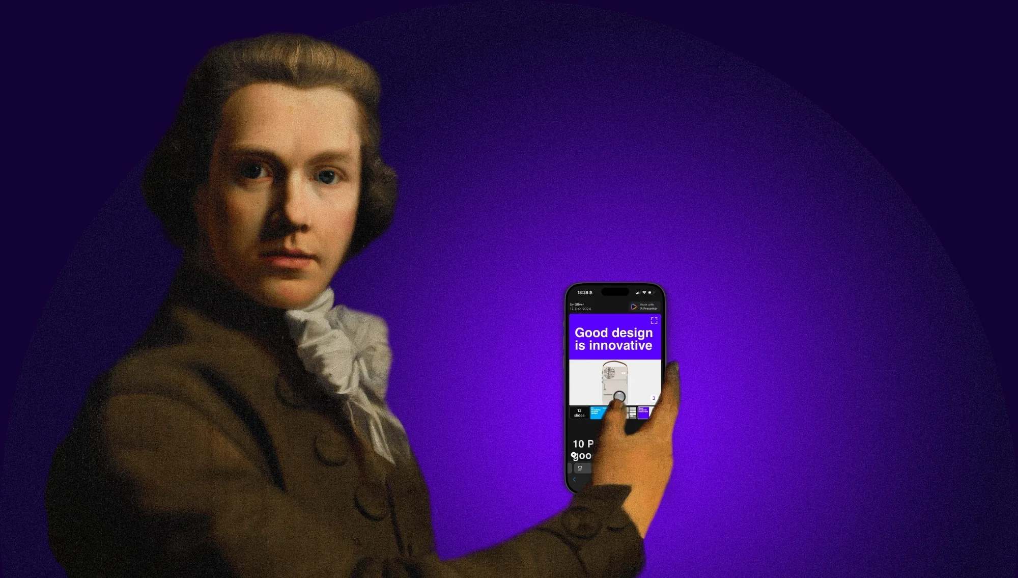
Great presentations are really great stories. It’s great stories that move people, not stock images, bullet points, or diagrams. To achieve that we needed to create a new category of presentation apps. One that starts with what you want to say.
Presentation apps haven’t fundamentally changed at all since the early 90s. In all that time they’ve never really solved the human side of the problem. As designers, we feel compelled to create a new solution, one with a slightly different emphasis. By changing our focus, we change the likely outcome. To avoid reinventing the wheel, it is useful to look back before moving forward.
Yesterday: Look at the past to understand the future
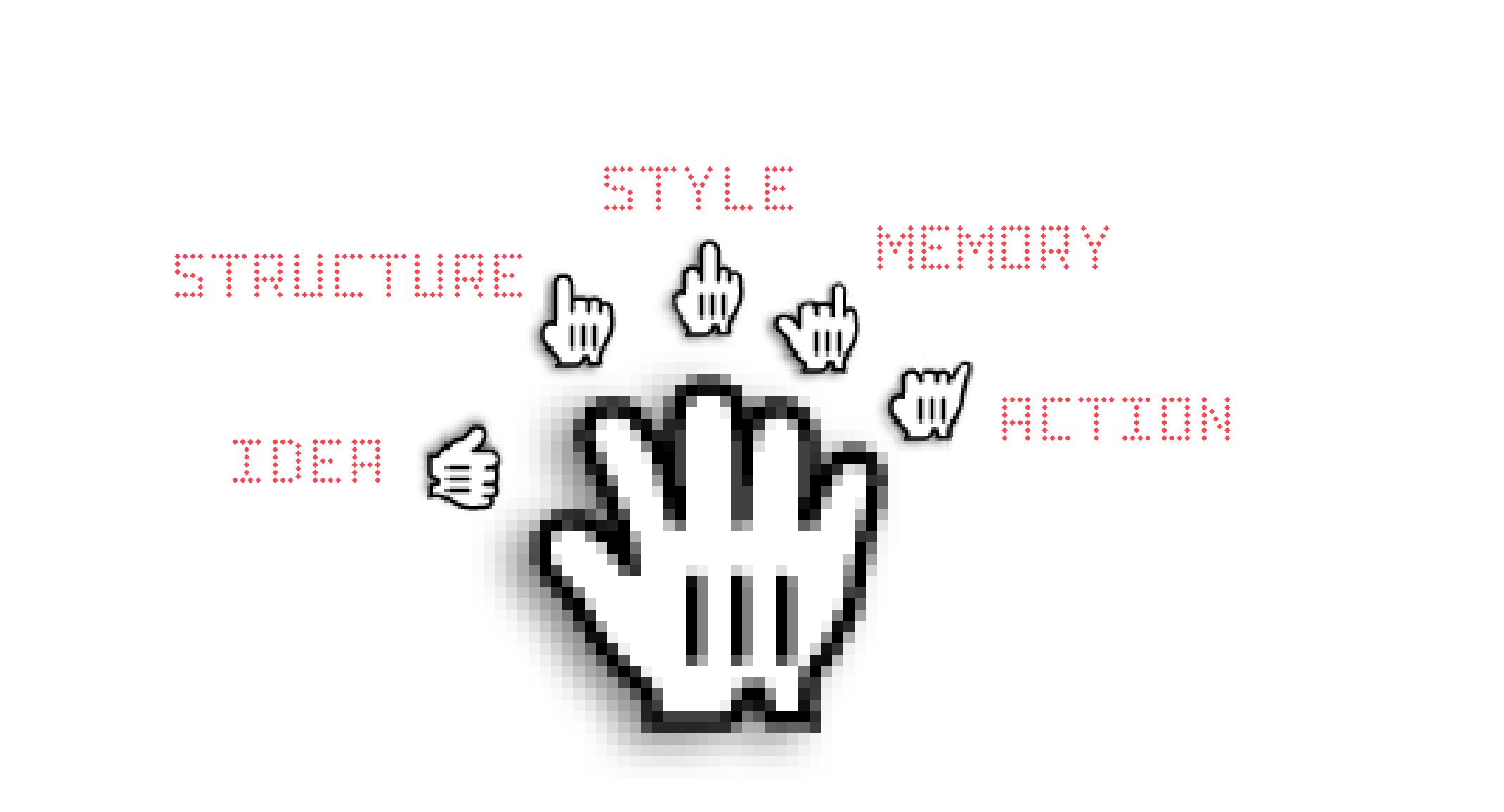
There’s a simple, efficient, and fun way to prepare and tell a convincing story. It’s called the Rhetoric Canon and it’s the standard way to prepare a speech since ancient times:
| Mnemonic | Step | Function |
|---|---|---|
 |
Idea | What do I say? |
 |
Structure | Order and Orientation |
 |
Style | Make yourself heard |
 |
Practice | Rehearse and remember! |
 |
Delivery | Tell your story! |
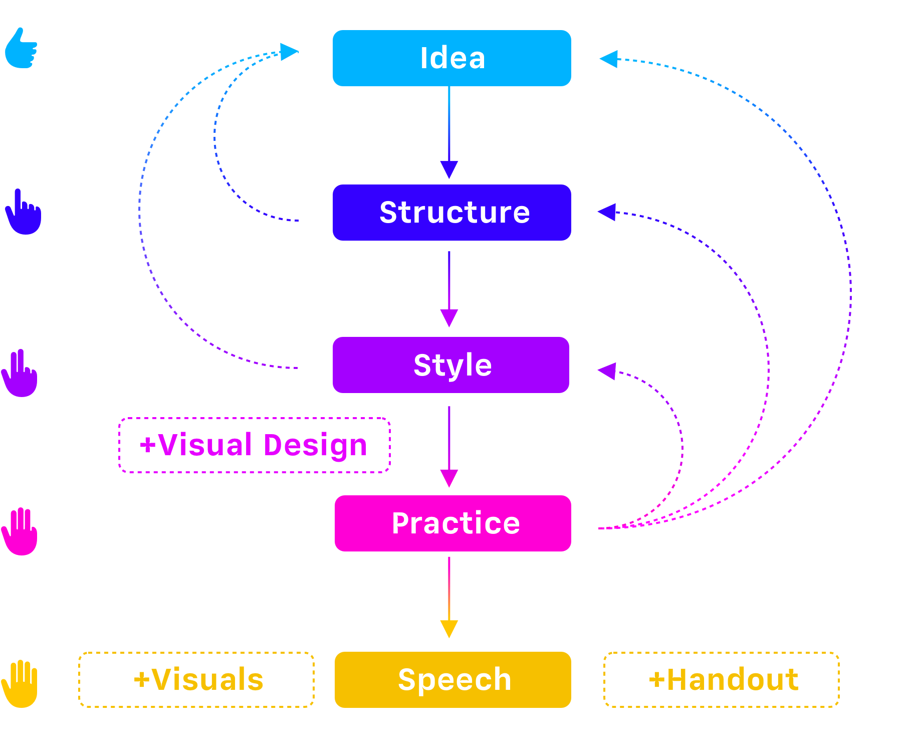
What looks like a step-by-step approach is in reality a more complex process. The idea evolves with the structure, the structure evolves as you elaborate your style. Practicing your presentation will inevitably lead to alterations. And if you hold your speech more than one time, the delivery will again push you to work on every part of your presentation.


The rhetoric canon was developed for holding speeches. Presentations add visuals, design, and handouts to the mix. As you can see, the interdependencies then become a lot more complex. There are more elements to be taken care of, and each influences the other. If you change a tiny detail here it impacts every other part. We quickly get lost when we think about everything, idea, script, visuals, fonts, colors, and the design of our handouts at the same time.
Harder, Better, Faster, Stronger: What we are aiming at
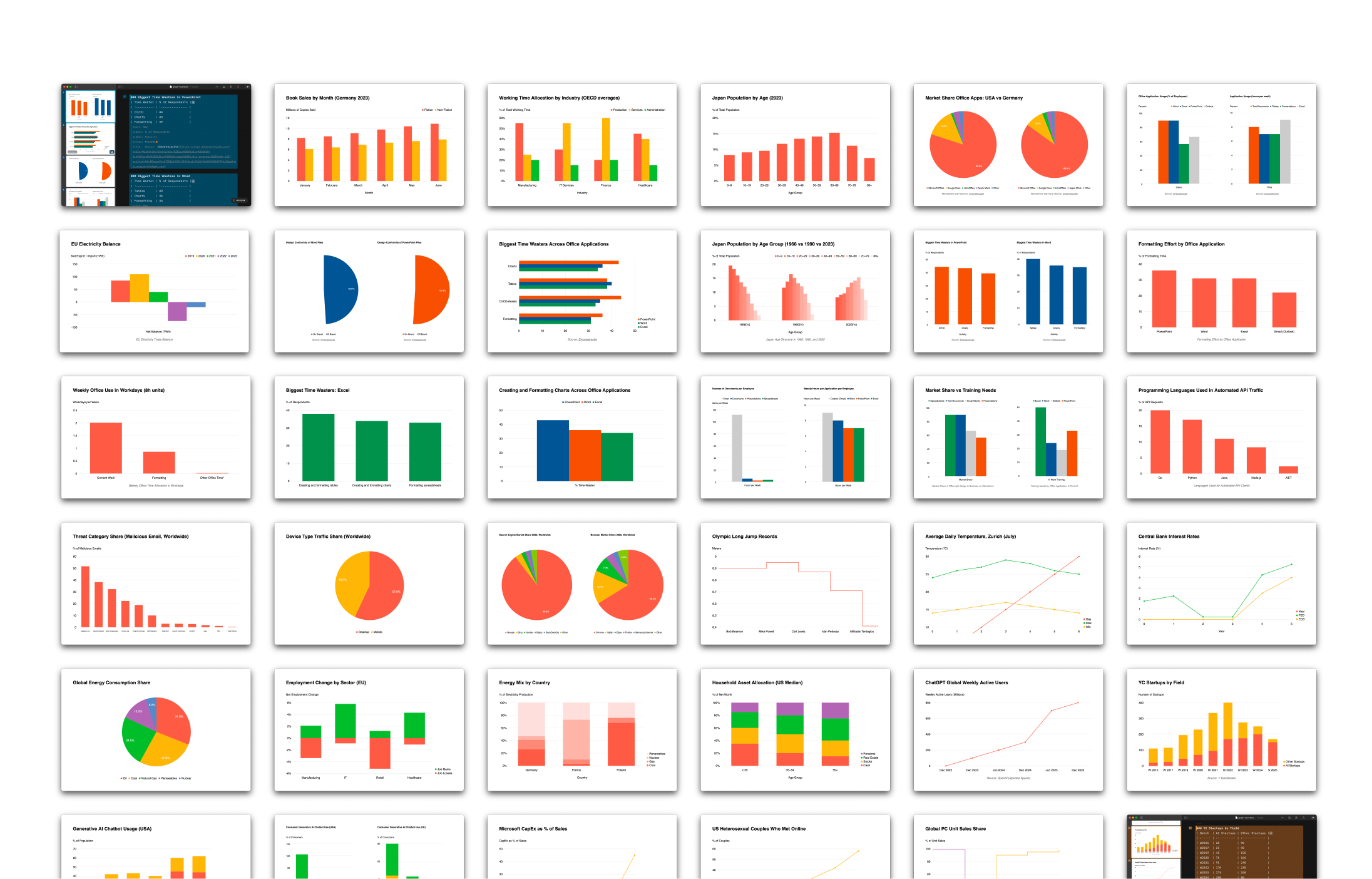
We asked you last year what you’ve struggled with using PowerPoint. You sent us hundreds of passionate responses to our boring questionnaires. Your main concerns were that in traditional presentation apps you
- Time: Spend a lot of time without noticing and getting under time pressure
- Focus: Struggle with design questions neglecting the content
- Confidence: Fear of boring others or getting a blackout
This is not a surprise when you look at how of PowerPoint & Co. structures the creative process. Comparing how presentations were created before and after PowerPoint shines a light on what might have gone wrong.
To stay focused we need a direction and go step by step towards the goal. The interdependencies will inevitably influence us as we move forward, but we get better results if we think before we act. How we start sets the tone.
1. Think: Idea
Lose yourself: Audience and purpose
A presentation is not about us, our nerves, our insecurities, or the medium we happen to be using, it’s not even about what we think. A presentation is about our audience. The obstacles standing in the way of their goals, and the solutions they might adopt to keep moving forwards.
With this in mind, we start our creative process with two questions: Who is our audience, and what is the purpose of your story? When developing a presentation, we believe that it’s far more effective to focus on what we are going to say first. Not just on what our audience is going to see. In traditional presentation apps you start by picking a design theme. Then you fill out a mask and pick the next page layout.
Great presentations are great stories
We think that great presentations are really great stories. And that it’s great stories that move people, not stock images, bullet points, or diagrams. To achieve that we needed to create a new category of presentation apps. One that starts with the story.

By developing our story using a simple text interface, we can begin to create a compelling and persuasive narrative. A narrative that has structure and purpose. You know the deal: Beginning, middle, end. What is the problem? What are the obstacles? How do we overcome them?
Fast Love: Work with existing text
iA Writer, our focused writing app, taught us a lot about helping people with challenging creative tasks. Writer is 12 years young and continues to help millions of people to get focused, get started and share their voice with the world. In the same spirit, we believe that the best way to start making a presentation is not with a template or an empty slide, but with a blank writing screen.
A blank writing screen removes the temptation to play with shapes and colors, or to entertain ourselves with transitions. It sets the tone for the task. Calm and clear. It whispers to us - What’s important here?

Sometimes we find ourselves starting with a basic structure, adding big ideas, then fleshing those ideas out until we have a rough script. Other times we have a head full of ideas that we just want to get down on the page and organize later.
Whatever path our mood takes us, we are always focused on the idea and the audience. We are developing our narrative, as we would a movie. We don’t start out thinking about camera angles and costumes. Or in this case slides, layout, fonts, and transitions.
2. Keep’em separated: Structure
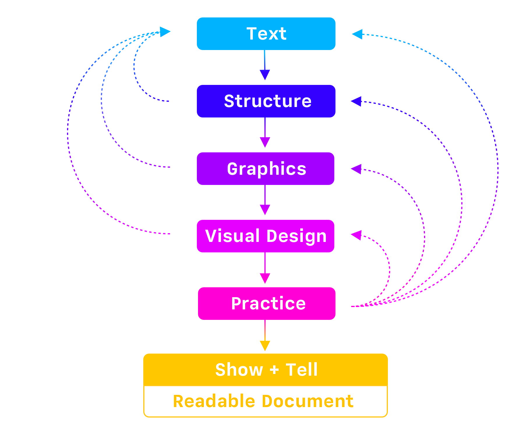
We develop our narrative by writing and organizing our script. A script focused on what we want to say. A script that keeps our audience attentive, interested, and engaged because it’s about them and the challenges they are facing. The script discerns what is said and what is shown:


Once we started to think about our presentations as a story, not as a series of split-up visuals, once we focused on what we wanted to say, not what they needed to see, it dramatically cut our creation time and made our presentations more engaging.
We no longer had to start from scratch every time we wanted to turn a memo, email, tweetstorm, or blog post into a presentation. We could just copy and paste our existing work into our text-based script editor and we were halfway home. What does that script editor look like and how does it work? Well, let’s finish our main thought first…
3. Black or White: Visuals
Only when we’ve worked out exactly what we’re going to say, do we think about what our audience is going to see while we’re speaking to them. And it turns out this doesn’t work as we first imagined.

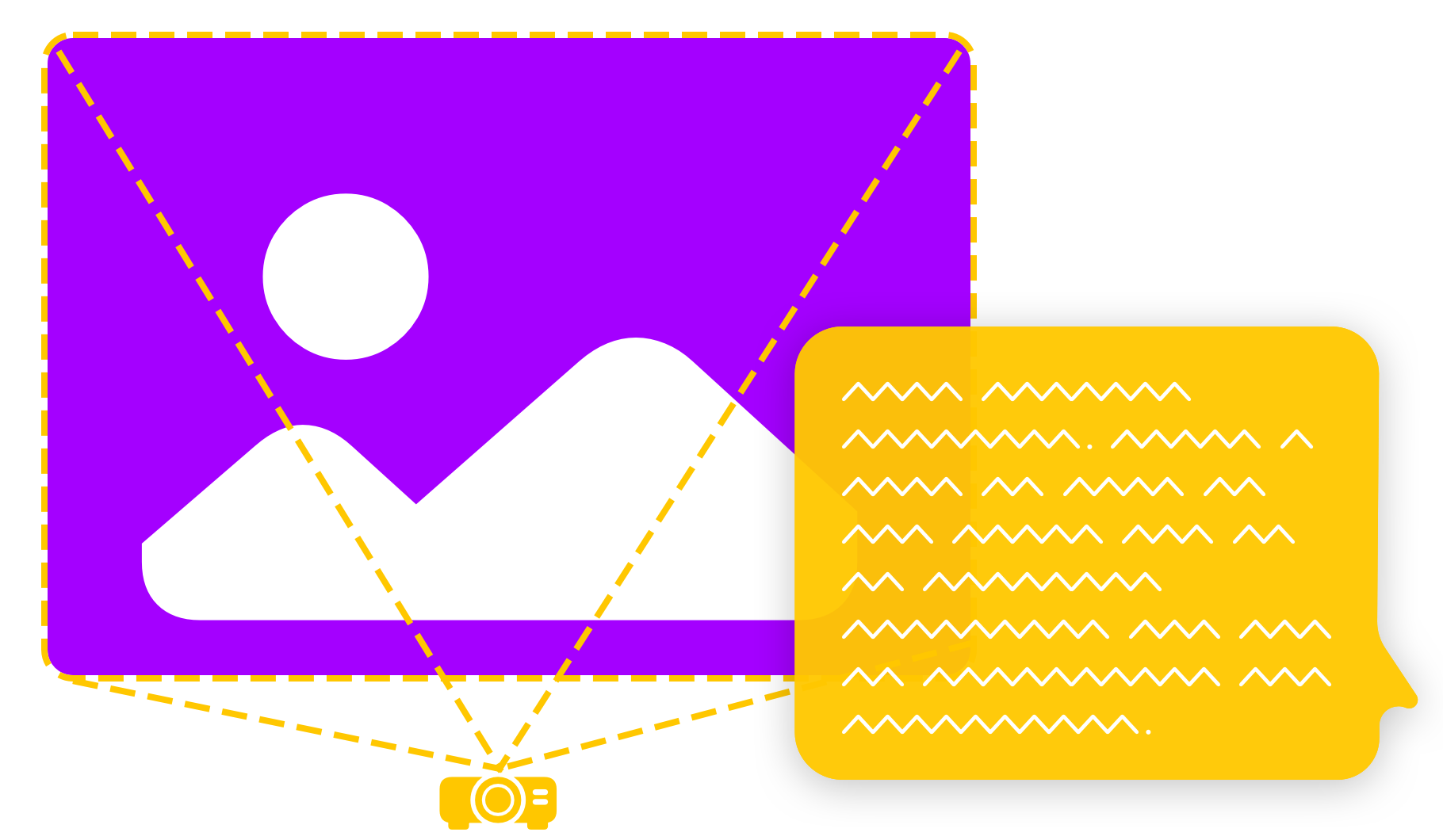
Once a script has been drafted it becomes obvious where an image or two will offer a clear benefit to our audience. A picture can be worth 1000 words. And if it is, then we should use it. But not every picture is worth a thousand words. We believe that most of the time, our audience doesn’t need to be looking at unnecessary imagery. A boring presentation doesn’t get more engaging with replaceable stock images. Images should direct the attention towards your message.
Simple headlines and great illustrations reinforce what we’re saying. They give the audience a visual hook to hang the idea on and keep them focused on the voice of the person presenting.
4. I will survive: Rehearsal
Let’s think about the topic of practice for a second. When we practice our story properly two things are happening. First of all, we’re not just repeating it, we’re making it our own. We’re experiencing our own argument, hearing our own voice. Noticing the snags and the rough edges, we’re smoothing them out. The experts call this deliberate practice and it makes a difference. It helps to have an editor that lets us make rapid changes while we practice.

The second benefit of practice is that it eases our anxiety. Any uncertainty we might otherwise encounter, starts to fade into the background the more we engage with the script. We’re laying down memories, one on top of the other, and calming our nervous system: “That didn’t kill me”, “That wasn’t as bad as I remember”, “That was thrilling”, “I can’t wait to do that again”.
5. The Great Pretender: Delivery
While we are all-in on the benefits of proper practice, we didn’t want to rely on it as a solution. We wanted a safety net, for when we’re in the hot seat and all eyes are on us. The traditional “slide notes” seem like such an afterthought. When I’m under pressure I don’t care which slide is coming up next, all I care about is the next sentence that needs to come out of my mouth.
We believe that nothing calms the nerves like knowing that there is a backup. Imagine you always have the option of seeing exactly what we need to say, big and bold right in front of you. An experience more akin to that of a teleprompter, or an autocue. But without the expensive equipment. Just our story, in big, bold type, that’s easy to read and easy to scroll.
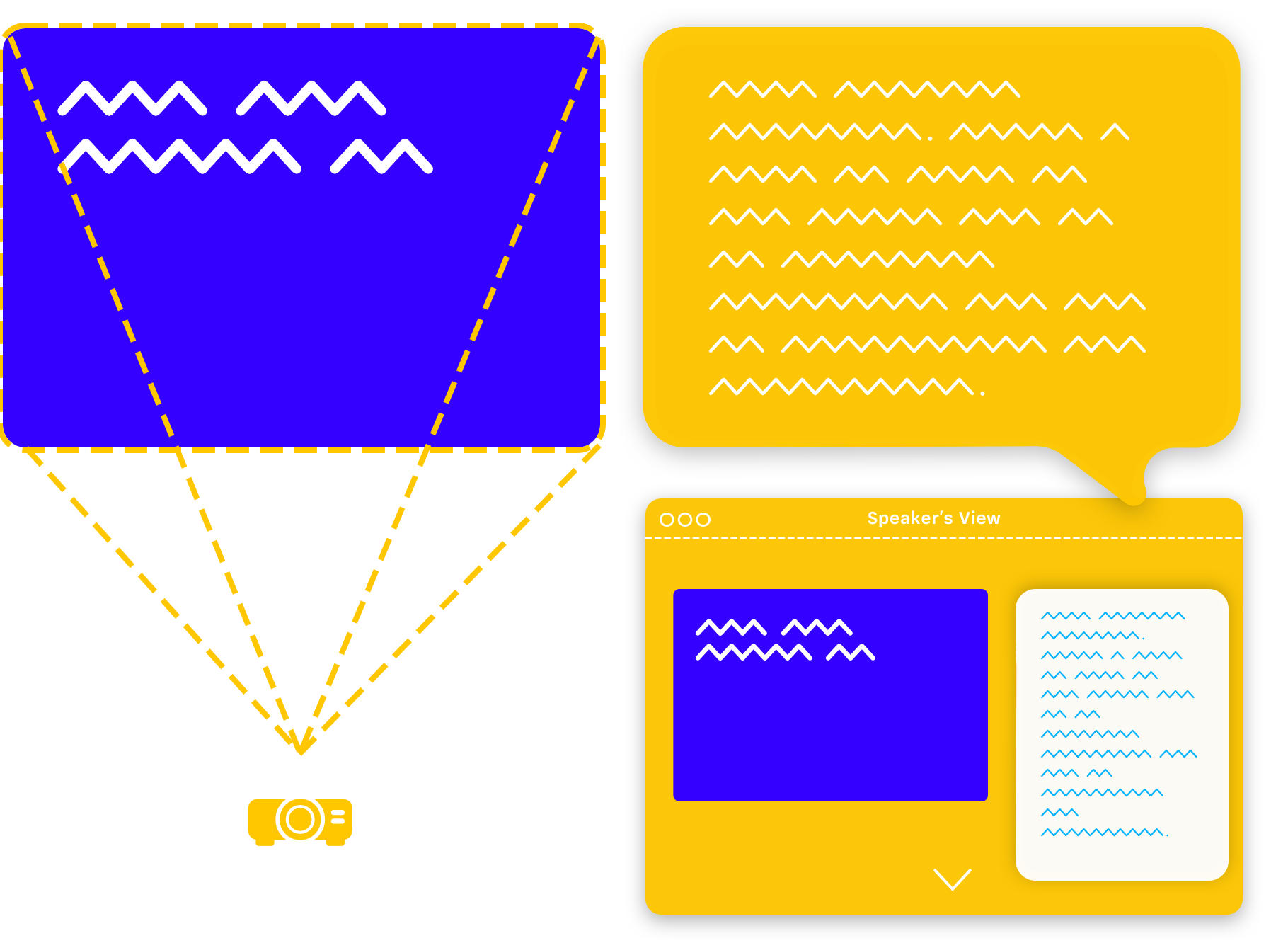
We have this just in case. If we wrote our story, illustrated it properly, practiced and optimized it, we don’t need to read from the slide or from teleprompter.
We still feel a shot of adrenaline the moment we step up to speak. And that’s ok. With all our ducks in a row that shot of adrenaline is exactly what we need to give our story a spark. It lights a fire under our ideas and helps move our audience to act.
What about design?
Changes: Responsive Design!
In times of responsive web design and mobile-first approaches, PowerPoint still forces us to obey strict resolutions and aspect ratios. That the main form of business communication nowadays uses unresponsive static slides is simply stunning. If we change the resolution of the our presentation the whole presentation falls apart. A device-independent, flexible, mobile-friendly design format is what you want in 2022.

If you get a presentation on your phone, you should be able to read it like an email. No zooming, no pinching in and out. Contemporary digital design adapts to the world of 100’000 different screen sizes, and most of all, mobile screens. Contemporary presentations need to be readable on a handheld device.
Okay, but then how do you control the layout? You don’t! You shouldn’t have to.
Let it go: Automatic Layout!
Imagine not having to deal with layout at all. All you do is writing a text, editing on headlines, illustrating your story where it makes sense. The layout gets picked automatically. But how would that work? An algorithm? AI? Black Magic?
If you limit the amount of information to not compete with what you say, there are not that many layouts to cover. If you get rid of the pressure to use slides as index cards, and you eliminate reading from the screen, you end up with a handful of slide types. These can be picked algorithmically based on the number and type of elements you use on a single slide:
The amount of layouts multiplies again when you automatically scale and reorganise the elements depending on screen aspect ratio. A horizontal comparison f.i. becomes a vertical comparison on a phone. Static cards on a landscape layout become scrollable in portrait, etc.
This is also liberating. No more pixel pushing. You don’t design a static page, you design a flexible story that will work on different devices.
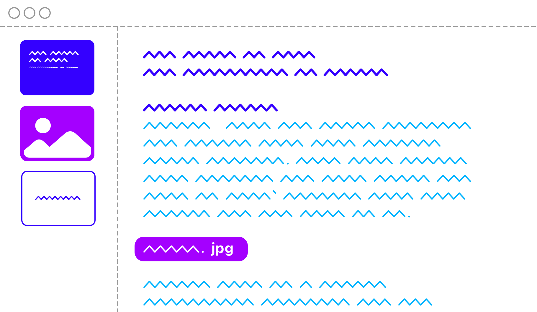
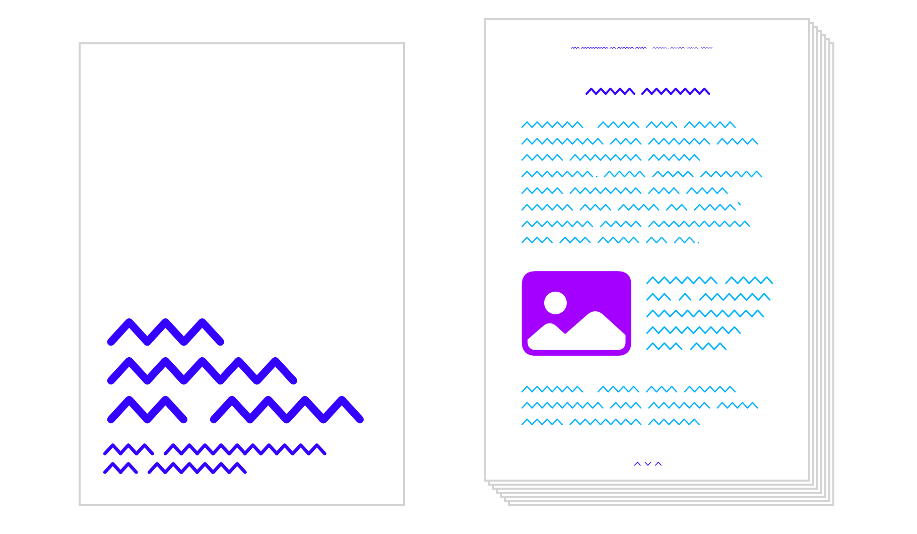
Easy like Sunday morning: Readable text documents as handouts!
The story is the backbone of a good presentation. A story-based presentation app allows you to:
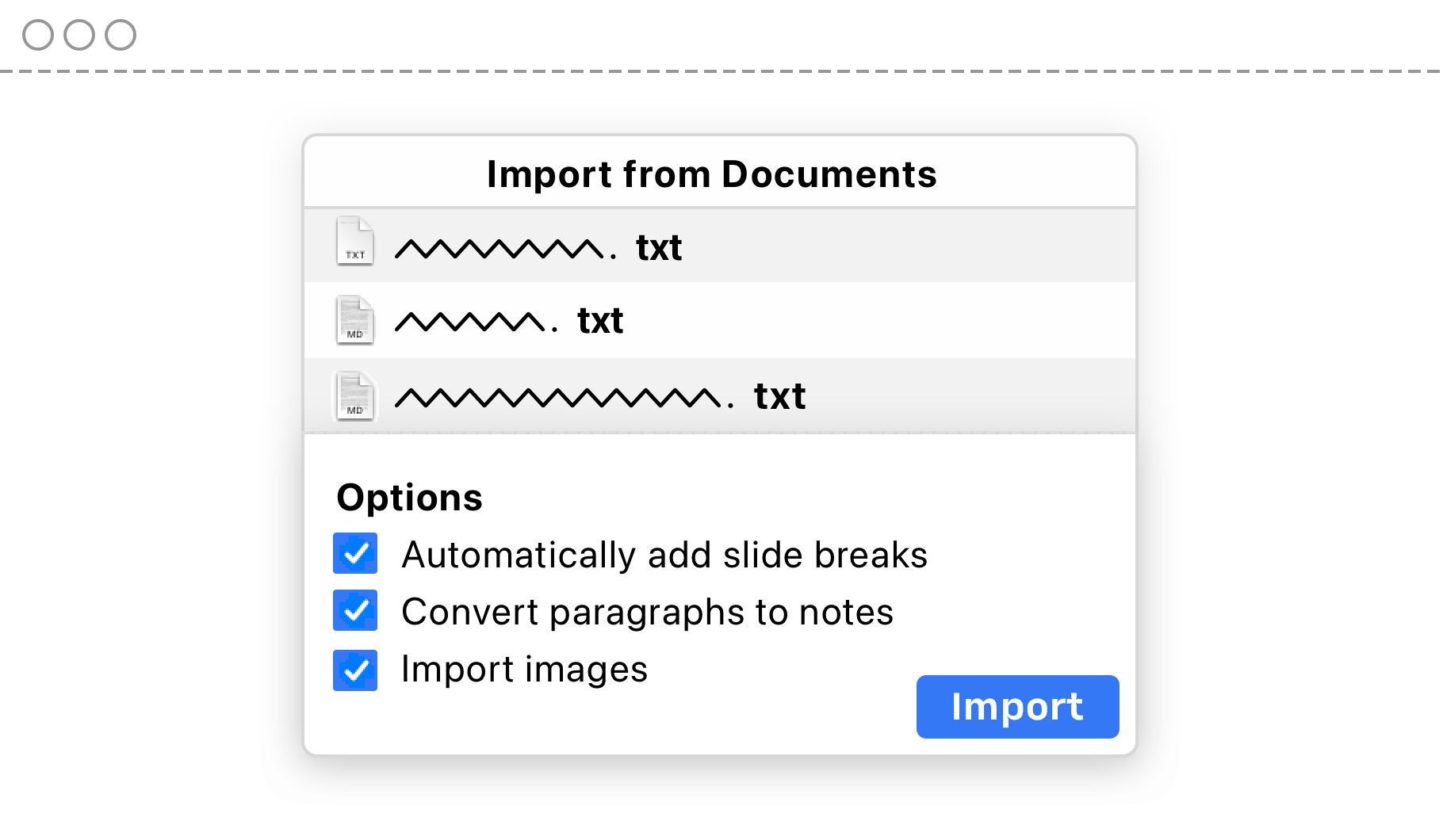
- Import existing texts
- To practice and optimize your pitch
- To calm you down knowing that you have a safety net in case you get lost
Once the story works, you know it by heart and you almost don’t need it anymore during the presentation. Except that after the presentation it comes in handy again: To create a readable handout.
Taking a story-based approach, allows you to start with regular text and finish with regular text, exporting your presentation not as a labyrithian mosaic that needs pinching on a phone and slaloming through an A4 with little cards, but as a standard text document with images.
Next: Outlook
In Part I, we looked at the challenges that we’ve been dealing with when making presentations with the existing tools: Getting started, understanding the weird and time-consuming format of slides, remembering what we want to say, and not being boring.
And in this post, we shared our belief that in order to solve those challenges we need a presentation app with a different emphasis. A way to create presentations focused on stories and one that puts the storyteller’s needs first. Because a prepared, calm and supported presenter makes for a more interesting and compelling presentation.
To achieve that we: Start with a blank slate. Write the script first, and sort the visuals later. Take advantage of existing work. Then tell a moving story that’s impossible to forget. Coming up in Part 3: What we made.
- iA Presenter Trial for Mac