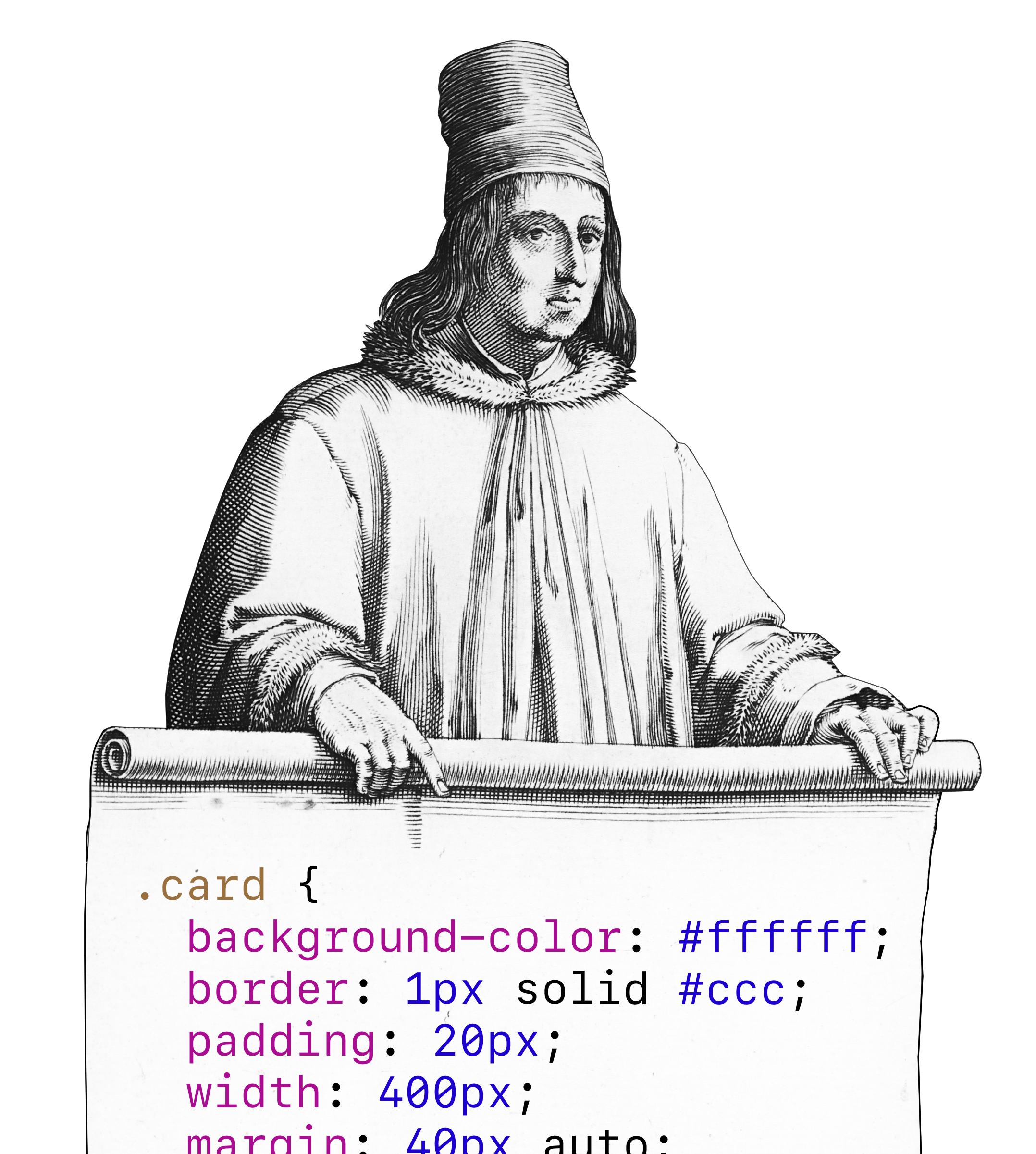
Corporate design manuals, CSS, information architecture and object oriented programming follow the same principle. They are modular.
I am currently reading a book on information design that makes me clap my hands every 5 minutes. Unfortunately it’s been published in German only (so far). The book is about scientific findings about human perception and what these findings mean for the screen designer.
Congruency of system elements among different form criteria: It all becomes obvious when looking at corporate design manuals. They describe in detail, which elements are part of the visual identity, how they’re applied and how they may or may not be combined. In order to achieve a closed and homogenous impression, the once defined elements are meticulously coordinated. The same tendency towards precisely defined elements of order becomes more and more obvious in modern information systems. This is partially due to the more and more increasing complexity, but also with the possibility, to define different variations of visual order of information in advance. —Systemic Design: Intelligent surfaces for information and interaction, p. 28 (my translation)
Which, in simple English means: Corporate design manuals are modular. Information technology is modular. They’re both modular because modularity is the only way to deal with complex information such as corporate design for multinationals or thousands of lines of code.
