How do you navigate content on the iPad? Scroll or flip? In 1987, the biggest neck beards in tech held a conference on the Future of Hypertext and there were two camps, “Card Sharks” and “Holy Scrollers”. They had an epic battle over this question: Should you scroll or flip pages on the screen? Who won the fight?

Let’s first look at how the discussion went. Here is a short rundown of the debate (a lot of it feels like déjà vu):
As happens in every new field, a struggle is already taking place over which hypertext methods are the best, with creators defending their philosophies. Many hypermedia developers are divided, for example, over whether to break up hypertext into small notecard-like chunks, the way Apple’s Hypercard does, or to give unlimited size to the chunks. “There are two camps: Hypercard and scrolling”, said Jef Raskin, formerly of Apple and now president of Information Appliance of Menlo Park, California. “I’m a holy scroller.” Apple’s decision to give the program away with every Mac will put the power of hypermedia into the hands of millions, generating a giant library of millions, Brooks said.
In practice, it’s pretty clear who won the debate: 99% of all websites scroll, and most desktop applications scroll when they display a lot of information. While scrolling won the race in most cases, there are instances (see PowerPoint) where the card model makes more sense. What instances?
Cards have a fixed-size presentation canvas. You can position your information within this two-dimensional space to your heart’s content (allowing for beautiful layouts), but you can’t make it any bigger. Users have to jump to a new card to get to information that won’t fit on a single card. HyperCard was the most famous example of this model. Scrolls provide room for as much information as you want because the canvas can extend as far down as you please. Users have to jump less, but at the cost of a less-fancy layout. The designer can’t control what users are seeing at any given time. iPad Usability: First Findings From User Testing, Jakob Nielsen
How do we know when to pick which model? If you look at the interactive logic of the two navigation models it becomes quite clear:
When to Use the Scroll Model
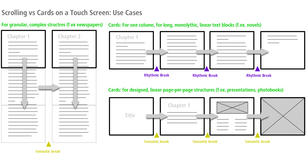
The scroll model allows you to easily separate content and design. Scrolling is preferable to the card model when:
- Content needs to scale over different platforms and screen sizes (for example: mobile, tablet, desktop)
- Layouts need to be automatically generated (daily newspapers)
- Accessibility is an issue (variable font sizes for sight-impaired people)
- A complex information architecture requires chunking
When to Use the Card Model
Cards work really well when you deal with a linear interaction design structure (novel, presentation, slideshow) given that you have full control over the layout. It is preferable to the scroll model when:
- You have full control over the device
- Your information entities don’t need more room than one canvas
- Accessibility is not an issue
- The interaction model is linear and the information architecture only has one dimension

When Not to Use the Scroll Model
By now it should be clear that a linear information architecture (PowerPoint, novel, children’s book), demands the card model. The scrolling metaphor breaks when pages become too long (20 pages or more) and the scroll bar becomes so tiny that it no longer offers a visual clue about page length.
When Not to Use the Card Model
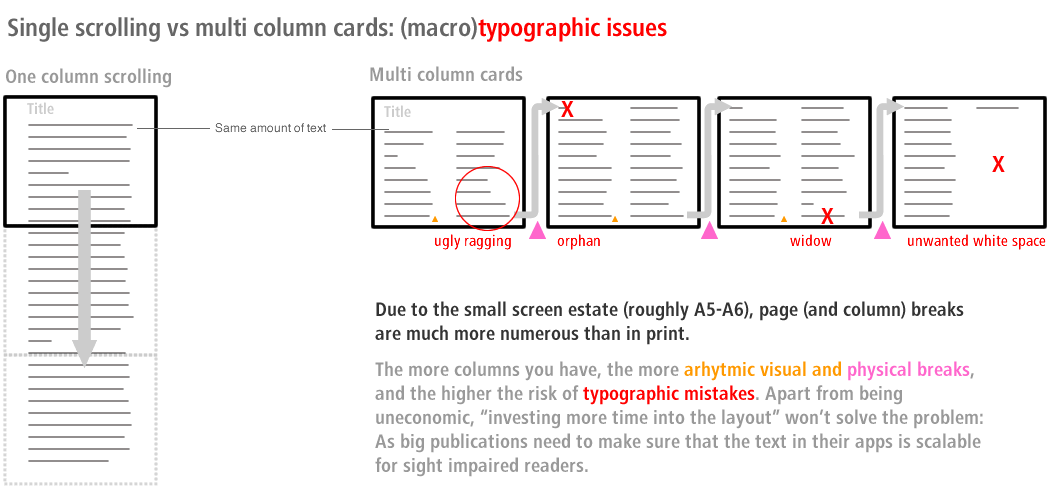
Cards are generally difficult if your information architecture has more than one dimension. As soon as you add a dimension other than just forward and back, cards become stacks. And that’s where things get confusing:
- Information Architecture: The more comprehensive the image you have of the overall application, the less conscious effort you need to navigate. A horizontal series of different sized scrolls makes a simpler site map than a plane of identical cards.
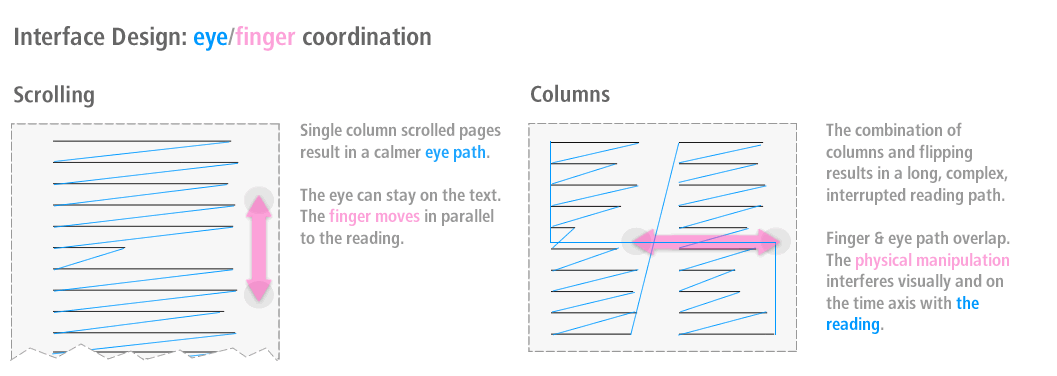
- Information Design: Card stacks create random breaks in the reading flow. The more breaks the more you need to reorient—in other words: think. There is nothing wrong with thinking when you handle a tool. But your thinking should be focused on what you do with the tool and not how to handle the tool. The less you need to think about how you use a tool, the more you can do with it.
- Orientation: As long as you are not reading The Great Gatsby on one page, scroll length is a better indicator for article size than page numbers. With pagination you never really know how much text is waiting for you. It is too abstract. Having no visual or physical indicator forces the user to check with a swipe if there is more, and that’s very unfriendly.
- Interaction: Swiping requires a big gesture, scrolling is a small gesture. Using big gestures for big actions (next article) and small gestures for small actions (continue in article) corresponds to the weight of the action. Similar gestures for differently weighted actions are less intuitive.

The iPad Is Here, So Shave the Neck Beards!
You often hear the argument that the iPad is all new and the Internet is all crap (too cold, too technical, not pretty enough), so the nerds should be ignored. After all, the iPad is closer to a printed magazine than the Internet, right? No, it’s not. It’s a touch screen device. Touch SCREEN device. It’s light years away from print.
While a touch screen follows different rules than a desktop interface with mouse or touchpad, you still need to understand how screen interfaces work. Dear paper tiger, the iPad is not going to undo the Web, it’s accelerating the change you hate so much. Nerds have learned to care about typography because it improves the performance of interfaces. If you want to make it on the iPad, it’s time to learn a couple of things about interface design.


