The last couple of days we have received some excellent feedback on our article “Washington Post Redesign as a Wiki”. First of all, thank you to everyone who took the time to study our problem and form an opinion. To be able to receive input from the best people in the field is rare and rewarding. We got lots of applause, together with some questions and reservations.
We chose to address the following questions and comments from a well-known and respected authority—Jared M. Spool—asks:
The LA Times tried this experiment and failed. How is your design informed by their experience?
We feel the key to preventing the same outcome the LA Times has experienced lies in a real name user identity. Under their own name people act more responsibly, and, for a newspaper, clear identification is not difficult: They can link profile identity to their subscriber database. Posting on a newspaper is a privilege, not a right. Here is how it works:
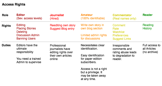
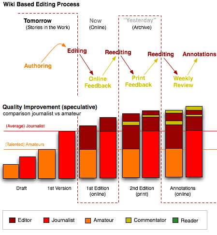
- This project, whilst based on Wiki software, will not be a public editing tool. It is a tool for editors to gather information and feedback for the paper edition of the next day. Only editors can edit articles.
- To comment, you will need a basic account in your own name. Good comments will be integrated into the printed article the very next day (instead of the usual letters to the editor days later). If that turns out to be too liberal, commenting will be restricted to identified users. Users will also rate each other’s comments.
- Paper subscribers will be automatically ranked as an “Amateur”. For non-subscribers, identification will be as strict as with citicendium. The incentive to become an “Amateur” is that you have a chance for your entry to be published in the online edition, and, if it’s really good, in the print edition. You will be remunerated for both.
- Editors will be able to move articles between different categories and sections. Before being published, user generated content will be edited and checked for integrity.
- Journalists will be able to edit their own articles.
- Once an article goes to print, it cannot be altered, but only annotated. The history is accessible to everyone.
It’s very sharp looking and you’ve obviously put a lot of thought into it. However, in either the description or your comments, I don’t see what user research was involved in how a wiki improves the user experience of the paper. In other words, what’s the improvement in the user experience because of your redesign?
We feel the answer to this is in two parts—how the concept of a wiki (openness) can improve the overall newspaper experience, and how the wiki software itself can improve the usability/experience of the website.
Improving the Newspaper Experience
Newspapers are currently closed environments, and as you can see from our explanations above, we don’t intend to open up the website, but the entity of the “Newspaper” itself. The full power of the technology will be used by in-house journalists and editing staff. From their perspective it will streamline the entire production process—the wiki becomes an airing ground for ideas and drafts, and through wiki-style collaboration, they can see these ideas through to a finished piece.
Where readers benefit from this is transparency—they will be able to see what’s coming up, how it was made, and where the information was sourced. Once the article is published online it becomes open for comment and suggestions from the general readership, and after this (at the discretion of the editor), will appear in the print edition along with the best reader-contributed content (which they will be paid for). Is this an improved experience for a newspaper reader? We believe so.
Improving the Technology Experience
From a conceptual and technical point of view, Mediawiki is a work of art. However, for most users it has some pretty insurmountable usability issues. Most usability-minded people wouldn’t have too many problems finding sore points. We have identified a few:
- Wikicode (used to format articles) is jargon, and looks scary to most people. The default text editor is powerful, and to hand it over to people right off the bat is both intimidating and dangerous. We’re working on integrating a WordPress-style WYSIWYG into the software. This means putting a GUI on top of the templating and layout functionalities possible with Mediawiki.
- The navigation is confusing—we’re experimenting with more comprehensive navigation tools (breadcrumbs, for instance), and we’re re-skinning the default interface. This includes the concept of an “edition”.
- We are looking at the various system pages, search results and user pages in order to make them more intelligible.
In terms of user testing, we have been using profiling and testing with the various flavors of users (editors, journalists, readers, etc.) to gather requirements, and are improving our changes based on their feedback. At the moment we are trialling this project with an online magazine, in which we can test the remaining assumptions we have made. Worst case, the wiki will be modded down to a simple CMS. As the initial investment is low—compared to a professional CMS—this test run is a reasonable approach for our client. If it fails they can use the developed designs in another environment with less functionality.
A Word on Scrolling
In the nineties, the general assumption was that people like to have as much stuff as possible visible on-screen. Our assertion is: People want to a) be able to find the information they are looking for quickly, and b) have their news organized, easy to read, and easy to scan. These lead to reasonable font sizes, less clutter, and scrolling.
Our experience, which goes back to working with T-Online (and they were obsessed with the page fold and getting as many clicks from the start page as possible), is that people don’t mind scrolling if they find everything they need in the visible area. That is the art of the online page fold. Not to cram as much information in there as possible (hoping for a lucky shot), but to reduce the info to its essence. The actual reduction to the present state was a lot of work. This is how it’s organized:
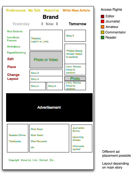
The assertion that people prefer organized, scannable pages over the usual link orgies needs serious real-time testing, and this is where our preliminary magazine project will help.
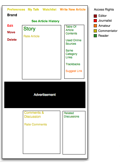
With those concerns answered we’d like to provide more insight on how things will work. Here’s a diagram of an article page detailing what each type of user will be able to do:
