Our call to question the common practice of blindly adding social media buttons to every page got a lot of attention, and found many friends across the board. This proves we are onto something. If you haven’t yet, please read Sweep the Sleaze and initial feedback first. Now, let’s look at some of the more critical reactions…
Insights From The Guardian
Martin Belam, former IA at the Guardian, usually likes what we do but disagreed this time:
Share buttons aren’t there because people don’t know how to share without them. They are there as a visual cue to share.
Note: Our conclusion was to integrate tweets and Facebook posts more tightly into articles, not just to eliminate all traces.
Martin’s article had highly interesting information to share: The Guardian just tested different positions of social media buttons, and found that their location matters greatly:
I don’t have serious research across the board […] we’ve actually just done a fascinating set of A/B tests around sharing buttons. This has culminated in the appearance of a ‘floating’ set of buttons to the left of an article. What intrigued me most of all when we did the test was not that ‘position A’ generated more share interactions than ‘position B’, or that ‘position C’ sounded the death-knell for sharing whilst ‘position D’ caused people to share more freely. What intrigued me was the effectiveness of the positions was different for each service, even though they were always all presented as a block together.
This is fascinating in many ways, but doesn’t prove much against the main argument. The Guardian didn’t test our suggestion to replace the buttons with tighter social media integration, they tested the position of the buttons.
Research by Nieman Journalism Lab
The most extensive research so far (although on Twitter buttons only) comes from the Nieman Journalism Lab. They used a Ruby script by Luigi Montanez to look at a series of news sites. The following graph comes from the same source, although we extended the scale to 100% to give you a better impression of the actual percentage:
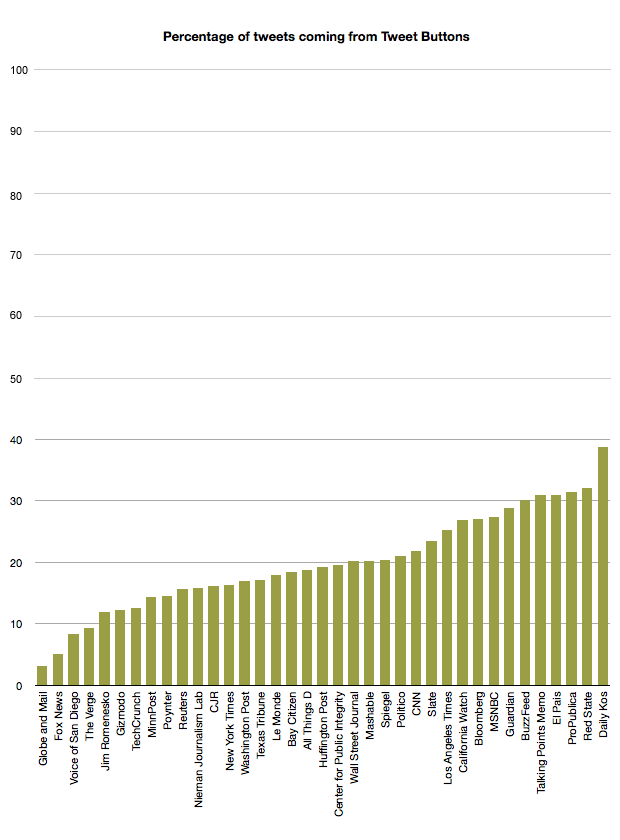
And this is how they interpreted the data:
Tech sites seem to be less reliant on the Tweet Button, as a percentage—as one might expect from sites with a social media-savvy audience. Presumably readers of The Verge are comfortable copying and pasting a URL into Twitter on their own, or tweeting to Verge content by seeing someone else’s reference to it in their feed.
Here is how I see it: Apparently, the more you understand technology the less you use the buttons. But why? Because technological minds use technology more efficiently? Because they know that those buttons don’t provide the best experience? Because they come from Twitter, then go back to tweet? I don’t know, but I’m very curious to learn why.
Sites with a clear ideological profile—Daily Kos on the left (38.8 percent) and Red State on the right (32.1 percent), for instance—are among the heaviest beneficiaries of the Tweet Button.
I’d say: The more ideological, the more likely you blindly push buttons. It’s good to have soldiers supporting your cause. I prefer to learn from conversations. The following graph comes from the same source, although again we extended the scale to 100% to give a more accurate impression:
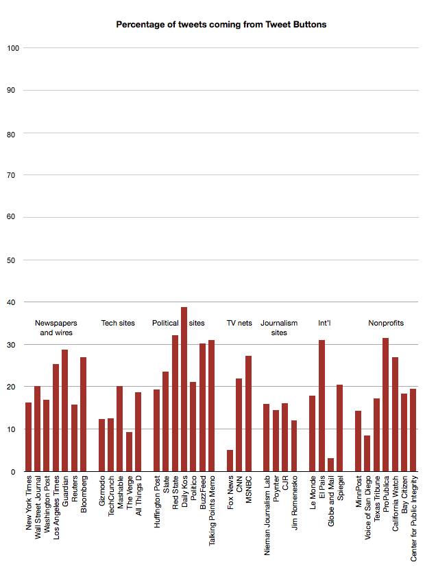
I am not surprised that the buttons are used. Of course, people do use these buttons. But wouldn’t they tweet without buttons? And isn’t 20% rather a low number, not a high number? Isn’t 80% manual tweets surprisingly high? Is it really 20%? What happens on small sites? Does size play a role? The relatively low button use (15%) on the New York Times is also noteworthy. Could they improve tweets by being more active on Twitter instead? What’s the matter with Fox News (5%)? Do they know about that? Are they doing something differently, or is it the user base? The most important question is: how high is the percentage of total readers (not tweeters) that use those buttons and how much additional traffic do they generate?
In any case, what we suggested is not cutting social media off, but integrating it more selectively and consciously. To further careful social media interaction and conscious debate. This is how we think social media works. What did surprise me was Joshua Benton’s conclusion:
…even this quick look would seem to support the idea that killing off Tweet Buttons would, for most news organizations, remove somewhere around 20 percent of their Twitter link mentions.
He then relativizes this conclusion (“maybe more, maybe less”), but let’s be clear:
- We can’t conclude that people using the tweet button wouldn’t tweet otherwise.
- Part of the original argument, nicely put by SmashingMag, was: “We removed FB buttons and traffic from Facebook increased. Reason: instead of ‘liking’ articles, readers share it on their timeline.” Meaning: They liked less but discussed more, which resulted in more traffic. Quality instead of quantity.
- Again: We’re suggesting the conscious integration—not elimination—of Social Networks.
- To say for sure whether these buttons are beneficial at all you need to A/B test. To falsify the assumption that curation of tweets works better than tweet buttons you need to A/B/C test:
- An article with buttons
- The same article without buttons
- The same article with curated integration of tweets
Most of the critical reactions ignore what we suggested: Curation. Conscious handpicked integration of social media reactions instead of code snippets. This is core.
Insights From the Financial Times Lab
I was really pleased when I read “Decreasing the distance between producers and consumers of news” from Matthew Caruana Galizia, working at the FT Lab, who said:
…what we’d really like (my team and I, not necessarily the FT) is for the editorial team to engage more actively on social media. The first step would be, as the article points out, to discourage passive “Liking” and encourage the more active kind of posting that people would do otherwise. The second step would be to show journalists where these discussions are happening (using our tool) and lead them to participate.
So What Is It?
There isn’t a one size fits all, either-or answer to this. What have we learned?
- A lot of (technically savvy?) people despise these buttons and do indeed consider them to be sleazy. If early adopters in tech are indicators of tech trends, then these buttons will disappear sooner or later.
- Apparently, they work quite well for activist political sites and removing them might not be the smartest thing for similar sites.
- From what we can see, there are definitely smarter ways to integrate social media for quality tech sites like the Verge, and quality newspapers like the New York Times. And this was what—as a newspaper designer and tech blogger—I was most interested in to begin with.
- Don’t be fooled: If you have 30 visitors per month, those buttons won’t make you a star. And for a quality brand with a higher brand value than Facebook and Twitter (yes, they still exist), these buttons actually profit more from you than the other way around.
Whatever side you are on, this has been (and will continue to be) a highly interesting debate. It is not a black and white case, and it is far from over. Let’s get to the bottom of this.
Further Reactions and Additional Insights
In the mean time, most reactions now come in long form, which is preferable as it is a complex debate. Here are a few reactions to this article and some additional information:
Visitors to the Huffington Post in January 2008 would have been given the option to share an article via Digg, Reddit and Delicious. Now they are given up to 20 ways to share an article just via Facebook alone. —Journalism.co.uk
is there any point compromising the entire design of your site with buttons that are going to drive such small volume of traffic. Are people just installing these buttons because they see them on every site in the world? —simplyzesty.com
@iA We noticed in usability testing that even novice users were uncomfortable with branded share buttons: ‘I don’t want to be followed.’ —@bartvandebiezen
Love a good questioning of the status-quo —@on_ah
I redesigned Useit for a project, and his share buttons weigh 30x more than the rest of the page combined. —@ctbeiser
@iA Killed off those social media buttons, replacing them with a link to your article in the source code. —@davidbauer
@iA And then all web browsers add the social media buttons to their default toolbars: Mountain Lion —@bartvandebiezen
A few months ago I toyed around with the idea of removing share buttons from my company’s email newsletters, just to see what would happen. After a few email newsletters had gone out I checked out the numbers and was pleasantly surprised by what I saw—the blog posts were getting more shares than they had ever gotten before! I realized that the social share buttons in the newsletter weren’t doing me that much good. —Search Engine Journal
One argument in favor of sharing buttons is the psychological phenomenon of ‘social proof,’ where a person entering a new environment tends to conform to the behavior demonstrated by others. […] ‘just look at all these other people who already have!’ […] We also know that many people share content because it makes them look smart and well-informed. Part of that is being among the first to have shared it, and thus not sharing something that’s already well-circulated. In this way, a sharing button could limit the potential spread of your best content. —Poynter
so far I’ve noticed that, on any given day, about 2% of my visitors share a link. Each shared link generates a little over 2 extra visits, and that adds accounts for about 3% of my site’s traffic. —The Digital Reader
There has been some discussion on G+ on how G+ activity affects your SEO. While it’s a shrewd trick to get people to use G+ by influencing Google Search results depending on your G+ action, the 100,000 Dollar question is, again:
Where do you rather get a +1? On G+ or on your page? Would you not get even more +1s if you provide a more engaging hook into +1 than a silly button, meaning: Doing what I suggested, and feature some of the social Media interaction at the end of the post? —Me on G+
