When we built websites we usually started by defining the body text. The body text definition dictates how wide your main column is, the rest used to follow almost by itself. Used to. Until recently, screen resolution was more or less homogeneous. Today we deal with a variety of screen sizes and resolutions. This makes things much more complicated.
In the heat of relaunching ia.net I wrote a quick weblog post on responsive typography, focusing solely on the aspect of our latest experiment: responsive typefaces. Without knowing the history of iA, you’d miss some key aspects to the responsive typography and design in our relaunched site. I decided to start from scratch and explain responsive typography in detail, step by step. This is step one.

To avoid designing different layouts for every possible screen size, many web designers have adopted the concept of Responsive Web Design. In a nutshell this is the idea that your layout automatically adapts to the device viewport. There are different ways to do it, but I like to put it this way:
- Adaptive layouts: adjusting the layout in steps to a limited number of sizes
- Liquid layouts: adjusting the layout continuously to every possible width
While both have advantages and disadvantages, we believe that adaptive with as few break points as possible is better, because readability is more important than having a layout that is always as wide as the viewport. This is a debatable opinion on a complex matter in itself, but optimal readability requires a certain amount of control over the measure (column width) of the text, and in this regard a liquid layout creates more problems than it solves. More about that another time.
Note: Responsive design already incorporates a lot of macro-typographic issues (type size, line height, column widths), so responsive design already incorporates responsive typography in many ways. What we focused on in our responsive typography article mainly referred to our use of graded fonts on ia.net. I’d like to talk about grading in the next post and dive right into the basics of responsive macro typography on the screen now.
Choosing a Typeface
The Right Tone
Sooner or later, you need to decide what kind of typeface to use. The choice of your font is mainly a matter of tone, but as every typeface has its own qualities, and demands (or forbids) certain treatments, the choice of type has a lot of visual and technological consequences. With web fonts you now have a big choice of typefaces, so finding the one that fits has become yet another challenge.
In 2012 we designed our own typeface iABC for this website to experiment with responsive typography. We chose a serif because it fits our tone, and mirrored the refinement of our content (or at least that’s what we thought). For iA Writer we chose a monospace typeface. Because the primary purpose of our program is helping you getting a first draft out, we specifically chose Nitti—a typeface that feels strong and careful at the same time. The decision to use a monospace typeface also came about because the first iPad’s Operating System didn’t auto-kern proportional typefaces. Instead of using a proportional typeface that would be rendered poorly, we decided to go for a monospace typeface right away.
Three years later, our love for Nitti has led to the custom proportional (and graded) version you’re reading now.
Serif or Sans Serif?
Usually the choice falls between serif and sans serif. This is in itself a complex matter, but there is a simple rule of thumb that might help you: The serifed typeface is a priest, the sans is a hacker. One is not better than the other, but, for various reasons, a serifed typeface has a more authoritarian touch, whereas a sans serif feels more democratic. Remember, this is five thousand years of typographic history wrapped in two sloppy lines—don’t take it too seriously.
A lot of people still think that for screen typography the question “serif or sans serif” answers itself. Actually, it’s not that easy. Against common beliefs, both serif and sans serif can perform equally well, if you choose a body text size above 12 pixels. Below 12 pixels serifed typefaces don’t render sharply enough, but (and this brings us to the second point) on contemporary monitors 12 pixels is definitely too small anyway.
What Size?
The size of your body text doesn’t depend on your personal preference. It depends on reading distance. Since computers are generally further away than books, the metric size of a desktop typeface needs to be bigger than the sizes used for printed matter.
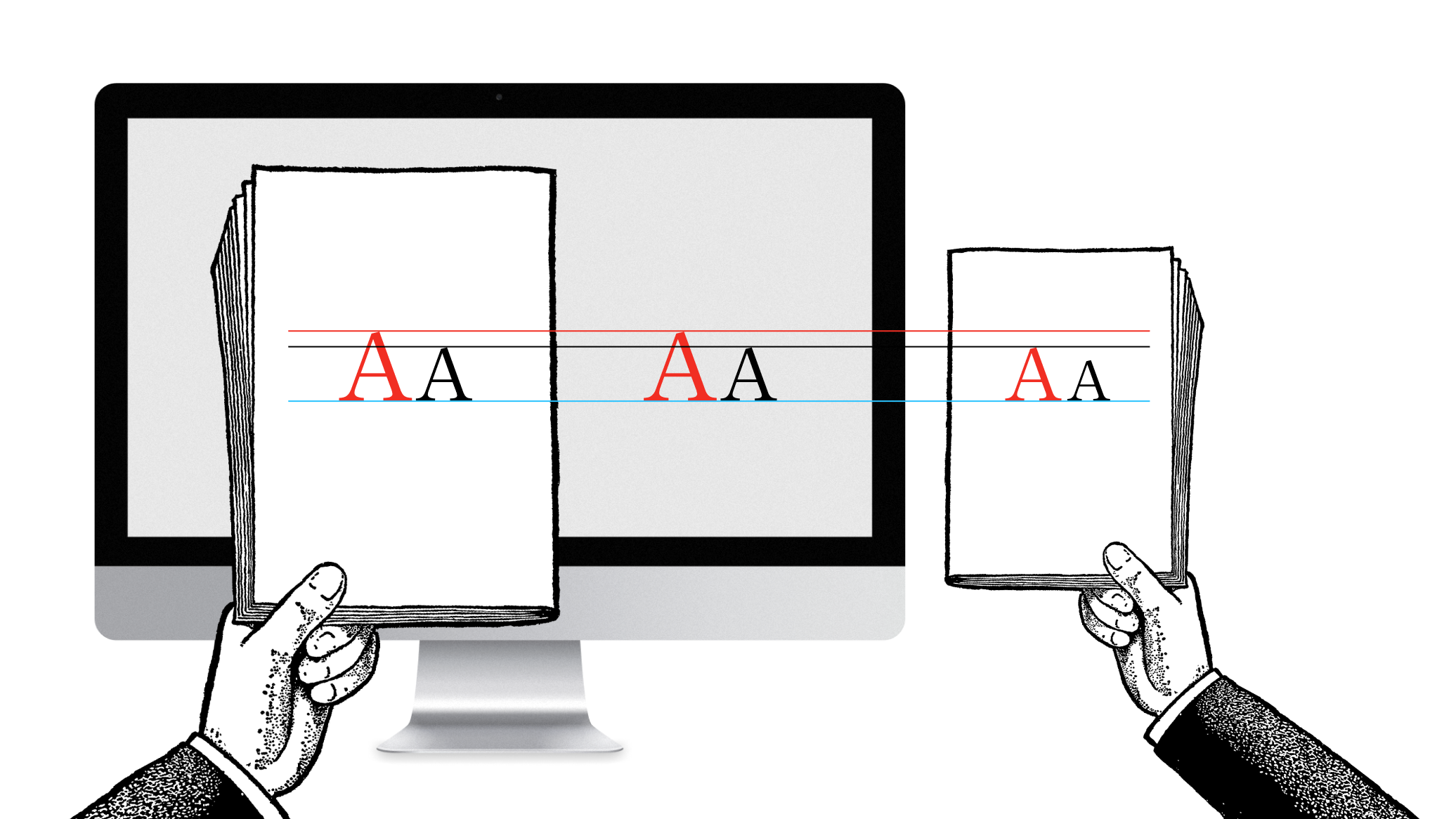
The illustration below shows that the further away your body text, the bigger it needs to be. The two black and the two red A’s have the same metric size. But since the right pair is held further away, the perceived size is smaller. The red A in the right image has the same perceived size as the black A in the left image:

The further away you hold the text, the smaller it becomes visually. You need to make the text size bigger the further away the text is read, to compensate for a larger reading distance. How big is, again, a science in itself. If you are inexperienced, a useful trick is to hold a well-printed book at a comfortable reading distance while looking at your website to compare.
Graphic designers without web design experience are surprised how huge good body text on the web is in comparison to printed matter. Mind you, it’s only big if you compare it side to side, not if you compare it in perspective.

If, after increasing the size of your body text to match, the new size irritates you in the beginning, don’t worry—that’s normal. However, once you’re used to it, you will not want to go back to the “standard” small sizes.
We’ve been promoting these “perspectively proportional” font sizes since 2006. Initially, our claim that Georgia 16px was a good benchmark for body text sizes provoked a lot of anger and even some laughter, but now it’s more or less a common standard. With higher resolutions, that standard is becoming slowly obsolete. But more on that later.
Line height and contrast
While body text size can be evaluated with that perspective trick, line height needs some adjustment. With more reading distance and (what we call) pixel smear, it’s wise to give screen text a little bit more line height than printed text. 140% is a good benchmark, but of course, it depends on the typeface you use.

Today it’s a given that you make sure that the contrast is not too weak (e.g. grey text on a light grey background) or too garish (e.g. pink on yellow). Since screen typefaces were designed to be displayed black on white, using dark backgrounds is also somewhat difficult, but these can work if done right. With contemporary high contrast screens it’s also preferable to choose either a dark grey for text or a light grey for the background, instead of a hard black on white. But that is, again, not the most important question.
iPhone vs iPad
A lot of what we learned about responsive typography came from finding the perfect typography for our writing app. When we designed iA Writer for iPad we invested weeks to find the right typographic definition. At the time, the high resolution screen of the iPad was a completely new challenge, and it took quite some time until we understood how it works. When Apple introduced Retina displays for iPhones and later for iPad, everything changed again. We could write a whole book to explain how we got to the iconic look of the iA Writer typeface, but there is still so much to say about more general matters so I’ll cut to the chase.
If you compare our current version of Writer for iPhone with the version for iPads, you will notice that the type size is not the same.

Why different type sizes for iPhone and iPad? If you read the above explanation attentively, you might have already guessed.
- While the distance is not always the same, in general you hold the iPad a little bit further away. Whether you use your iPad on the breakfast table, on your knee sitting on your sofa or right in front of your face lying in bed gives a variety of reading distances. This was an entirely new challenge, because the reading distance on desktop and laptop computers doesn’t vary that much. In order to make it work in all instances we chose the furthest reading distance defining the type size. This might result in a slightly bigger than usual type size when you read it in bed, but it’s not uncomfortable, and generally you don’t use a writing application lying on your stomach in bed.
- You have less screen estate on an iPhone so you are forced to make adjustments.
Luckily, the iPhone is held closer to the face so being forced to use a smaller type size works out perfectly. From an average reading distance, both iPhone and iPad have a similar perceived type size.

Since the iPhone is held closer, the line height could also be tighter, which again is a necessity because of the smaller screen:

Not everything always works in your favor when you design for the screen. Interaction design is engineering: it’s not about finding the perfect design, it’s finding the best compromise. In our case we had to reduce the line height, and also the gutter and the spacing between characters:

The adjustments were so delicate that if you don’t know it, you won’t notice how small the gutter is. Why didn’t we just get rid of the gutter? The gutter is not an aesthetic matter, it lets the text breathe and helps the eye to jump from line to line.
If you think that this all sounds esoteric: no, so far we’ve just covered the basics.
What About Desktop Computers?
Some people complain about the big font size in Writer for Mac. Just like we had to go for the biggest minimal size choosing the font size for iPad (which is held at different reading distances), we went for the biggest minimal font size on Mac as well. At the time our benchmark was a 24 inch high resolution iMac, where the perceived size is more or less the same as on all other devices.

Since the variety of Mac computers that run iA Writer is finite, we could determine the different possible resolutions. We looked at every possible configuration to make sure that the type size was the best compromise for most machines.

You might ask “Why not just allow the user to choose the type size?” Well, adjusting type size is not a matter of taste, but a matter of reading distance. Since most websites and applications have an overly small type size, new customers would initially choose a type size that they are used to, that is: too small a size, and never experience the full pleasure of our writing app. The main reason is not that we want to force a certain look upon all users: what we want is that iA Writer works without settings, without fumbling, that the only thing you can do with it is write. This has been the open secret of its success and changing that would be messing with its core. (What we need to improve are the accessibility integration for people with bad eye sight).
Okay then, why not adjusting to the device’s resolution automatically? Wouldn’t that be true responsive typography? That’s right, and we are working on something similar. Now, in adjusting to the resolution, you also have to choose the right optical weight to make sure that the typeface really works as intended with every size and resolution. With the type size and the resolution optics of the font change as well. That’s why iA Writer for Mac, iPad 1/2 and iPad3 all have different grades as well. To explain the full logic behind grading digital fonts and explain the thoughts behind our new Website, I need a little bit more time and space. So, stay tuned for Part II!
Response So Far
In spite of having no social media buttons, this article got lots of of retweets, very few critique points, mainly around the question of liquid vs adaptive layouts, a topic that I’d like to address at a later point. I was surprised when Joshua Porter asked:
@iA You had me until the line ’interaction design is engineering’. How does that work? —@Joshua Porter
Just in case other people wondered… The full citation is: “Not everything always works in your favor when you design for the screen. Interaction design is engineering: it’s not about finding the perfect design, it’s finding the best compromise.” Usually I say “Web design is engineering: it’s not about finding perfection, it’s finding the best compromise.” With the term “Web design” the sentence becomes a bit clearer because of the somewhat more obvious technical implication. I used “interaction design” because in the examples I used an app.
What it means is that while graphic design requires and allows you a great degree of graphic control, Web design requires you to think about compromises between visual design and technology from the very beginning. To get the optimal results you need to explore a lot of different solutions, each with its own pros and cons and try find the best compromise among all the suboptimal choices.
At this point, graphic designers often chime in and try to make the point that they, as well, deal with a lot of technology and so on. And sure, you do. All creation of artifacts, all design requires technological knowledge. But just as there is a difference between engineering car engines and Websites, there is a difference between designing Websites and Magazines. And the difference is the degree of engineering involved.
In conclusion that means that in the process of designing Websites and apps, a lot of what we do is thinking about compromises and trying to find solutions that do not have too many downsides. This is what turns a lot of graphic designers off, because they are used to having control. More about that in the excellent presentation by Khoi Vinh on the difference between screen and graphic design (2007).
