I had a perspective-changing talk on the subject of pay walls with the chief executive of a big publishing company (no, I can’t tell you who). He asked me what I think about pay walls.
I told him what I always say: The main currency of news sites is attention not dollars, and that I believe that it is the publisher’s job to turn that attention into money, to keep the attention machine running. He nodded and made the following, astonishing statement:
I can’t see pay walls working out either. But we need to do something before we lose all of our current subscribers. Sure. It’s a tough business environment, but… But the flight industry is a tough environment too, and they found ways. So tell me: Why do people fly Business Class? In the end, an airplane brings me to the same place regardless of whether I fly Economy or Business Class, and the massive price-increase I pay doesn’t compare the difference in value.
He asked whether I knew of a way to apply this logic to online news. What would a Business Class news site look like?
People pay for Business Class because they don’t want to be tortured in Economy. They get faster lanes at the security check. They get an extra glass of champagne. The stewards are more attentive. They get off the plane more quickly. They get the feeling of a higher social status.
And he added that he wished that there was a way to lead each reader through to Economy again, to again show what they avoided by being in Business Class.
Limiting Information is not Economic
Say what you want, but he has a point. Reading news online feels like flying Economy. Loud distracting banners, cheap stock picture material, sloppy typography, a lot of useless comment noise, machine generated reading tips, no human service, and a claustrophobic information design make the reading experience a torture.
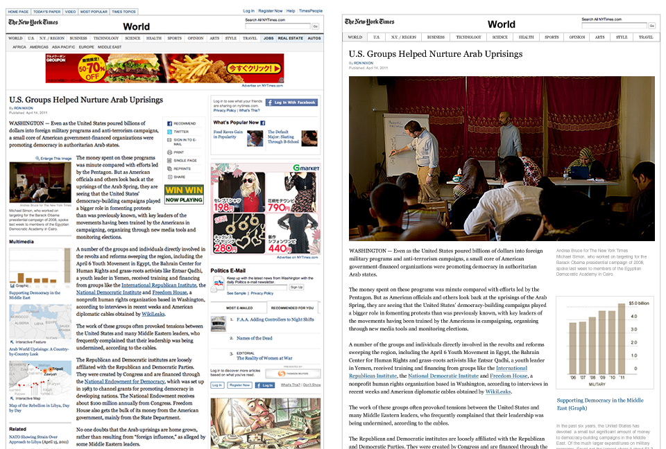
If you’ve been designing online newspapers as well, of course, you know that designers cannot solve this problem by themselves. Newspapers need to make money. And most newspapers look the way they look because that’s what the design brief dictated. The following comparison demonstrates how much space and attention this marketing strategy requires to subsidize the product, and how small the space is for actual content:

Even with all this noise, it seems online news still doesn’t make enough money. Some newspapers try to tackle the financial problem by erecting pay walls. “You want information? Pay up!” But, as many have noted before, that’s a tough sell in a medium where information exists in overflow. The strategic problems with pay walls have been discussed extensively:
- There is no information shortage online—if I can’t read this article, I’ll read another.
- Pay walls weaken the main attractor (content) of your site, and complicate the user experience (login on different platforms). Some leave social media back doors, but that’s not a good long-term strategy either, as more and more people use social media to find content.
- Often pay walled news sites feature the same amount of marketing noise as free sites. Paying customers are of course more attractive ad targets, but… Paying for news and then dealing with a silly blinking bonanza while reading doesn’t seem like a fair deal.
To be clear: content pay walls are not what we are suggesting. Remember, whether you fly Economy or Business: the result is the same (you travel from a to b), and only the experience differs. And likewise Business Class and Economy class seats on news sites should deliver the same content.
The idea of creating a business class for online news is not about buying information, but buying better experience, it’s about service and customer experience. That’s right: customer (paying), not user (free).
Same Information, Different Experience
The idea of creating a business around the terrible online news experience is not that extravagant: Instapaper, Readability, FlipBoard & co. are already profiting from the terrible reading experience of current news sites. Actually, Jay Rosen has suggested that it should have been publishing houses that released FlipBoard (and with news.me the NYT is just doing that). All these reading interfaces have one thing in common:
- Design—focus on content
- No blinking obnoxious advertisement and space-filling noise
- Personal relevance
…and they have the advantage of collecting news from different sources. What they don’t have, but publishing houses could provide:
- High-end picture material (often too expensive for a broad audience)
- The immensely powerful brand and social network of news sites
- Human service through qualified news professionals (for premium accounts only)
Now, wouldn’t it be at least worth a try to add a business class version to your site instead of leaving it to the booming reader industry?
Sounds Good but What Does It Look Like?
What would a business class version of a news site be like? We are currently working on a behind-the-scenes consulting project dealing with that problem, and, as far as we can see, it’s not impossible as one might think. Obviously we can’t show you the actual designs, but here’s an example of just one aspect. Here is what happens to the New York Times if you get rid of the noise:

Which one would you rather read? What if you could get the loud one for free and pay for the nice one? Would you be tempted? And would you be tempted to use the same interface for other news as well?
No, you don’t need to make the free version ugly on purpose—apparently, airlines do torture us on purpose in Economy class—the traditional CPV/ad model design requirements will do the job for you.
It is understood that it’s difficult to make a business class version for the New York Post; you need a brand that fulfills the promise of “Business Class”. The business class idea would only work for titles like The New Yorker, Die Zeit, Il Sole 24 Ore, Le Monde (Le Monde actually has a similar concept in place but the up sell is tied to more information, not better experience—which, again, is not what we’re suggesting).
How Much?
So here is our question for you: as a regular reader of Le Monde, NYT, or Die Zeit, how much would you be ready to pay for a business class version of your news site? I’m guessing that it should be a yearly fee. It doesn’t hurt to pay $99 once a year, but it hurts to pay $10 per month. Keep in mind that the above design is just a quick mockup, and that the benefits go beyond a better design.
So. How much? $0, $5, $9, $49, $99, $299 per year? What if in addition you could read other news sources through the same interface as well? We’d be happy if you could send us a tweet with the price you’d be ready to pay.
Reactions
Reactions on Twitter are intense and surprisingly positive. So far, it seems like the average user is willing to pay is $99 to become a customer. Several tech sites have reacted:
There’s no question that Reichenstein is onto something with this approach. Many newspaper pages and websites look hideous… —GigaOm
I love this idea from Oliver Reichenstein: a premium “business class” level for news websites. Stop trying to figure out ways to block the flow of information with paywalls. Allow everyone the same access to the content—in the way that every passenger gets transported from A to B on an airplane—but allow people to pay for a superior experience. —Daring Fireball
Perhaps as well as the layout, the “business class” service could also include better (and more immediate) forms of discoverability and curation to help with the above, or even the ability to create filters (so I could block out all political or environmental stories, say). —News.YCombinator
Internally, since its introduction in 2003 we have always talked about our Edition Abonné as our “classe affaire.” And indeed it is more about a better experience and better services than content. Our subscribers get an almost adfree website and get in the “club” which allows them to comment, to run a blog on our website, to be greeted with a personalized summary of the news if they haven’t reached the site for more than 3 days… etc… —Edouard Andrieu, Product Development Manager at LeMonde interactif
Critique
Some (including GigaOm) have noted that the news business is not like the airline business, meaning: They can force us into Economy, because we have no choice. The argument was not that the news business is like the airline business. Of course not. The argument is that news should learn to up sell their readers to a better experience, not to more or better information.
Twitter user @mrjohnsly has noted that Ars Technica already has a similar model in place. And indeed they do. One particularly nifty feature of their model is that they offer full RSS feeds for paid subscribers. I’d love to know how well this is working for them.
As briefly mentioned in the article, the offer would be even more attractive if the business class environment allowed the user to not only find articles from other publications, but also read articles from other publications. Some say that this is strategically impossible (even though FlipBoard proves that with enough negotiation skills it is), others suggest that this could be a model for a strategic cooperation among different publishing houses.
I won’t elaborate on this here (it’s an article in itself), but one thing is pretty clear: The success of such a reading service would be much more likely if it is platform independent.


