First, the paper magazine was crammed into the little iPad frame. In the form of a PNG slide show. To compensate for the lack of interactive logic, this pretty package was provided with a fruity navigation. In the end it was spiced with in-app links, plucked with a couple of movies, and salted with audio files (“interactive”). Then it was off to marketing. And it sold 24,000 copies. Dammit. It’s the Nineties all over again.
Update: I updated most of the examples to show the difference between InDesign and iPad. I did so since many said that while they agree that it’s not appropriate to just export designs from Indesign into an iPad app, they didn’t see the typographic issues (it’s actually one and the same argument). The iPad examples are not 100% fair as they’re scaled down, enhanced contrast screen shots (losing granularity), but since I cannot mimic a higher resolution on the computer screen, this was to only way to show what happens when you increase contrast and scale down the fonts to the perceived size. If you want an appropriate comparison, you need to hold your iPad WIRED app next to the screen shots.
Good pictures speak for themselves. But text is a different story. It needs a lot of rhetoric skill and typographic care to do what it should: to communicate. On the screen things become even more complicated. While WIRED journalists and graphic designers are still at the top of their game, the typography and the interaction design of the iPad app doesn’t come even close. Here is a short, brutally honest rundown of how iA sees the new WIRED app.
One or Two Columns? Not a Matter of Taste
The iPad portrait mode allows for a nice column width with enough white space left and right. The landscape offers even more white space. Why not use it? In a medium with infinite vertical space there is no need to create dense multi column layouts. Yes, multi-columns look classy-classic, but so do heavy black rotary telephones. In practice, multi column article pages are as useful as heavy dial disc cellphones. At half of the size and half of the resolution of a printed page, that is, at one quarter of the granularity of a printed page, you’re playing a different game. Columns for iPad article pages don’t work, because:
- They fragment the text body, cluttering and suffocating the notoriously small iPad screen
- They force you to use small text sizes or disproportionally increase the number of line breaks, creating a nervous zig-zag reading path
- Breaking long text into disconnected page blocks, they complicate the overall orientation and interaction (scrolling in article vs swiping between articles)
- They require more hyphenation; they generate big text holes or ugly ragging; on a small canvas they don’t save space, they waste it
- They force you into a paper metaphor and a defined page height
- They create numerous “what now?” moments
- They complicate the mental navigation model: For example, what happens if I scroll left on the second page of an article? Do I go to the second or the first page of the neighboring article?
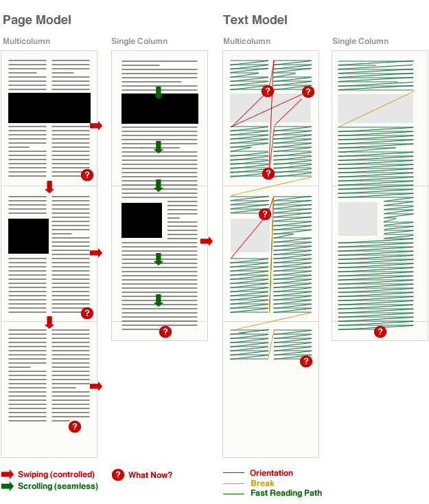
Let’s make this clear once and for all: at the current surface and resolution of the iPad, multi column layouts for long screen texts are sentimental nonsense. And the more columns you use, the worse it gets.
If you can’t see the beauty of screen-optimized typography that focuses on readability, instead of old standards based on lead and paper limits, at least make sure that you have enough gutter between the columns.
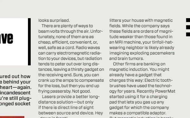
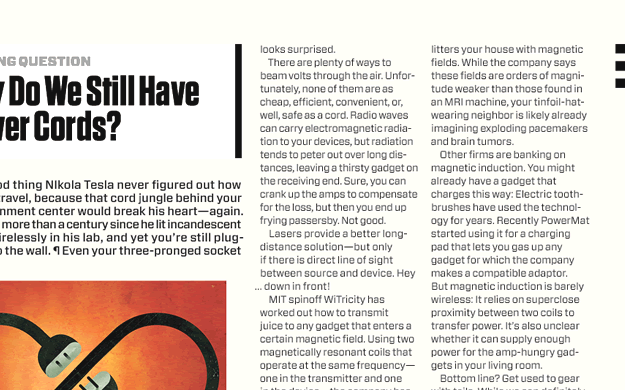
The column problem on the WIRED app is not limited to the article pages. On some pages, column widths are so narrow that the text turns into a nerve-straining reading puzzle. The following layout looks pretty, but I can’t read it without hearing the Benny Hill theme song as background music:
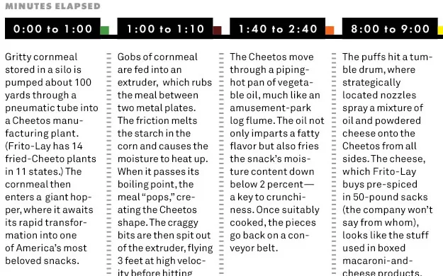
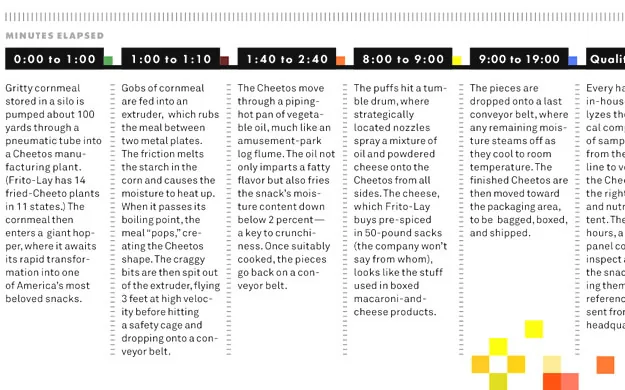
(The New York Times app has the same problem. Five columns in landscape mode and three in portrait mode at a readable font size results in 3-5 words per line: this looks nostalgically aesthetic, but reads nervously like the fast, silly soundtrack of a 20’s slapstick movie. The NYT app uses a scroll right card model for their articles, which creates other problems [lots of dead ends]).
Dear Paper Designer…
Fonts that work together well in print don’t necessarily work on the screen, since the anti-aliasing makes them unstable and shaky. I find this tweet by Hoefler+Frere-Jones quite ironic:
Congratulations to @sdadich and the Wired team for a great iPad app, and not only because it’s chocked full of @H_FJ fonts!
Yes, indeed, “it’s chocked full of fonts”. But what makes type foundries happy doesn’t necessarily make the reader happy.
- Using non-screen fonts on the iPad is (still) a no-go unless you use them at massive sizes, (which leads to other problems). Font rendering on the iPad screen is a bitch. And you need to deal with it if you expect people to read your content.
- Generally speaking, mixing fonts is like writing long sentences. Don’t do it, unless you have full super-genius level control over what you do. The bad news: on the iPad you don’t have full control over the way fonts look, the resolution just trashes any delicacy. The following font combination might work like a charm in print, and even be OK on the screen, but at iPad resolution/contrast the bold “a grazing snail” and “eats a bird” clash:


Ornament and Crime
You cannot just transpose print candy to screen candy. In print, graphic page ornaments are a matter of taste and brand. On the screen they become confusing clutter.
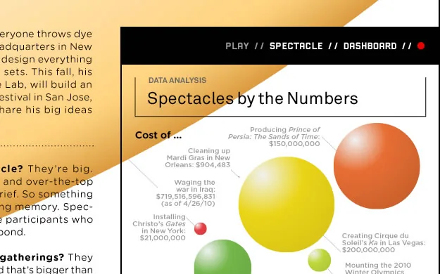
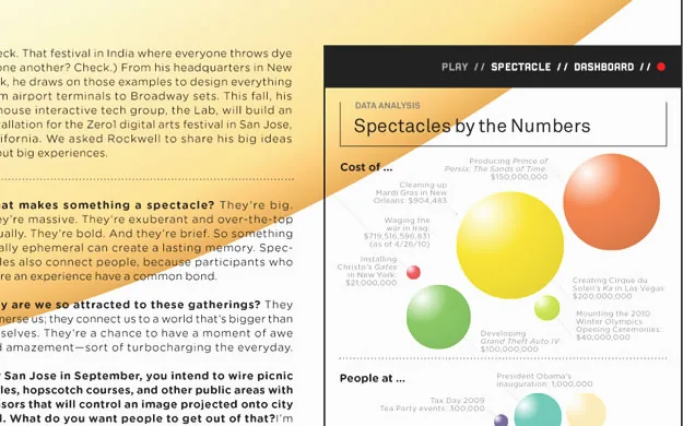
- On a small screen with the visual liberty of an old 640 × 480 display, graphic ornaments steal important screen estate; due to the high pixel density the 1024 × 768 feels much smaller.
- The bold, black iPad frame (with the surface of half a magazine page) creates a claustrophobic setup; wasting space on things other than content or white space makes the room feel even smaller.
- Navigation on an electronic device is not as automatic as flipping pages. Every element on the screen that has no direct semantic or obvious structural character can be misunderstood as a navigational control. Once the user learns it’s mere candy, it will effectively be blanked out by the user’s eye. Once that happens, important navigational elements are blanked out as well and the whole app becomes one baroque carpet (who would have thought that the words marked in yellow were in-app links?).
Ad Integration
While I applaud the use of full screen ads and the absence of annoying banners in the content, the WIRED app also has some major problems with its current ad integration:
The editorial design looks nice but it is hard to discern from the advertising. John Gruber, who for some reason still gives a thumbs up to the app, finds that “…in many cases, especially with multi-page ads, there’s no visual clue to tell you when there are more pages underneath the current one”. Every page requires a second or third glance to identify whether it’s editorial content or advertisement. Often you even need to scroll to confirm whether you are reading editorial content or ads (which is not only a usability issue, but also a journalistic one). Towards the end of the app I just couldn’t be bothered anymore, and just flipped forward to the last page without reading.
Five bucks for a stack of flat graphics is a lot of money (don’t tell me plugging in movies, audio, and internal links qualifies as “interactive”). If 75% of those graphics are then ads, I start feeling like a fool. I paid five bucks to look at a funny navigation for couple of ads with unreadable chunks of content? Seriously?
I know Wired costs more than $5 to make; there’s inefficiency in their system. Cooks Illustrated is ad-free, costs $7.95 (and it’s great.) —@nevenmrgan
Most of the problems that I pointed out (column width, font choices, ornaments, the paper metaphor), and many more (unable to copy paste or zoom), seem to be a result of using InDesign, a layout program optimized for paper designs.
Steve Jobs was Right (again)
We should use original tools to create iPad apps, not because Steve Jobs said so, but because these tools create products with flesh and bone. We need them to get an understanding of the purpose, the potential, and the limits of the iPad technology.
So should WIRED care? After all they sold 24,000 apps and iA’s apps are not even out yet (and who knows what our clients are planning with those columns!). Now, while WIRED might have more money on the launch day than our apps ever will, I am still very pessimistic about long term sales.
The WIRED app launch success doesn’t come as a surprise. It’s the result of brand blindness by the reader (“It’s WIRED, it looks like WIRED, so it must be WIRED good”), and wishful thinking by the journalist audience, perfectly summed up in Adobe’s 90’s marketing bullshit language:
The future of magazines is now
No, it’s not. The future is never now. And the future of journalism is definitely not a stack of banners spiced with videos, exported from a paper layout program. You need to try harder.
Update # 1: Jonathan Hoefler’s Comments
The quotes are the parts of the above article he refers to, his comments start with as “JH:” (Jonathan Hoefler), my replies to his comments are referenced as “OR:” (Oliver Reichenstein):
Using non-screen fonts on the iPad is (still) a no-go unless you use them at massive sizes, (which leads to other problems).
JH: The text face that we designed for the Wired iPad app was specifically designed with screen resolution in mind, and these were tested against the device-resident fonts Georgia and Verdana, as well as the also-non-screen-fonts Times, Helvetica, and Arial. Our text face, Exchange-ScreenSmart, won the lottery by being most legible on screen.
OR: The Exchange-ScreenSmart is, when seen on a regular screen, truly a masterwork. I am sure that—as most fonts we have been working with since starting to design for iPad—would be even more beautiful if properly rendered on the iPad (it’s crazy how well Minion renders on the iPad).
Font rendering on the iPad screen is a bitch.
JH: Personally I disagree—we’re testing all of our screen-optimized fonts on both desktop platforms and the iPad, and the iPad’s rendering (especially in-browser rendering) is demonstrably superior to even Safari 4 for Macintosh. But this is a discussion for another day, since all the fonts on the Wired app were rendered on a desktop platform, and provisioned to the app in the form of flat PNG files. The Wired app does not use the iPad’s rendering software at all.
OR: The problem is that one can simply not see that on the iPad since they’re all flat files. Which is a terrible waste given all the good work you have done. By “rendering” I didn’t mean that the iPad renders worse than OSX, I meant that the iPad resolution is a bitch in comparison to print (where there is no rendering). As you said, this is a different discussion, but the idea that you can render in InDesign and get a good result on iPad is, in my eyes, a terrible mistake. It is also a terrible mistake to put a print designer in charge of an iPad app. As Erik Spiekermann said: “iPad is not iPaper”, it has more or less 1/4th of the granularity. Who would use columns on a quarter of a magazine page?
Generally speaking, mixing fonts is like writing long sentences. Don’t do it, unless you have full super-genius level control over what you do.
JH: The Wired iPad app was art directed by Scott Dadich, who among other things is a three-time winner of the National Magazine Award. So I’d like to think the designer qualifies as “super-genius”—though, perhaps you’re talking about the rendering technology? If so, it might interest you to know that the composition of these pages was done in InDesign CS5, which certainly as sophisticated a degree of typographic control as any application on the market. (Are there better ones?)
OR: Scott is a super genius when it comes to paper design. But screen design is a totally different beast. Funnily enough, his pages look pretty good on a regular screen, with a lower contrast screen and without that black frame. On the iPad (with different contrast and resolution) they fall apart. Again: You just can’t design iPad apps in InDesign and export them as flat files. That’s nothing short of amateurish. (Sorry, Scott!). The main issues I have are not so much micro typography (I am an amateur there myself) but macro typography and interaction design. This is where the WIRED iPad app falls apart as a vain slide show.
The bad news: on the iPad you don’t have full control over the way fonts look, the resolution just trashes any delicacy.
JH: Perhaps I misunderstand your point, but this sounds like a general criticism of reading fonts on screen, no? In any case, I’m not sure which of the fonts in the Wired iPad app you felt were “delicate”—the palette includes our Vitesse, Tungsten, and Gotham Rounded families, as well as a few unpublished designs (Exchange and Forza) that are five of the least delicate typefaces we’ve ever produced.
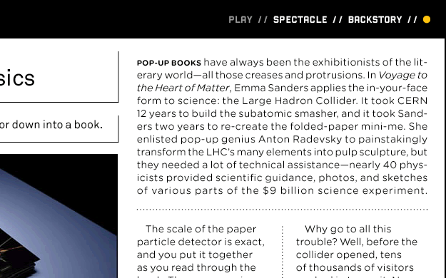
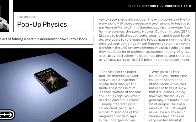
OR: You misunderstood. If you start reading through our site you will notice that, in fact, the contrary is the case. My point is that a paper designer has per definition more typographic playroom because of the much higher granularity; he can do things that screen designers just can’t. I clarified the screenshots in the text to make my point more clear: You can’t put Ultra Black next to an ultra light type on a colored background in a strong light contrast environment such as the iPad. You can in print (if you’re a super genius like Scott). But the iPad is too rough a matrix to pull such tricks. BTW: Some of the problems are not obvious on a computer screen. Since the iPad slides are made on a regular screen they actually work much better here than on the iPad.
 JH: I hope you don’t think that I’d have commented favorably on the app merely because it used a lot of our fonts. Plenty of designers and organizations license lots of fonts from us, and if you’re a regular follower of either H&FJ’s blog or our Twitter stream, you’ll know that I’m rarely moved to praise any designer’s work. My tweet really did attempt to offer the perspective of a reader, not a vendor; I just mentioned that Wired was a client in the interest of full disclosure.
OR: I totally understand that and I am very happy we were both able to clear all this up for everybody. Let me just add one more thing since you don’t seem familiar with our work. We have been working on several iPad designs since January (among others, two pretty big newspapers and a text editor). Of course, we have tried different fonts, sizes, contrasts, backgrounds back and forth to oblivion. In other words, we are not trash-talking bloggers, but people that put their head on the block with such articles. Once our stuff comes out we will have to prove that we can do better—or run right into a big hammer. If you want to, I’d be happy to show you some of our work (after checking back with our clients—I’d be surprised if they said no to such an excellent opportunity).
I hope that cleared most misunderstandings up. If you want to continue the conversation, I’d be happy to update the article. But let’s continue on Monday. My family needs me on the weekend. :-)
Update # 2: Khoi on Column Width in NYT Editor’s Choice
**Khoi Vinh (creative director of the New York Times Online) on the column width (measure) in NYT Editor’s Choice reacting to my claim that “3–5 words per line is not how it works”. Please read the whole Flickr thread for context.***KV:* […] Oliver, as for your original criticism that 3–5 words per line is “not the way it’s done”, can you elaborate as to why you feel that is? Shorter line measures like this are very often easier to read than longer measures, which makes this layout, for me, quite preferable to many other article layouts (in apps and blogs). I acknowledge that the lack of true hyphenation and justification control makes this particular execution less than ideal (and that could be a legitimate case against it), but for me, this works very well, and I think lots of our users would agree.
OR: Even though my Swiss English might sound kind of harsh, I try to not rely on my feelings when I make such bold claims. It is a matter that I have researched at length when building my case for relative readability and bigger body text fonts back in 2006/2007. At a reading distance of 30 cm, the rules of thumb for long body text measure known to me are:
- Ruder: “something around 50–60 characters (depends a little bit on the language)” Ruder on measure, Example of too tight, good and too narrow a measure
- Müller-Brockmann: 7–10 words, Brockmann on measure
- Some say two to three alphabets, some say 45–70 characters
From The Elements of Typographic Style: “Anything from 45 to 75 characters is widely regarded as a satisfactory length of line for a single-column page set in a serifed text face in a text size. The 66-character line (counting both letters and spaces) is widely regarded as ideal. For multiple column work, a better average is 40 to 50 characters.”
All these rules gravitate around 50 characters. If you increase the reading distance (which is often the case with the iPad, since you happen to hold it on your lap and not with bent arms) you either have to increase the font size or the line width.
That you don’t have hyphenation is indeed not a minor issue: It makes things much worse as you get a ragged text that makes it impossible to discern where a paragraph ends.
To fix that you guys chose to indent the text which makes the initial line of a paragraph even tighter (you cannot use a line break in between). (Have you checked whether the line height inconsistencies come from the indent?)
That you don’t have justification is (like you said) another major issue. Newspapers have tighter columns because they need to feature more information on a defined space because of paper costs (and because of the big paper sheet dimensions). They can go for the lower end of column width because they have a lot of control over the text (hyphenation and justification). But we have neither the space problem nor the control.
Now you know that I greatly respect you. I cite you all the time when it comes to explaining the difference between web and print design (control, granularity). As a matter of fact, when my clients asked me why I am against columns and I usually say that I cannot imagine that you did this but the paper department (which is a situation I know very well since with my newspaper clients it is also the paper department that is in charge). So I hope that you will see this discussion in this context.
The main issue I have with columns though are not the typographic problems. My first main issue is that they force us to use a card model, that in turn forces us to
- Use a defined screen height, which
- Narrows the liberty of using the touchscreen estate vertically, and
- Forces a lot of swipe interaction (instead of scrolling & swiping).
Secondly, they complicate the orientation between the text blocks as soon as you use pictures in your layout, forcing the reader to find out where the text continues on a conscious level.
As you can see, I am pretty sure about this, and really curious to hear your answer. (I hope you will see this debate in the context of your article on critique).


