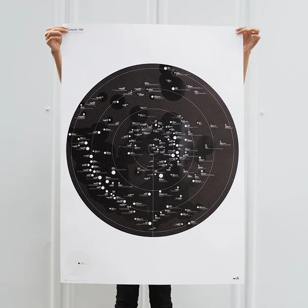
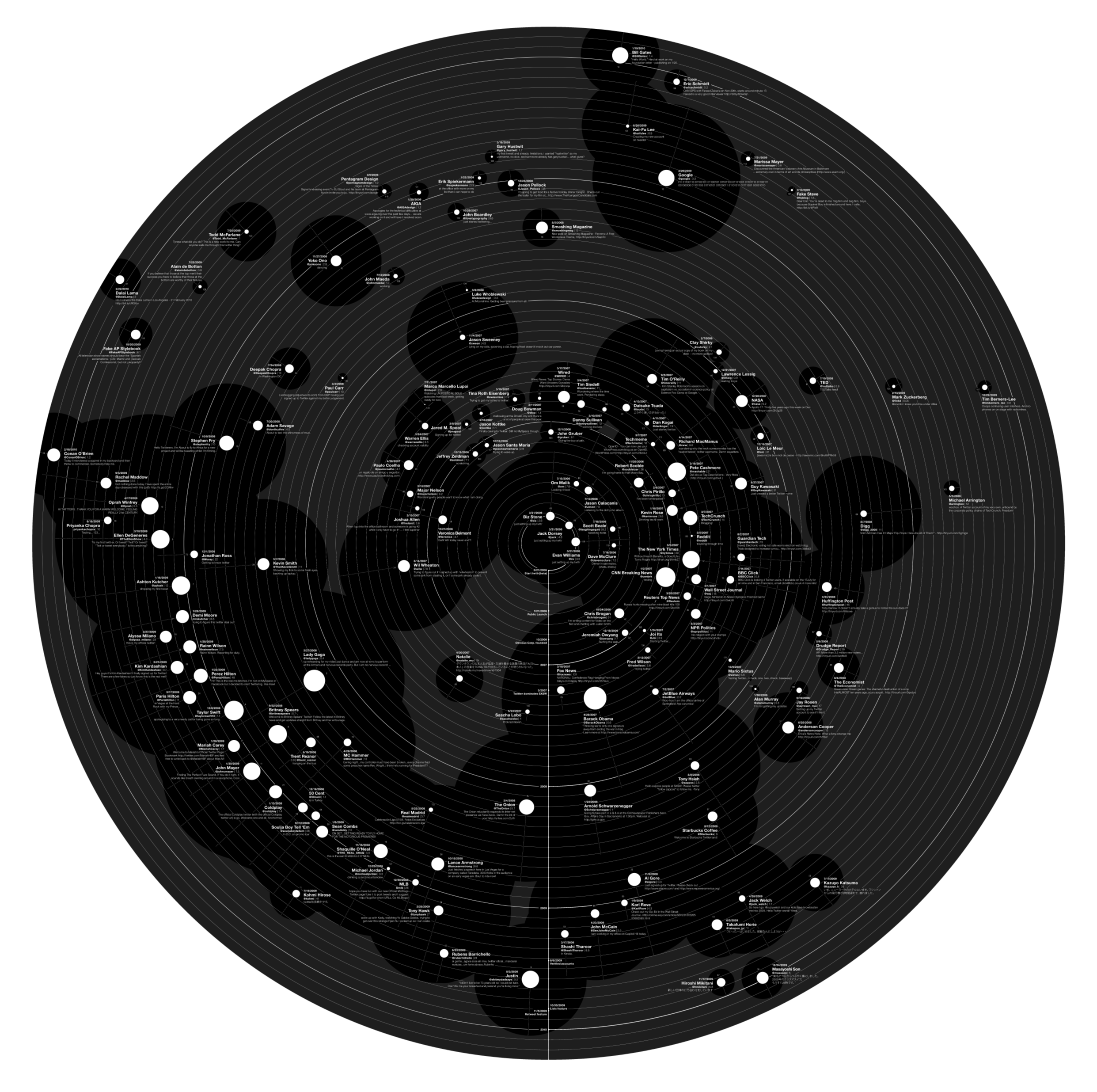
Our latest Web Trend Map tells the story of Twitter and its 140 most influential Twitter users. It took quite some time until we had it in the shape we envisioned, and we didn’t expect it to be as popular as Web Trend Map 4.
We were wrong: The Guardian, Mashable, Swissmiss, Zeldman, Flowing Data, Fontblog, El Mundo, Huffington Post, Newsweek, Fast Company, ReadWriteWeb, Laughing Squid, Gizmodo, the BBC, and The New York Times are on the case.
Just like the previous Web Trend Map, it is an A0 poster on super high quality paper, black and white with a high fidelity PP varnish.
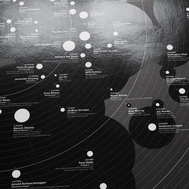
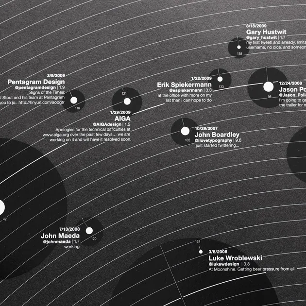
It features the most influential Twitterers in each category, shows when they joined, what they first said, how many followers they have, and how many times they tweet per day. All sizes are relational—the size of the big black circle represents the total number of Twitter users, and every other circle is a direct representation of the relative number of users. For instance, you can see that the followers of Barrack Obama indeed cover a big chunk of the total users on Twitter.


We printed 1,000 copies on thick, high quality paper by the best printer we could find in Japan. On the surface it’s more artsy than geeky, and looks like something straight out of the MoMA. But if you dive into it, you’ll find lots and lots of interesting data inside.
Where does the data come from?
We analyzed the data in our Web Trend Engine (30GB), got a sneak peek into the top 100 list from the Max Planck Institute Twitter research team, we talked to Twitter directly, and we asked our audience to make sure that we get international tweeters in there as well.
I’d like to thank the Twitter team for providing so much buried data, Takeshi and Johan for outdoing themselves, Craig Mod for his eagle-eyed support, Pedro Cascao for the video magic, and the numerous volunteers that contributed to the first feedback round.


