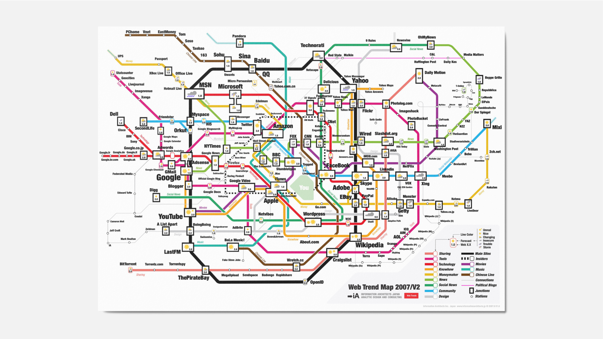
We have done it before: the 200 most successful websites pinned down on the Tokyo Metro Map, ordered by category, proximity, success, popularity, and perspective. Now we have done it again—and better. Back by popular demand: here is iA’s next Web Trend Map:

Download It! We figured that this would make a nice desktop background image as well. So here are some wallpapers to download and replace that ugly Windows Vista crap or the boring blue Apple background image. We’ve also included a big A3 version and an OSX screensaver.
What’s New?
First of all, the new Trend Map features many more websites than the previous one. While the focus is still on English language sites (because that’s where it’s at), we have added some Japanese ones (a mystery to most of you gaijin), some German ones (yeah, there are some popular ones) and a Chinese line (the second Internet).
More Consistency: The different trend lines have been renamed, simplified and cleaned up. Now, if you follow the Technology line—you will find tech sites; if you follow the News line—you will find news sites.

More Lines: The original raster (Tokyo metro map) has been substantially modified to fit the needs of an Internet Trend Map.
Less Japanese Jokes: There are less insider jokes about the different stations and more consistency between the connections and the neighborhoods of the different sites. Still, people who know Tokyo will find lots of little hints and sarcastic comments hidden in there.
- Google has moved from Shibuya, a humming place for young people, to Shinjuku, a suspicious, messy, Yakuza-controlled, but still pretty cool place to hang out (cf. Golden Gai).
- YouTube has conquered Shibuya.
- Microsoft has moved to Ikebukuro, if you know what I mean.
- Yahoo is in Ueno—a nice place, but nothing going on there.
- Wikipedia is now in Shimbashi, the place for square and hard-headed salarymen—a bit like the Wikipedia watchdogs.
- The Chinese line runs parallel to the “Sharing line”, which starts with the main pirates…
- Paper info designer Edward Tufte is directly below the Federated Media, right before joining with the interactive information design circle at a 90 degree angle.
- “You” are in the Emperor’s palace, at the center of the network.

Revealing Coincidences
- The main Japanese sites are all on the Money line. I never noticed before, but most big Japanese sites are financially successful.
- The northern part of the Main Sites line (the Yamanote line) is a boring, unknown territory (just like in the real Tokyo).
- Ze Frank ended up close to the German carousel.
- iA ended up close to the pirates.
- Adobe moved from Ginza (high class) to Tokyo station (anonymous, lots of money there), alluding to the fact that they continue to move towards the center of gravity without being too loud about it.
- Skype has conquered a place that doesn’t exist.
Insiders Circle and Your Palace: There is a new Insiders circle, with the tech trend scouts, the tech bloggers… and You, occupying the Emperor’s palace.
Trend Forecast: Of course, you will notice that we added a weather forecast. This is our six month prognosis for each candidate (no big surprises there).
Web 0.5, 1.0, 1.5, 2.0, 2.5? Last but not least, we have added a Web Generation number (Is it Web 1.0 or Web 2.0? Is it corn or is it a nut?). I don’t want to spoil all of the little things in there, but please note that there are some websites that are Web 1.5, some that are 2.5, and some that are 0.5. This is not a mistake. Web 2.5 is what Facebook is up to… Web 0.5 is what Jakob Nielsen is still doing.
The Generation number is not necessarily qualifying, but it’s not surprising that websites that do well are usually above 1.0; some of them (like eBay and Wikipedia) were 2.0 long before the term was coined.
More Mistakes: Of course, there are some totally absurd and meaningless coincidences, due to the complexity of the map. There might also be some misspellings and, here and there, you may discover something totally obsolete. Please feel free to comment on these goofs. Also, if you feel that we forgot a (your) major site, put a wrong weather forecast or got the Web Generation number wrong, please tell us.
Less Logos: You might have noticed that we had to take off the inverted Tokyo Metro logo, featured in an early version of the first Trend Map. This is because they asked us to. We respect the decision of the Tokyo Metro Corporation, but we still believe that it wasn’t a smart move for them.
The map has been downloaded 10,000 times and has been featured in traditional and online media all around the world. For a couple of weeks, it was one of the cooler tech advertising spots on the net.
Sponsor It!
We are now offering the free space in the lower left corner to sponsors. If you have a company and you want to be featured as a sponsor, feel free to contact us. There are ten spaces available, for US$2,000 each. You can also buy the whole adspace for yourself.
Your sponsorship will be featured in all versions of the map over the next 6 months: 1. Desktop background images. 2. Printable A3-size PDF. 3. Clickable webpage. 4. A big poster that will follow as soon as we have the sponsors. 5. A simple screen saver.

Who gets the space? Basically, it is first come, first served, but the sponsor that wants to buy the whole adspace at once will be able to outbid the small sponsors.
How to Use It
First of all, it’s fun to look at. If you’re a geek like us, you might just want to download the A3 PDF, print it out and hang it on the wall. Then you can stare at it all day long.
We use the Trend Map as an in-house consulting tool. It has helped us explore, define and explain the Internet strategy and positioning of all of our clients since we first introduced it in January. Each website on the map stands as a (more or less) successful paradigm for an interactive brand, design or business model. In order to position yourself, you need to know your place on this map.
- Find the possible existing candidates that serve as a paradigm for your client’s redesign, repositioning or strategy change.
- Evaluate each candidate according to technical, brand and business affinity (good: green, average: yellow, bad: red).
- Explain your evaluation and let your client choose which design, strategy and business paradigm he wants to follow.

And Then?
This week, we’ll straighten out a couple of small mistakes. As soon as we get some sponsors, we’ll print a couple of posters. In the next big release (December), we are planning to add more international sites. We are currently working on the Japanese, French, Portuguese, Spanish, Swiss and German lines.
UPDATE: Microsoft was interested in the sponsorship, but in the end it was probably too long a long shot, what with the prognosis we gave them.
UPDATE2: The web is going crazy for our map: Wired, Techcrunch, Mashable, Valleywag, Boingboing… They all love it. We hit 100k page views with the Trend Map today.
