Over the last two months we have been working on several iPad projects: two news applications, a social network, and a word processor. We worked on iPad projects without ever having touched an iPad. One client asked us to “start working on that tablet thing” before we even knew whether the iPad was real. The question Are we designing desktop apps, web sites, or something else entirely? has been torturing us until that express package from New York finally arrived. Here’s a quick writeup of design insights before and after the appearance of the iPad at our office.
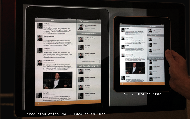
Even though we developed everything inside the black box of Photoshop, it became quite clear that iPad app design is substantially different from web design in many ways. The most obvious challenge was being forced to design for iPad pixels using iMac pixels. The resolution gap between a 24 inch iMac and an iPad added a massive uncertainty factor:
1. Typography: Is it nice to read?
The obvious issue with the resolution gap is typography. Type that looks fine on an iMac screen might break on iPad. In order to answer the questions…
- Is the font big enough?
- Is it too big?
- Does it render well?
- Is the schriftbild (text impression) inviting or not?
- How does it feel to read?
…we had no choice but to print out 1:1 scale mockups. We printed out hundreds of these designs to get a feeling for the new canvas and the dense resolution. Of course, we were still unsure about the usefulness of our work, since printed pixels are not the same as backlit pixels.
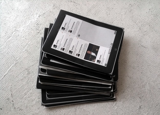
Reality check: Wow, this thing is sharp!
After two months of printing, we did get the typography pretty much right, but there was another surprise waiting for us: The sharpness. With its high contrast and backlight, the iPad is a miracle picture book or photo frame, but designing long text passages for good readability is tough. If executed carefully, text on an iPad can come close to printed text, but it needs a lot of care and specific screen typographic know-how.
Web body text sizes (e.g. 16px) feel too small on iPad, while bigger sizes clash with the canvas dimensions. This leads to all sorts of grid restrictions.
The iPad’s resolution is higher than a regular LCD but lower than an iPhone, which gives pixels an unusual “in between” feel. Paradoxically this can make type feel more pixelated than on a regular computer screen, which is usually farther away from the eye and less contrast-intense. (At first I thought it’s the sub-pixel anti-aliasing that becomes more apparent—there is a blue and orange glow around black-on-white type—but at the time of writing iPhone and iPad don’t have sub pixel anti-aliasing. So contrary to my initial assumption, the lack of sub-pixel anti-aliasing might be another reason why text doesn’t look as smooth as expected.)
But make no mistake: It’s generally far more pleasant to read on an iPad than on a regular screen. And yes, this thing is fast. So while it still doesn’t replace printed matter, it is a hell of a competitor to the laptop for reading digital text.
Backgrounds and the delicate sound of noise
Our first measure was to re-examine the relationship between text and background. While black text on a white background is even worse than on a regular screen, decently colored text-to-background combinations (like a sepia background with a dark umbra font, or a light blue-gray on dark blue) worked quite well. Another way to get around the hard contrast is using subtle patterns for backgrounds. Once a big no-no among graphic designers, noise backgrounds started to establish themselves as a new design trend even before the iPad, as screen resolutions and contrast increased (for example Dribbble).

2. UX & Skeumorphism: What about that phony 3D stuff?
Studying Apple’s Human Interface Guidelines in February, we understood this much: If web design is Lego, iPad design must be Duplo. And in testing the guidelines on the iPad, most of them proved to be correct. For instance:
- Make it work seamlessly in landscape and portrait mode
- Minimize full frame swipes, stay within the same frame as much as possible
- Try to reduce navigation to a left sidebar in landscape mode and a popover in portrait mode
Dubious UI guideline principles
Now one thing just didn’t click: the guideline to make apps look like physical objects. It’s quite clear why Apple would try to push designs to imitate tangible things:
- It’s a touch interface: 3D objects look more tangible and inviting
- Everyday interfaces are easy to understand and familiar in their use
- Glitzy interfaces are easier to market
But… Let’s put it this way: you might remember the ultimate standard bearer of such “easy to market” interface design: Kai’s PhotoSoap. It was as tacky as it was popular. A huge hit on main street, a nightmare on designer’s lane, and to the disparaging a one-way street leading through OS X Aqua to that tacky iPad Calendar app.
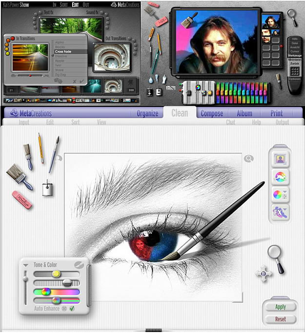
Everybody in the iA team strongly doubted the validity of that particular guideline, but we had no way to verify or falsify our doubts. So we went full steam ahead: Everything 3D! Make a newspaper look like a newspaper! Make that word processor look like a type writer! Use wooden backgrounds! And why? Because Apple said so.
Like I mentioned above: We had no way to check our designs except by printing them out to scale. Now, as you can imagine, digital products imitating physical objects printed on paper… It just didn’t look right. Well, maybe we just need to see it on the device, we thought.
We couldn’t help it: the longer we worked on our designs, the more we moved away from the fake 3D effects. However, we found that 3D effects and material surfaces do work if used sparingly—as an invitation to touch, not as a basic metaphor. In other words: Avoid the fake wood backgrounds, or creating a clickable living room (cough, Yahoo!). Be tasteful. Be delicate.
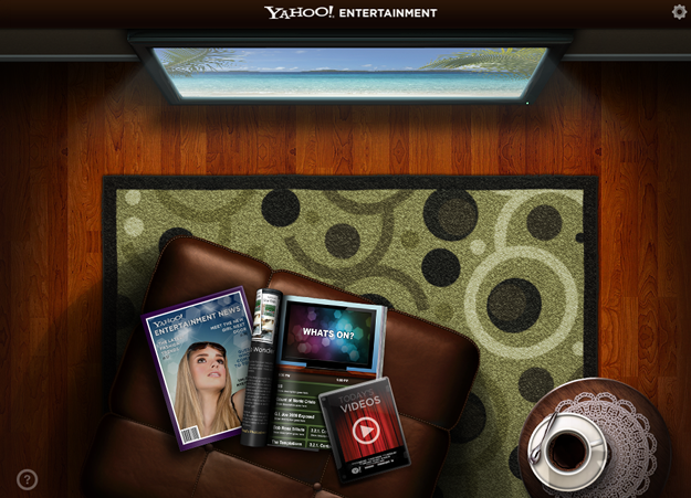
Reality check: Does kitsch work?
The amount of special effects an interface can hold is also a matter of taste. Old screen designers like me have their biases of how interfaces are supposed to look.
So what happened to our elitist 3D resistance after the iPad reality check? Looking at different iPad apps that strongly push material surfaces and special effects, such as Calendar, Notes, and Pages, only confirmed that we were right to be hesitant.

Pushing leather buttons in the Calendar app feels very much like real leather buttons would feel: tacky.

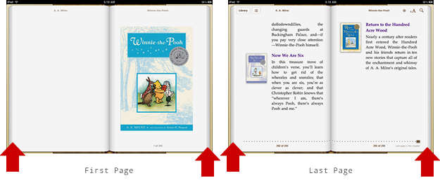
Having the same thick stacks of pages left and right in your e-reader application on the first and the last page feels wrong, and it is wrong. It’s kitsch, as is using unhyphenated justified text in narrow columns, inviting text holes and rivers.
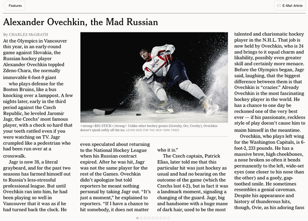
Aping a printed newspaper by using three-column layouts on horizontally scrolling nine page articles reads less easily, and is harder to handle than a vertical column. That the New York Times goes down that path, doesn’t make it right.
Using ragged text in super-narrow columns like the over-designed and overpriced Wall Street Journal app is also typographic kitsch.

Leather buttons, stitches, torn paper edges, multi-screen multi-column pseudo-newspaper layouts… on the screen it is just kitsch. It tries to be something that it is not—and miserably fails at the attempt. E-books don’t wear down on screen. There are no leather buttons in the real world. Meaningless stitches in the UI distract the eye from the information.
So what about special effects and metaphors in user interface design? Use special effects, but use them sparingly.
Using metaphors
The same rule applies to visual metaphors: Just as with any literary metaphor, a visual metaphor hurts if it doesn’t clarify; it breaks if you stretch it; it quickly becomes ludicrous if you combine it with a second or third metaphor.
Avoid metaphors that do not clarify. If a metaphor darkens the meaning of what you are trying to express, cut it.
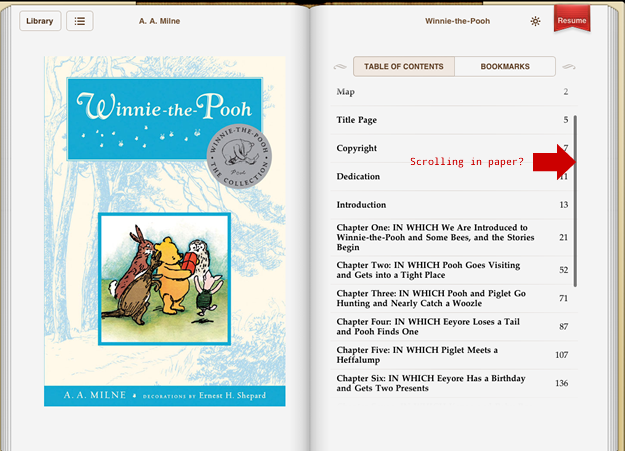
If you display stacks of pages in your e-reader, engineer the stacks to show where in the book you are. Give them a function. If you use the page metaphor, don’t use scrolling inside the page since it clashes with the basic mental model of a sheet of paper.
Written metaphors often feel good to their authors, and since we know how hard it is to coin a strong, consistent metaphor, we are generally forgiving of weak ones. In UI design, however, we are less tolerant.
UI metaphors have more impact in the overall texture: While a weak text metaphor can be over-read, we have to deal with weak UI metaphors again and again—and weak UI elements get on our nerves quickly. They are bad jokes.
For example: Using a book shelf for choosing a book is a consistent metaphor, but does it help you understand the interface? Does it help in any way? Do you still like the hard-to-scan bookshelf after looking at it for the 200th time? What if you have 200 books?

Note that using quirky metaphors and plastering your app with special effects will not kill your app sales. Unfortunately the audience for kitsch is bigger than one for elitist UI design. Just be aware that kitsch design is for the moment: phony products don’t have a long lifespan.
3. Interaction design: So what works?
The iPad is a stunning device to consume photos, comics, children’s books, games, videos, and (well-proportioned) text, and it also seems to work surprisingly well as a writing device—if you’re not a touch typer. And while it looks like Duplo, it also feels a lot like a kid’s toy, which is the perfect condition for good user interface design:
- The limited screen real estate, and the limited “credit” on physical actions needed to complete one task (don’t make me swipe and touch too often), pushes designers to create a dead simple information architecture, and finesse the interaction design patterns to use a minimal number of actions. This goes hand in hand with the fundamental law of user interaction design: Minimize input, maximize output.
- Since the smallest touch point for each operation is a circle the size of an adult index finger tip, we cannot cram thousands of features (or ads!) in the tight frame; we have to focus on the essential elements. Don’t waste screen real estate and user attention on secondary functions.
- We found that the iPad applications we designed were relatively easy to translate back into websites. The iPad could prove to be a wonderful blueprint to design web sites and applications with. If it works on the iPad, with a few tweaks it will work on a laptop.
I spy with my little eye… something that is black
The iPad looks and feels like a massive photo frame with a far more defined canvas than a website—and to a certain degree, that’s how you should design for it. But don’t get too high on the fixed screen size: don’t paint for the canvas. The iPad scrolls smoother than any computer out there: There is no need to replace scrolling with a monotonous swiping marathon. Even on the iPad it’s still easier to scroll than to swipe. So go for the easier option if you can. Don’t copy column design or the swiping fest of the New York Times article page:
On a computer we have to take into account that the user physically operates between keyboard and mouse, while visually he moves between monitor, OS, app window, and the inner visual order of the window. On the iPad, eye and hand movement are brought together and held captive within a massive black frame.
Overall orientation
Websites are volatile objects. They’re (hyper)linked with billions of other sites. They work deep within a complex functional set of frames: Computer > Monitor > OS > Browser. Websites seem to have infinite depth and complexity. On the other side, iPad apps have a much simpler functional framing that suggests a more finite, closed information architecture. Still, most iPad applications so far seem to fail to provide a clear overall orientation and mental model.
The passive (or as Apple calls it: “lean back”) tablet format suggests creating limited information architecture with linear use modes. In comparison to a website, an iPad app is like a closed egg.
And this is one of the main challenges iPad app design poses to interaction designers. How do you make navigating on iPad as easy as breaking an egg? And in particular, how do you measure information on a device without static scrollbar?
In order to make the user feel in control of an iPad app you either need a strong, simple, structured content model that is consistent with the mental model of most users (like the brilliant Marvel app), or you need to re-invent the way information is measured and orientation is given.
Average Reading Time
Working on our word processor we have been experimenting with zooming, using the page stack metaphor, and scrolling to give the user orientation of where in the text they currently are. We also tried to combine both. Of course, we experimented with progress bars and… I think we have a better solution than all of them: Using time as a measure. We call it Reading Time.
Imagine, when you read a book, it doesn’t show you how many pages are left or how many words you have read, but how far into the text you are time-wise and how long it will take you to finish. Imagine when writing a text seeing:
- How long it would take to read your text until the caret (top number)
- The total reading time of your text (bottom number)

Instead of trying to figure out what that scrollbar, page number, or Street Fighter power bar actually mean, you just look at the time read and time remaining, and you know where you are.
To find your average reading time all you need is calibration. Take a two minute reading test and you’re set. Want to see more? You’ll have to wait a little. We will present our Writing Machine at Typo Berlin 2010 next May. So:
Stay tuned
I cannot emphasize enough how radically different the framing that iPad interfaces are embedded in is. The iPad brings hands and eyes back together. There is more to say, but for a first impression this is long enough.
