Apple has unveiled a bold new design language for all its operating systems. It’s still too early to say how good or bad it is, but we can outline the challenges.
It looks fresh, dynamic, and (very) on-brand. The fact that iOS, iPadOS, macOS, tvOS, and watchOS now all follow the same UI patterns is good news, and we can only imagine how hard it was to coordinate and push through in a huge organization like Apple.
First Impressions
As expected, Apple’s announcement triggered the usual flood of sarcasm and glee online. Of course, it’s not all bad. Some of the world’s best designers worked on this… and designers, being human, make mistakes.
The backlash after Apple launches something new has become tradition. It’s as loud as it is predictable, and the insight you get from first reactions on Social Media is as meaningful as any carnival music.
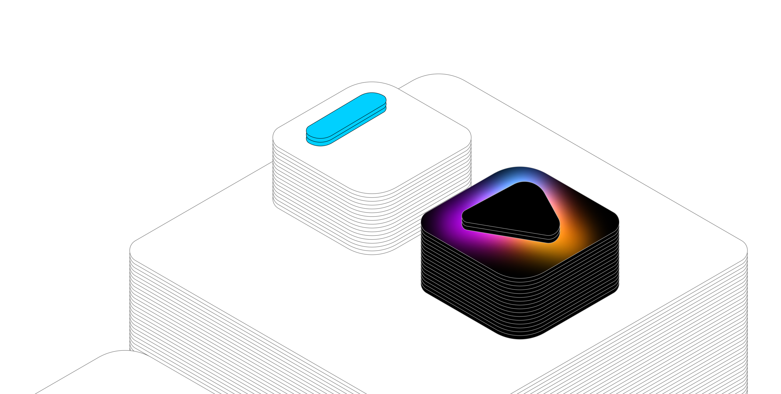
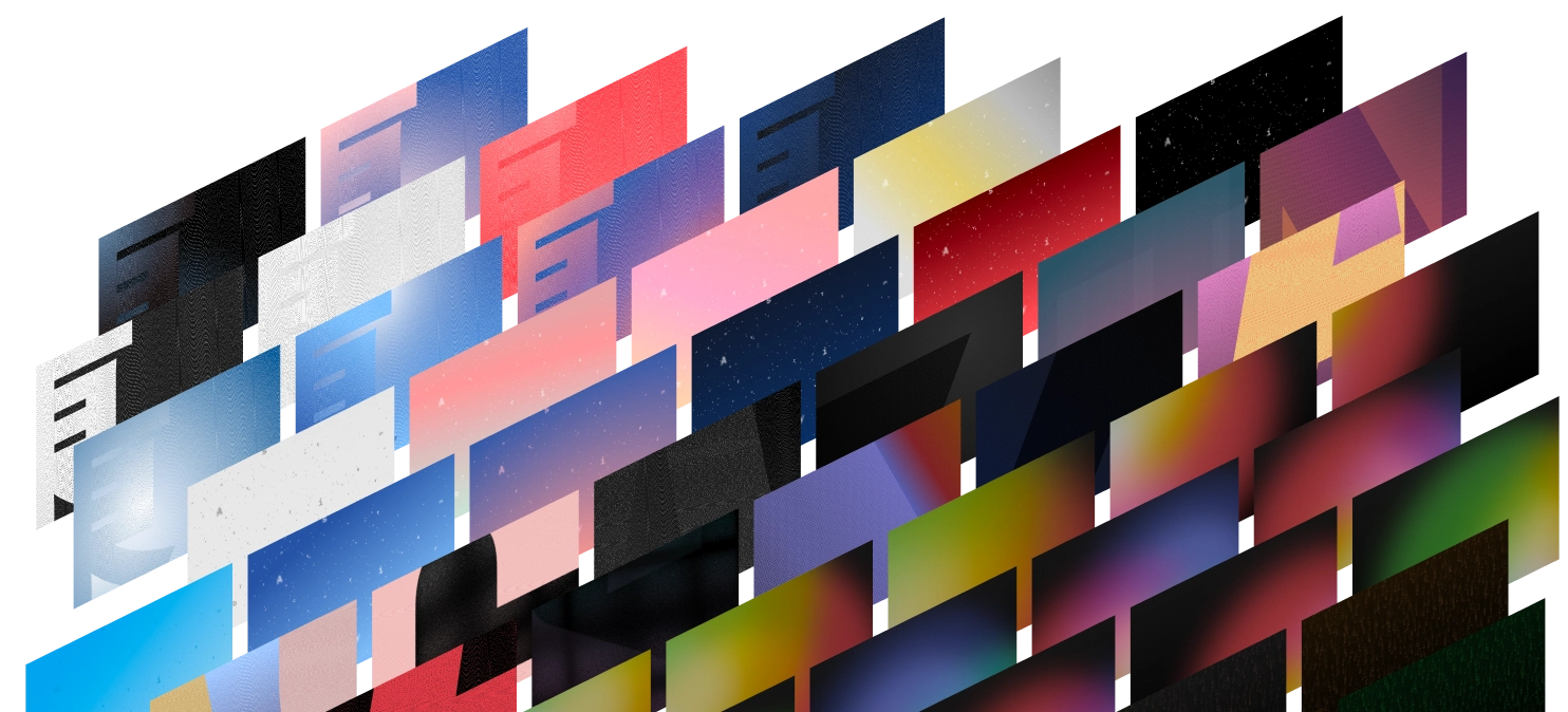
Let’s be honest: Liquid Glass isn’t a great name. But the concept is bold, the animations feel fresh, and apps still using the previous look already seem a step behind.
More importantly, this shift isn’t just cosmetic. It’s the first time Apple has introduced a truly unified design across all platforms. UI elements render live and morph with context. That’s not just aesthetic polish. It’s systemic change.
The Metaphor
As a metaphor, glass is consistent and logical on iPhone, a device made of glass with limited surface area. No matter the model, space is always tight.
Glass works similarly on iPad, where the interface is also defined by touching a glass screen. But it’s arguably less necessary here, since the iPad has, broadly speaking, enough space for simultaneous UI.
Remember Aqua, Apple’s major OS redesign from 25 years ago? Aqua means “water,” which acts like a form of “liquid glass.” So while there are roots going back decades, which is nice, that history makes Liquid Glass feel less fresh and a little less convincing on macOS, which otherwise has just become a lot rounder.
Where Liquid Glass Works… and Where It Doesn’t
Looking at Liquid Glass on macOS raises the question of whether transparency should be limited to contexts where it clearly improves the experience. Liquid Glass seems helpful on smaller devices. On iPad and macOS, it may make sense in situations where:
- There is limited space or UI elements get in the way
- Controls appear on time-limited UI elements where readability isn’t a concern, like media player controls
- Transparency improves clarity; like play buttons on videos, contextual menus on photos, or secondary text
Moving forward, Apple might consider keeping the full-on glass effect time-limited. Visual effects have the most impact when used sparingly. Think of the spectacular Siri wave or Apple Intelligence animations. They surprise and delight precisely because they appear and vanish.
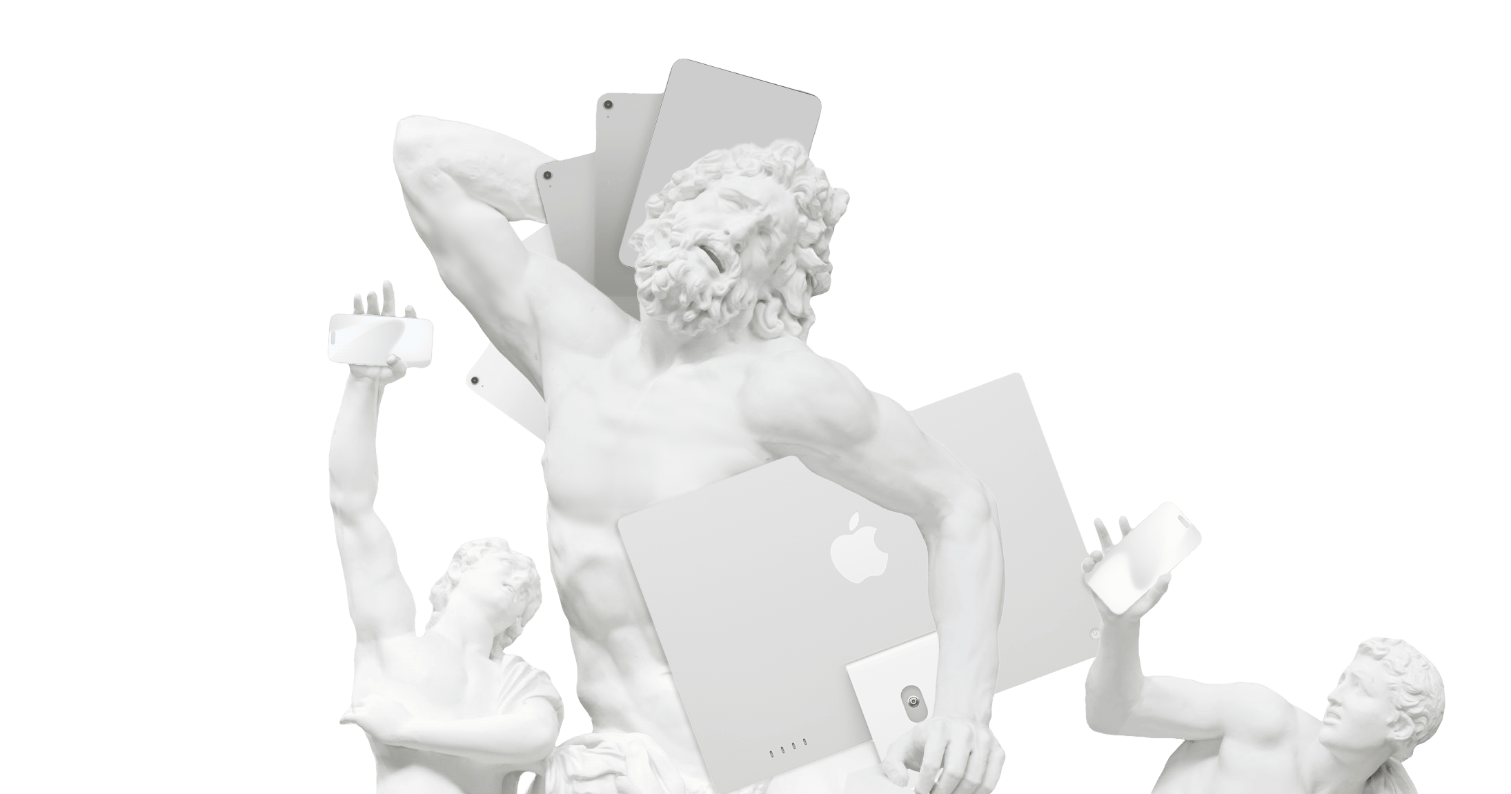
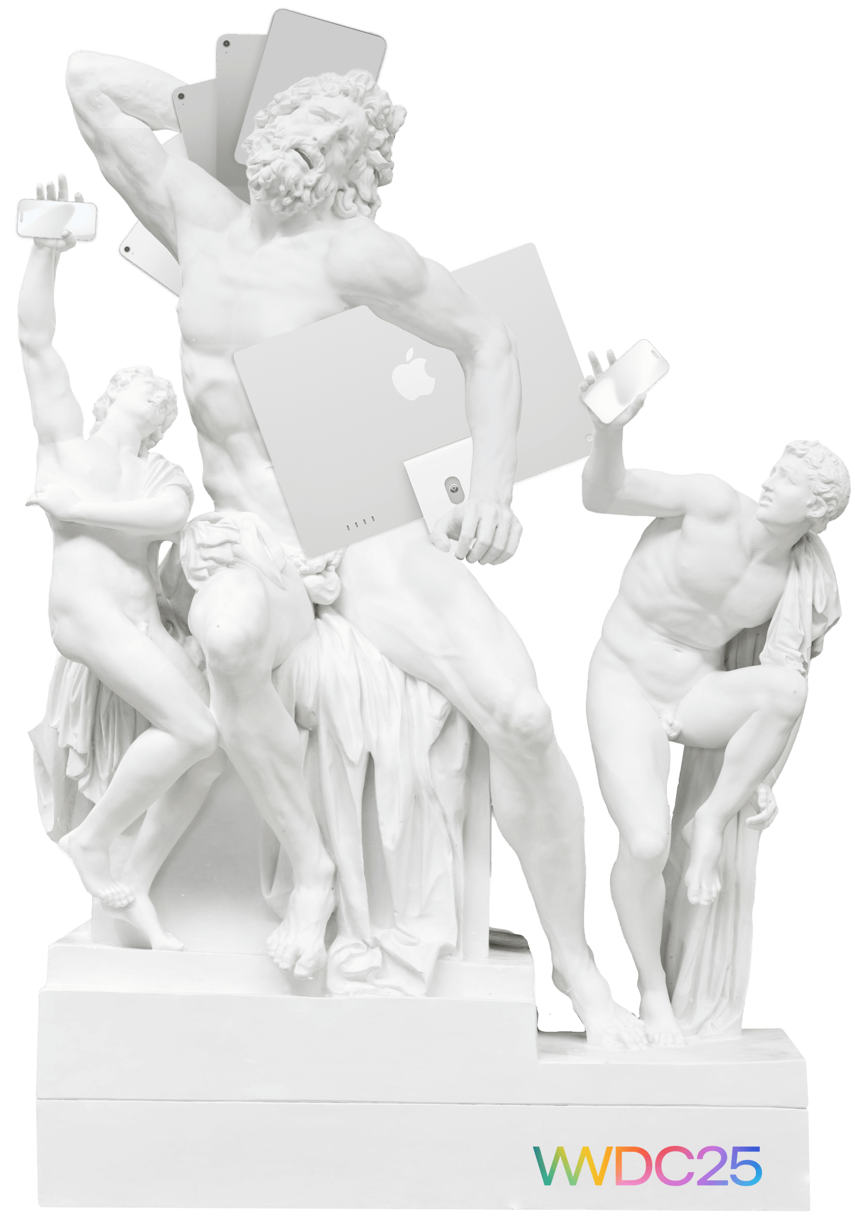
The Laocoön-effect
Liquid Glass may suffer from a Laocoön effect:1 According to Lessing, dynamic action forced into a static medium distorts or diminishes the intended expression. Glass is a static material, and animating glass is inaccurate.
But it looks great…like the Siri wave or Apple Intelligence effects. What’s not to like? Mind you, good design is not primarily about aesthetics. The question is whether Liquid Glass works.
Readability is a concern. So is energy consumption. And visually, the overall look feels blurred. Some quick app icon renders appear smudged: a surprising waste on such a crisp screen. Maybe it just takes some getting used to, but the icons are neither circles nor squares, which gives them an odd, undecided feel.
In fact, the first iteration didn’t work too well. Too much effect, not enough function. So they toned it down. Does it work now? Or is it still trying to be something it’s not?2
“Desire lacking ability turns to Kitsch.” —Jan Tschichold3
So this is the ultimate dare for a company known for world-class design. Liquid Glass: does it work, or is it kitsch?
Potential
Glass as an Extension of the Device
Using glass as an extension of the screen makes sense. It might be more convincing if glass elements didn’t float independently below the surface, made of glass. But they worked with the surface. If the glass we interact with was working with the glass we touch. Like the fake click effect, some UI elements could be rendered to feel like a dynamic indentation on the surface you touch.
Imagine a form field that looks and feels like your phone’s screen has a real indent. If the glass effect is tied directly to the surface interaction, the animation would feel consistent… and the Laocoön-effect wouldn’t be a concern.
Design or Kitsch?
So, is it design or kitsch? The first beta leaned toward the kitschy side. It didn’t quite work. Right now, it’s somewhere in between, but heading in the right direction. The better it works, the less it’s just effect, the more it becomes design.
We’re excited about the unified design, optimistic that Apple will fix any technical issues, and eager to update our apps to work with the new OSes. But we will take our time. It requires much more than just reskinning our apps. The keyboard extension, for example, need some deep rethinking. And… we’re working on other things right now that we need to finish first.
-
In Laokoon (1766), Gotthold Ephraim Lessing argued that dynamic actions, when forced into static media like sculpture, lose their natural expression and become distorted. Animating an inherently static material like glass risks creating aesthetic dissonance. ↩
-
If you drain the battery for visual effects, you may win new buyers but lose happy customers. And no matter the aesthetics, consistency, metaphor, courage, or design philosophy. It’s not good design if it kills battery life. Especially on mobile. ↩
-
“Was einer möchte und nicht kann, wird Kitsch.” ↩