Since I’ve started developing websites I’ve been looking for the ideal layout. Today I got another hint on the direction to take. Jacob Nielsen calls it the “F-Pattern”.
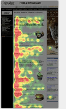
In a recent interview with ZDnet, Usability guru Jacob Nielsen revealed his latest insights he got from extensive eye tracking tests. He says that the users follow an F-pattern, when scanning a page.
They don’t look in on, across the lines of a page, and often fixate on something, such as the first few words of a headline, for only a tenth of second. The right-hand side is often never in view of the eyes. People look down the pages in an ‘F’ pattern [see example on the left], with a few stripes at top—the first one longer than the second—and then down the long vertical stripe to see if is any else. Sometime the track turns into an ‘E’ pattern but it’s usually an F.
The F-Pattern describes the visual path a user’s eyes describe when scanning a page. The study revealed other interesting facts:
Pictures, images and moving objects tend to be more of an obstacle course for the eye, Nielson said. “It’s a bit of strange finding, but it’s consistent across Web sites. They tend to have a goal of distracting the user,” he said.
This is not real news to the experienced webdesigner, but it adds up to the inventory of arguments when defending cold designs against hot ones. The internet is—against common belief—an information and not an entertainment provider. Jacob Nielsen’s research underlines once more that webdesign radically breaks with the common understanding of graphic design. While in classic paper design, the use of merely aesthetic elements adds value to the designed object, webdesign is more a form of product design, where functional reduction leads indirectly to an overall aesthetic appeal.
Well, if that were true, one might object, why does Jacob Nielsen’s website look so poor? The answer is obvious: Even though on the level of information design Jacob Nielsen’s website is pretty solid, it still lacks that aesthetic appeal, because it does not take the necessary second step. Information design as such leads to aesthetics, but an aesthetic eye is needed to reveal the underlying beauty of a solid structure.
