You’ve waited patiently for it, and now it is here. Version 1.2 of iA Writer for Windows has launched. This release packs in a boatload of improvements, making it the biggest update to hit the platform since the initial release.
New Preview Engine, Unified Templates
You sent us a lot of requests to improve Preview, Templates, and Export. Most issues you encountered had to do with the unfortunate requirement to support old versions of Windows. iA Writer for Windows had to use IE9 as the web rendering engine—not the greatest of all browsers. Templates that were worked on, painstakingly, didn’t give you the results seen on Mac and iOS. So we went full speed ahead with a modern browser engine — Chromium.
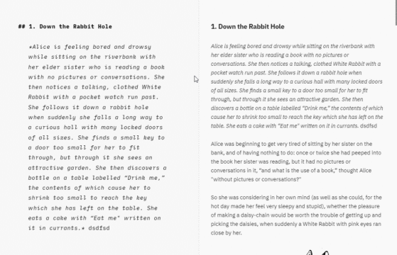
Your HTML-Preview is now combined in the same window as the Editor, just like on Mac. It renders the templates beautifully, just like on Mac. All templates use a standard format, you guessed it… just like on Mac.
The export of PDFs takes advantage of this modern rendering and now supports headers, footers, page size and other properties that can be configured within the standard iA templates.
WHOA: Paginated PDF Preview!
A brand new paginated PDF Preview option makes its debut in version 1.2. Flick a switch in the menu bar and you’ll see a PDF of your current document rendered right in the Preview area. This lets you see exactly where page breaks will occur before printing or exporting to a PDF file! PDF Preview had an eye-opening effect on us and the tester group: “I understand the benefit of Markdown much better now that I see that markdown allows me to edit the source while the final printed result id displayed on the right.” It is likely coming very very soon to iOS and macOS.
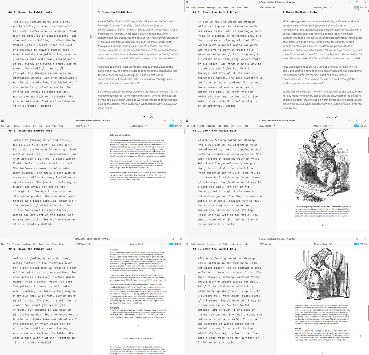
PDF preview consumes a lot of resources, so please be patient with it, especially if you use it with very large documents. You’ll love the big strides made in Preview here. Now, bear with us; it gets even better. Version 1.2 is packed with quality of life improvements in every area of the app:
New Typography Options
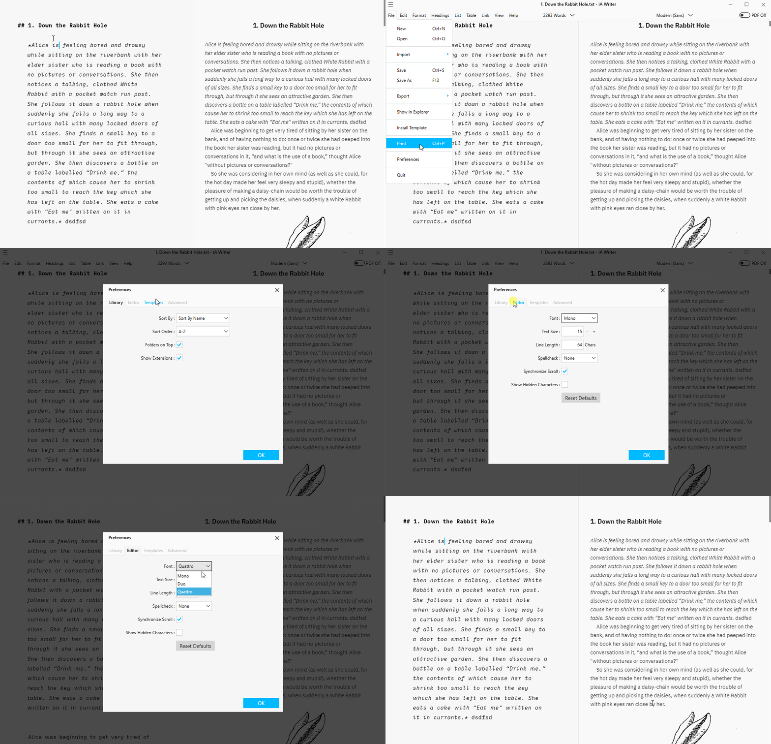
You now have Mono and Quattro available as font choices in the Editor in addition to the current Duospace. Since Mono was added, tables always use it in the Editor so they stay nicely aligned. Btw, did you know that on Windows you can auto-align tables?
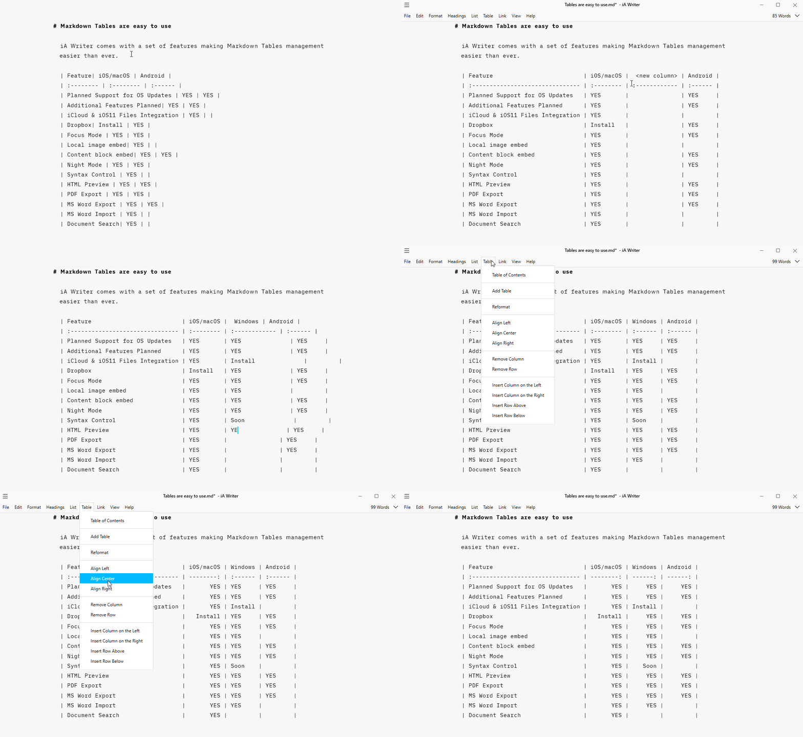
You didn’t know that? There are more Jedi tricks hidden under iA Writer’s hood. We should inform you better and we will.
New Preferences Panel
Again mirroring the experience on Mac, iA Writer for Windows now includes a Preferences panel. While many of these options were pulled from menus and assembled in one place for ease of use, there are plenty of new members. For example, we added our own version of SmartyPants in this update, so you can choose what type of quotation marks should replace straight quotes when you render text.
Devils and Details
- You get proper touch support for scrolling and selection. This can be used in the Library, Editor and Preview
- Swipe gestures are now supported to show or hide the Library and Preview
- LaTeX math expression support in Preview, PDF and Word export, using the same KaTeX implementation as Mac and iOS
- Images are now visible in the Library file list, with preview tooltips and the ability to drag and drop them in the Editor as Content Blocks
- Manual page breaks using
+++ - Hashtag syntax highlighting and the option to hide these in Preview
- and more and more and more…
You get the picture. It is a big, big update and you’ll want to install it. If you already have iA Writer for Windows you can just relaunch the app and it will inform you the update is available and it will guide you through the install. If you don’t have iA Writer for Windows already, what are you waiting for? You can get the free trial which includes all the new features from 1.2 right here.
Hey! What about feature parity?
Of course, we’d like to give the best to every platform and we are constantly considering the effort of aligning them as close as possible. And if we had 100 employees and 100 Million Dollars to spend, we’d be 100% feature par. But we are not Microsoft, we are not Apple, we are not Amazon and we are not Google. But we believe that being on all major platforms is key for a text editor and we are giving all we can to make you happy.
What we are, is independent, small and hungry, and we are eager to explore the boundaries of text editing. We are a curiosity-driven operation. Feature parity is on our horizon, but we want to drive our products forward with the resources we have, push the envelope where we can, and learn along the way. What’s the problem with feature parity?
Different platforms support different features, and rather than being on par everywhere and cutting back features everywhere, we explore new options on different platforms. Those who work, we port to other platforms. Sometimes, the tiniest (and often essential) feature requires weeks of work on a different platform. Until recently, it was practically impossible to have a custom line-height on Android without rewriting core elements of Android (now it’s finally possible, so the next big update will have a decent line-height). The new Android version is coming as well, very soon. Android comes with much less power under the hood than Mac, iOS, and Windows, so feature parity is way harder to achieve. But we do what we can to make all of you happy.
Currently, Windows has Text Folding, Menu Outline, PDF Preview, Table Alignment, but no Syntax Highlight. Mac and iOS have Syntax Highlight, but no Folding, Menu Outline, and PDF Preview. We have been working on Syntax Highlight for Windows. But unlike on macOS and iOS, where it comes with the Operating System, on Windows, it requires some heavy AI lifting. Same for Spelling and Grammar (it doesn’t come bundled with the OS on Windows).
From the feedback we have gotten from testers, we already know that you want PDF Preview for Mac and iOS. We’re working on it. Menu Outline on Mac and iOS is planned as well. This will take a bit longer, but it is coming. We are 9 years in, now and it still feels like we are just about to get started.
