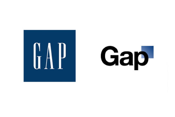
There has been speculation about whether the Gap redesign was a super-dynamic marketing stunt, or just mere tomfoolery. If you know how plump most big corporations are, the answer to that seems pretty clear (tomfoolery). In the light of the recent run of brand redesign hullaballoos—London2012, Tropicana, IKEA, AOL, iTunes 10, MySpace, Gap—it’s worth discussing whether scandalous redesigns help brand awareness or hurt brand image.
When Deutsche Telekom introduced pink under the name “Magenta” as the new color for German telecommunication, the nation was in an uproar (the original German post office branding was yellow). People started smashing those new pink telephone booths, the top national paper “Bild” incited the anti-pink mob with big aggressive headlines. A nightmare scenario for Interbrand, the agency in charge of the redesign? Not at all!
I worked for Interbrand 10 years ago, and according to one of my former bosses, the reactions at headquarters were high fives and champagne corks popping.
There is no better introduction for a new brand than a design scandal. Everybody knows the brand from day one. A big part of the brander’s job is done. Millions in ad money for brand recognition saved. All you need to do after a scandalous brand introduction is have a terrific product, communicate well, and load up the new brand mark with good customer experience.
Mastermind or New Era?
Some might argue that Gap’s redesign scandal was masterminded by a marketing genius, or—on the contrary—that this might be the beginning of a new era, where customers not branders design the brand. Hmm…
The mastermind (conspiracy) theory is fun to think and tell, while the “new era” thesis certainly has a more inspiring appeal.
One thing is clear: today, the angry consumer is not just an irrelevant shouter in a faceless crowd that—worst case—might smash a couple of telephone booths; the consumer has a discernible public presence, and in some cases an annoyingly eloquent and loud voice. Pulling off the launch of pink phone booths would be a tougher job today.
On the other hand, I am pretty sure that experienced branders still pop the Champagne corks when a brand introduction creates a little scandal.
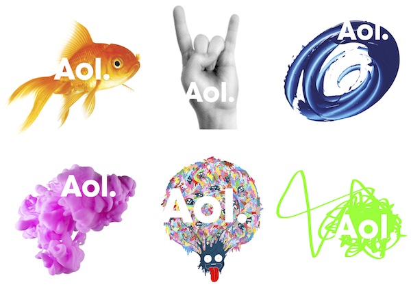
Wolff Olins has shown on several occasions (London 2012, AOL Rebranding), that an initial uproar can be used for cleverly positioning the brand. London 2012 promises to be the different Olympics, AOL’s radical rebranding now seems justified in the light of its radical change of strategy from access to content provider.
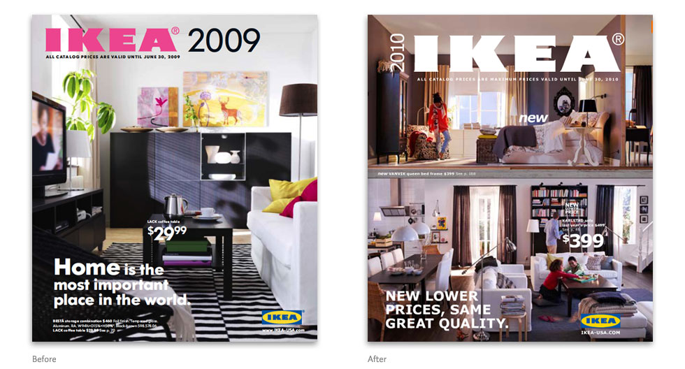
As long as the design discussion stays within the irrelevant community of cocky designers, there is no risk anyway. Who cares if IKEA changes its corporate font to a screen typeface? It’d take the most eloquent designer half an hour to explain why that’s bad to the average IKEA customer, who doesn’t even know it changed.
Controlled Demolition
But the Champagne only flows if that scandal has been foreseen and planned as a controlled demolition of the old brand. In Gap’s case, it’s more like a demolition gone wrong. The agency in charge is not an independent branding machine with experienced badass demolition specialists—it’s a small, nice agency, very close to its customer:
The new logo was designed by Trey Laird and his firm Laird and Partners, who have served as Gap’s creative directors for many years, while working closely with Gap of North America president Marka Hansen. —Gap on Disastrous New Logo: “We’re Open to Other Ideas”, Fast Company
The Gap logo story—and at this point I am merely speculating—looks more like a case of client gone wild, where the agency loses all power and has to bow to their client’s every ridiculous whim. This happens all too often when small agencies deal with big clients. As bad goes to worse, agencies that depend mostly on one client don’t even have the power to distance themselves publicly from dictated crap work…
Who Identifies with your Identity?
However calculated the previous design was, if consumers feel misrepresented by a rebranding you’re in trouble. If it’s a fashion brand (or an orange juice), you’re in deep shit. After all, Gap customers wear that mark on their bodies. They identify with it. This thing has to fit perfectly.
If a fashion brand changes its look and feel from “boring American pseudo classic” (old logo) to “cheap boring square” (new logo), it needs to prepare for the reaction of an insulted clientele. When, after a failed introduction, they hope to fix things with a crowd-sourcing campaign, all hell is bound to break loose… Wow, that was one social media marketing ninja that came up with this idea! Kaboom, baby.
Here again, many people thought it was all on purpose. But looking at how amateurishly the whole thing was handled, and how badly the people in charge communicated, I am pretty sure that this was just mere tomfoolery.
So?
So, do scandalous rebrandings help brand awareness or do they hurt brand image, or both, or what?
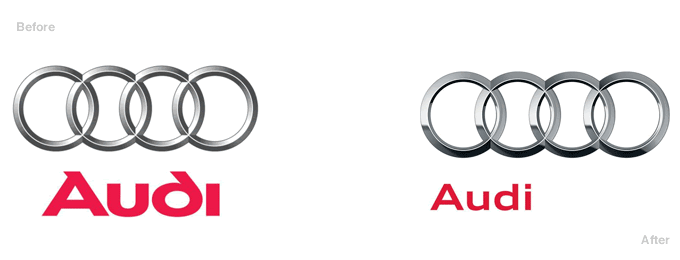
First of all a rebranding is not just something you do because the brand is old and deserves a change, or because some jerk in your organization believes that serifed fonts represent “old”. If you just want to modernize your image, take small steps that the consumer will feel but hardly notice, such as the smart work on the refreshed Audi brand.
A fundamental rebranding is a serious top-level management issue. It needs to go hand in hand with a radical reorientation of the company (cf. AOL). It also communicates to the customer that something fundamental is happening inside the company. You can’t rebrand to just look better—if you don’t change after a deep rebranding you just end up looking hysterical.
There are instances where it makes sense to rebrand radically. For example, an irreparably serious scandal (Academi, formerly Xe Services LLC, Blackwater USA, and Blackwater Worldwide). A significant strategic repositioning (AOL). Or when a company gets stuck with a negative, obsolete image, like MySpace (Hey TechCrunch! The new MySpace logo is NOT Helvetica).
Relaunch with a professional, solid identity. Communicate clearly. Making waves with a scandalous design is only a good move if you are dead sure that your plan is solid.
However you look at it, Gap’s plan was not solid. The Gap logo is a brand demolition gone wrong. If you still have doubts whether the Gap fiasco was planned or not:
- The awareness Gap gained does not even out the damage they caused to their brand: Gap now stands for a fashion house that has the design sense of a truck driver. They will try to make this incident be forgotten as quickly as possible.
- It takes a megalomanic idiot of cosmic proportions to believe that hurting the core of your brand in exchange for brand awareness is of any help.
- You can’t plan or even control reactions on the web. All you can do is cover your ass by being transparent and avoid troll-incited hasty mistakes by exercising your stoicism.

