We are bringing charts to iA Presenter. Instead of adding options, we added focus. By stripping away the noise of traditional tools, we’ve built a charting system that prioritizes clarity, readable defaults, and a powerful new table editor.
Charts have existed in Presenter from the start, but we hid them. Early versions were technically ready, but they didn’t work. We tried to dress them up, but design is not just how it looks…
Early iterations encouraged the kind of tinkering Presenter is designed to avoid. Adding features is easy, but making them work takes time.
How it started
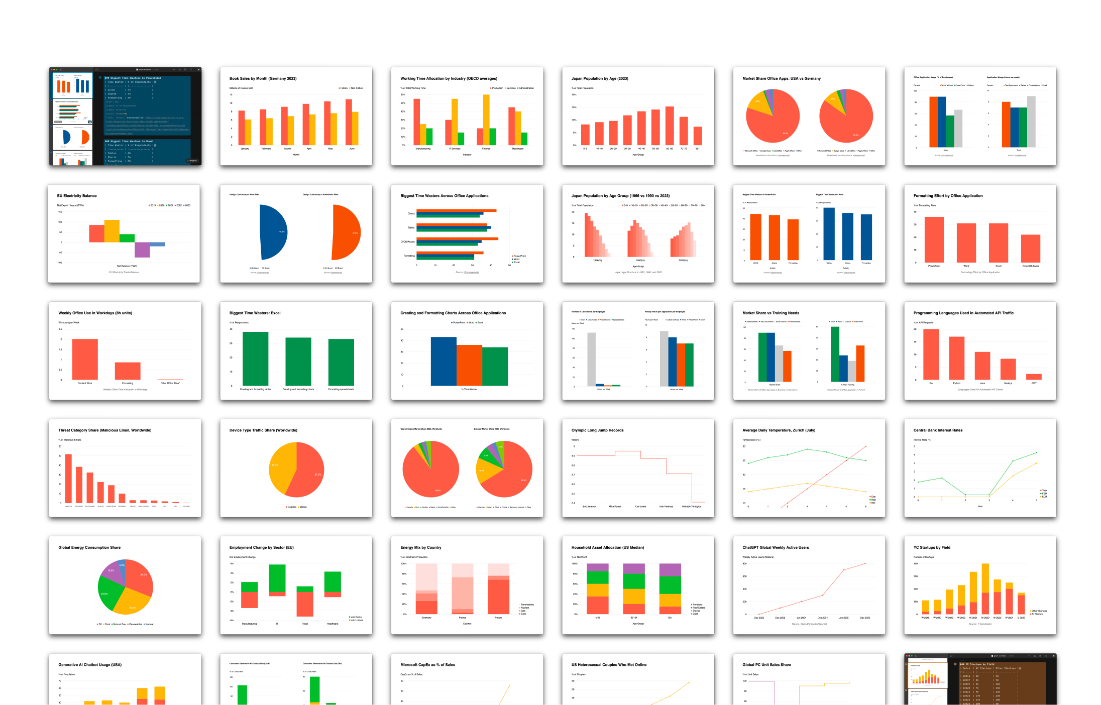
When we revisited charts after our template update, our first instinct was to clean up the CSS and offer as many chart types as possible. Users could then choose the right one for each occasion.
Adding lots of choice and letting the user decide is a popular way to design apps. It’s the opposite way of how we usually do things. And yet, this time it seemed the right thing to do. Modern charting frameworks make it easy to offer 500 chart types, and more options look like more fun. Too many options, of course, was exactly the problem we couldn’t name.
What we learned
Most chart types add noise rather than clarity. We had to decide what’s useful. We’ve designed charts, tables, and infographics for years, but meeting Nick Desbarats at Smashing Conference this year and later reading his book, Practical Charts pushed us to strip everything back to first principles. It provided the clarity and structure for what we had assumed.
The eye opener: A small number of chart types cover most real use cases. Bar and line charts do most of the work. Even the popular pie charts only work under strict conditions. Many popular formats look impressive but make accurate reading harder. That sounded awfully familiar. So we did what we do best: We built charts around strong defaults and clear limits.
- Fewer chart types.
- Quiet colors.
- Layout constraints that keep charts readable across screen sizes.
- Limits on how many charts fit on a slide, because dense layouts reliably break charts.
Instead of adding a big library, we chose to offer the basics of how charts and responsive slides work. Giving a limited choice forces us to think about the story we want to tell and how to tell it best. Moving forward, we will, step by step, add new features, building on user needs, carefully, slowly, to not overcharge the feature and turn it into a procrastination thirst trap.

Better Table Support
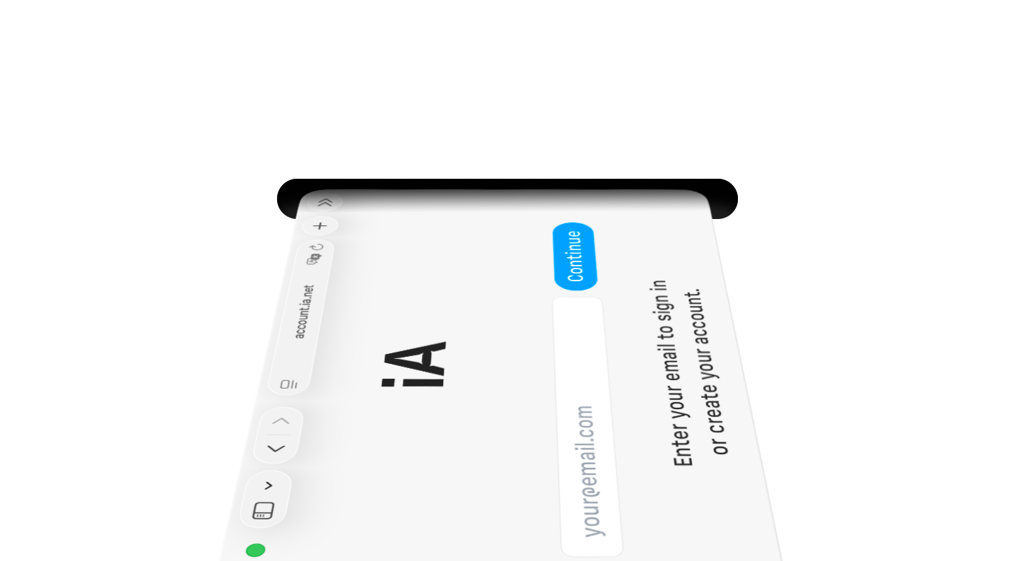
Charts require clean data, which led us to a new, more powerful table editor. This wasn’t just a utility update, it was an opportunity to bring auto-formatting Markdown tables, a long-standing goal, closer to reality. Try it out and let us know where it can be sharper. Push it, break it, and tell us what’s missing. We are going deep on Markdown tables, and once they are polished, they will be available across all our apps.


Try it
Charts in Presenter are now in beta. They are straight forward, simple and of-the-charts fast. This is the moment to try them and tell us how to improve them. Your feedback will help us getting them ready for the premiere in January.
- Join iA Presenter Beta