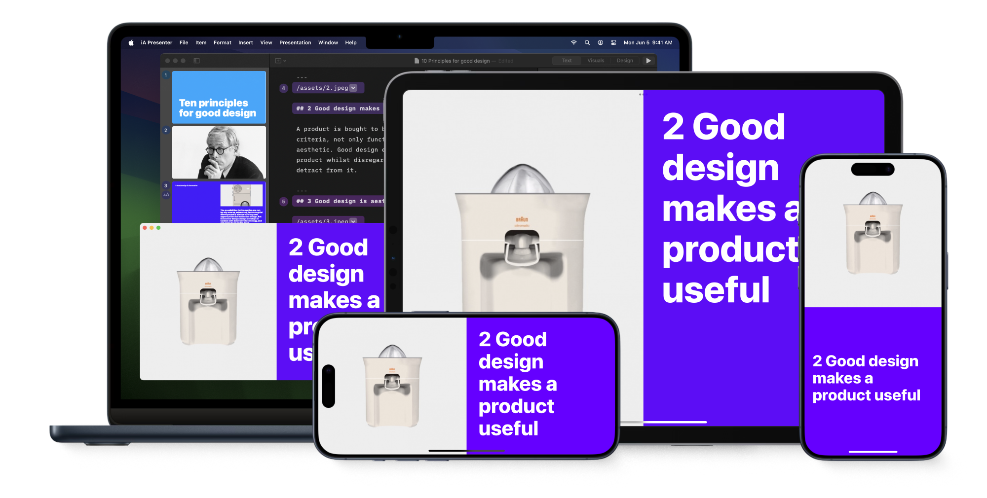
Imagine a presentation app that allows you to write professional presentations in under 20 minutes. Its beautiful typographic templates automatically scale to any screen. You can create, fine-tune, rehearse, and present your deck anywhere. On your laptop, tablet, or phone, as you see fit.
Most presentation apps make us spend hours fiddling with layouts, colors, and fonts… only to end up with boring, cluttered slides. iA Presenter takes a different approach: it lets you focus on your story. In under 20 minutes, you create a beautiful, typographically precise deck. And now, for the first time, you can do it all on iPhone and iPad.
The Idea
The Problem with Common Presentation Apps
PowerPoint and Keynote were built for desktop computers, with point‑and‑click interaction models designed in the 80s. They assume landscape formats and fixed templates that don’t scale to other screens.
AI-powered “next-gen” apps didn’t fix this. They just added autogenerated clichés on top of the same bloated workflow. They help you decorate slides, instead of shaping a meaningful message.
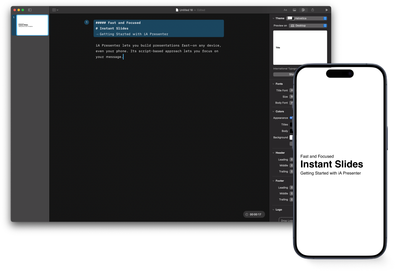
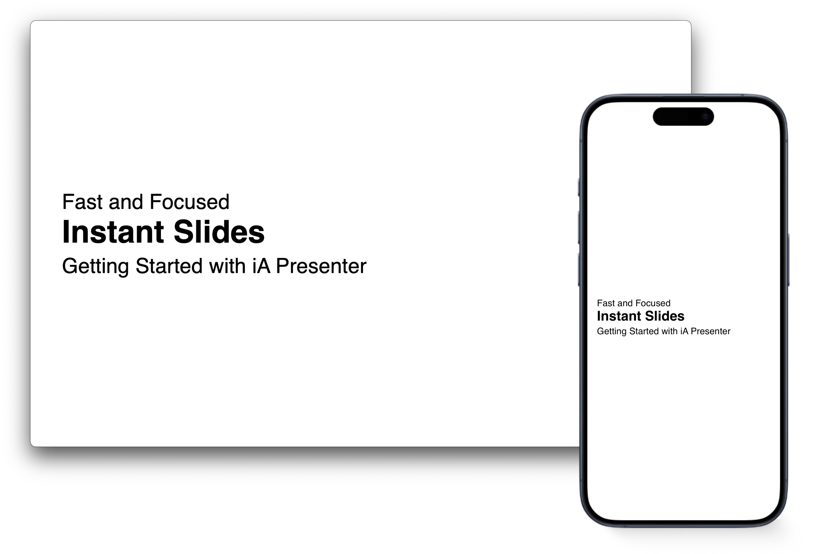
Fast and Focused
iA Presenter starts from text, not design. You focus on your message; Presenter takes care of visual clarity. Its responsive templates scale beautifully to any screen, from iPhone to projector. You create, rehearse, and present anywhere, without losing focus or quality.
We’ve learned a lot since the first launch. Of course, everyone wants more features, but the main lesson was this: What makes Presenter stand out isn’t its look or its features, but its simplicity and speed.
Version 1.5
Instead of adding more to version 1.5, we focused on simplifying the app further. We moved even further away from PowerPoint and brought it closer in spirit to our first app, iA Writer.
It’s simpler, faster, and more focused. After conducting a series of user interviews this spring, it became clear that to make it work even better on mobile phones, we had to further simplify our templating system.
Simple Default
PowerPoint and similar apps start by letting you pick a design. Making your presentation look good right away sounds helpful. But in practice, it distracts. It shifts your attention to how the slides look instead of what you want to say.
Putting the focus on design from the get-go is a fundamental mistake. To make the user concentrate on the message, the design should stay in the background… until it’s time for design. Flashy colors in the default template are counterproductive.
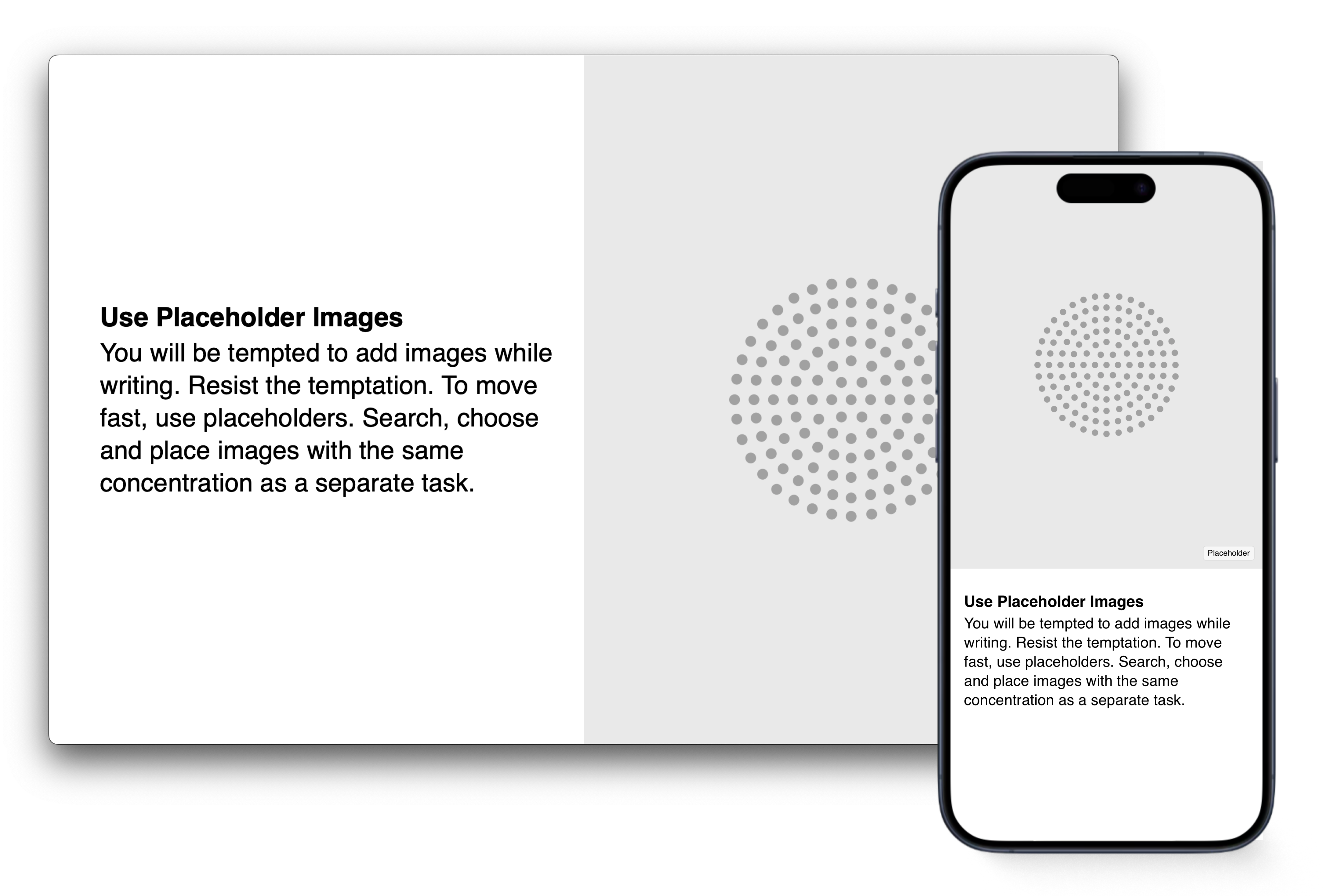
In Presenter 1.5, we default to a simple black-and-white design. Instead of being dropped into a colorful, design-heavy template, you start with a clean black-and-white layout in the International Typographic Style, so you can concentrate on your content.


Rather than picking a random template based on taste or color preference, you begin with what you want to say. You stick with a neutral template until your story is solid. Once your content is ready, you can change fonts, colors, and layout details like footers, font scaling, or logo size.
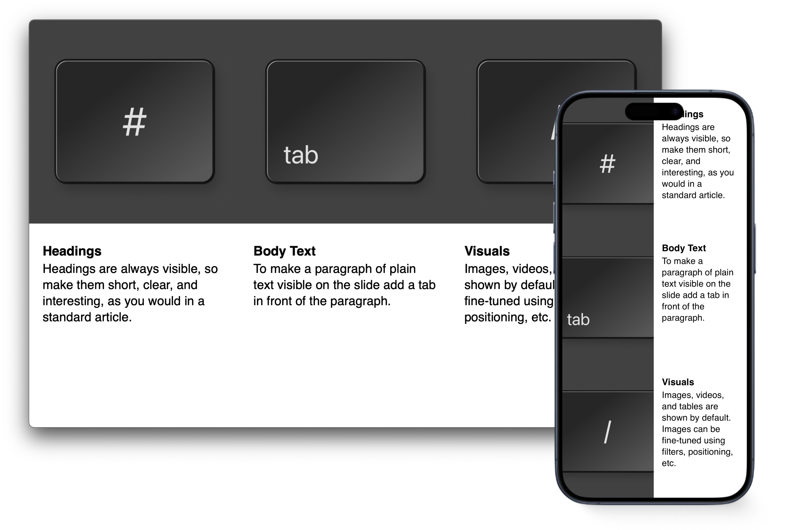
Careful Typography
To simplify the slides while improving typographic quality, we redesigned and rebuilt our template system from scratch. The new templates offer more flexible layouts, smarter content analysis, better performance, and more efficient use of screen space. Line height, margins, font weight… every element has been carefully refined.


We spent weeks fine-tuning the typography. With thought-through vertical spacing, type sizes, padding, margins, the liquid type metrics, iA Presenter delivers a typographic quality that is unmatched. In this first step, we offer two designs: The International or Swiss Style in the Helvetica template, and a classic French book design in the iA Garamond template.


Getting vertical spaces, margins, and typesizes for all the layouts just right was much harder than anticipated. There are hundreds of combinations between different layouts, heading types, and text categories.
iA Presenter’s typography scales as you change the window size, and it adapts to different screen sizes. You need to try it to experience the full power of responsive slides.
Compromises
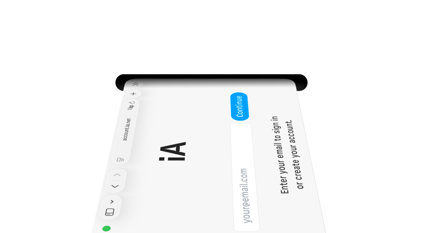
For years, the most common request was not a new feature. It was: “Give us the app on iPhone and iPad.” We’ve had stable beta versions for a while. What held us back was one major hurdle: Web Sharing.
Building an account system took more time and energy than expected. We’re close, but as always, the last 20% takes 80% of the effort. So we chose to release Presenter on the App Store now, without Web Sharing, rather than delaying it further.
This hurts. Especially after putting so much energy into simplifying it. Look how much simpler and cleaner the new Web Sharing is:


The second compromise: we had to hold back on some UI simplifications. Five years in, we have a clear vision of how to further streamline the Editor. You’ll see those improvements roll out after Web Sharing is implemented across all platforms.
Conclusion
After years of testing our iPhone and iPad apps, we’re going live with a brand-new, simple, beautifully crafted template system. Web Sharing will follow soon.
iA Presenter is now the first presentation app designed from the ground up for mobile and touch. You can write, edit, refine, and present, anywhere, on any screen, without losing your focus or your mind.