Once again, we’re stepping into the holiday season with our popular advent calendar and a big round number.
This year, iA turns twenty, and we’re marking the moment with 20 sets of wallpapers, each tied to a story that shaped us. Each set comes in versions that span the full day, calm during work hours, wild like dreams when the night drifts. One set unlocks every day. The last five hint at what’s coming next year.
21st-25th: Preview 2026
- Charts for iA Presenter. They are built in-app, generated from Markdown tables or CSV files. We’ve spent the last few months making them off-the-charts fast and faster. If you want to get a sneak peek, they are now in beta. Sign up to try them out. Read the debut post for more.
- iA Account will ship across all our apps. With iA Account, verification for our apps works via email. Download, activation, de- and reactivation is quick and easy. It’s available next week for those who purchased Presenter from us directly. Next year, we will bring iA Account to all our apps on the App Store. You’ll be able to try our iPad and iPhone apps before you buy. Read our announcement post to learn more.
- Authorship for Windows. It is one of our most loved features. Applying signature colors to AI-generated text, explained the feature without using too many words: replace placeholders with what you truly think and feel. Next year, finally, authorship will be available in iA Writer for Windows.
- Outline. We’ve been working on this forever. We refactored half the app to make it the smoothest, simplest, and most efficient outline function possible.
- New templates for iA Writer, with an all-new UI and custom fonts.
20th: iAI
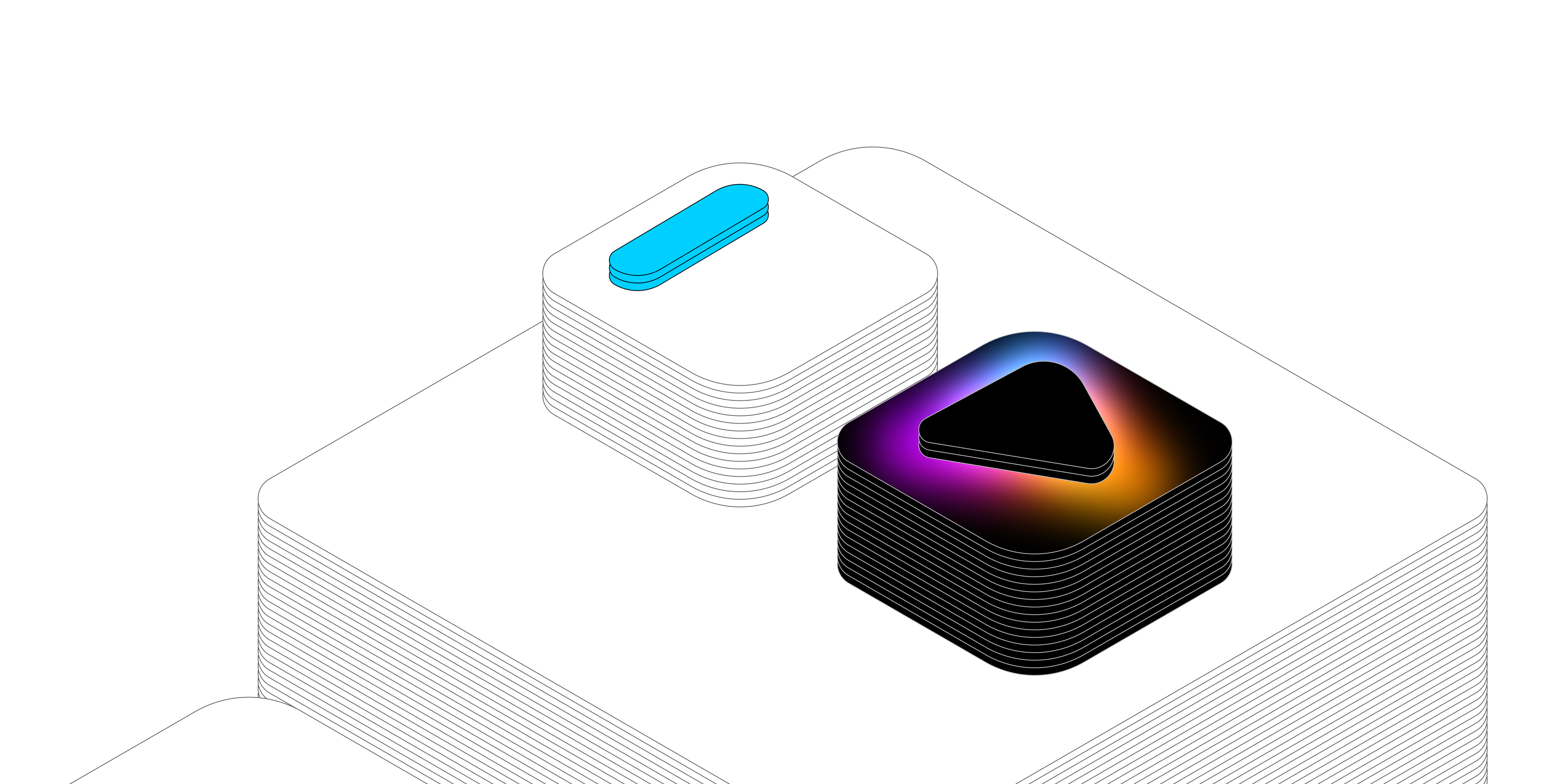
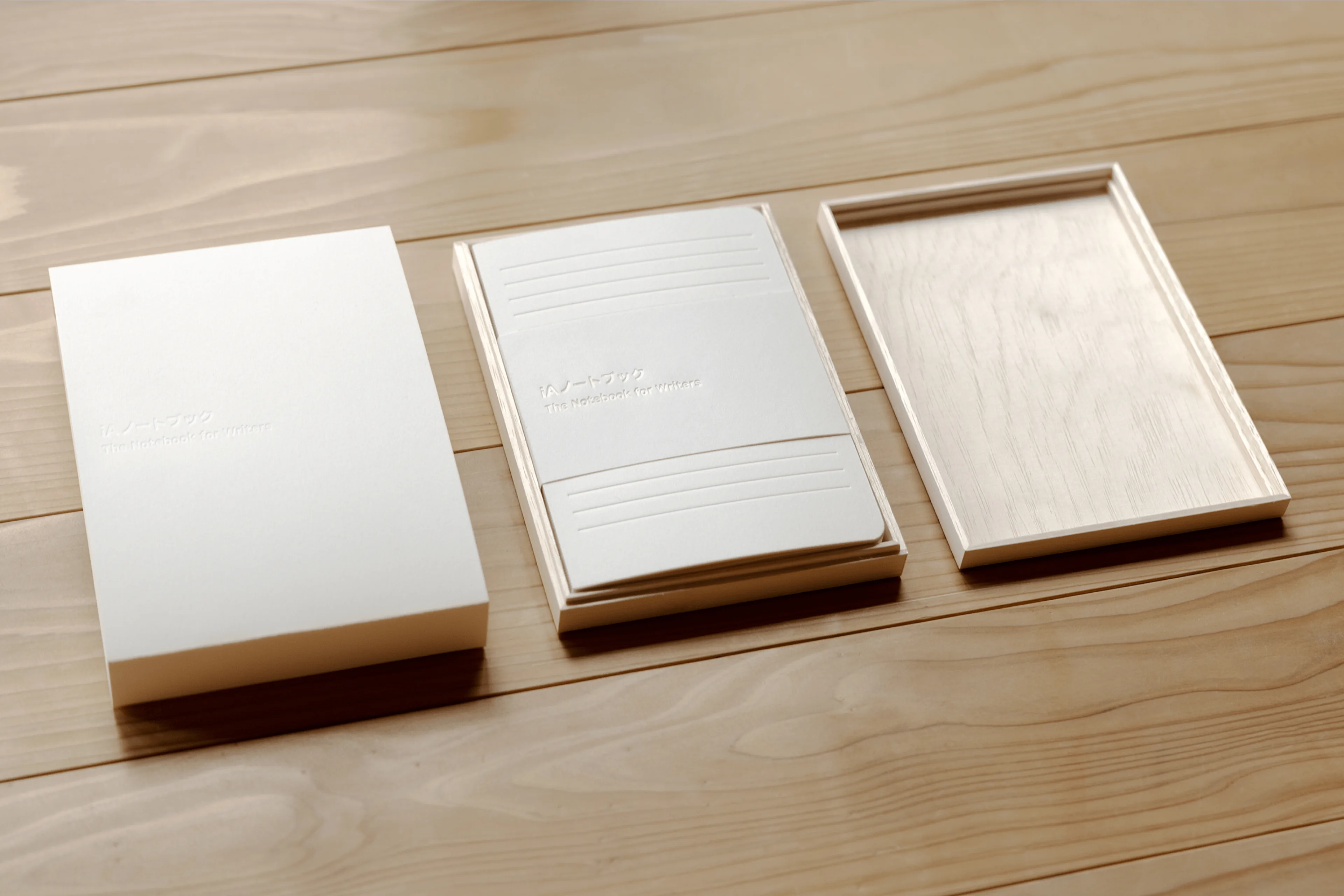
The iA Notebook has been 10 years in the making. We announced it in 2023, launched it in 2024, and sold out our first batches in no time. In 2025 we won the Red Dot ‘Best of Best’ award, the Japan Stationery of the Year award and showed it at museums and trade shows around the world. Good things come in threes, and so Apple invited us to Cupertino as an Apple Design Award finalist. Meanwhile iA Writer for Windows got its Leopard update that made it faster and smoother. iA Writer for macOS, iPadOS, and iOS doubled down on its strategy with AI: separating human and machine authorship visually and technically (instead of integrating ChatGPT like everybody else). Our 2025 recap has the full story. iA Presenter now has an iPhone and an iPad app with much simpler, cleaner templates, and it will offer charts very soon. Our wallpapers for 2025 are a tribute to iA Notebook. Those who like to read tea leaves might see something in there or not. Make sure you don’t miss out on our love letter to markdown and the beautifully typographic Tokyo Focus Tracks.
19th: Time wasted on PowerPoint divided by 111
If you work at an office, statistically, you spend between seven and nine hours a day in PowerPoint, Word, Excel, and email, each. In one week you write an average of 111 emails, five Word documents, three spreadsheets, and one presentation. Is a presentation 111 times more important or 111 times valuable than an email? No. Presentaions are wasting our time by focing us to be designers. Finding assets, logos, images, match CI/CD requirements and formatting each element on every slides individually is a complete productivity killer. So, we set out to make presentations as focused as writing an email. iA started working on Presenter before COVID. In 2022, we openly discussed, explained, announced, and openly asked for your thoughts on pricing it. The Mac version launched in 2023. Without a responsive experience and the ability to share presentations as a text and slide hybrid, it did not yet fully convey the idea that drove the app. This year, we added charts, which also made us rethink tables.
18th: Lasers and Presents
In 2022, we added wikilinks to iA Writer. The majority of note-taking apps support linking documents. Upon popular demand, we added the feature so people could use iA Writer in their preferred mix of apps. It required a lot of heavy lifting, and we had to make sure that it kept the app laser-fast and that it stayed invisible to those who still just wanted to write. In the same year, we announced our next app, iA Presenter. We looked more closely at emoji, and in November we lifted the veil on iA Presenter. We asked you about how you’d price our app. Designing Presenter, and how design demands presence and ends up as a gift of time, made us think about presents and presence, design and time. In the tradition of presents for Christmas, we offered a letter template for iA Writer.
17th: May we Have Your Attention?
In 2021, first out of curiosity, then out of necessity, Oliver started looking into ADHD and how it works. He told his wife that someone should think about ADHD-friendly software. Ideally, by someone that knows ADHD from within. She paused and said, almost puzzled, that he had been doing exactly that for twelve years. Only then did it sink in. iA Writer was not just a general app for focus. It was software made by people with ADHD, for people with ADHD. In all our work on focus, that fact had quietly slipped through the cracks. A writing app that works for the easily distracted works even better for those who can focus without special tricks. Looking into who uses our apps, we discovered that a growing number of teachers and students use iA Writer, since, step by step Markdown became a standard at University. In the same year, we took another shot at discussing the pricing of software. This time, we aimed at our colleagues who compare the value of software to coffee. Our point was: software is not a cup of coffee. It’s a coffee machine. We ended the year on topic with a recipe on how to end procrastination. And this is why, representing the year 2021, we offer a 24h set of focused wallpapers.
16th: Drawing lines
In 2020, we spent a lot of time sharpening boundaries. We improved how PDFs work in Writer, with a new preview, better web publishing, and improved editing. We introduced Style Check to help writers see patterns, not mistakes. At the same time, we were vocal about the conditions under which software is made and sold. We wrote about monopolies, Apple, and Epic, reflected on subscription or no subscription, and revisited what it really means to think different. We questioned why the companies that made most money on Apple platforms were not paying the Apple tax. The kerfuffle with Epic ended with Apple cutting commissions from 30 to 15 percent for small developers. Last but not least, we shipped Style Check to Windows.
15th: Ethics, sound, and stability
In 2019, we slowed down and looked sideways. We wrote on ethics and ethics, as a daily design practice. We explored music in writing, rhythm, pacing, and how sound shapes concentration. We refined iA Writer with a new PDF preview and new typography preferences. In the same year, iA Writer was named MacStories App of the Year. Less noise, more trust.
14th: A glass of iced water in hell
In 2018 we kickstarted iA Writer for Windows. Steve Jobs had promised that bringing iTunes for Windows would be “like giving a glass of ice water to somebody in hell.” We wanted to deliver that promise and bring focus to Windows for the first time since Word 2.0. Unfortunately, someone had to go to hell to deliver that glass, and coming from macOS, dealing with Windows frameworks was an ice-cold shower. No clear UI standards, tons of hacks to get around the many limitations in terms of spell check, linguistic tools, typographic limitations, and performance hogs. On Windows 11, Microsoft basically abandoned its native text view. On the other hand, Windows made it easier to offer folding and outline features, and we tested some features that iA Writer users in the Apple world are still waiting for. The good news is that 2026 is the year when we bring all of our apps closer together. More on that after the 20th. Somewhat inspired by the great Alan Kay, 2018 was the year when we got back into blogging. In January alone, we wrote a prophetic piece about AI five years before ChatGPT, took a shot at the ideal paragraph, procrastinated about procrastination, hammered Facebook three months before the Cambridge Analytica scandal, wrote about money, power and time, sending traffic to the App Store, the need to make bots identifiable, and a second piece on AI. In February we explained how how blogging could save the world, added tabs to our Mac app, went head-to-head with MS Word, looked at how the West was turning into China, wrote about Ethics and Aesthetics, added tags in Writer, and ended with Word Export and a Typographic Christmas. The year was a pull-up exercise in blogging and updates, looking far into the future.
13th: Duo Space and Syntax Highlight
2017! Monospace had been the only choice in iA Writer for seven years. In monospaced fonts every character has the same width, which slows down the reading speed. It supports focused writing. Technically, monospacing is a remnant of mechanical typewriters and their equally spaced hammers. Its wide letters like w, m, or Æ get squeezed, narrow ones float, and the text develops dark spots and white space that compress and extend the rhythm of the strokes. Duo Space keeps the discipline of mono, but corrects its most obvious flaw. Using a simple trick, some characters become one and a half units wide. On their own, they still feel restrained. When two appear next to each other, the texture opens up and the dark spots dissolve. On the way to duo, we made a Triospace (unpublished) and a Quattrospace, too. Meanwhile, our Zurich office became a place of research. Nick Denton joined us at the office in Zurich and Tokyo, for almost a year, to explore how online discussion could work beyond forums and Reddit-style threading. We discussed, built prototype after prototype, and learned a great deal from each other. Meanwhile, our work in Japan accelerated. The collaboration with Nikkei expanded quickly. We worked on their website and apps, deepening a relationship that continues to this day. In December we announced iA Writer for Windows.
12th: ICONS!
In 2016, we went down the icon rabbit hole. Because we believe that one can only understand what one makes, we made a lot of icons, we made pixel iconfonts and retro icon games, and that was a lot of work and a lot of fun. We researched how icons really work, which icons work how and why, and the result was that icons don’t work very well, except for a handful of very obvious ones. Sure, you can use icons with labels, but then why use them at all? Emboldened by our very clear insights, we got rid of a lot of icons in our writing apps and added readable menus instead. iA Writer 4 came with transclusion, the ability to add textdocuments in text documents. Our app was made for people who understand the virtue of clear text). No icons, all text and even text in text! Our beta testers nodded and clapped. What could go wrong? Our users didn’t understand transclusion (we called it “Content Blocks”, because we already foresaw that noone would want “transclusion”). More importantly, our users found that menus made our apps “look like Windows.” The lesson was, once again: Useful is not what, theoretically, works best, but what people are used to. So we took out the menus and put icons back. A couple of years later Apple added menus to iPadOS, and now that we’re all used to them, they’re not “like Windows”, but “amazing,” “gorgeous,” and “magical”. User research outside our hard core beta group may have shown all that before… Meanwhile, somewhat ironically, we did a lot of user research for a client, in Italy, England, German, the UK and in Japan for Condé Nast, a prototype of how VOGUE could work and look in the future.
11th: iA Writer 3
In 2015, we designed Web banking system for over ten banks in Switzerland, worked with Asics on the structure of their new site, and helped shaping some of Red Bull’s organisational tools. On the product side, we launched a new, even simpler version of Writer and started out on Android.
10th: Big in Japan
In 2014, two years before the next US election, it was already clear to us that after Web 2.0, misinformation and disinformation would start shaping the world at a scale we had never witnessed before. It was time to put thought into things. 2014 was one of our best years as an agency. But we saw the signs: Clients built strong in-house teams while big tech and consultancies hovered one studio after the other and occupied our space. Fjord joined Accenture in 2013, Adaptive Path joined Capital One in 2014, and Teehan+Lax’s core team moved to Facebook in late 2014. iA turned down any offers, both for the agency, and for the product. No to selling the team, no to selling our apps, no to venture capital. What did we do instead? We doubled down on our product, while building out our relationships with Japanese clients.
9th: Light and Darkness
In 2013, we worked with The Guardian, Red Bull, and Freitag. Behind the scenes, we started making type, a form of meditation that became an obsession. Our first font, iABC, was a sketch, a poetic take on the origins of letters. Designing letters we shape both the form and the space in between.
The universe is dark, and light the rare exception,
Yet neither stands alone—they shine in mutual reflection.
There’s logic to it, but getting it right is in our eye and in your hands. The first big step was creating custom fonts for iA Writer. We almost used iA Sans but chickened out and settled on a modified IBM Plex. Then came Duo, for a better gray value. Quattro followed, mostly because it looked good. Then iA Sans, iA Serif, and iA Garamond, now used in our presentation templates. iA Garamond will eventually… more on that later. Today’s wallpaper set illustrates the infinite fascination of looking at letters up close.
8th: Aftershock
2012 is represented by mix of different waves darkly blending into the curtain of Twin Peak’s Red Room. It illustrates how murderish the time after 3/11 felt to us.
In 2012, we slowly came back from the shock and we woke up to something different. iA was founded in the middle of the Web 2.0 optimism. In 2008, Obama got elected with the power of the Web. In 2012, he got reelected, but Web 2.0 was over. Closely observing online disinformation during the crisis, we knew that we were witnessing the roots of a digital mess. Technology is an amplifier, it amplifies power, and whoever is in power amplifies what serves them best. As Web designers we felt responsible. We had to do better. First, we found relief in studying type design. We made our first font, iABC, after a poetic study of the origin and meaning of letters and designed our Website using our own responsive typeface, diving into a rabbit hole of responsive typography. David Lynch, the creator of Twin Peaks, passed away in 2025. He was a master of finding beauty in darkness. This series is a tribute to a creative mind that remained “wild at heart and weird on top” until the very end. An art spirit we learned from and grew with over several decades.
7th: Shock
2011 was shaping up to be another good year. But as we were about to put the finishing touches on iA Writer for Mac, the office started shaking. In Japan, earthquakes are almost as common as rain. This one was different. We held our monitors that were shaking on our glass tables. We put them face down on the floor and stepped outside, looking at the city around us. Trains stopped, the cellphone network broke down. Everyone walked home, some for four, five, six hours. Shibuya’s skyscrapers moved in the aftershocks like poplars in the wind. Reality turned into a movie. TV, Japan’s pacifier for adults, blared with dire warnings. Again and again the tsunami rolled in, nuclear plants exploded, and we were told that we were safe. After the S waves came the alpha waves, beta waves, gamma waves. Supermarkets emptied out in 24 hours. First the toilet paper, then rice, the water, in the end even chewing gum was gone. No ads on TV. It was meant to signal readiness, humility, and hands-on leadership, but it felt staged. He looked drained, pale under the studio lights, asking us to 頑張る, to work hard and do one’s best, to strive unrelentingly in the face of difficulty. But there was nothing we or he could do. Friends and family were calling, begging us to leave the country. The days, weeks and months following 3/11 we were wandering through Twin Peaks’ Red Room, losing our minds. It was a black day in a black year, and it took some time to find words for what hit us in 2011, which is why the 7th is left black.
6th: iA Writer
2010 was a big year for us. iA Writer for iPad, our first app, hit the App Store. Having worked on iPad apps for Die Zeit and Süddeutsche Zeitung, we had a head start in design. The app was tested in our network of UX designers and typographers using literal paper prototypes. It sold so well, we hit #1 in practically every store. Hard to believe that this was already 15 years ago. We now offer apps for Mac, iOS, and Windows. There’s an Android app, but Darth Vader has frozen it in Carbonite. Since 2010, we’ve sold over three million copies. iA Writer has won several AppStore App of the Year awards. This summer it became a finalist in the Apple Design Awards. Economicaly, 2025 it is already its most successful year to date. When it launched, iA Writer had no settings, no font choice, no title bar. Instead, it introduced Reading Time, Keyboard Extension, Focus Mode, Auto Markdown, and a colored caret… features that have since become standard in many writing apps. It was the first focused Markdown writing app. To celebrate iA Writer’s simplicity, today, we offer only one wallpaper with a ıııiıııııııl modification.
5th: UXD
2009 was a year of real momentum for the iA design team. After opening our office in Zurich, we redesigned one newspaper after another. Our design team grew quickly. In the middle of the heat we created The Spectrum of User Experience, a colorful graphic that cut through the chaos of shifting design jargon at the time. It gave us a clear structure when terminology kept changing. Even now, we frame decisions through the same three lenses: Business, Technology and Design. In reality, all these notions blend into each other, which is why we now offer the original graphic in a set of super-blurred versions of the original graphic.
4th: Web Trend Map
In 2008, we scaled our Second Web Trend Map from A2 to A0. One year later the third version became the cover image of TASCHEN’s bestseller Information Graphics, followed by the Big Bang edition in 2010. The web felt wide and open, with many paths and many players. Today it is owned by a handful of corporations. Now you know why for fourth set of wallpapers we went all in on The Matrix. The Wallpapers show its signature digital rain, but made from Tokyo station names. Amber and green recall old school monochrome computer screens. The rainbow version holds on to our hope for a more vivid Internet.
3rd: Editorial Design
In 2007, we redesigned the weekly magazine DAS MAGAZIN using our 95 percent typography and 100E2R principles. Reading time rose by an order of magnitude, and visitors multiplied several times within a short period. It became our first major editorial project and led to further work for Tages-Anzeiger, Basler Zeitung, Berner Zeitung, DIE ZEIT, Süddeutsche Zeitung, Krone, Internazionale, Salzburger Nachrichten, The Guardian, and Nikkei, for whom we have shaped the core digital experience for more than a decade and continue to do so today. The third set puts the big letters of DAS MAGAZIN to use.
2nd: The Cosm of Typography
In 2006, we found that typography is one of the bridges between beautiful and functional design. In an big take that became widely quoted, we argued that Web Design is 95% typography. The second wallpaper set offers a cosm of letters.
1st: Founded in 東京
iA launched in 2005 in Nishi Azabu, Tokyo. The founding idea of iA was that it should be possible to create digital design that is both functional and beautiful. We’re starting this series with wallpapers that capture a little bit of Tokyo at different times of day. You’ll find static versions for each moment, plus a dynamic macOS version that shifts as the day moves.
A lovely present from Japan
Are you looking for Christmas shopping ideas? The new iA Notebook inspires careful writing and makes a thoughtful gift.