In Search of the Perfect Writing Font
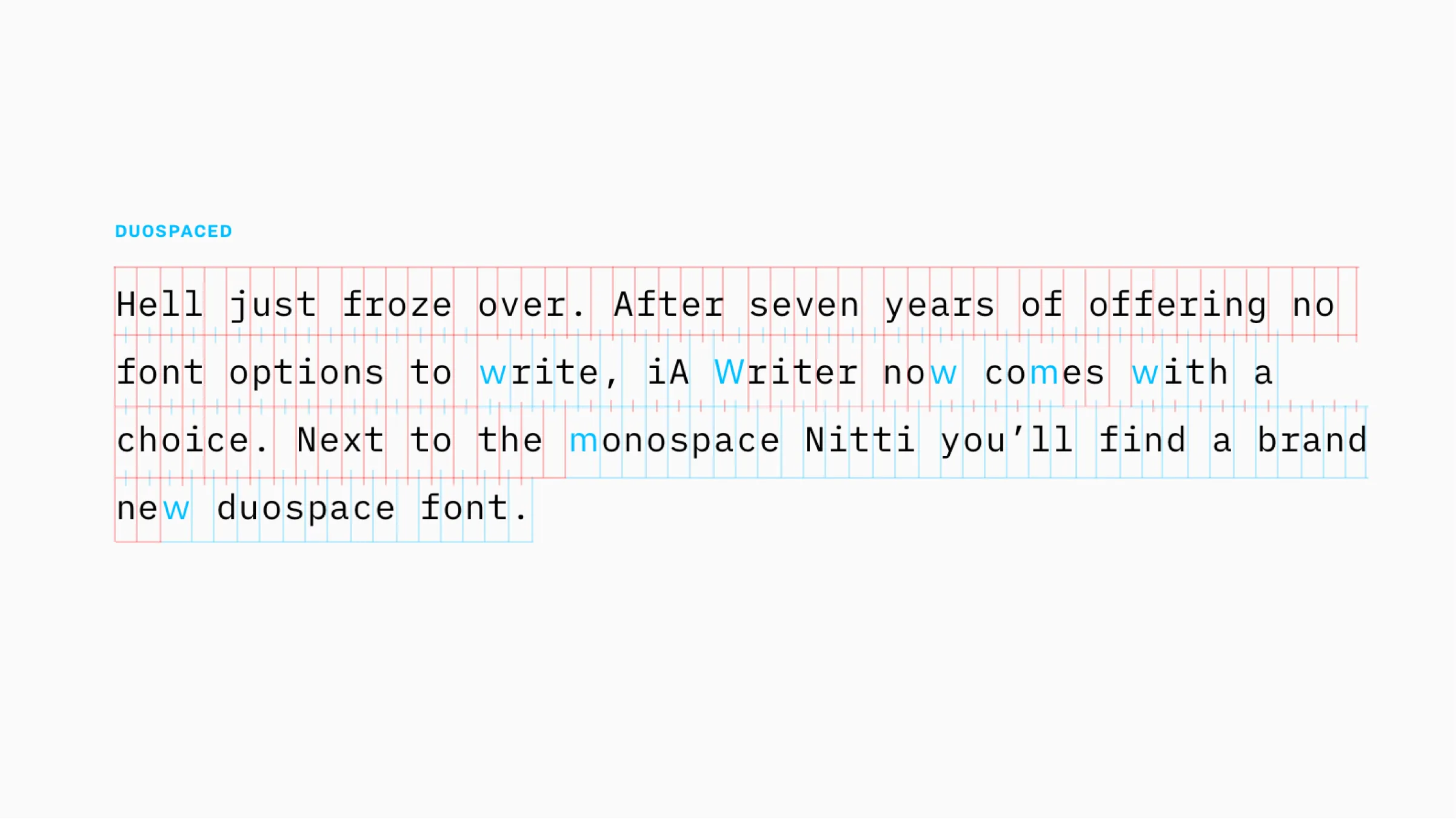
Monospace is the typical choice that communicates writing. With iA Writer Duospace, we went a step ahead. After seven years of offering no font options to write, iA Writer now comes with a choice. Next to the monospace Nitti you will now find a brand new duospace font. Duospace?
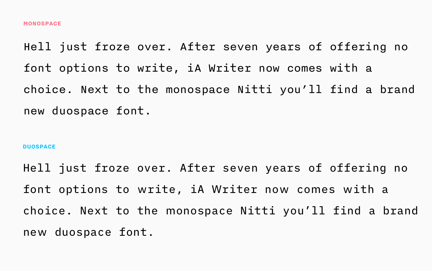
Caan yoo feeel iit? No? Yeah, it’s subtle. We are not adding a completely new flavor for fun. It’s the fruit of years of our detail-obsessed quest for a better writing typography.
The virtue of single spaced writing fonts
For an app that was designed as the digital equivalent of a typewriter, a monospace font is not a far fetch. But, if font choice were just a matter of style, there are better and less expensive ways to impress than leasing a high end monospaced typeface that many take for a silly Courier.
1. Honest Shape
In contrast to proportional fonts that communicate “this is almost done” monospace fonts suggest “this text is work in progress.” It is the more honest typographic choice for a text that is not ready to publish. Compare the following two: Which one is more appropriate for publishing, which one is more appropriate for work in progress?
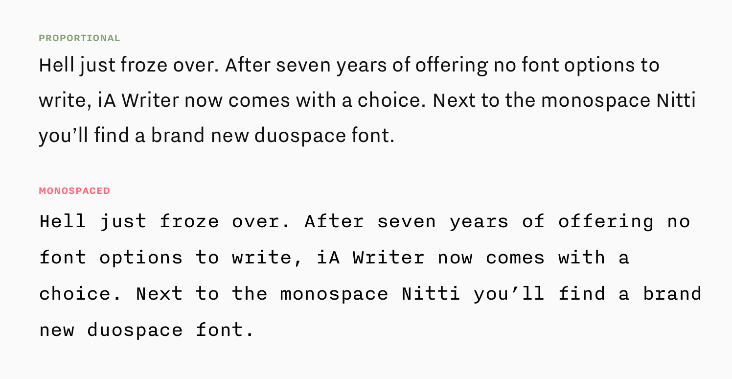
The typographic rawness of a monospace font tells the writer: “This is not about how it looks, but what it says. Say what you mean and worry about the style later.” Proportional fonts suggest “This is as good as done” and stand in an intimidating contrast to a raw draft.
2. Reading Pace vs Writing Pace
Proportional fonts are optimized for high reading speed. That makes them the perfect choice for reading. Good writing, on the other hand, is measured, reflected, slow. It takes one step at a time. In a monospace font every letter, every number, every punctuation mark and every space takes the same visual space, which slows us down. And, for writing that’s a good thing.
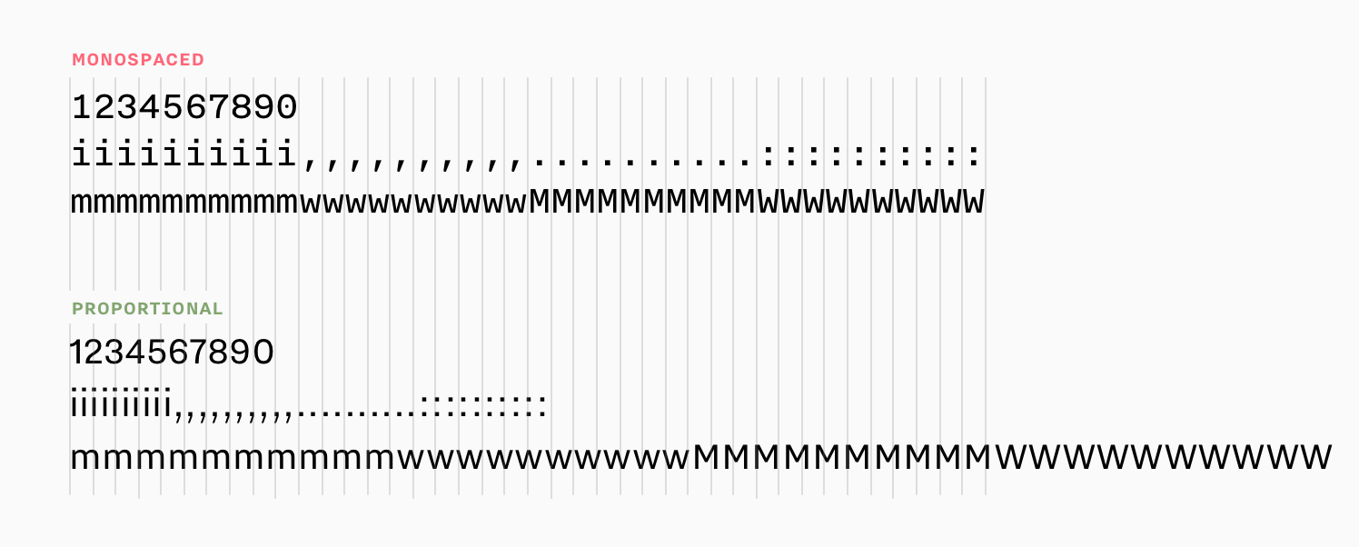
Proportional fonts save space. They suggest that you “hurry up and fill the page.” Monospaced fonts, on the other hand, feel more productive. Every typed letter translates into a homogenous visual progress in writing. It is both more relaxing to write at a slower pace and more satisfying as the progress is more tangible.
3. Discernability of letters and words
Programmers use monospaced fonts for their indentation and because it allows them to spot typos. In a perfectly regular horizontal and vertical raster, letters and words become easily discernible: A typical proportional font comes with word spaces as wide as an i. Monospace fonts come with rather large word spaces. This makes it easier to discern each word and letter.
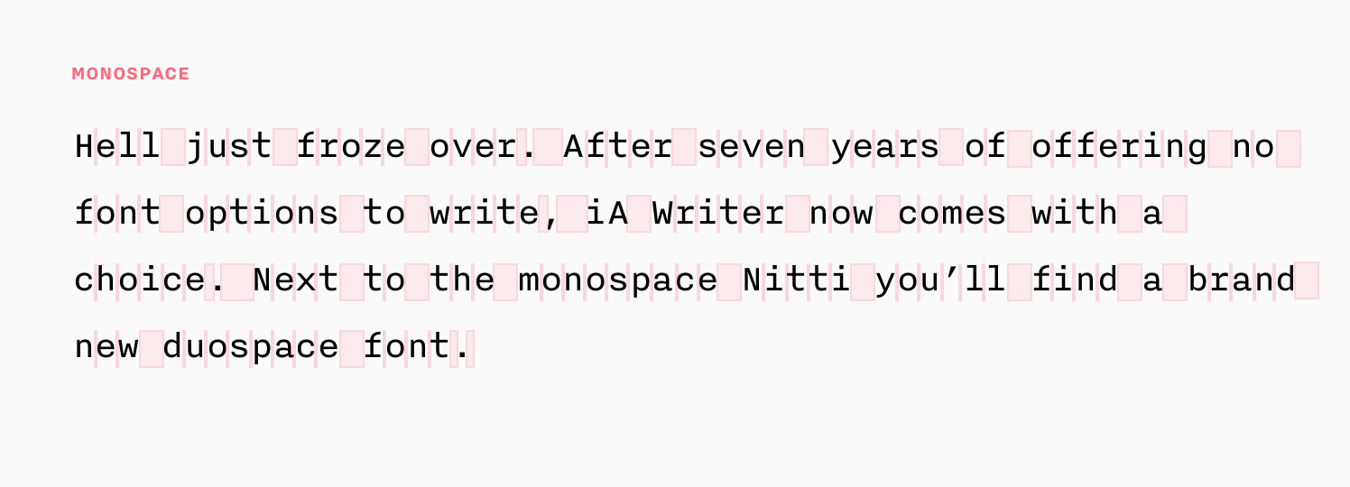
Designers have pointed out that, with all the structural benefits that may or may not come from using a monospace font when writing, there are typographical compromises in typewriter fonts that are mere mechanical constraints that can and should be overcome. Due to the way mechanical typewriters worked, using the same horizontal space for each letter was inevitable at the time. As beneficial as this regular rhythm is for writing, do we really need to squeeze every letter into the same square? Can we not at least make some exceptions?
Nitti iA
For years we have experimented with exceptions. Bold Monday designed a special Nitti iA for us that looks like Nitti but is in fact a proportional version of Nitti. On top, you have Nitti, on the bottom the proportional Nitti iA:

We have used it for some time on our site and we still use it in email and in our internal documents. Nitti iA was meant and thought and executed well, and it is great to write emails in. It was a branding dream come true. Unfortunately, people read measurably less text on our site. Proposals felt less finished. Prospective clients wondered about our “Courier” font. Only the typo nerds got it.
The true benefit of a monospace font gets gradually lost the closer you move to a proportional font. Eventually, we realized, that while Nitti iA is great to write casual text in, it’s not the end of typographic wisdom for reading or writing fonts. Nitti iA works nicely for email but too fast for a careful writing environment, and not fast enough for publishing. Maybe we really cannot have our cake and eat it?
Duospace
This year, again, we set out exploring our own writing font. We started from scratch, moved from proportional to monospace to three spaces (50% for i and j) and ended up with duospace for MWmw. Progressively, we came to realize that the right question is how to make a proportional font look like a monospace, but how many exceptions you allow until you lose the benefits of a sturdy monospace.
With Latin characters you need to free the m’s from their obsolete mechanical straight jacket. What about the w’s then? And if you give room to lower case letters, what about their parents? The M and the w look alright in mono, no? They almost look better, even… Well, not next to a free m. In Cyrillic, there are a couple of characters more that need breathing room. If you give 150% to the letters w, W, m, and M, you get a text image that has almost all benefits of a monospace font, but the text flows nicely. And born was the duospace concept.
What is Duospace?
Duospace is a notion familiar from Asian fonts where there are single and double width characters. Our candidate is a bit different. It offers single and four 1.5 width characters.

Duospace gives 50% more space to the letters m, M, w and W. It takes two of those to get back in step with the monospace rhythm. The advantage over proportional fonts is that you keep all benefits of the monospace: the draft like look, the discernability of words and letters, and the right pace for writing. Meanwhile, you eliminate the downside stemming from mechanical restrictions that do not apply to screen fonts. Here is what we came up with:
We had the chance to pitch the 1.5 duospace idea to Matthew Carter, the creator of Verdana, Georgia and Bell Centennial, during 2017’s type Rencontre de Lures type conference. Matthew nodded. He uses a similar technique (monospace with a few wider characters), for his private correspondence font. There is nothing new under the sun.
To implement or not to implement…
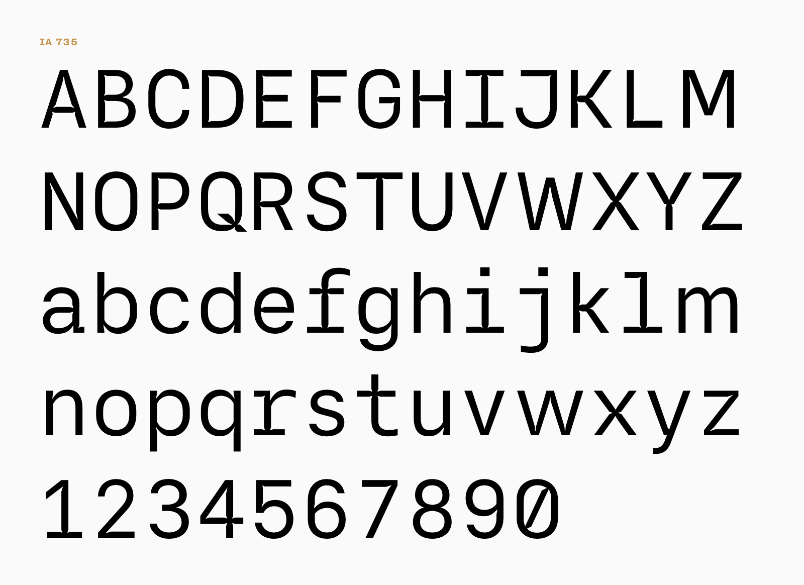
From that point we were debating back and forth whether or not we should implement our own duospace font in iA Writer. The issue we had with iA 735, our own font was that it didn’t look like Nitti’s cool brother but more like a half-cousin.
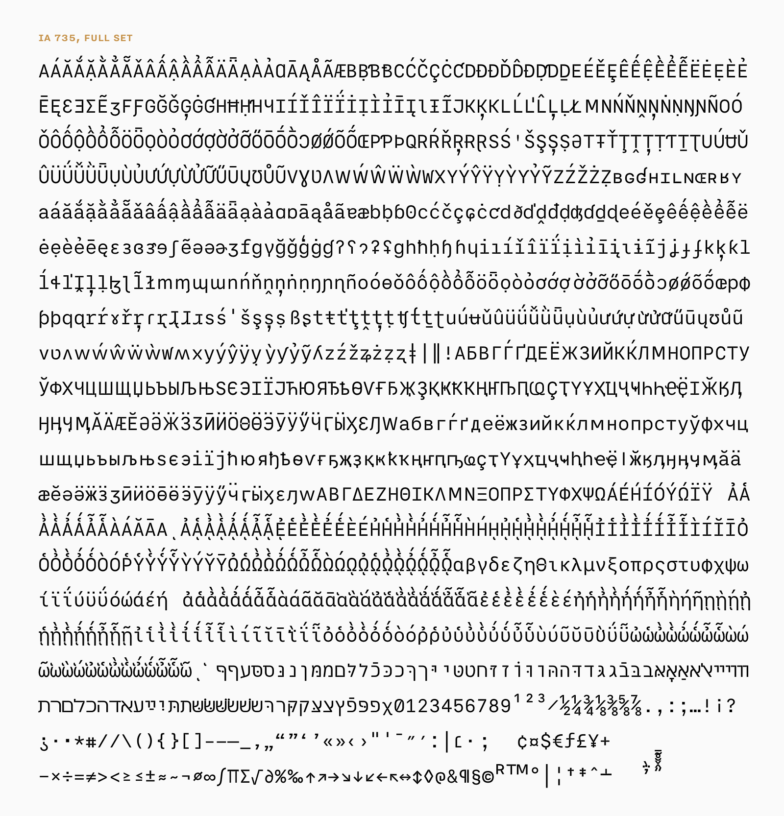
This Duospace is not cut from the same wood as Nitti, but it’s not bad, right? 735 comes with Greek, Cyrillic, and Hebrew. 735 was weeks and weeks of work. It’s called iA 735, because it took us 735 variations. It would probably take another 735 variations to get it done. But then something happened that made us forget about it. So, maybe, this is all you’ll ever see from it. Or maybe not?
Hell Froze Over
IBM Plex, like Nitti, was love at first sight. It comes from the same hands and minds as Nitti, it’s beautiful and functional, and it shares the same spirit.
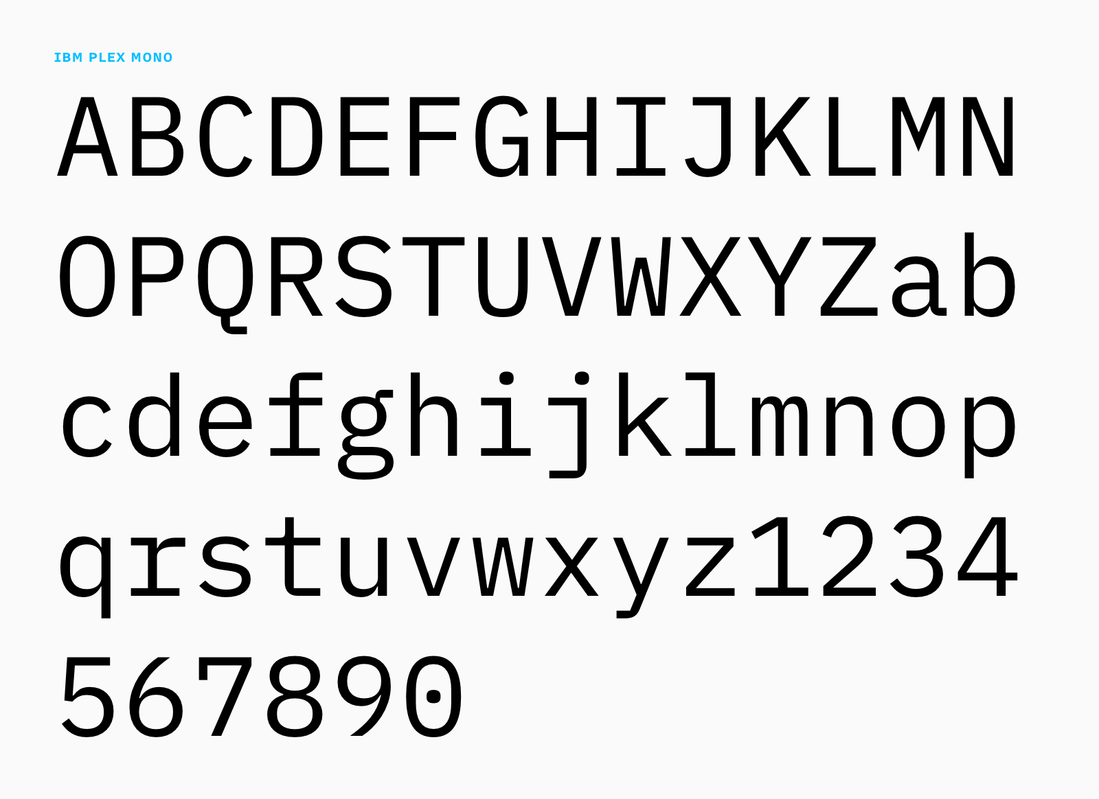
Plex a great alternative for Nitti. And, as the reactions on Twitter showed, it screams “iA Writer.” Since it’s open source, we could alter it as we wished. We adjusted the upper and lower case M’s and W’s as we did in iA 735, adjusted the g and, here it was:
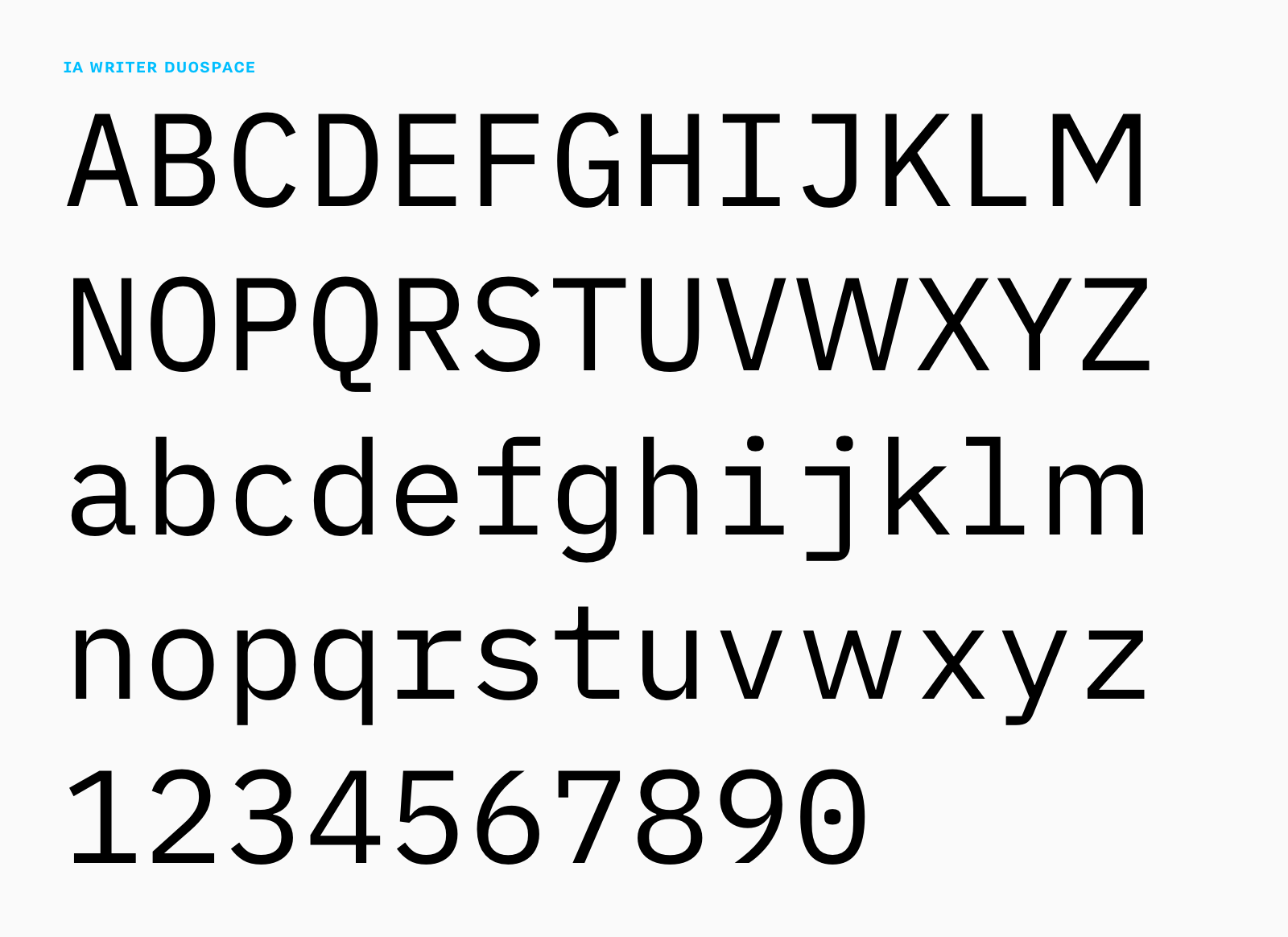
As you can see, we kept the one-storey lowercase g. The default double-storey g is beautiful for reading but it increases the palette of letter shapes. In a monospace font, it seems beneficial to use a smaller palette of font shapes. (The double-storey a is again a completely different story, but let’s not get too nerdy here). In short, for writing purposes, the single story g makes the text image more homogenous, calmer. It shares its look with Nitti and is historically closer to handwriting.
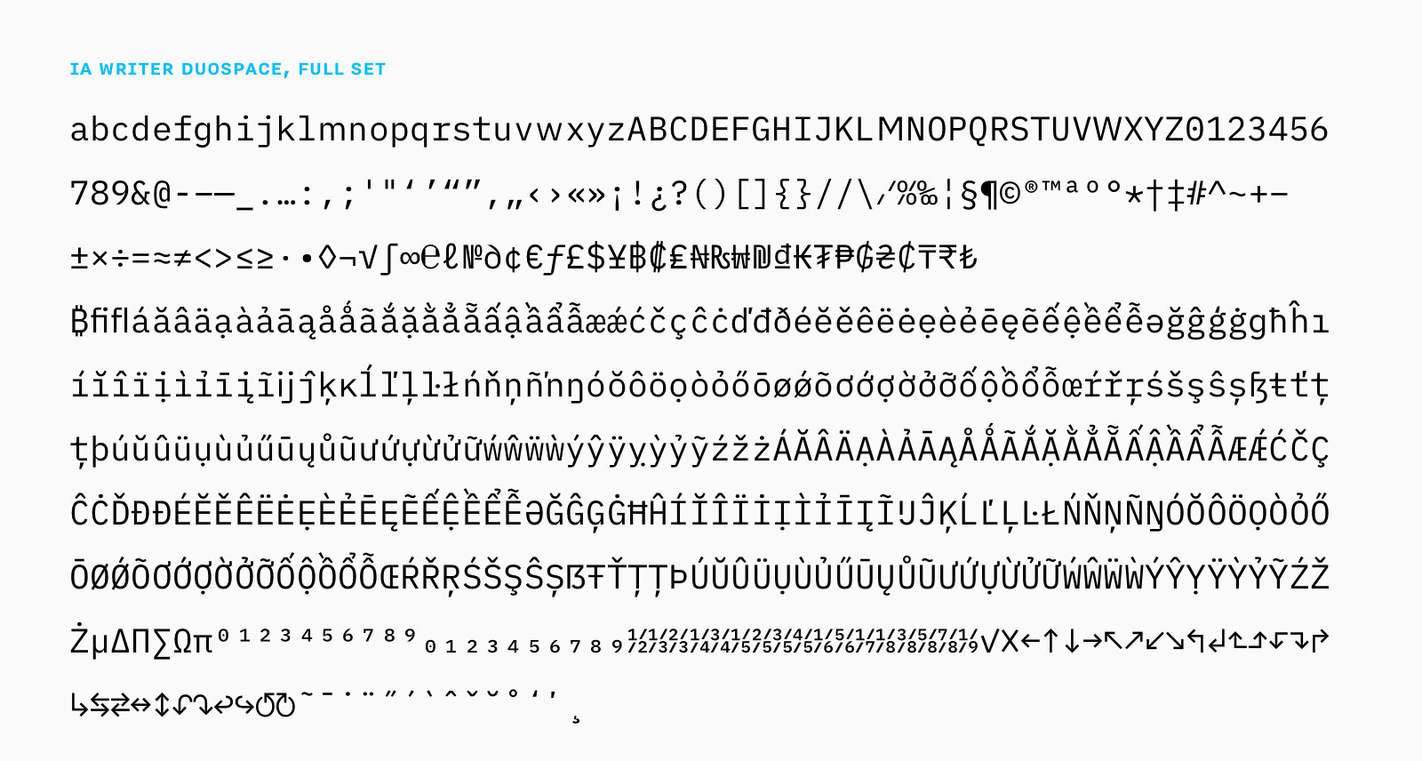
You should give it a try. We think it flows really nicely. Our variation made Bold Monday smile. We are quite certain, that this type of adaption is very much in the spirit of IBM open sourcing it.
Try it out
You can get iA Writer Duospace in the latest update of iA Writer for Mac and iOS. You’ll find it in Settings/Editor/. We are looking forward to hearing how it feels to you.
