With the chaos of different screen sizes and a new generation of web browsers, the design paradigms of layout and typography have shifted away from static layouts and system fonts to dynamic layouts and custom web fonts. Screens are changing not just in size, but also in pixel density. Now we need not only responsive layouts, we also need responsive typefaces. To test this assumption, we have relaunched our website with responsive typography and a custom-built responsive typeface.
Until recently, we only had a couple of system fonts to choose from, there was not much choice. For serifed typefaces there was mainly one (Georgia) and for sans-serifed typefaces there were two or three (mainly Arial and Verdana). These typefaces were designed in the early 1990s for what we now consider low resolution screens. They work well in those conditions. Unfortunately, they don’t work on high density screens. Why?
Goodbye Georgia?
Georgia works perfectly as body text up until 16 pixels. As soon as you go over that size, it starts to look odd. This is not a design deficiency of the typeface. It was simply not designed to work for big body text sizes and dense screens.
This is why we designed a custom typeface that adapts to different resolutions. We call it iABC (a lot of shapes were inspired by a little side project of the same name). Currently you can only see it on mobile devices and OSX—until iABC is properly hinted, PC users will see Georgia.
In retrospect, making a custom typeface was pure madness, and the micro typographic result is far from great. Professional type designers at TypoBerlin were frowning over the many bumps and spacing mistakes.
Our new typeface is also quite boring, conceptually, and the idea of using graded fonts for different conditions is not new. Newspapers have been using graded fonts for different paper qualities for a long time. But it was not our goal to create the best typeface, or convince the best type designers that we can. We wanted to test our concept of responsive typography. And since there are hardly any screen fonts that offer this feature, we had to create it ourselves.
Our custom typeface also gave us the liberty to embed all graphic elements of the site into the typeface. Except for actual pictures, the whole website is constructed with type.
Which Fonts Work Where and Why?
Now it gets complicated. Since there are so many different screen sizes, pixel resolutions and rendering processes, it helps remembering the following rules of thumb:
- PC: System fonts look ok in most cases. Custom fonts are a nightmare if they’re not hinted.
- OSX: System fonts look good on low resolution screens (e.g. the old PowerBook G4), too bold on high resolution screens (MacBook Air), and okay on Retina displays (Retina MacBook Pro). Lighter fonts look excellent on high resolution screens, but they are too light for Retina displays.
- iOS: System fonts look too bold on high resolution screens (iPhone 1-3, iPad 1-2) and they look okay on Retina Displays (iPad 3). For perfect HTML performance on Retina displays, you need a slightly bolder font in portrait mode and a regular weight in landscape mode. For perfect performance on high resolution screens, you need a lighter typeface.
The list will probably confuse you more than it will clear things up. To put it in simpler terms: For optimal performance beyond low resolution, and outside the PC world (where system fonts still perform adequately), you need three font grades:
- Lighter (for high resolution screens)
- Regular (for Retina landscape HTML mode)
- Bolder (for Retina portrait HTML mode)
Show Me!
You can see it right here; that is, actually, you can’t. You can’t see responsive typography on only one device. And you can’t even see it comparing the devices if it’s done right. The idea of responsive typefaces is that the typeface always looks and feels the same. Let’s look at two examples:

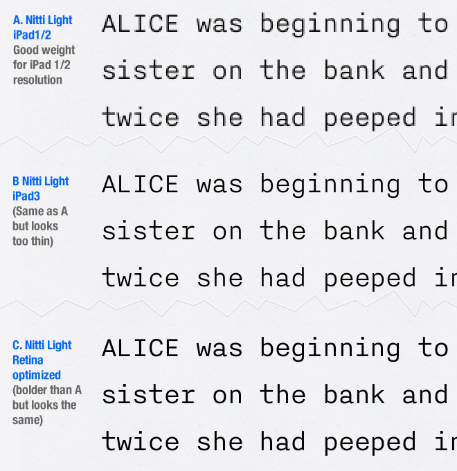
An example from our writing app iA Writer. If you squint you will notice that A and C look the same. However, it’s actually A and B that are the same font. This means in order to make the font look the same on iPad 2 and iPad 3, the low resolution font needs to be designed a little bit lighter.

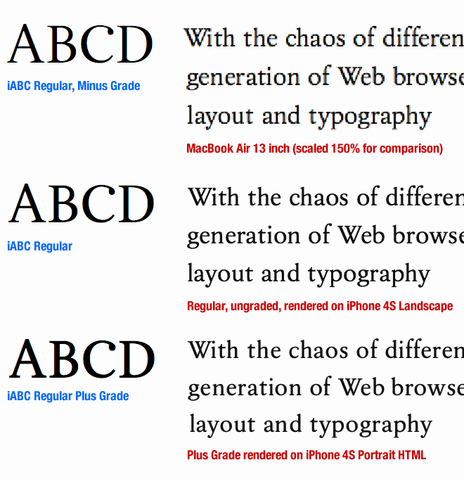
For this website we use three grades. A lighter grade for high resolution screens (top), the regular grade for Retina landscape mode (middle), and a bolder grade for Retina portrait mode (bottom). If, again, you squint, you can see that we need three different grades to get the same visual appearance. (Actually, for perfect homogeneity the bolder grade needs to be a little bit bolder than here).
Why Would You Care About That?
Now, this kind of malarkey is not possible in every circumstance. It is literally impossible to make Mac and PC screens look the same, but that’s not big news. However, responsive layouts and responsive typefaces create a better digital reading experience. The more readable the typeface, the better the reading performance of a site. Most people can’t discern good from bad typography, but everyone can feel it. For now, we hope that our provisory typeface doesn’t make you uncomfortable.
If you’re interested in hearing more about this, we’ve just started a series that explains Responsive Typography from scratch: Part 1 is Responsive Typography: The Basics.


