After our last post on “The Future of News” we have been asked again and again to illustrate:
- What does a newspaper as a wiki look like?
- How can newspapers bring their online and offline identity together?
- What is appropriate advertisement?
- What is an easy-to-read newspaper website?
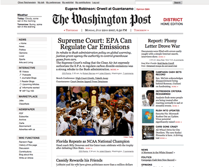
Of course we are still not allowed to show the work we did for our client. So instead we made a sketch this afternoon of how the Washington Post might look as a wiki made by iA:
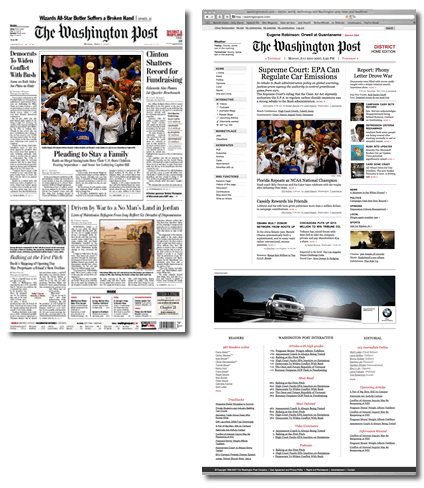
In the meantime it still looks like this:
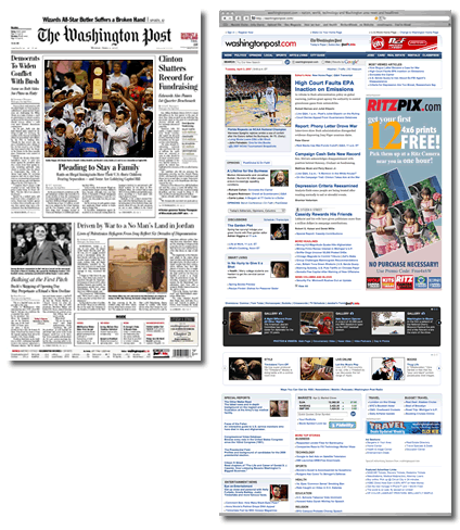
Here is the direct comparison:
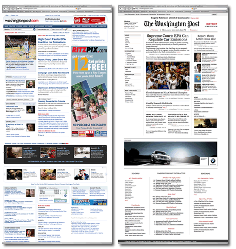
Now of course you want to look at it in detail, don’t you? Click on the image to see a 1:1 version:
Please note that:
- This is just a sketch that illustrates the possibilities we’ve discussed.
- The .jpg above is made from this design. The actual HTML dummy with the original design looks much nicer, as it scales and displays the fonts more clearly.
- iA is working on a project that looks very similar to this, meaning: a) You are not allowed to copy this in any way, and b) we cannot show you the detail of the wiki interface just yet.
- No: Wiki doesn’t mean that users cannot do whatever they like, the wiki is a publishing tool for editors, first of all.
- No: Users will not need to use wikicode. We found an elegant solution for that, believe it or not.
- Yes, users will be able to see an article’s history.
- We are going to post more on how a newspaper wiki would work very soon.
- Before criticizing (not enough ads, not enough stuff, too much like the printed edition, you are an idiot, etc.) please read this, or, if you’re in a hurry, this.
Addendum
Please read our follow-up article Newspaper Wiki: Schematics for more details.
