Articles related to
Web Trend Map 2007
As a Christmas and New Year’s present to our clients and readers we have created three fun Internet overviews.
Internet 2007 Predictions
After looking closer at what made the web in 2006, it is time for some bold predictions.
Technorati: Big Business with Bogus Data
Since the PR giant Edelman and Technorati are working together they are both trying to become an industry reference for statistics on the blogosphere. The question is how reliable is Technorati’s data?
Partner in Astroturfing: Boycott Technorati?
We all had a bad feeling about this right from the start. Why is the blog watch-and-search engine Technorati bonding with the No.1 PR giant Edelman? Can we trust them?
Web 3.0: You Say You’re on a Revolution?
Web 1.0 started as a streaming publish-to-read medium; web 2.0 has established itself as a publishing platform for everyone. Now web 3.0 is said to be a technologically advanced Internet, where the user executes and the machines do the thinking.
Good Books Want to be Re-read
Good books are good people: Books are people speaking with signs. Meeting cool people several times is nice.
Build a Plane and Fly to Sicily
Since Mondays are typically low energy days, I’d like to share this story with, to reassure you: If you have a strong vision—no one can stop you.
The Electronic Gentleman
If you have a website that is not user friendly, you have an unfriendly website which basically means that you lack manners. The specialists use that word (“user friendly”) so often that they forget that “friendly” actually is an ethical term.
The 100% Easy-2-Read Standard
Using 10 pixel Verdana made sense in a time when screens were 640 pixels wide. Today it is a mistake.
Read Different: Apple Ads in Japan
Last Sunday, they started airing the "Hello, I'm a Mac… and I'm a PC" ads here in Japan. And here's a surprise: they're different. The Mac guy isn't particularly cool and the PC guy is a real "salary man" type. The ads aren't as obvious as the Western originals.
New Athens
When people ask me about my background, they're confused. I studied philosophy. How come I do web design? In short: The old Greeks brought me here. What can Internet workers learn from the old Greeks?

Reactions to 95% Typography
An avalanche of comments, hundreds of applauding blog entries, honorable mentions from cooler and more sublime and hotter and higher places, forum discussions, translations in Chinese and partially in Italian and even blunt plagiarism was incited by one of my recent notes.
Jakob Nielsen, Time Machine?
In 2001, usability guru Jakob Nielsen—according to USA Today “the next best thing to a true time machine”—was convinced that by 2007 books would be gone and “fully replaced with online information”. Was he being serious?
Coca-Cola and The Matrix
Brands make us associate positive values and positive experiences with the products they mark. Brand values are defined by the senior management in the “Brand Matrix”. Coca-Cola recently changed their brand matrix. Are we soon going to associate other things with Coca-Cola?
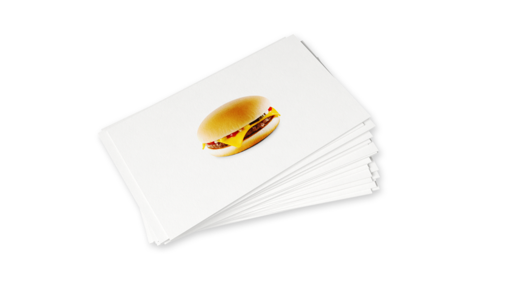
The Interface of a Cheeseburger
All things have an interface. Shaping interfaces is shaping the character of things. The brand is what transports the character of things. When looking at McDonald’s, iPod, or Nintendo DS it becomes quite obvious that the interface *is* the brand.
Web Design is 95% Typography
95% of the information on the web is written language. It is only logical to say that a web designer should get good training in the main discipline of shaping written information, in other words: Typography.
Design is How it Works
“Most people make the mistake of thinking design is what it looks like. That's not what we think design is. It's not just what it looks like and feels like. Design is how it works.”
CI and CSS
Corporate design manuals, CSS, information architecture and object oriented programming follow the same principle. They are modular.
Why is Simplicity Difficult?
Simple websites are easy to use, easy to understand, nice to look at. In practice, websites are either unusable or ugly and filled with too many words. Why do designers have a hard time to keep it simple?
Internet Consulting?
The Internet business took a hard hit around 2000 after the tech bubble burst. To call yourself an “Internet agency” or even an “Internet startup” was considered nothing less than masochistic. That is when most Internet companies started to get into “consulting“ and “branding” and “marketing”.
Usability News: The F-Pattern
Since I’ve started developing websites I’ve been looking for the ideal layout. Today I got another hint on the direction to take. Jacob Nielsen calls it the “F-Pattern”.
Internet Users Visit Only 6 Websites
We now have over 75 million websites we can go to, but still we only visit six of them regularly, as we just learned from a study recently made public by Directgov. Their findings make us think of a new phase of the Internet.
Usability and Branding
Your website is more important for your company and its brand portfolio than your business card, your brochures, the products you sell, your packaging, the address and the building your company resides in.
Usable Interface Design
As an information designer the interfaces we currently work on—no matter whether Apple or Windows—bother me. Yes, OS X looks a lot better than its predecessors, and Windows’ upcoming rip off of OS X looks better than the previous rip off.
The Right-Side Column: Just Noise?
If it is your side column on your website you want it. But does your user read—or even: see—it? You might argue that the side column is standard. So we do need it. Do we?
Do We Really Need a Site Navigation?
Whoever performed any usability tests knows that users look at the content straight away. Users first look the pictures, then at the titles, then at the text. Navigation often gets completely ignored. In my seven years of conceiving websites and monitoring usability tests I am tempted to say that navigation is useless.
How Important is Design on the Web?
Internet users can give websites a thumbs up or thumbs down in less than the blink of an eye, according to recently published study report. Nature.com and Wired recently reported on the fact that we pass judgement on a website in less than a second. This sounds like good news for web designers. Is it?