iA Writer
The Original Focused Writing App
iA Presenter
Story Centered, Effortless Design

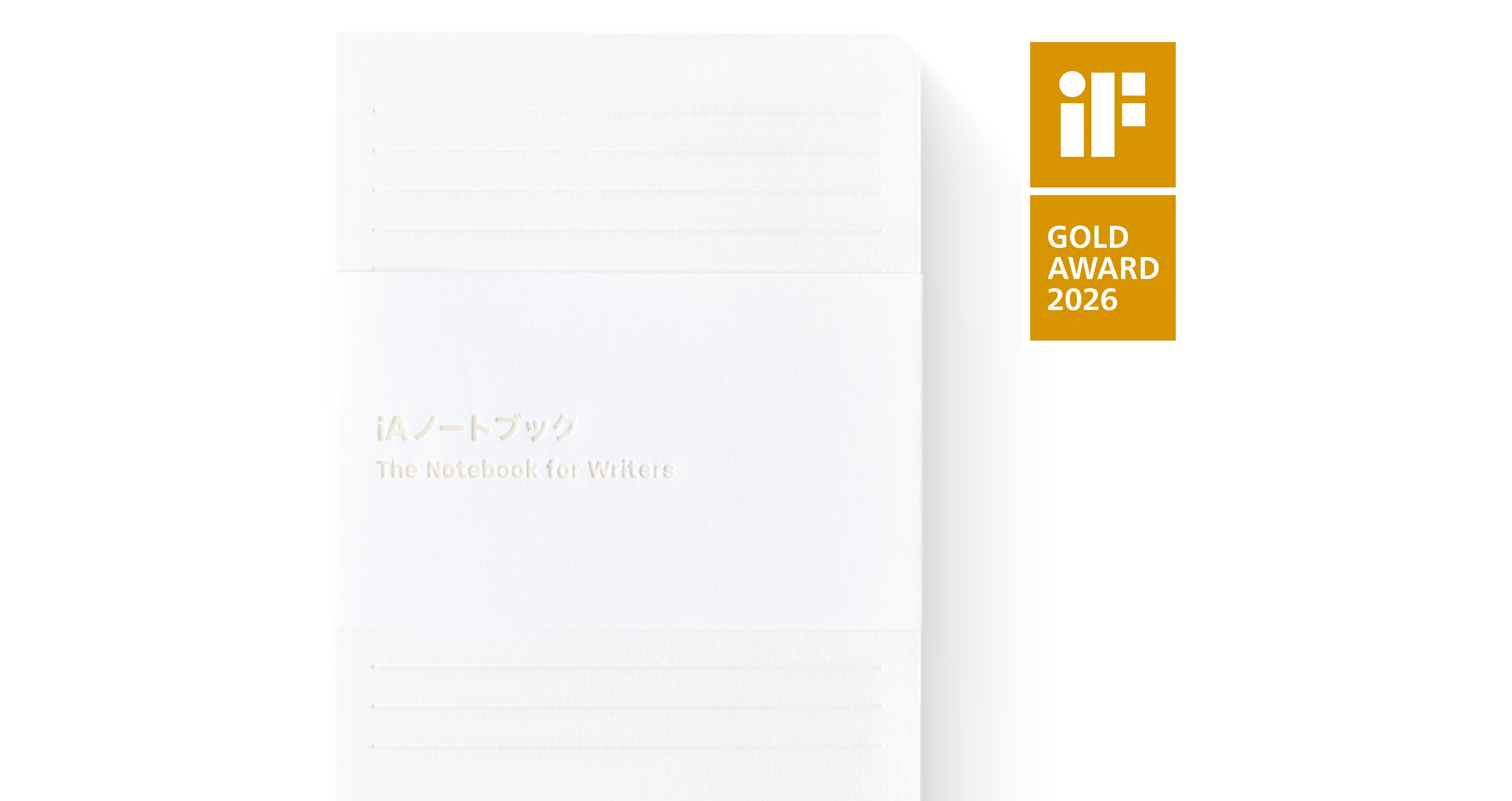
iA Notebook
Good Design is Invisible

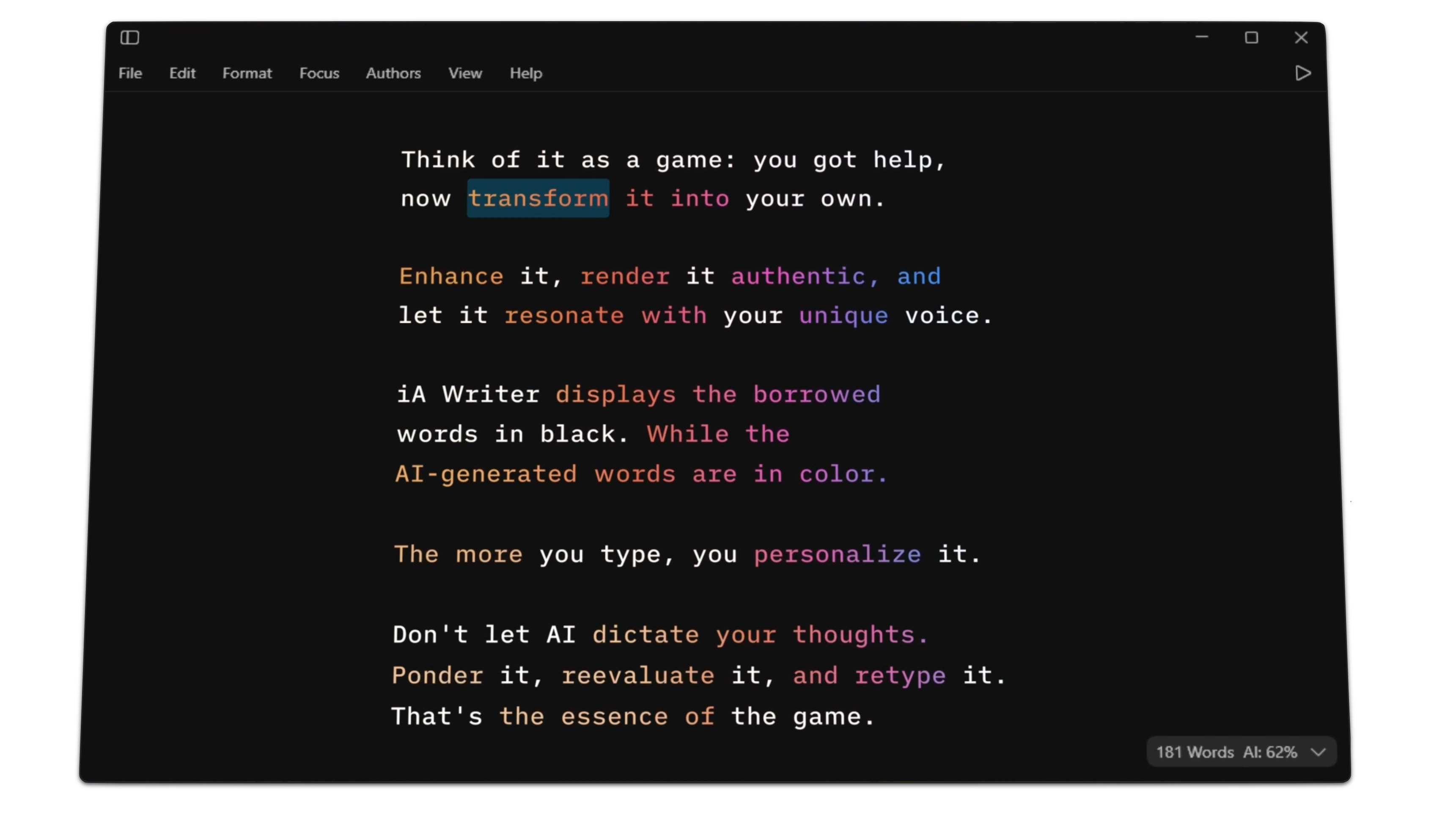
Who wrote this?
Authorship comes to iA Writer for Windows
Paper Alchemy
The making of iA Notebook
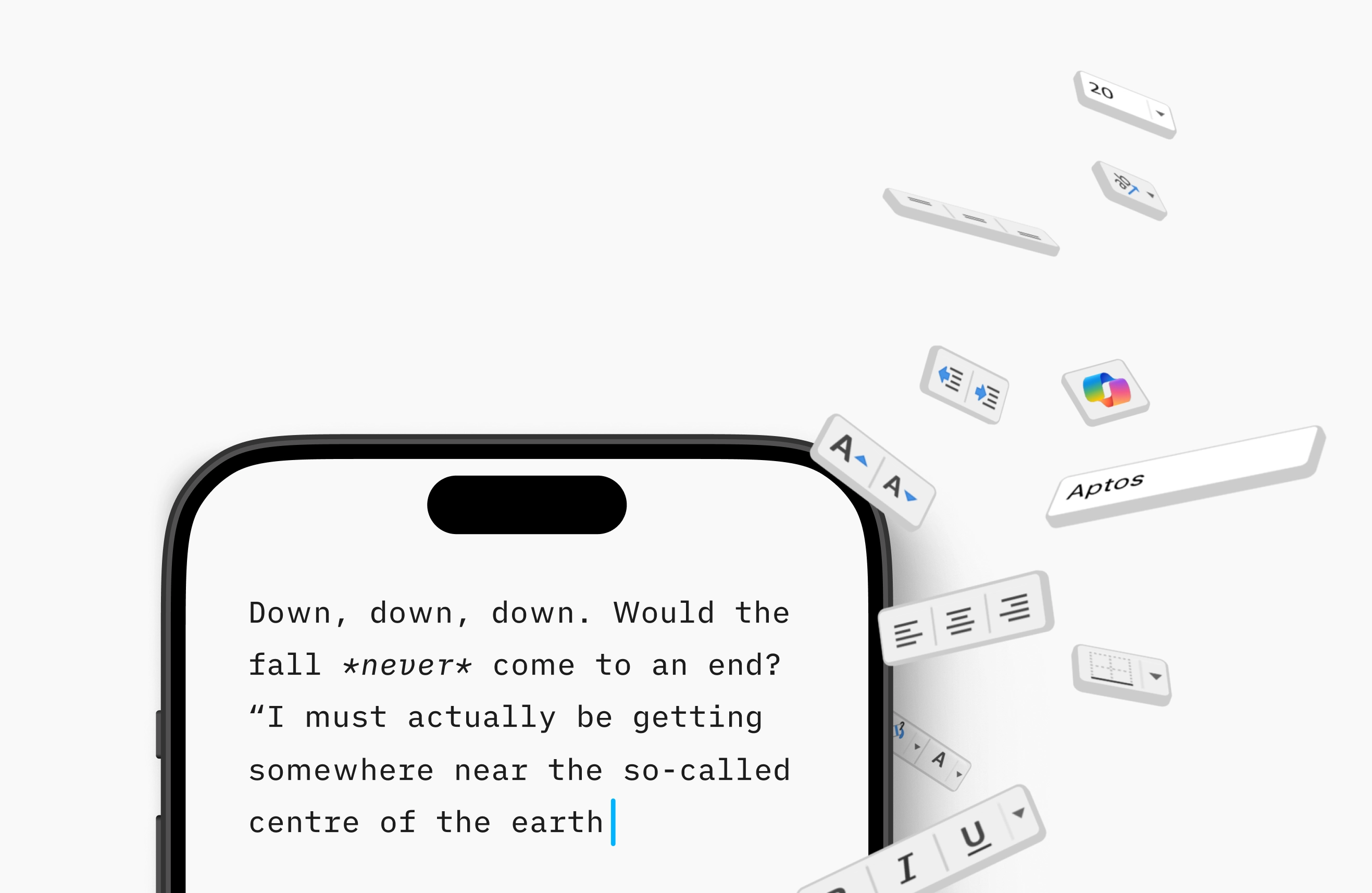
Separate Writing and Formatting
How to get focused

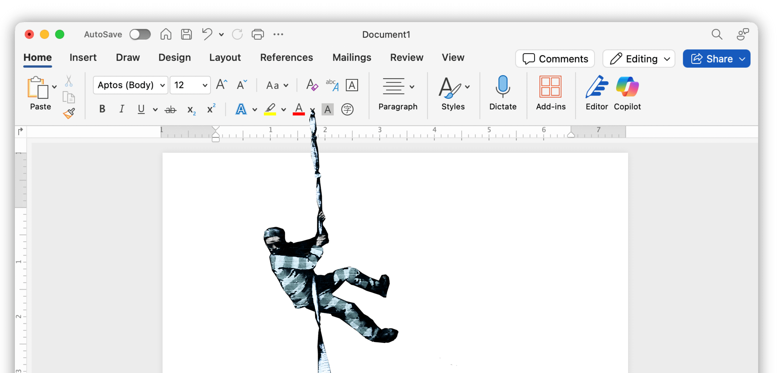
Trapped in MS Office
Seeking IT independence, Europe wants to escape Microsoft Office. The question is: where to?
NYC Midnight and iA Partner Again
Supporting aspiring writers worldwide

Popping-Up in Roppongi
More pop-ups, and a new office around the corner of Roppongi Hills
-
iA Newsletter


