まず、紙の雑誌が小さな iPad の枠に押し込まれた。PNG のスライドショーという形でだ。インタラクティブなロジックの欠如を補うため、この見栄えのいいパッケージにはフルーティーなナビゲーションが付けられた。最後には、アプリ内リンクで味付けされ、いくつかの動画を載せ、音声ファイル(「インタラクティブ」)で塩を振って、マーケティングへ回された。そして 24,000 部売れた。ちくしょう。90 年代がまたやってきた。
更新: InDesign と iPad の違いを示すために、ほとんどの例を更新した。多くの人が、InDesign から iPad アプリへそのまま書き出すのは適切ではないことには同意しつつも、タイポグラフィ上の問題は見えていないと言っていたからだ(実際には同じ論点だ)。iPad の例は、縮小してコントラストを強めたスクリーンショットなので 100% 公平ではない(粒度は失われている)。しかし、コンピュータ画面でより高い解像度を再現できない以上、コントラストを上げてフォントを見かけのサイズまで縮小したときに何が起こるかを示すには、これが唯一の方法だった。適切に比較したいなら、iPad 版 WIRED アプリをスクリーンショットの横に並べて見てほしい。
良い写真はそれだけで語る。だがテキストは別物だ。本来果たすべき役割、つまり伝えることをするには、かなりの修辞の技術とタイポグラフィへの配慮が必要になる。画面上では、事態はさらに複雑だ。WIRED のジャーナリストやグラフィックデザイナーが今も一流である一方で、iPad アプリのタイポグラフィとインタラクションデザインは、その足元にも及ばない。ここでは、新しい WIRED アプリを iA がどう見ているかを、短く率直にまとめる。
1 カラムか 2 カラムか? 好みの問題ではない
iPad の縦向きには、左右に十分な余白を取れるちょうどいいカラム幅がある。横向きなら、さらに余白は増える。なら使えばいい。縦方向に無限の空間がある媒体で、密な多カラムレイアウトを作る必要はない。たしかに多カラムは上品でクラシックに見える。だが、重たい黒いダイヤル式電話も同じだ。実際には、多カラムの記事ページは、重いダイヤル式の携帯電話くらいしか役に立たない。印刷ページの半分のサイズ、半分の解像度、つまり印刷ページの 4 分の 1 の粒度では、まったく別のゲームをしているのだ。 iPad の記事ページでカラムがうまくいかない理由は次のとおりだ。
- テキスト本体が分断され、もともと小さい iPad 画面をさらに散らかし、圧迫する
- 小さい文字サイズを強要するか、不自然に改行を増やして、神経質なジグザグの読み筋を作る
- 長文を切れ切れのページブロックに分けることで、全体の方向づけと操作が複雑になる(記事内のスクロールと、記事間のスワイプ)
- ハイフネーションが増え、大きな文字の穴や見苦しいラグが生まれる。小さなキャンバスでは空間を節約するどころか、無駄にする
- 紙のメタファーと固定されたページ高に縛りつける
- 「で、次は?」という瞬間を何度も作る
- メンタルナビゲーションモデルを複雑にする。たとえば、記事の 2 ページ目で左にスクロールしたら、隣の記事の 2 ページ目に行くのか、それとも 1 ページ目に戻るのか?

はっきり言おう。現在の iPad の画面と解像度では、長文の画面テキストに多カラムレイアウトを使うのは感傷的なナンセンスだ。カラムを増やせば増やすほど、事態は悪くなる。
鉛と紙の限界に基づく古い基準ではなく、読みやすさに焦点を当てた画面最適化タイポグラフィの美しさが分からないなら、少なくともカラム間のガターは十分に取ってほしい。


WIRED アプリのカラム問題は、記事ページだけに限られない。ページによってはカラム幅があまりに狭く、テキストが神経をすり減らす読解パズルになる。次のレイアウトは見た目はきれいだが、ベニー・ヒルのテーマ曲 を脳内 BGM にしないと読めない。


(New York Times アプリにも同じ問題がある。横向きで 5 カラム、縦向きで 3 カラムを、読みやすいフォントサイズでやると 1 行 3〜5 語になってしまう。見た目はノスタルジックで美しいが、20 年代のスラップスティック映画の速くてばかばかしいサウンドトラックのように、読んでいると落ち着かない。NYT アプリは記事に右へスクロールするカードモデルを使っていて、それも別の問題を生む [行き止まりが多い]。)
紙のデザイナーへ…
印刷では相性のいいフォントでも、アンチエイリアスのせいで不安定で揺れて見える画面では、うまく機能するとは限らない。Hoefler+Frere-Jones の このツイート には、かなり皮肉を感じる。
@sdadich と WIRED チームのすばらしい iPad アプリに祝福を。しかも、@H_FJ のフォントがぎっしり詰まっているからだけではない!
たしかに、「フォントがぎっしり詰まっている」のだ。だが、活字鋳造所が喜ぶものが、そのまま読者を幸せにするとは限らない。
- iPad でスクリーン向けでないフォントを使うのは、(いまのところ)巨大なサイズで使わない限り無理だ(そしてそれは別の問題を生む)。iPad 画面でのフォント描画は厄介だ。読者にコンテンツを読んでほしいなら、そこに向き合わなければならない。
- 一般論として、フォントを混ぜるのは長い文を書くようなものだ。超天才レベルの完全な制御がないなら、やるべきではない。悪い知らせは、iPad ではフォントの見え方を完全には制御できず、解像度が繊細さを台無しにすることだ。次のフォントの組み合わせは、印刷なら見事に決まるし、画面でもまあ大丈夫かもしれない。だが iPad の解像度/コントラストでは、太字の “a grazing snail” と “eats a bird” がぶつかる。


装飾と犯罪
印刷のキャンディを、そのまま画面のキャンディへ移すことはできない。印刷では、ページの装飾は好みとブランドの問題だ。だが画面上では、混乱を招く雑音になる。


- 古い 640 × 480 ディスプレイのような視覚的自由しかない小さな画面では、装飾要素が貴重な画面領域を奪う。しかも高いピクセル密度のせいで、1024 × 768 でもずっと小さく感じる。
- iPad の太く黒いフレーム(雑誌半ページほどの表面)は、息苦しい環境を作る。コンテンツや余白以外に空間を使うと、部屋はさらに狭く感じる。
- 電子機器でのナビゲーションは、ページをめくるようには自動的に進まない。直接的な意味や明白な構造を持たない画面要素は、すべてナビゲーションコントロールだと誤解されうる。ユーザーがそれを単なる飴だと学んだ瞬間、視線の中で事実上無視されるようになる。そうなると、重要なナビゲーション要素まで無視され、アプリ全体がバロック絨毯のようになる(黄色で示された単語がアプリ内リンクだなんて、誰が思うだろう?)。
広告の統合
コンテンツの中にうるさいバナーがないことや、フルスクリーン広告を使っていることは評価するが、WIRED アプリの現在の広告統合には重大な問題もある。
編集コンテンツの見た目はきれいだが、広告との見分けがつきにくい。John Gruber は、なぜかこのアプリをまだ高く評価しているが、「……多くの場合、とくに複数ページ広告では、今見ているページの下にまだページがあることを示す視覚的な手がかりがない」と指摘している。各ページで、編集コンテンツか広告かを見極めるために 2 回、3 回と見直す必要がある。編集記事を読んでいるのか広告を見ているのかを確かめるために、スクロールしなければならないことも多い(これは使い勝手の問題であるだけでなく、ジャーナリズム上の問題でもある)。アプリの終盤では、もう面倒になってしまい、読まずに最後のページまで飛ばした。
平たいグラフィックの束に 5 ドルは高い。(動画、音声、内部リンクを突っ込めば「インタラクティブ」だなんて言わないでほしい。)そのグラフィックの 75% が広告なら、私はばかみたいに感じ始める。読めないコンテンツのかたまりが載った、いくつかの広告のための妙なナビゲーションを見るのに 5 ドル払ったのか? 本気で言っているのか?
WIRED を作るのに 5 ドル以上かかるのは分かっている。彼らの仕組みには非効率がある。Cooks Illustrated は広告なしで 7.95 ドルだ(しかもすばらしい)。—@nevenmrgan
私が指摘した多くの問題(カラム幅、フォント選択、装飾、紙のメタファー)や、さらに多くの問題(コピー&ペーストやズームができないこと)は、紙のデザインに最適化されたレイアウトプログラムである InDesign を使っていること が原因のようだ。
Steve Jobs はまた正しかった
iPad アプリを作るには、オリジナルのツールを使うべきだ。Steve Jobs がそう言ったからではなく、そうしたツールが肉と骨を持った製品を生むからだ。iPad 技術の目的、可能性、限界を理解するには、それが必要だ。
では、WIRED は気にするべきなのか? 彼らはすでに 24,000 本売っているのに、iA のアプリはまだ出てもいないのだから(しかも、あのカラムでクライアントが何を考えているか誰が知るというのか!)。たしかに発売初日の売上は、WIRED のほうが私たちのアプリより大きいかもしれない。だが長期的な売上については、私はかなり悲観的だ。
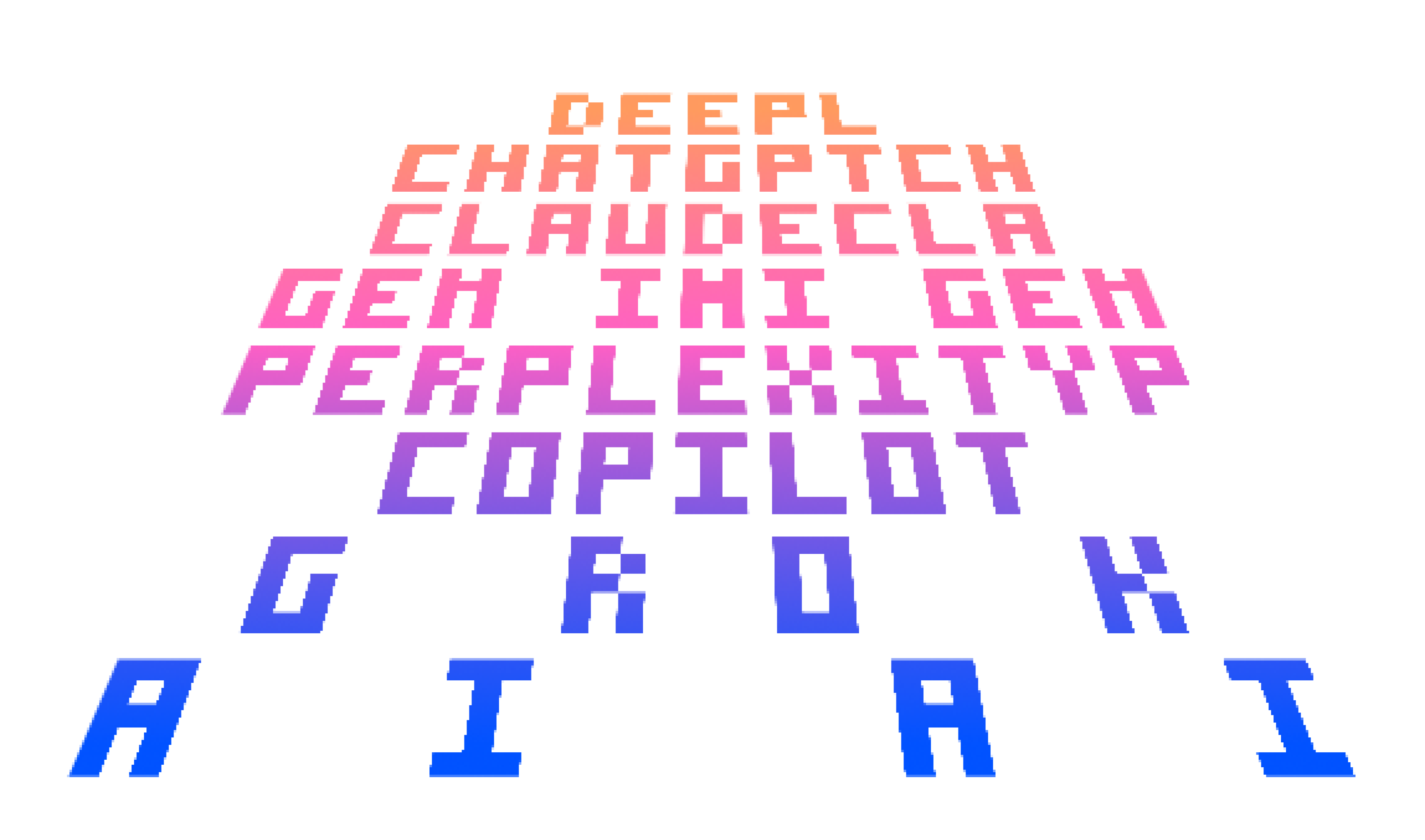
WIRED アプリのローンチ成功は驚きではない。読者のブランド盲目(「WIRED だ、WIRED っぽい、だから WIRED 的に良いはずだ」)と、ジャーナリスト読者層の願望的思考の結果であり、それは Adobe の 90 年代的な マーケティングのたわごと に見事に要約されている。
雑誌の未来は、いまここにある
いいや、違う。未来は決して「いま」ではない。そしてジャーナリズムの未来は、紙のレイアウトプログラムから書き出された、動画入りのバナーの束では絶対にない。もっと頑張る必要がある。
更新 #1: Jonathan Hoefler のコメント
引用は、彼が言及している上記記事の該当箇所だ。彼のコメントは “JH:”(Jonathan Hoefler)、私の返答は “OR:”(Oliver Reichenstein)で示している。
Using non-screen fonts on the iPad is (still) a no-go unless you use them at massive sizes, (which leads to other problems).
JH: The text face that we designed for the Wired iPad app was specifically designed with screen resolution in mind, and these were tested against the device-resident fonts Georgia and Verdana, as well as the also-non-screen-fonts Times, Helvetica, and Arial. Our text face, Exchange-ScreenSmart, won the lottery by being most legible on screen.
OR: The Exchange-ScreenSmart is, when seen on a regular screen, truly a masterwork. I am sure that—as most fonts we have been working with since starting to design for iPad—would be even more beautiful if properly rendered on the iPad (it’s crazy how well Minion renders on the iPad).
Font rendering on the iPad screen is a bitch.
JH: Personally I disagree—we’re testing all of our screen-optimized fonts on both desktop platforms and the iPad, and the iPad’s rendering (especially in-browser rendering) is demonstrably superior to even Safari 4 for Macintosh. But this is a discussion for another day, since all the fonts on the Wired app were rendered on a desktop platform, and provisioned to the app in the form of flat PNG files. The Wired app does not use the iPad’s rendering software at all.
OR: The problem is that one can simply not see that on the iPad since they’re all flat files. Which is a terrible waste given all the good work you have done. By “rendering” I didn’t mean that the iPad renders worse than OSX, I meant that the iPad resolution is a bitch in comparison to print (where there is no rendering). As you said, this is a different discussion, but the idea that you can render in InDesign and get a good result on iPad is, in my eyes, a terrible mistake. It is also a terrible mistake to put a print designer in charge of an iPad app. As Erik Spiekermann said: “iPad is not iPaper”, it has more or less 1/4th of the granularity. Who would use columns on a quarter of a magazine page?
Generally speaking, mixing fonts is like writing long sentences. Don’t do it, unless you have full super-genius level control over what you do.
JH: The Wired iPad app was art directed by Scott Dadich, who among other things is a three-time winner of the National Magazine Award. So I’d like to think the designer qualifies as “super-genius”—though, perhaps you’re talking about the rendering technology? If so, it might interest you to know that the composition of these pages was done in InDesign CS5, which certainly as sophisticated a degree of typographic control as any application on the market. (Are there better ones?)
OR: Scott is a super genius when it comes to paper design. But screen design is a totally different beast. Funnily enough, his pages look pretty good on a regular screen, with a lower contrast screen and without that black frame. On the iPad (with different contrast and resolution) they fall apart. Again: You just can’t design iPad apps in InDesign and export them as flat files. That’s nothing short of amateurish. (Sorry, Scott!). The main issues I have are not so much micro typography (I am an amateur there myself) but macro typography and interaction design. This is where the WIRED iPad app falls apart as a vain slide show.
The bad news: on the iPad you don’t have full control over the way fonts look, the resolution just trashes any delicacy.
JH: Perhaps I misunderstand your point, but this sounds like a general criticism of reading fonts on screen, no? In any case, I’m not sure which of the fonts in the Wired iPad app you felt were “delicate”—the palette includes our Vitesse, Tungsten, and Gotham Rounded families, as well as a few unpublished designs (Exchange and Forza) that are five of the least delicate typefaces we’ve ever produced.
OR: You misunderstood. If you start reading through our site you will notice that, in fact, the contrary is the case. My point is that a paper designer has per definition more typographic playroom because of the much higher granularity; he can do things that screen designers just can’t. I clarified the screenshots in the text to make my point more clear: You can’t put Ultra Black next to an ultra light type on a colored background in a strong light contrast environment such as the iPad. You can in print (if you’re a super genius like Scott). But the iPad is too rough a matrix to pull such tricks. BTW: Some of the problems are not obvious on a computer screen. Since the iPad slides are made on a regular screen they actually work much better here than on the iPad.

 JH: I hope you don’t think that I’d have commented favorably on the app merely because it used a lot of our fonts. Plenty of designers and organizations license lots of fonts from us, and if you’re a regular follower of either H&FJ’s blog or our Twitter stream, you’ll know that I’m rarely moved to praise any designer’s work. My tweet really did attempt to offer the perspective of a reader, not a vendor; I just mentioned that Wired was a client in the interest of full disclosure.
OR: I totally understand that and I am very happy we were both able to clear all this up for everybody. Let me just add one more thing since you don’t seem familiar with our work. We have been working on several iPad designs since January (among others, two pretty big newspapers and a text editor). Of course, we have tried different fonts, sizes, contrasts, backgrounds back and forth to oblivion. In other words, we are not trash-talking bloggers, but people that put their head on the block with such articles. Once our stuff comes out we will have to prove that we can do better—or run right into a big hammer. If you want to, I’d be happy to show you some of our work (after checking back with our clients—I’d be surprised if they said no to such an excellent opportunity).
I hope that cleared most misunderstandings up. If you want to continue the conversation, I’d be happy to update the article. But let’s continue on Monday. My family needs me on the weekend. :-)
Update # 2: Khoi on Column Width in NYT Editor’s Choice
**Khoi Vinh (creative director of the New York Times Online) on the column width (measure) in NYT Editor’s Choice reacting to my claim that “3–5 words per line is not how it works”. Please read the whole Flickr thread for context.***KV:* […] Oliver, as for your original criticism that 3–5 words per line is “not the way it’s done”, can you elaborate as to why you feel that is? Shorter line measures like this are very often easier to read than longer measures, which makes this layout, for me, quite preferable to many other article layouts (in apps and blogs). I acknowledge that the lack of true hyphenation and justification control makes this particular execution less than ideal (and that could be a legitimate case against it), but for me, this works very well, and I think lots of our users would agree.
OR: Even though my Swiss English might sound kind of harsh, I try to not rely on my feelings when I make such bold claims. It is a matter that I have researched at length when building my case for relative readability and bigger body text fonts back in 2006/2007. At a reading distance of 30 cm, the rules of thumb for long body text measure known to me are:
- Ruder: “something around 50–60 characters (depends a little bit on the language)” Ruder on measure, Example of too tight, good and too narrow a measure
- Müller-Brockmann: 7–10 words, Brockmann on measure
- Some say two to three alphabets, some say 45–70 characters
From The Elements of Typographic Style: “Anything from 45 to 75 characters is widely regarded as a satisfactory length of line for a single-column page set in a serifed text face in a text size. The 66-character line (counting both letters and spaces) is widely regarded as ideal. For multiple column work, a better average is 40 to 50 characters.”
All these rules gravitate around 50 characters. If you increase the reading distance (which is often the case with the iPad, since you happen to hold it on your lap and not with bent arms) you either have to increase the font size or the line width.
That you don’t have hyphenation is indeed not a minor issue: It makes things much worse as you get a ragged text that makes it impossible to discern where a paragraph ends.
To fix that you guys chose to indent the text which makes the initial line of a paragraph even tighter (you cannot use a line break in between). (Have you checked whether the line height inconsistencies come from the indent?)
That you don’t have justification is (like you said) another major issue. Newspapers have tighter columns because they need to feature more information on a defined space because of paper costs (and because of the big paper sheet dimensions). They can go for the lower end of column width because they have a lot of control over the text (hyphenation and justification). But we have neither the space problem nor the control.
Now you know that I greatly respect you. I cite you all the time when it comes to explaining the difference between web and print design (control, granularity). As a matter of fact, when my clients asked me why I am against columns and I usually say that I cannot imagine that you did this but the paper department (which is a situation I know very well since with my newspaper clients it is also the paper department that is in charge). So I hope that you will see this discussion in this context.
The main issue I have with columns though are not the typographic problems. My first main issue is that they force us to use a card model, that in turn forces us to
- Use a defined screen height, which
- Narrows the liberty of using the touchscreen estate vertically, and
- Forces a lot of swipe interaction (instead of scrolling & swiping).
Secondly, they complicate the orientation between the text blocks as soon as you use pictures in your layout, forcing the reader to find out where the text continues on a conscious level.
As you can see, I am pretty sure about this, and really curious to hear your answer. (I hope you will see this debate in the context of your article on critique).