"Design": In everyday life, “Design” refers to the pleasant shape of things. It is a superficial term, cosmetic rather than structural in its meaning. When designers talk about “Design” they refer to how a product or service works, rather than how it looks. Designers, a highly heterogeneous audience, have a more structural, sometimes even moral understanding of how products are built. The difference in use can lead to a lot of misunderstandings. When talking to a client, be sure to specify what kind of design you’re referring to, which helps avoid debates around Taste.
PLAN
Articles related to "Design"

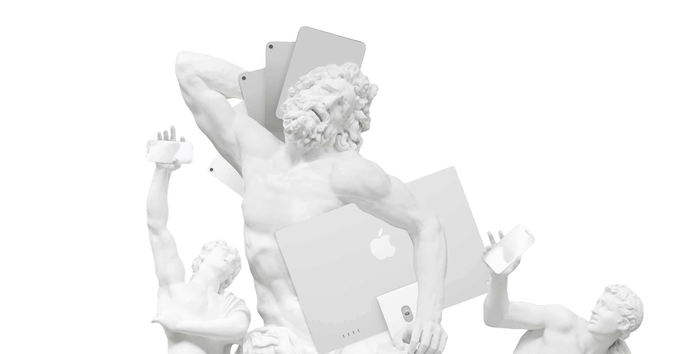
Madness and Imagination
To improve anything, we need to dare to imagine and make what doesn’t exist.
Liquid Glass
Design or Kitsch?
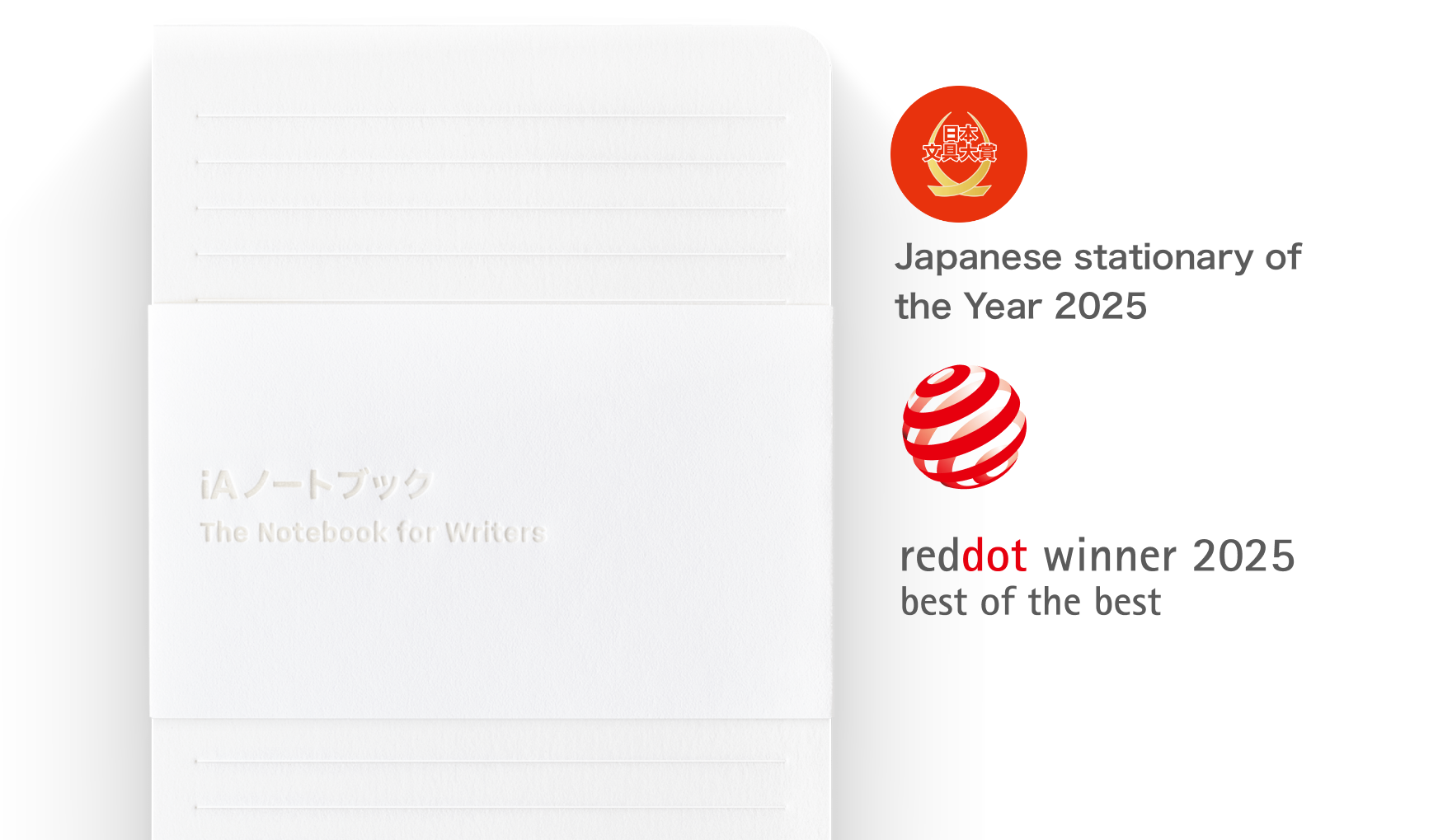
Japan Stationery of the Year
iA Notebook wins its second award this year
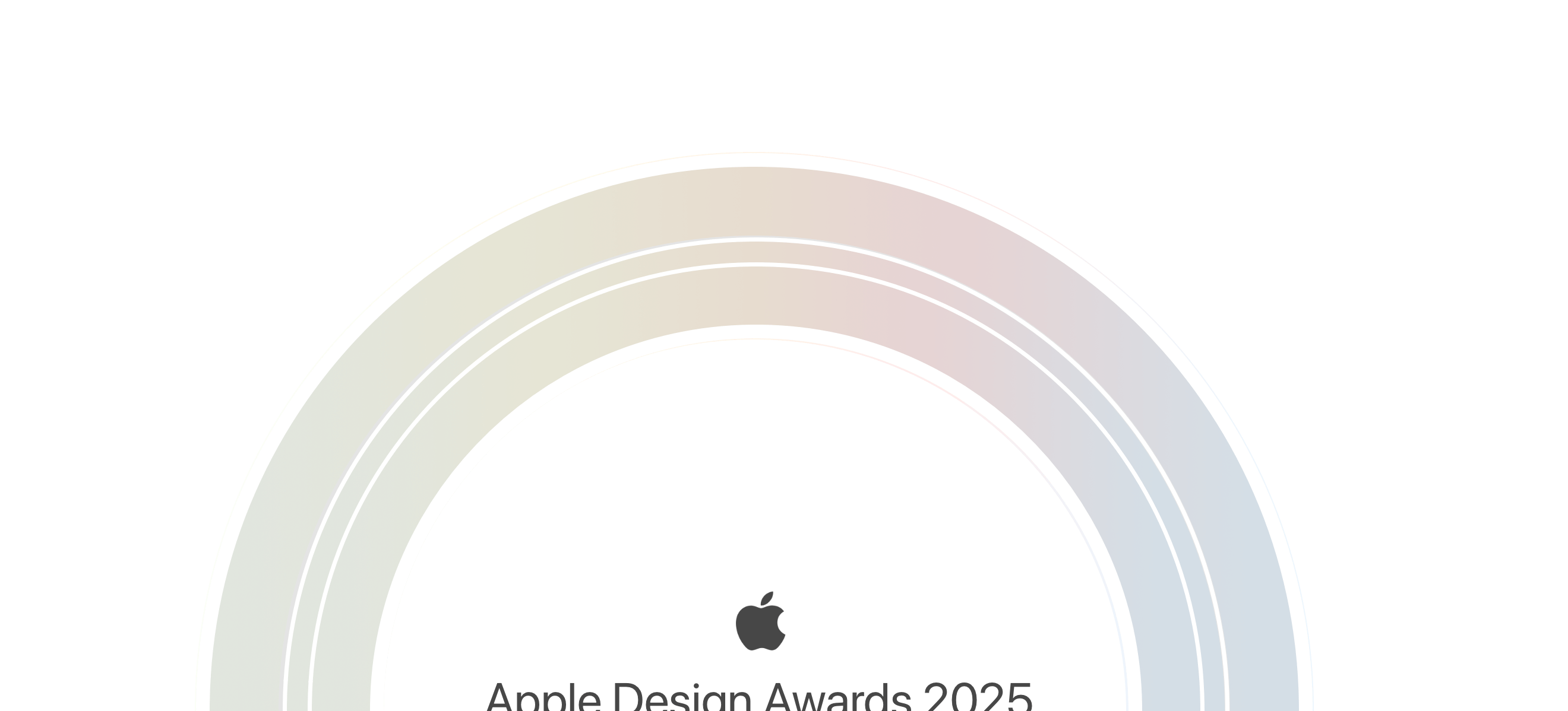
Apple Design Award Finalist After 15 Years
Good design is long-lasting

Know How
Jony Ive’s Philosophy of Design

Maker’s Knowledge
Giambattista Vico's Design of Philosophy


