PLAN
Design: In everyday life, “Design” refers to the pleasant shape of things. It is a superficial term, cosmetic rather than structural in its meaning. When designers talk about “Design” they refer to how a product or service works, rather than how it looks. Designers, a highly heterogeneous audience, have a more structural, sometimes even moral understanding of how products are built. The difference in use can lead to a lot of misunderstandings. When talking to a client, be sure to specify what kind of design you’re referring to, which helps avoid debates around Taste.
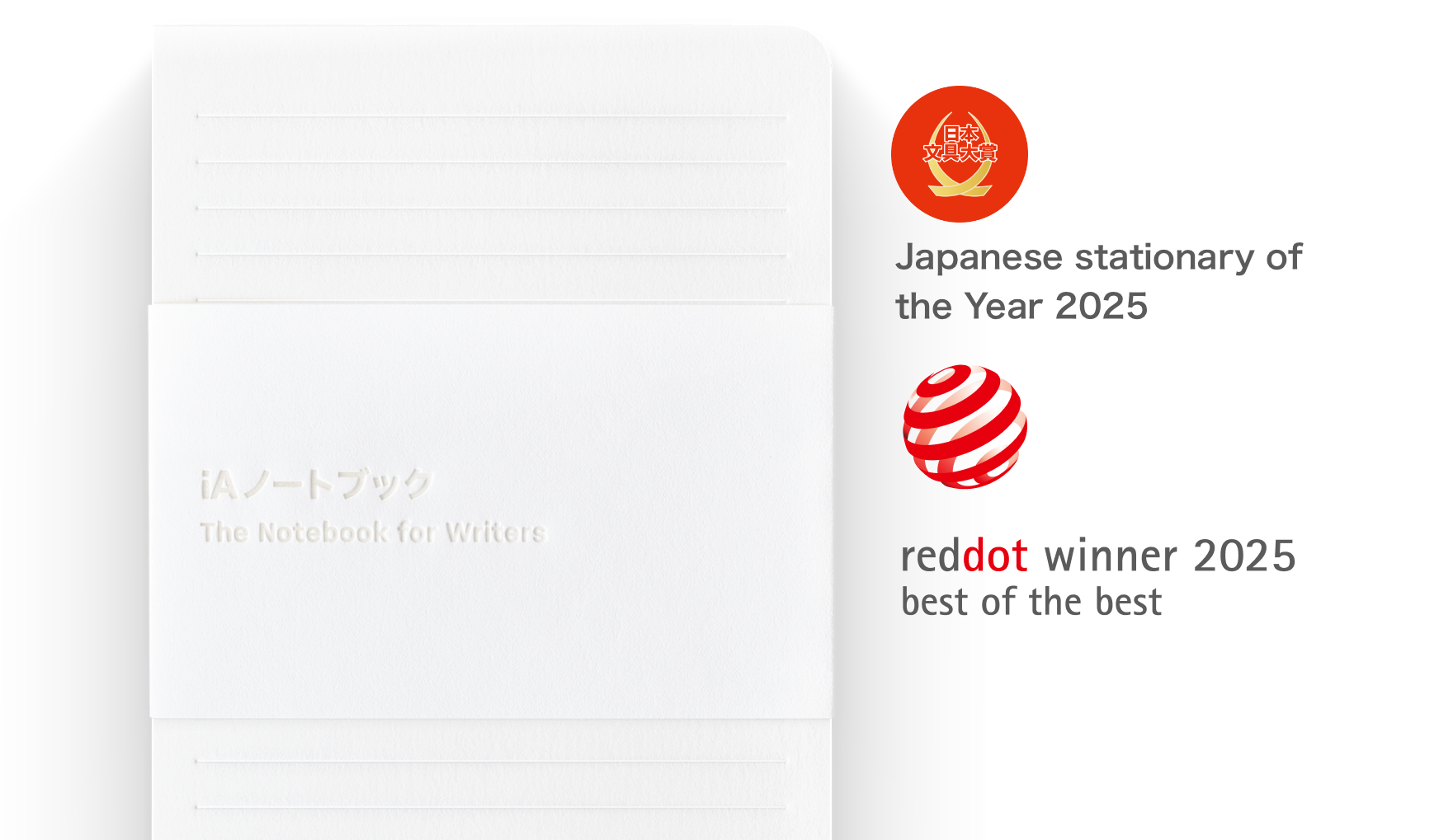
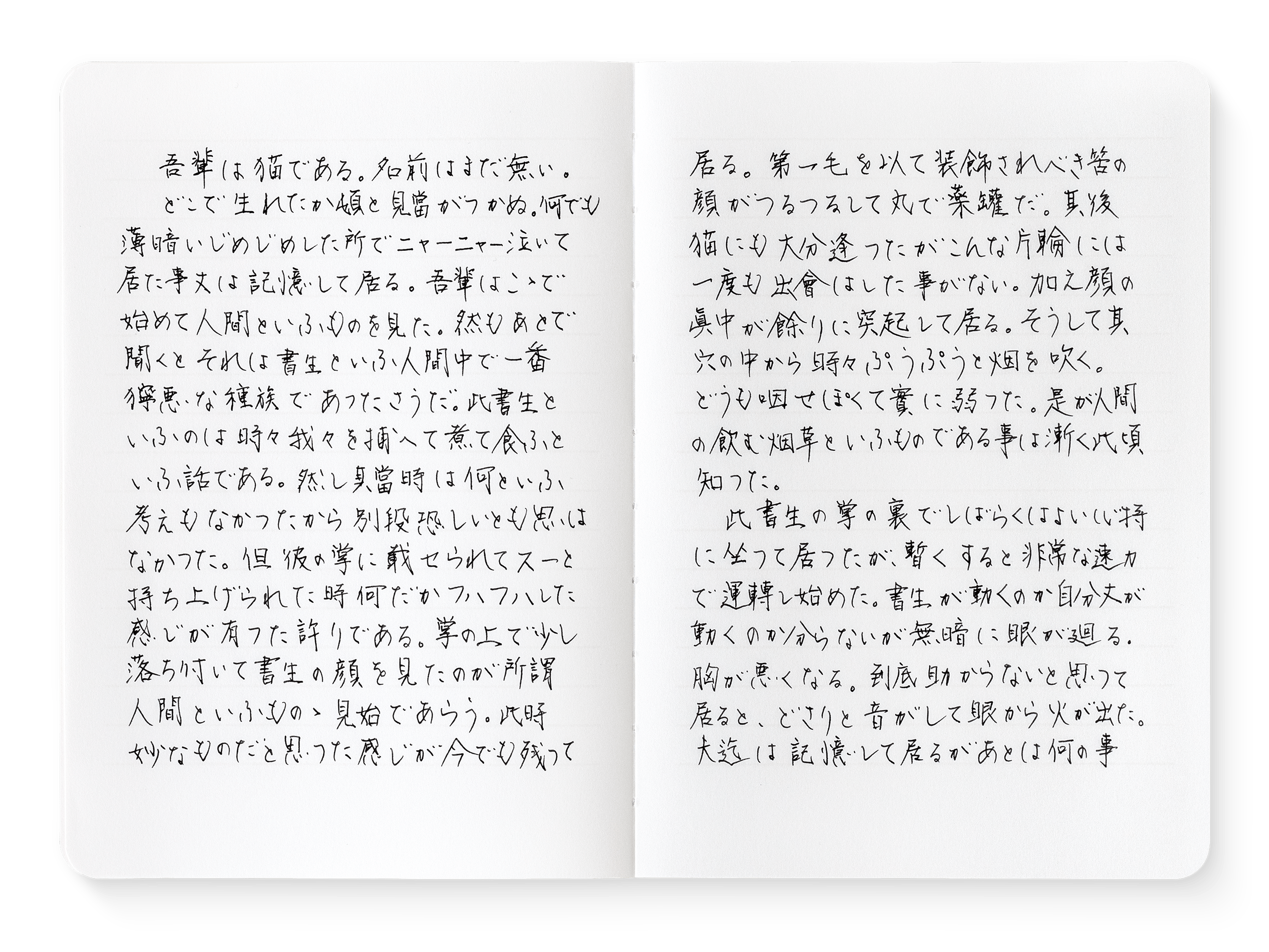
Not sure what to get your friends for Christmas? The next batch of 1,000 iA Notebooks is ready to ship—just in time for the holiday season!
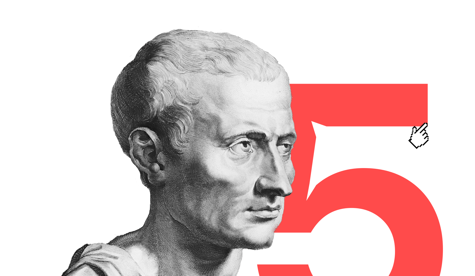
Presenting is an ancient art, studied and refined over centuries, and captured in the Five Canons of Rhetoric.
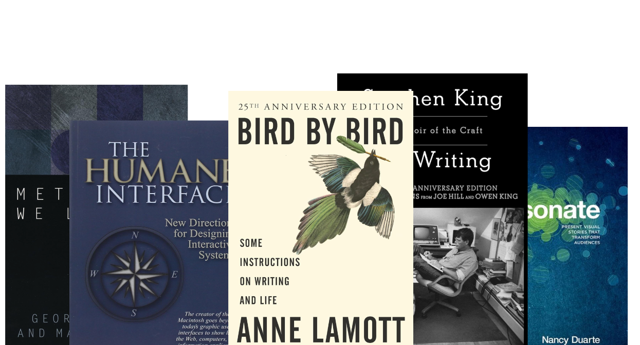
Five more books to help you improve your writing, presenting, and design skills.
Looking for reading suggestions for this summer? Check our selection of books about writing, presenting and design.
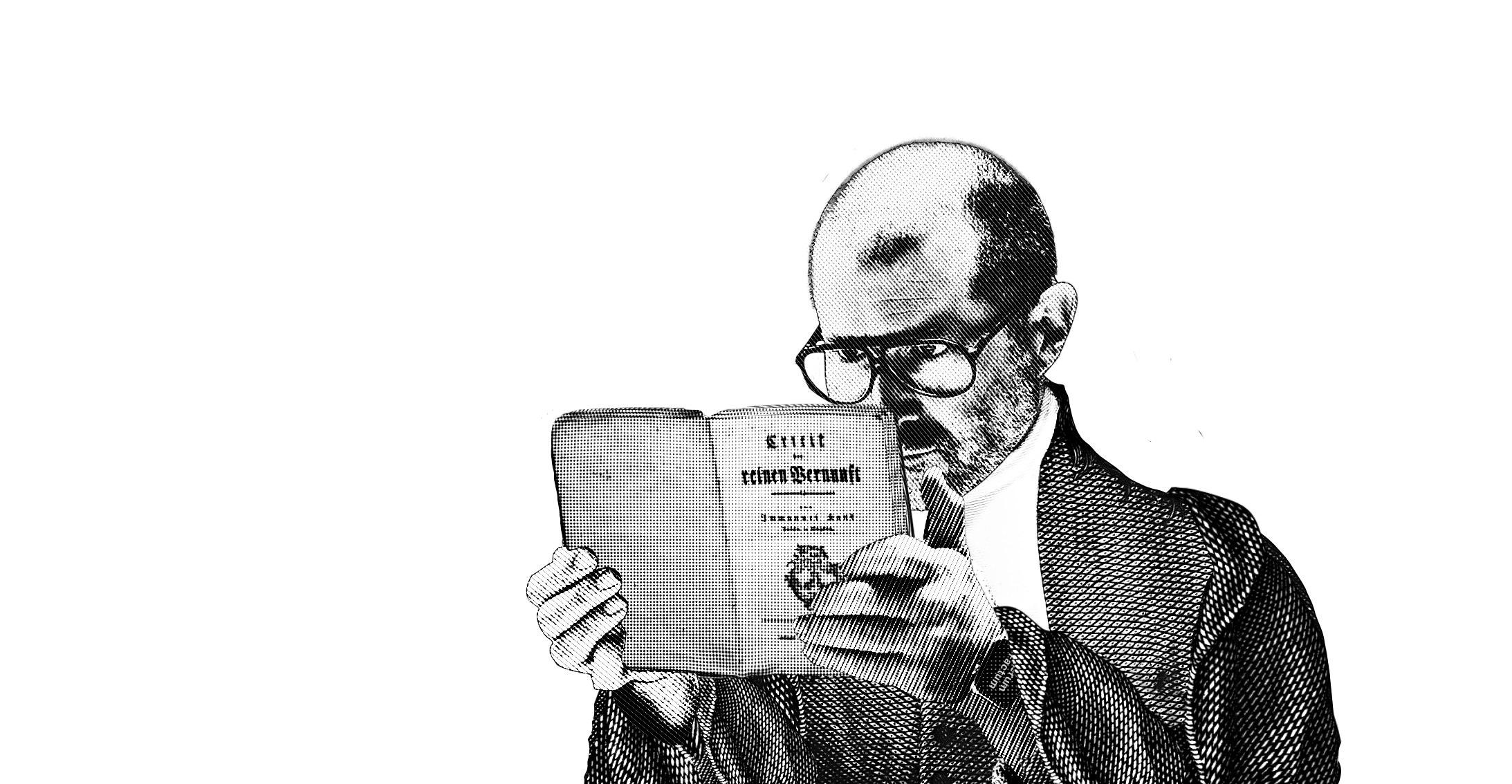
Orlando and Oliver studied philosophy together 30 years ago. Their shared love for philosophy, design, and technology reunited them to discuss AI and the future.
Online sharing is now available in iA Presenter beta for Mac.
Following the enthusiastic response to our announcement in December, we are pleased to open preorders for the handcrafted iA Notebook.
Things can be replaced. Lost time, however, is forever lost.
Designing iA Presenter took us three years. Design takes time.
Being fully immersed in writing is like composing and playing music while we drum up our perceptions into letters, words, sentences, and paragraphs. How does it all play together?
Facebook fishing for our email passwords, Roomba is hovering up all the data on our homes, Amazon is listening to our conversations for laughs, Tik-Tok spying on our kids. And that we see so much dirt on the surface makes it likely that under the surface it's even worse. The solution for all of this: "Ethics". Design ethics! Tech ethics! Business ethics! Ethics for AI!
The next update of iA Writer does some extreme typographic acrobacy. It comes with three variable fonts which give us 1000s of grades. This allows us to adjust the weight of the font depending on size, device and background color. Additionally, we adjust the line height and spacing depending on column width and type size. The crazy part is that you probably won't see any of this. But you might feel it.
As the success of design has become measurable, it has transformed a handicraft into an engineering job. Not the master designer but the user is the arbitrator of good design. The key performance indicator is not beauty but profit. As financial and technical performance was gained, beauty left the stage. Now it feels like something is missing.
Everything around us is designed. Design shapes cities, gives form to houses, sketches and connects spaces; designers define our environment, our things, bodies and minds. Design is political.
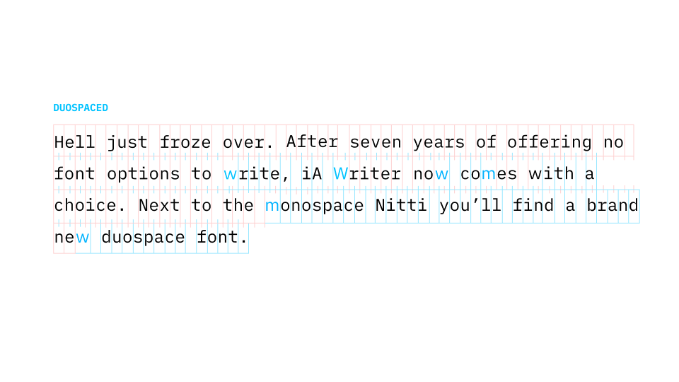
Monospace is the typical choice that communicates writing. With iA Writer Duospace, we went a step ahead. After seven years of offering no font options to write, iA Writer now comes with a choice. Next to the monospace Nitti you will now find a brand new duospace font. Duospace?
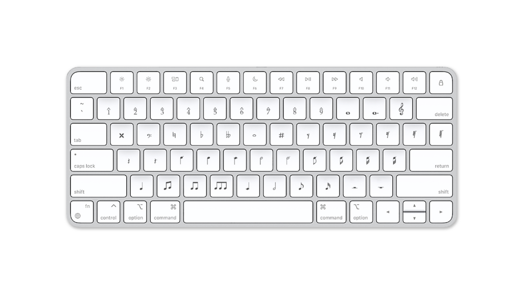
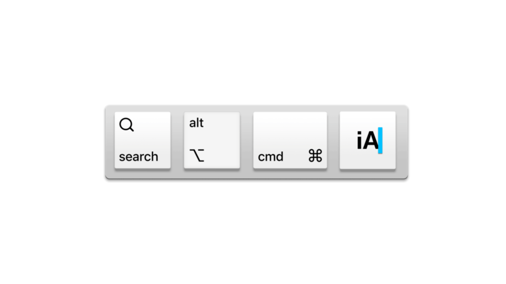
iA Writer 5 will be released on iOS shortly. You asked for more focus on the writing, so we directed our attention on the keyboard, the heart of your writing experience.
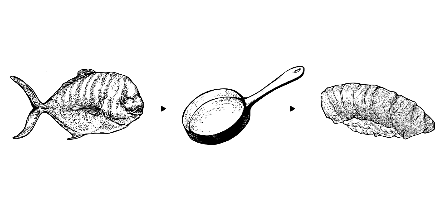
Technology evolves from raw to complex to simple. From the fist to the hand axe to the hammer. From carts to the Model T to Tesla. From switchboard-operated phones to digital phones to smartphones. From SMS to Facebook to Messenger. From the crude to the cooked to Sushi.
iA is speaking at a wide range of design and tech conferences. An overview of past and future events.
To spice up our monster essay on icons, we created an icon monster shooter arcade game. Planned as a one week hackathon, it turned into an amazing one year adventure. Here is what UX designers learned creating an arcade game.
Icons save space. Icons look crisp. Icons give quick answers to hard questions: How do we make it nicer? How can we brand it? How do we make it more fun? We ♥ icons. Until they start messing with our minds.
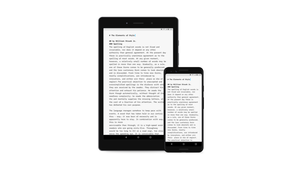
In the summer of 2014, we started dabbling with the Android SDK to get a feeling of what it would mean to develop an Android adaptation of iA Writer. We discovered a dev-friendly world with scant traces of the Android horror stories we had in the backs of our minds.
To get a good perspective, we start our projects with research. We go mobile first for prioritization, and we want all the content first so we can design in the browser… Unfortunately, the reality of web design follows a different stereotype.
Everybody likes logos. Everybody wants their own logo. Everybody wants to make their own logo. Everybody has a computer and some fonts. Anybody can make a logo. What makes designers think they are so special?
Learning to design is learning to see, an adventure that gets more and more captivating the further you go. A love letter to my profession.
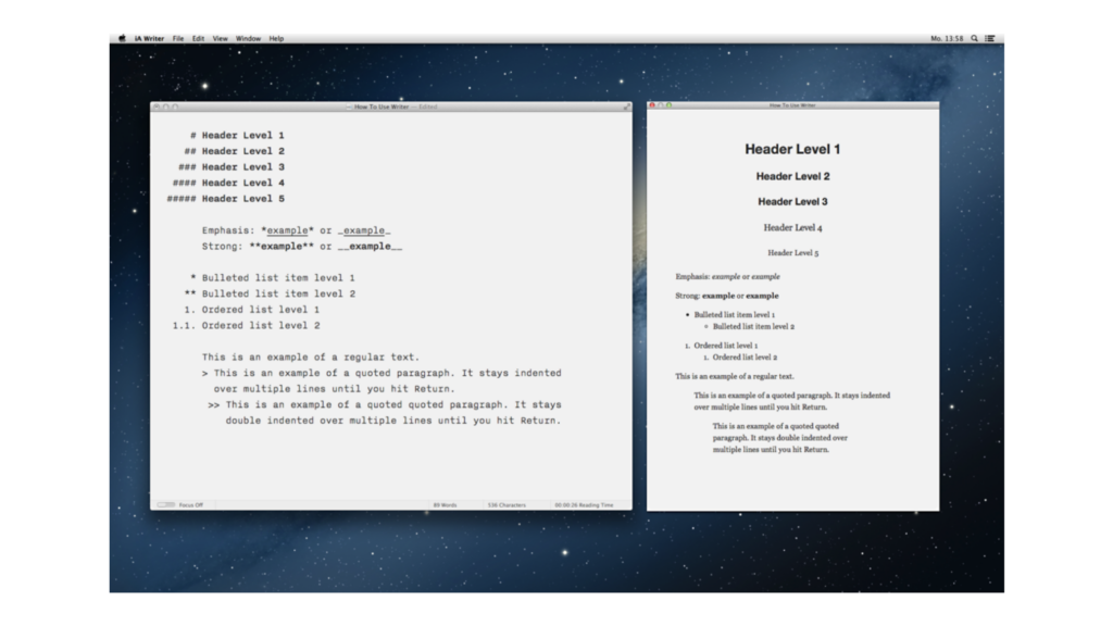
iA Writer for Mac is the first native text editor that uses a responsive design. Why did it take so long?
The following Interview on iA Writer and the secret of its success has appeared in Business Insider, who reached out to us, “to get the story on where his app came from, where it's heading, and what's wrong with contemporary text editors.”
Since iA's work is informed by its presence in Europe and Asia, The Verge wanted to know our thoughts on the differences between the two, and in particular where he sees the state of Japanese design right now.
When we built websites we usually started by defining the body text. The body text definition dictates how wide your main column is, the rest used to follow almost by itself. Used to. Until recently, screen resolution was more or less homogeneous. Today we deal with a variety of screen sizes and resolutions. This makes things much more complicated.
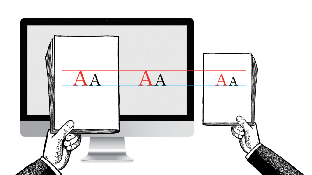
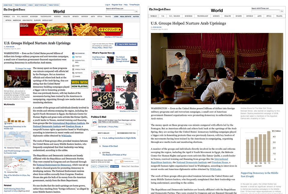
With the chaos of different screen sizes and a new generation of web browsers, the design paradigms of layout and typography have shifted away from static layouts and system fonts to dynamic layouts and custom web fonts. Screens are changing not just in size, but also in pixel density. Now we need not only responsive layouts, we also need responsive typefaces.
Interview with William Channer for DRT, focusing on “the importance of keeping interfaces simple, why current websites are complicated and the pitfalls of research and why it's a good starting point to understand user expectations.” This is the unedited transcript of the interview.
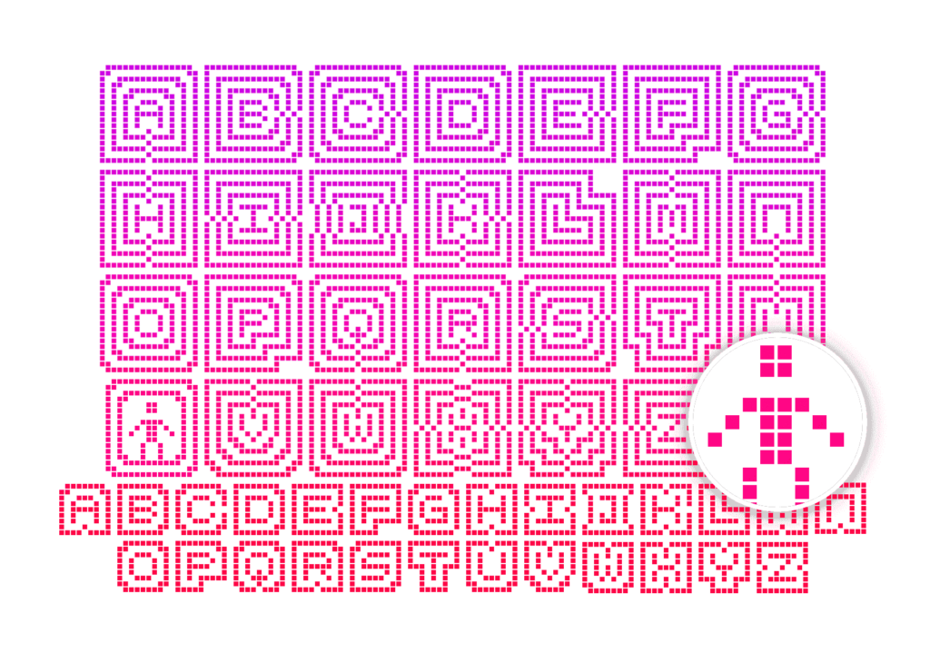
The idea: Look at the history, shape and sound pattern of each letter, sum it up in 140 characters, and collect a beautiful specimen for each letter.
I had a perspective-changing talk on the subject of pay walls with the chief executive of a big publishing company (no, I can't tell you who). He asked me what I think about pay walls.
Here is the lecture iA's Oliver Reichenstein gave in 2010 at Keio University on creativity, information, and innovation.
How do you navigate content on the iPad? Scroll or flip? In 1987, the biggest neck beards in tech held a conference on the Future of Hypertext and there were two camps, “Card Sharks” and “Holy Scrollers”. They had an epic battle over this question: Should you scroll or flip pages on the screen? Who won the fight?
There has been speculation about whether the Gap redesign was a super-dynamic marketing stunt, or just mere tomfoolery. If you know how plump most big corporations are, the answer to that seems pretty clear (tomfoolery). In the light of the recent run of brand redesign hullaballoos, it’s worth discussing whether scandalous redesigns help brand awareness or hurt brand image.
A presentation with the title "iA on IA," held at EuroIA 2010.
“Writer has out-innovated Apple. Writer is actively designed to help you write.” —Fast Company
Do architects design houses or do they design “inhabitant experiences”? The bullshit answer is “They design inhabitant experiences”. The pragmatic answer is: “They design houses”. The cautious answer is: Architects design houses that lead to a spectrum of experiences, some foreseen, some not. But they do not design all possible experiences one can have in a house.
Jeron van Geel interviewed Oliver Reichenstein on Jonny Holland. He asked a series of questions about the relationship between Philosophy, Design, Japan and Western culture.
First, the paper magazine was crammed into the little iPad frame. In the form of a PNG slide show. To compensate for the lack of interactive logic, this pretty package was provided with a fruity navigation.
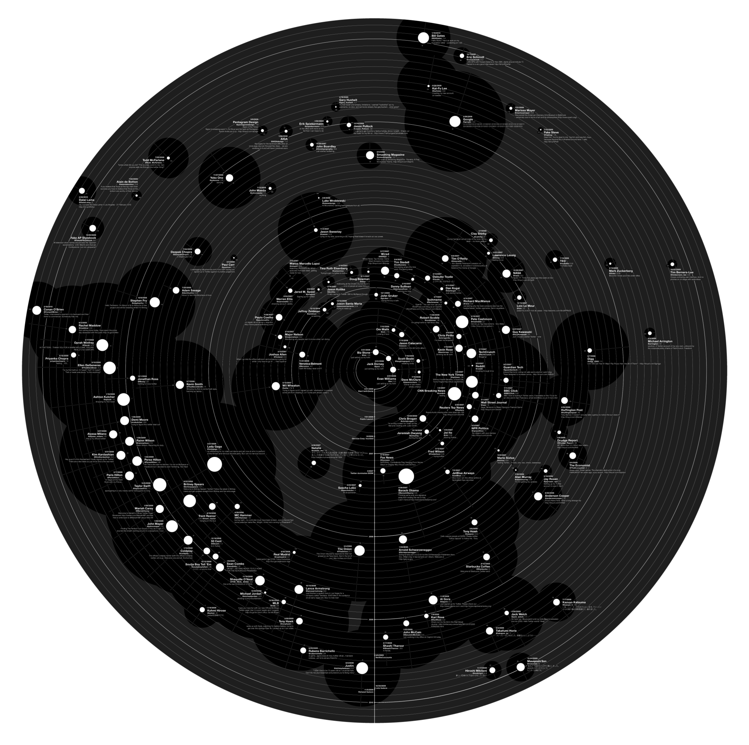
Our latest Web Trend Map tells the story of Twitter and its 140 most influential Twitter users. Surprisingly, it’s even more popular than Web Trend Map 4.
Hier ist unsere nächste Web Trend Map. In diesem Jahr gibt es keinen Metro-Fahrplan und auch keine Internet-Adressen. Stattdessen zeigen wir die 140 einflussreichsten Twitter User mit #Namen, #Alias, #Kategorie, #Einfluss, #Aktivität sowie wann und was sie zum ersten mal getwittert haben.
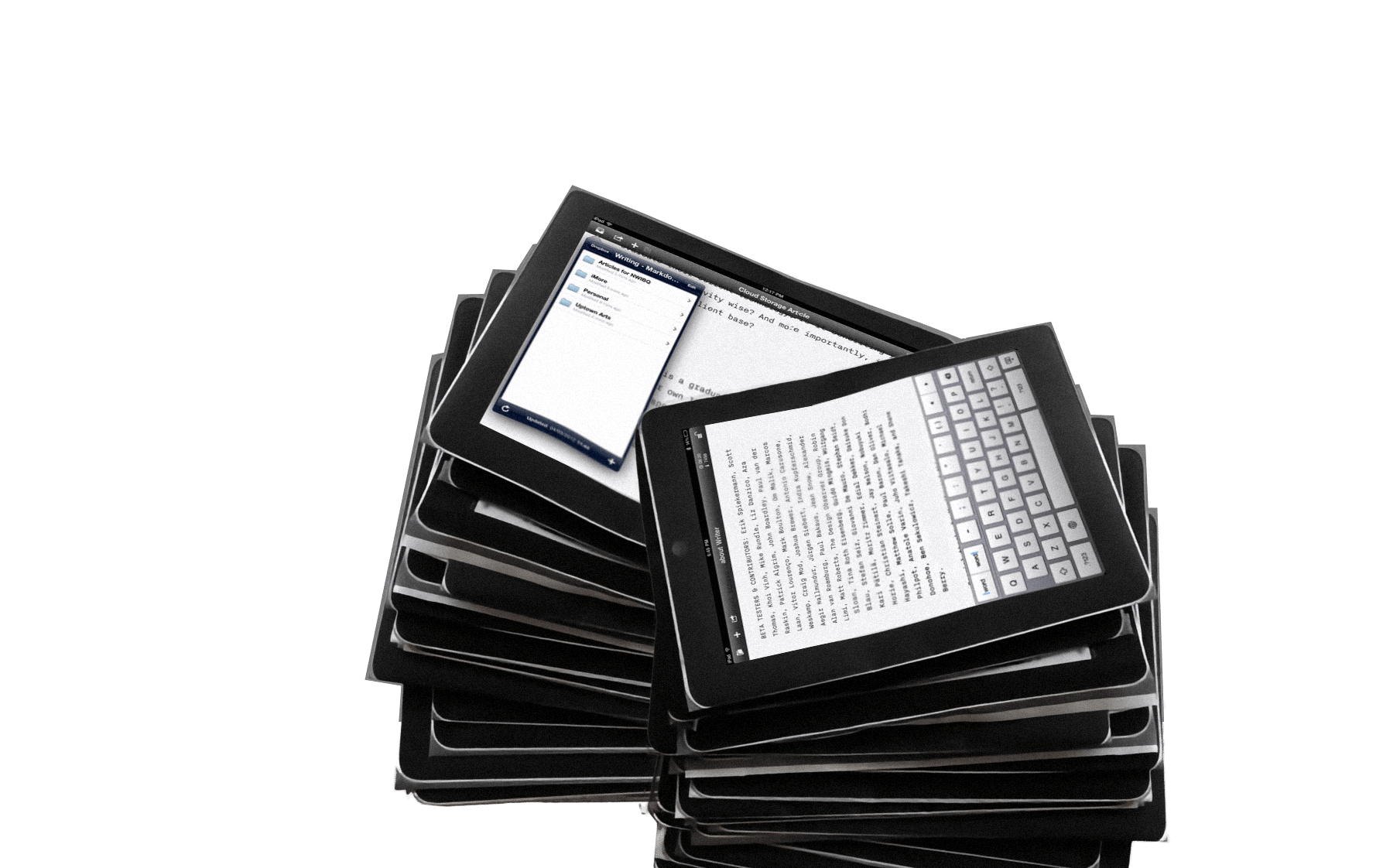
Over the last two months we have been working on several iPad projects: two news applications, a social network, and a word processor. We worked on iPad projects without ever having touched an iPad. One client asked us to “start working on that tablet thing” before we even knew whether the iPad was real.
From December 2006 to February 2007 we were in touch with the product manager of Facebook. The prospective: Redesigning Facebook. Eventually. Since the contract was never signed, we kept our designs in the drawer. Until now…
It’s one year since our last Web Trend Map. A lot has happened, but there are not enough changes in the landscape of domains in the last 12 months to create another domain-based Web Trend Map. The big changes happened one level higher, on the social layer, that is: On Twitter and Facebook.
I’ve been asked by the Italian magazine L’Espresso to write an article on The Future of Web Design. Here is the (longer) English text.
I sat down with the video team of GaijinPot for a short interview about the Web Trend Map.
First, think of a number between one and ten. Then take a step back and look at the words “User Experience Design” as if you had never seen them.
What makes Japanese design so special? Basically, it's a matter of simplicity; a particular notion of simplicity, different from what simplicity means in the West. So are things in general better designed in Japan? Well, actually, it's not that simple…

Recently, there has been a quality renaissance in the discussion about the economic future of journalism. While some are still touting the one miracle solution (usually alluding to Google’s business model and success), a lot of ideas have arisen that will probably make up for the economic future of journalism as a whole. Time for a summary.
Designers are narcissists, programmers are nerds, and whoever wears a tie must be a jerk. Designers, programmers and business people love to hate each other. That's why we keep them separated…
It hangs in the headquarters of Google, Microsoft, Facebook, WordPress, and Yahoo! Japan. Even the CERN in Geneva has its own copy. The WTM4 poster has caused quite a stir.
Blog comments have an innate communication problem: You can't discuss and moderate the discussion at the same time.
While the first map was hacked together in an afternoon, the second took a week, and the third devoured a month of concentrated work, the fourth Web Trend Map (due in February) has already taken more time in preparation than all previous versions combined.
With websites turning more and more into web applications, functionally as well as aesthetically, it'd be interesting to look at what makes a Web app work in terms of skinning. We start off by comparing two different approaches: HTML-skin vs. desktop-application-skin. In other words, Google versus Apple.
Das ultimative Tool für Internetfreaks, die Web Trend Map 2008, ist nun als A0-Poster erhältlich.
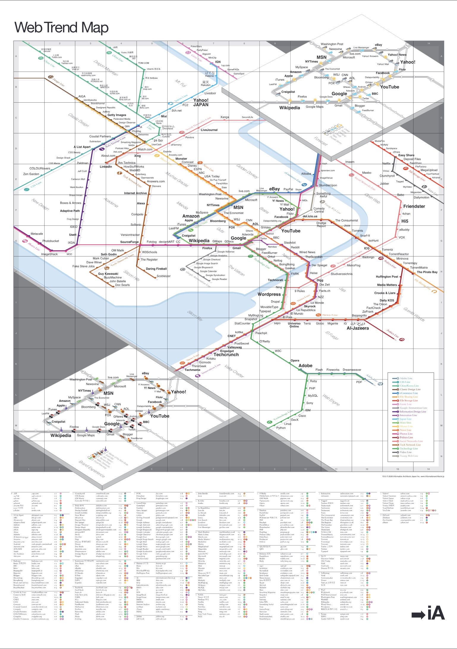
We are happy to announce that the coolest gift for geeks, the A0 poster of the 2008 Web Trend Map, as featured by The Guardian, WIRED, Le Monde, Corriere, kottke, Boingboing, Techcrunch, Mashable, Valleywag and literally thousands of blogs.
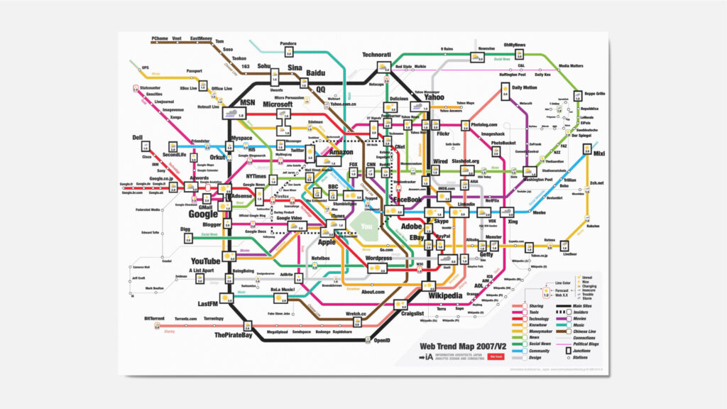
We present you with the 2008 Web Trend Map, in all its beautiful beta glory. This time we’ve taken almost 300 of the most influential and successful websites and pinned them down to the greater Tokyo-area train map.
Those familiar with the new Swiss train station maps may recognize one source of inspiration. We’ve adopted some concepts from our good friend Adrian Schaffner’s work on mapping Swiss train stations.
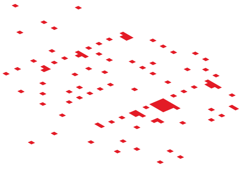
We’ve redesigned the Web Trend Map from scratch. It’s now presented as an isometric landscape.
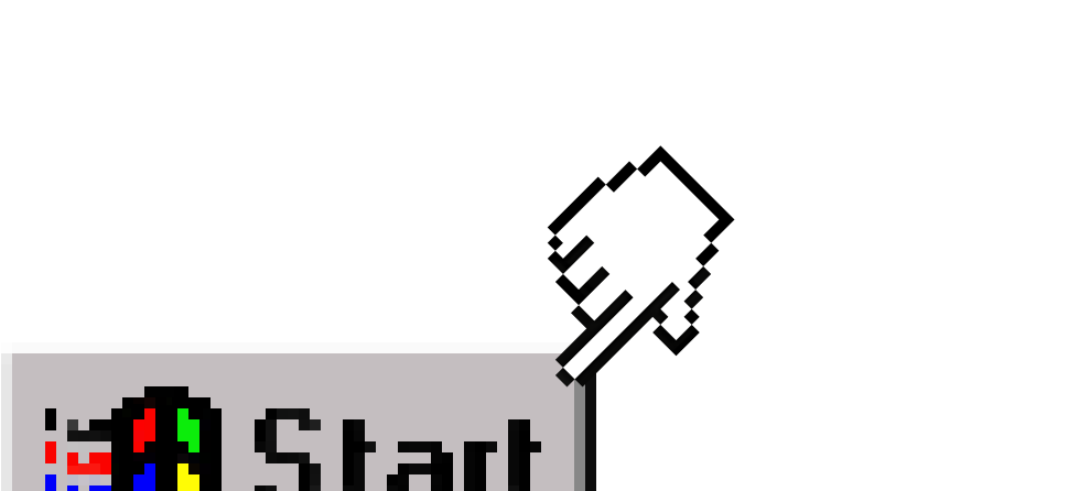
We have hated this thing for over 12 years now—the button that launches a pull-up menu. Only the twisted minds over at Redmond could come up with this. Yeah, I know it's not a real "Start" button anymore, with Vista it's become more of a clickable logo like the Macintosh one. But, after all this time, it is still a push-up menu. And that is another major branding crime. Why?
A wonderful example of what not to do if you believe that Brand = Interface. Copying interfaces defines you as a second choice company.
The Interface is the brand—but few interfaces qualify to leave out the main orientational element—the logo.
A company may choose to rebrand itself because of a merger, a bankrupting scandal, or because they simply have outgrown their name. These are solid reasons; however, on the web, rebranding should be considered with the caution of a face transplant.
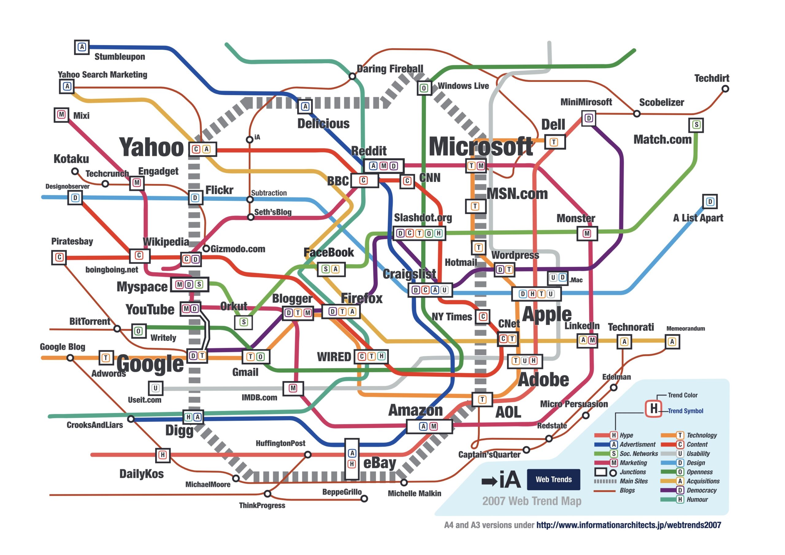
We have done it before, and now we’ve done it again—the poster of most successful websites, mapped to the Tokyo Subway, is back!
The other day we got a telephone call from a business man that planned to "exponentially increase" his Internet performance. His budget? $1,000.
After our last post on “The Future of News” we have been asked again and again to illustrate what a newspaper as a wiki would look like. We’re happy to oblige…
Earlier this year we speculated that in 2007 "Big ad investments start streaming in". Our prognosis was heavily understated.
When I read this morning that USA Today "refashions itself as a social network", I got a little shock as I was worried that they are going to eat our client's lunch. Fear nothing, client. Among information designers the USA Today redesign is a laughing stock.
What started as a fun new years card made quite a few waves. The Web Trend Map’s reception so far…
As a Christmas and New Year’s present to our clients and readers we have created three fun Internet overviews.
Since Mondays are typically low energy days, I’d like to share this story with, to reassure you: If you have a strong vision—no one can stop you.
Using 10 pixel Verdana made sense in a time when screens were 640 pixels wide. Today it is a mistake.
When people ask me about my background, they're confused. I studied philosophy. How come I do web design? In short: The old Greeks brought me here. What can Internet workers learn from the old Greeks?
An avalanche of comments, hundreds of applauding blog entries, honorable mentions from cooler and more sublime and hotter and higher places, forum discussions, translations in Chinese and partially in Italian and even blunt plagiarism was incited by one of my recent notes.
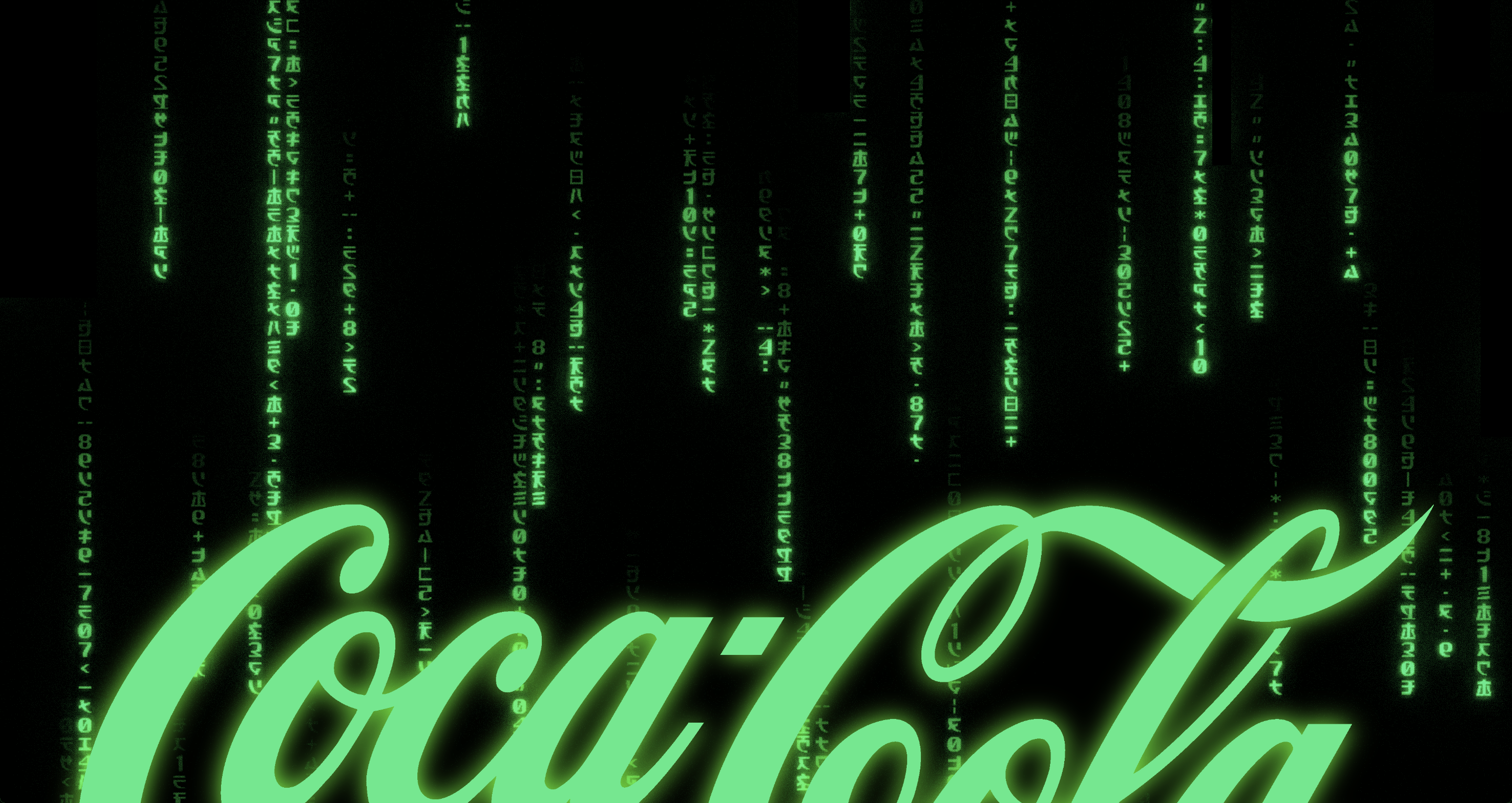
Brands make us associate positive values and positive experiences with the products they mark. Brand values are defined by the senior management in the “Brand Matrix”. Coca-Cola recently changed their brand matrix. Are we soon going to associate other things with Coca-Cola?
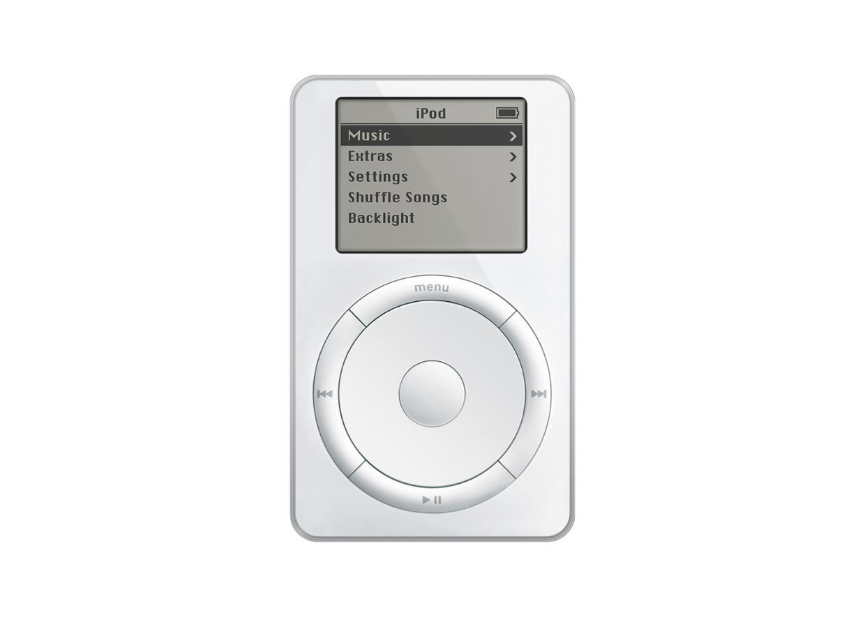
All things have an interface. Shaping interfaces is shaping the character of things. The brand is what transports the character of things. When looking at McDonald’s, iPod, or Nintendo DS it becomes quite obvious that the interface *is* the brand.
“Most people make the mistake of thinking design is what it looks like. That's not what we think design is. It's not just what it looks like and feels like. Design is how it works.”
Simple websites are easy to use, easy to understand, nice to look at. In practice, websites are either unusable or ugly and filled with too many words. Why do designers have a hard time to keep it simple?
Since I’ve started developing websites I’ve been looking for the ideal layout. Today I got another hint on the direction to take. Jacob Nielsen calls it the “F-Pattern”.
Your website is more important for your company and its brand portfolio than your business card, your brochures, the products you sell, your packaging, the address and the building your company resides in.
As an information designer the interfaces we currently work on—no matter whether Apple or Windows—bother me. Yes, OS X looks a lot better than its predecessors, and Windows’ upcoming rip off of OS X looks better than the previous rip off.
If it is your side column on your website you want it. But does your user read—or even: see—it? You might argue that the side column is standard. So we do need it. Do we?
Internet users can give websites a thumbs up or thumbs down in less than the blink of an eye, according to recently published study report. Nature.com and Wired recently reported on the fact that we pass judgement on a website in less than a second. This sounds like good news for web designers. Is it?