Presentation Tips

Behind every great presentation lies a great story. Find out how to create stories that move people—without stock images, bullet points, or dull diagrams.
A few years ago we asked people what they didn’t like about PowerPoint. Here’s a summary of hundreds of (passionate) responses:
- Time: We spend too much time on our presentation. Then we run out of it
- Focus: We constantly fiddle with design but neglect the content
- Confidence: We’re afraid of boring others, and/or freezing
This comes as no real surprise when we take a closer look at how PowerPoint & Co. structure the creative process. Let’s compare writing a speech to what happens when we use PowerPoint:


Bad Habits
Tools like PowerPoint and Keynote shape the way we live and work. Our meetings take too long. No one pays attention. We’ve accepted empty presentations as part of the meeting theatre.
1. Death by Pretending
PowerPoint isn’t designed to deliver captivating presentations. It’s designed to make us design slides. We’re made to pretend that we know what we are talking about. We’re forced into treating empty speeches as being normal.1
It’s not entirely PowerPoint’s fault that we pretend to speak and pretend to listen. But it’s not entirely innocent either:
“…responsibility for poor presentations rests with the presenter. But it is more complicated than that. PP has a distinctive, definite, well-enforced, and widely-practiced cognitive style that is contrary to serious thinking. PP actively facilitates the making of lightweight presentations.”2
To make people listen to you, they first need to look through your eyes. You won’t get that with stock images, graphs, or bullet lists. Instead, you need to tell a good story.
2. Playing with Templates
Starting is hard—and just gets harder the closer you come to presenting. We naturally resist beginning a task that will end in people judging us.
Common presentation apps try to push you through that fear by letting you choose a template. Picking a template feels nice. Suddenly, starting looks like fun. But it really just delays you. It pauses the pain of asking yourself what you want to say.
3. Walls of Text and Bullet Lists
Putting lots of text on a slide and reading it out to the audience is the number one presentation killer.
Instead, use text as the script that tells your story. Choose visible elements carefully. Less is more.
When you read what’s on a slide while the audience is trying to do the same, your voice clashes with their internal dialogue. You’re forcing them to listen to two people at once.
Next, here’s how our beloved bullet lists ruin a presentation. They:
- Increase cognitive load
- Look and feel robotic
- Are distracting
- Bore the hell out of everyone
- Make you predictable
- Sound and look like notes
- Should be notes
Slides packed with bullet points look like a lot of work, but all they do is sabotage your presentation. Instead, lists like these should be your reading notes.
Focus on Your Story
In the real world we send text messages, emails, tweets, and write posts. Or we talk. Now and then we’ll share a photograph or a video, but mostly we use our words to communicate, and we do it quickly.
Your story is the very essence of every presentation. That doesn’t mean that every presentation needs to be a TED Talk. But every time you speak, you need to have something to say.
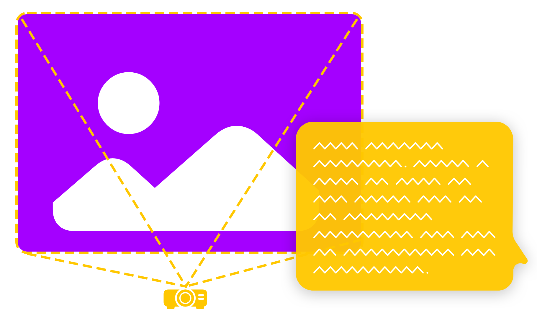
When you first open iA Presenter, you’ll see its text-based interface. By default, the focus is not on what your audience is going to see. The focus is on what you are going to say.
So start by writing your story. Add visuals later.

What you want to say usually already exists somewhere, in some form. You can paste or import an existing text, and you’re already 50% done. Add page breaks and visuals later.
What You Say ≠ What You Show
Reading from a slide is the fastest way to lose someone’s attention. We all know that. So why do we do it?
On average, we read 250 words per minute (WPM) while we speak at about 150 WPM. If you repeat what’s on a screen, your audience will read ahead. You’ve lost them. You spoiled them. They don’t want to hear what they already understand a second time. To keep their attention, avoid spoilers. Only show them the headline, while you tell the story behind it.
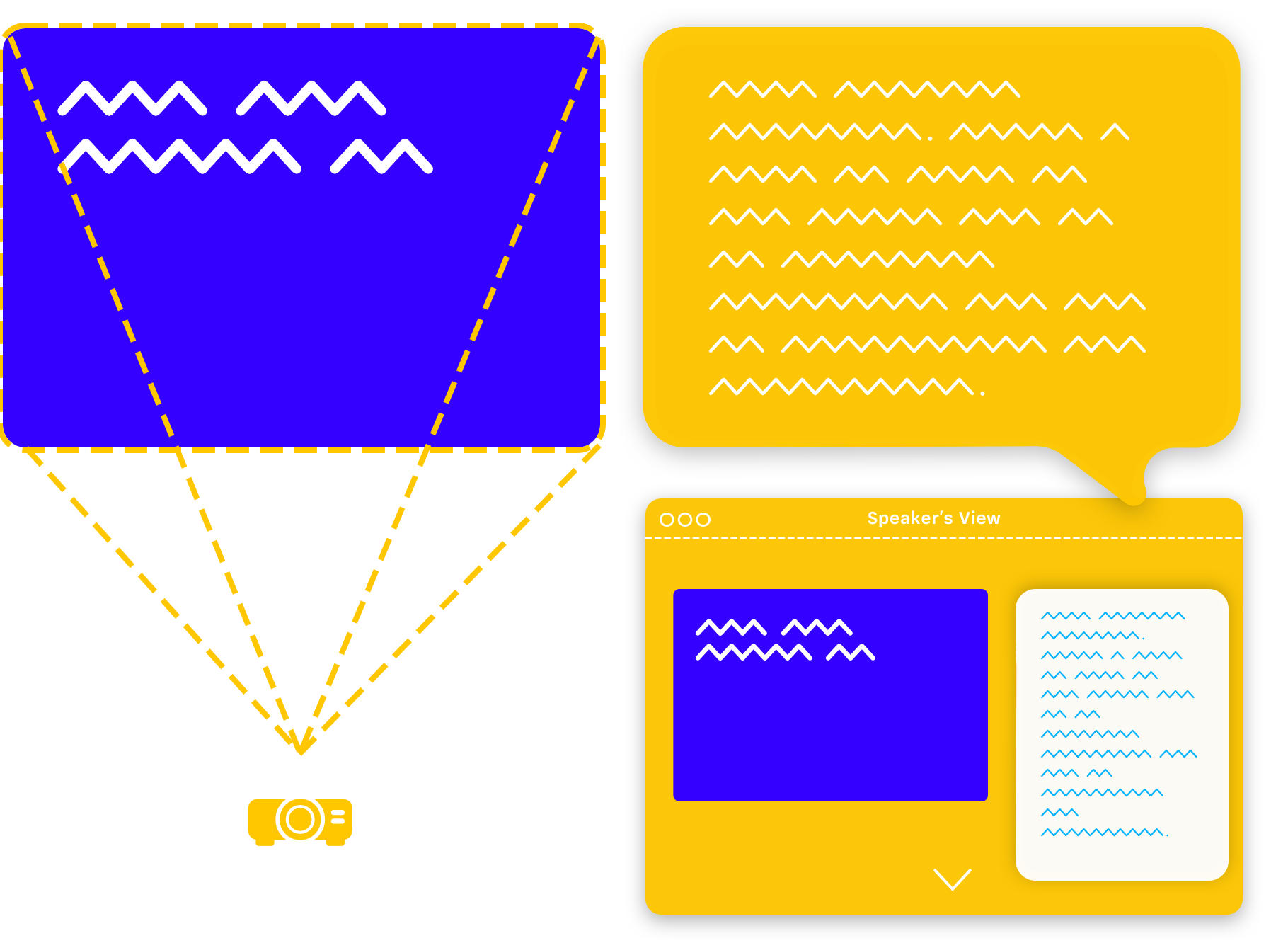
This is why in iA Presenter what you say is only visible to you.


Right, so don’t read out slides. Does this mean you should you read everything from the teleprompter instead? No. Think of your speaker notes as karaoke subtitles. You already know your favorite song by heart. But in case you get lost, it’s there to get you back on track.
Visuals: Tension and Attention
Reading from slides merely explains (again) what everybody already sees. But if that’s true, what should we show on our slides?
1. Less Is More
Strong headlines and great images reinforce what you’re saying. Together, they’re a visual hook where you hang an idea. It keeps your audience focused on your voice.
Not every image is worth a thousand words. Stock imagery is worthless and will likely insult your audience’s intelligence. Pick your visuals as carefully as you choose your words.

When we see something surprising and exciting, we’ll listen. If your story helps us discover something new about the images, we’ll listen. If the image conveys new information, we’ll listen. We won’t listen if you explain what we all already see.
Visual storytelling is as hard as text-based storytelling. You need the same care and skill to pick images that you need to pick words. Inexperienced presenters choose pictures that duplicate or reinforce the message. Both will bore the audience.
An experienced visual storyteller gets their audience’s attention by creating tension between what they say and the visuals. They choose images that raise questions, that make us watch and listen.
2. Design and Layout
Right, so you have a story and great visuals that back each other. Now what? You need a design—but also more than that.
The trouble is that if you design a static slide that’s optimized for your display it’ll only look decent on that display. When the big day comes your layout won’t look right on a tablet, a phone, or other devices.
PowerPoint still forces us to obey strict resolutions and aspect ratios. If we change the resolution, our presentation falls apart. In this era of mobile-first responsive web design it’s… well, staggering that most presentation apps still use unresponsive, static slides.
You should be able to read a presentation on your phone like it’s an email. No zooming, no pinching in and out. So why not do the same for presentations too?
You can. iA Presenter adapts your slides to different devices, automatically. Your presentation will look great anywhere you show it.

Rehearse and Deliver
Put your energy into what you are going to say. Take time to prepare and simplify. It’s important that you stay relaxed and calm, even under pressure.
1. Practice, Practice, Practice
Two things happen when your practice telling your story:
Make it Your Own
When you practice you’ll be exposed to your own argument. Verify it. You’ll hear your own voice. Listen to it. You’ll find snags and rough edges. Edit them out. Experts call this deliberate practice.
Ease Anxiety
The more you edit and practice telling your story, the more confident you’ll feel. Calm yourself by engaging with your story. Lay down memories, one on top of the other. Make it yours. In time you’ll move from thinking “That wasn’t as bad as I remember” to “I can’t wait to do that again”.

2. Your Safety Net
Nothing calms nerves like knowing that you have a backup, a safety net. That’s what your speaker notes in the teleprompter are for, just in case. If you wrote your story, illustrated it properly, practiced, optimized and own it, you won’t need notes at all. Still, it’s nice to know they’re there.
Step up Your Story
You’ll learn more about that makes a great presentation in our in-app tutorial, and check out our blog posts too:
- Being Boring: What’s Wrong With PowerPoint?
- How Can We Make Presentations Better?
- Introducing iA Presenter: The Story-Based Presentation App
-
ibid. “By playing around with Phluff rather than providing information, PowerPoint allows speakers to pretend that they are giving a real talk, and audiences to pretend that they are listening. This prankish conspiracy against substance and thought should always provoke the question, Why are we having this meeting?” ↩
-
Edward Tufte, The Cognitive Style ofPowerPoint: “In day-to-day practice, PowerPoint templates may improve 10% or 20% of all presentations by organizing inept, extremely disorganized speakers, at a cost of detectable intellectual damage to 80%. For statistical data, 1011 the damage levels approach dementia. Since about 1O to 1O PP slides (many using the templates) are made each year, that is a lot of harm to communication with colleagues. Or at least a big waste of time. The damage is mitigated since meetings relying on the PP cognitive style may not matter all that much.” ↩
 Basics
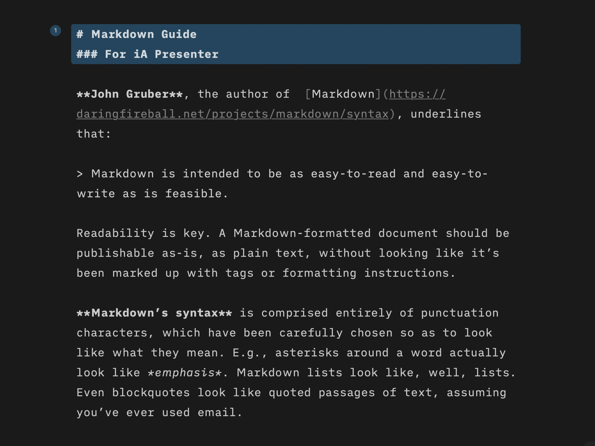
Markdown Guide
Learn quickly the basics of Markdown—or dive in to discover more complex formatting.

Features
Find out what you get with iA Presenter, and how it helps you tell a story they’ll remember.
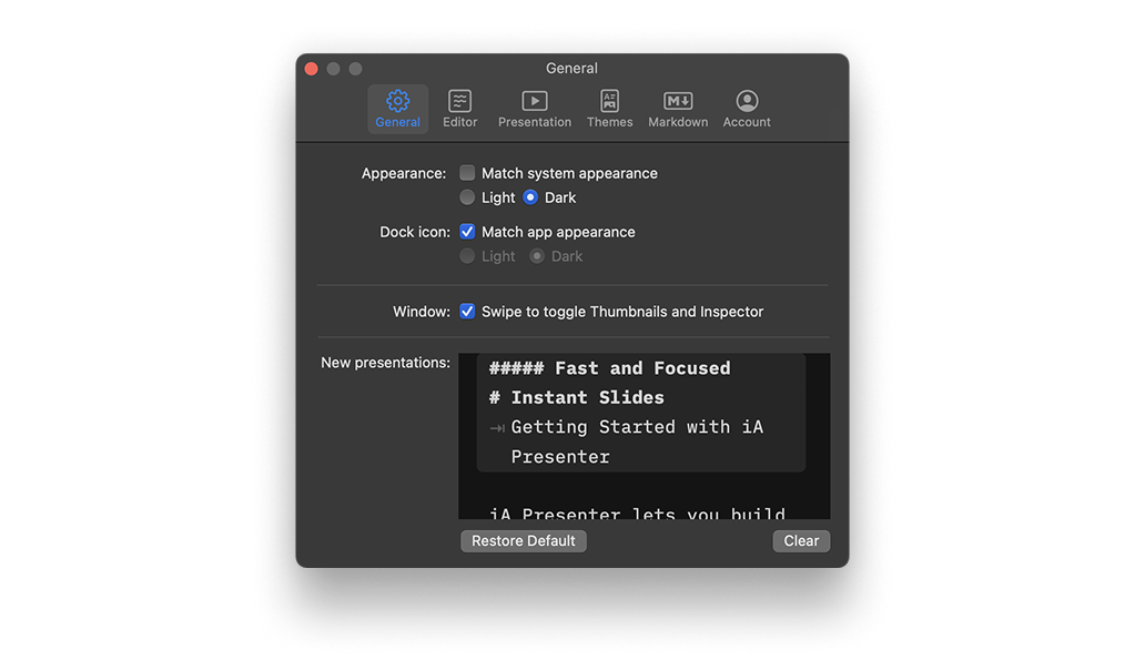
Settings
A wide range of options to fit the various use cases, professional and personal needs.
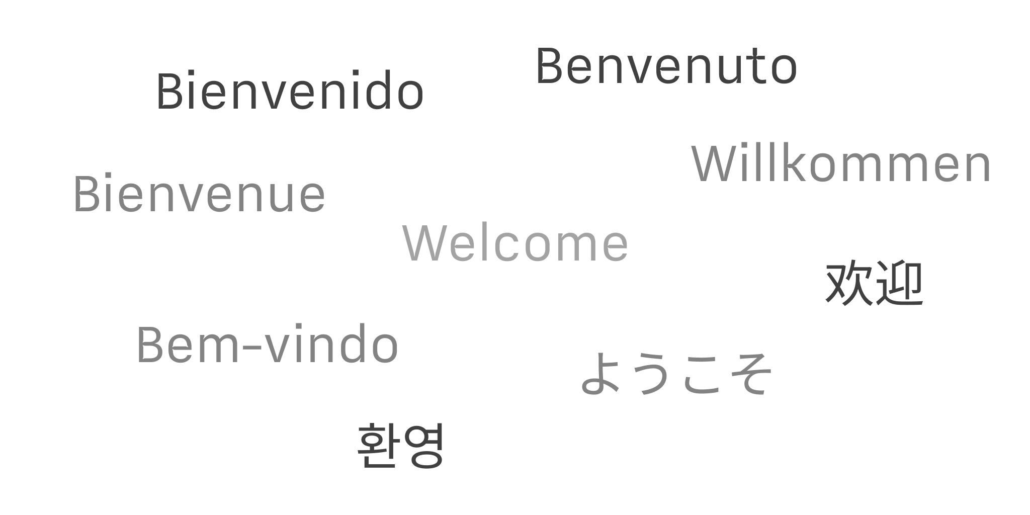
Languages
iA Presenter’s user interface is currently available in English, while presentation content supports left-to-right language text.


