INFORMATION ROOM
Information Architecture: The ancient art of structuring Information. Commonly used as a term for basic structure such as web site navigation. We believe information architecture starts with domain architecture, comprehends site structure, page structure, Container definition and typography. Information Architecture shares many similarities with traditional architecture. The difference in building a house is due to the different building substance. Traditional Architecture works with static problems. The main challenge in Information Architecture is the fluid nature of its substance.
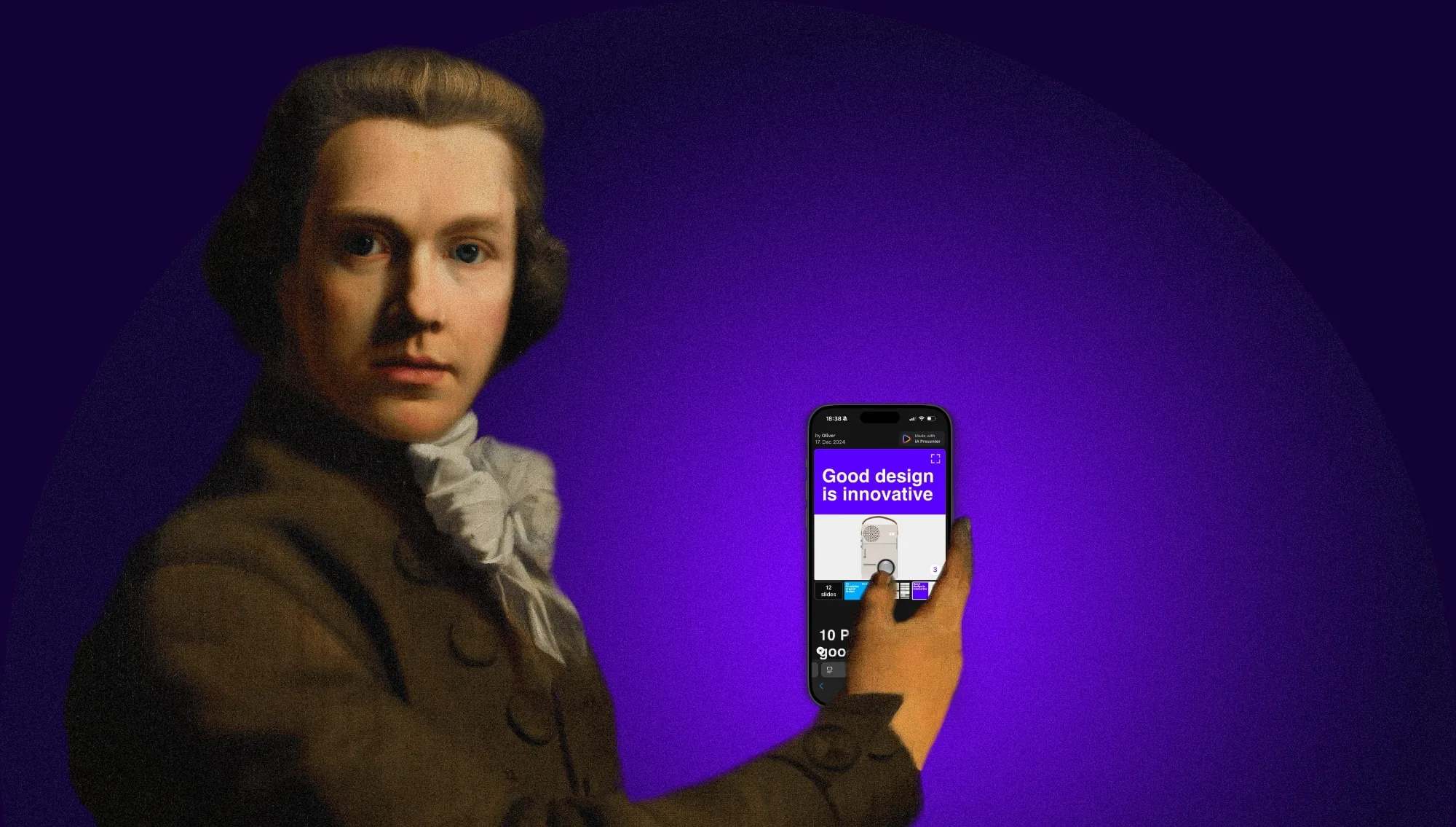
Sharing a presentation should be quick. But it's slow. Viewing a presentation should be easy. But it's hard. Until now.
Will information technology affect our minds the same way the environment was affected by our analogue technology? Designers hold a key position in dealing with ever increasing data pollution. We are mostly focused on speeding things up, on making sharing easier, faster, more accessible. But speed, usability, accessibility are not the main issue anymore.
There is a difference between checking Google Maps on your iPhone and asking a stranger for directions. It matters whether you listened to Beethoven’s 9th in a concert hall or in your living room, whether it plays from a vinyl LP or from your iPod. King Lear is not the same experience when seen at the theatre, studied on paper, or scanned on a Kindle.
Interview with William Channer for DRT, focusing on “the importance of keeping interfaces simple, why current websites are complicated and the pitfalls of research and why it's a good starting point to understand user expectations.” This is the unedited transcript of the interview.
I had a perspective-changing talk on the subject of pay walls with the chief executive of a big publishing company (no, I can't tell you who). He asked me what I think about pay walls.
How do you navigate content on the iPad? Scroll or flip? In 1987, the biggest neck beards in tech held a conference on the Future of Hypertext and there were two camps, “Card Sharks” and “Holy Scrollers”. They had an epic battle over this question: Should you scroll or flip pages on the screen? Who won the fight?
A presentation with the title "iA on IA," held at EuroIA 2010.
Jeron van Geel interviewed Oliver Reichenstein on Jonny Holland. He asked a series of questions about the relationship between Philosophy, Design, Japan and Western culture.
From December 2006 to February 2007 we were in touch with the product manager of Facebook. The prospective: Redesigning Facebook. Eventually. Since the contract was never signed, we kept our designs in the drawer. Until now…
I sat down with the video team of GaijinPot for a short interview about the Web Trend Map.
Designers are narcissists, programmers are nerds, and whoever wears a tie must be a jerk. Designers, programmers and business people love to hate each other. That's why we keep them separated…
Das ultimative Tool für Internetfreaks, die Web Trend Map 2008, ist nun als A0-Poster erhältlich.
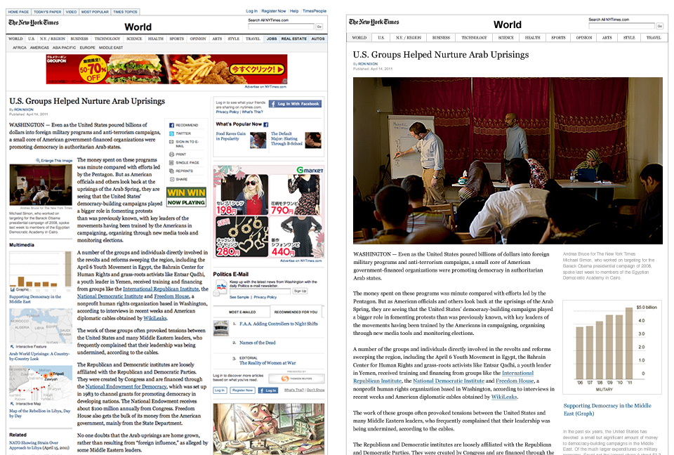
The last couple of days we have received some excellent feedback on our article “Washington Post Redesign as a Wiki”. First of all, thank you to everyone who took the time to study our problem and form an opinion. To be able to receive input from the best people in the field is rare and rewarding. We got lots of applause, together with some questions and reservations.
When I read this morning that USA Today "refashions itself as a social network", I got a little shock as I was worried that they are going to eat our client's lunch. Fear nothing, client. Among information designers the USA Today redesign is a laughing stock.
Your website is more important for your company and its brand portfolio than your business card, your brochures, the products you sell, your packaging, the address and the building your company resides in.
Whoever performed any usability tests knows that users look at the content straight away. Users first look the pictures, then at the titles, then at the text. Navigation often gets completely ignored. In my seven years of conceiving websites and monitoring usability tests I am tempted to say that navigation is useless.