iA / Dictionary / T / Threshold

🚪

A | B | C | D | E | F | G | H | I | J | K | L | M | N | O | P | Q | R | S | T | U | V | W | X | Y | Z

Threshold: The element, place or zone, visible, tangible, audible or imaginary that both limits and connects two spheres and the (change of) mindset that’s required to move from one to the other. As part of iA’s core Metaphysics, thresholds are often cited with reference to Jean Genette’s legendary book “Seuils”. Practical everyday examples of thresholds are book covers, beaches, and the 100 things that happen before you can watch a movie at the cinema. In interaction design, thresholds are often overlooked or unconsciously regarded as irrelevant. Too few web Designers realize that when they design a web site, they shape both the information and thresholds in between blocks of information, on an unknown server, inside an unknown browser, inside an unknown operating system, inside an unknown computer, inside an unknown setting, inside an unknown mind, in an unknown time and place. Even fewer designers can recognize the nature, importance and impact of thresholds between each of those spheres. Recognizing, understanding and shaping thresholds is the key to any form of superior interaction design. Thresholds both constrain and connect Text and Context. Creating, shaping and managing thresholds is a core challenge of the interaction designer. Moving between thresholds is transformational: You are one person at home, you are a different person when you leave the house, and another person when you enter the office. Thresholds allow you to adapt to new contexts and appropriately transform from, f.i. you at home, to you-as-a-pedestrian, to you-at-work. Discovering and reflecting on thresholds is mesmerizing, but be warned: Abstract thinking about thresholds can lead directly into a philosophical abyss as thinking about the nature of Interfaces. If all of this didn’t confuse you enough, here’s the killer: Interfaces are thresholds.

Articles related to Threshold

“400,000 downloads with a super simple app” (Business Insider)

The following Interview on iA Writer and the secret of its success has appeared in Business Insider, who reached out to us, “to get the story on where his app came from, where it's heading, and what's wrong with contemporary text editors.”

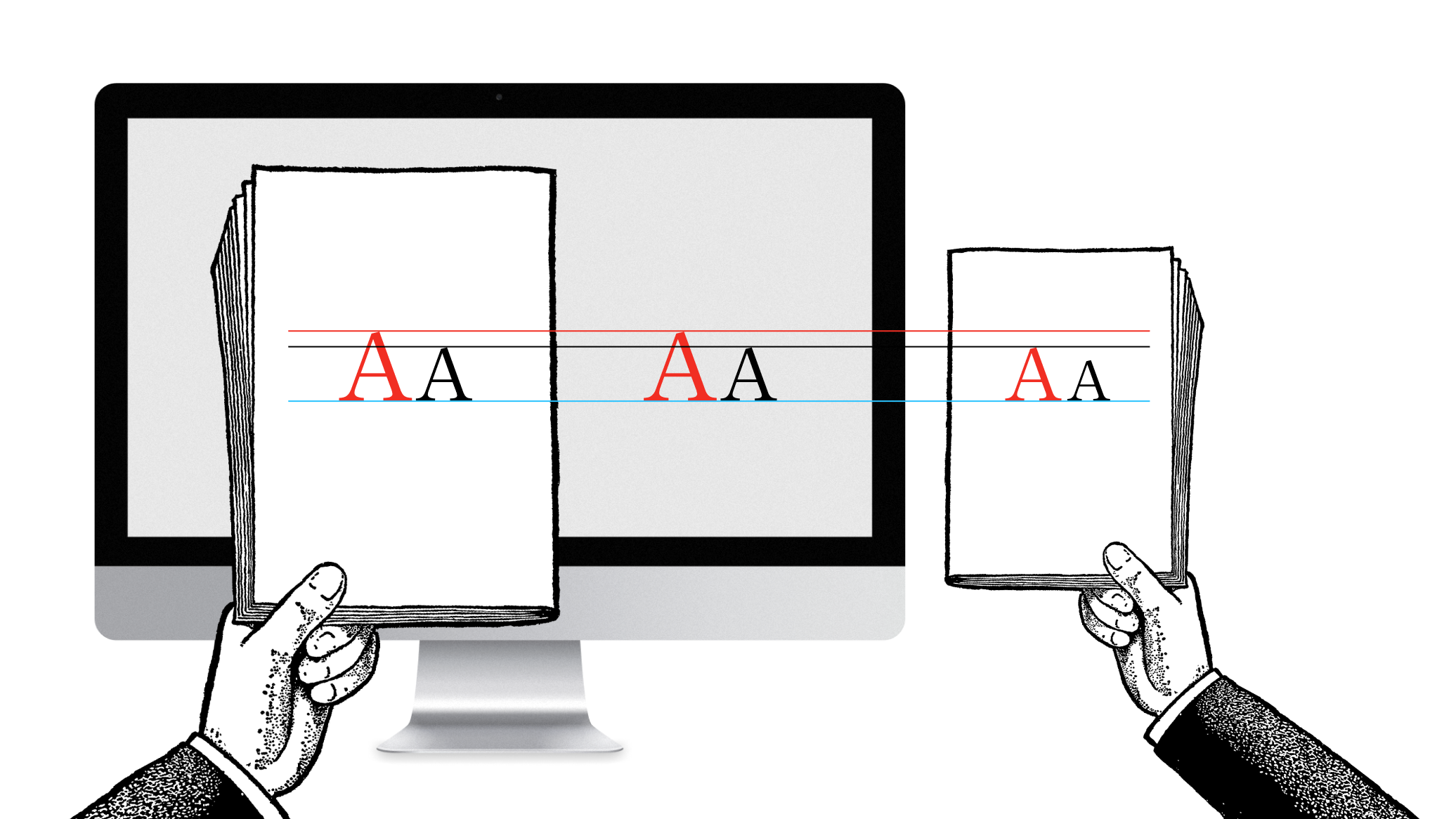
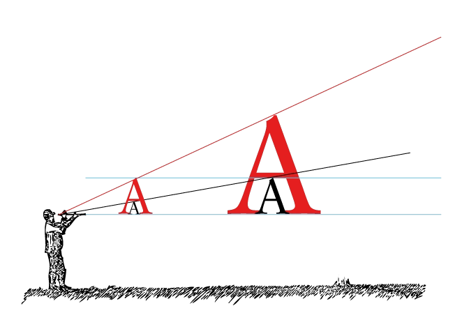
Responsive Typography: The Basics

When we built websites we usually started by defining the body text. The body text definition dictates how wide your main column is, the rest used to follow almost by itself. Used to. Until recently, screen resolution was more or less homogeneous. Today we deal with a variety of screen sizes and resolutions. This makes things much more complicated.

New Site with Responsive Typography

With the chaos of different screen sizes and a new generation of web browsers, the design paradigms of layout and typography have shifted away from static layouts and system fonts to dynamic layouts and custom web fonts. Screens are changing not just in size, but also in pixel density. Now we need not only responsive layouts, we also need responsive typefaces.

“Web design is engineering” (Jonny Holland)

Jeron van Geel interviewed Oliver Reichenstein on Jonny Holland. He asked a series of questions about the relationship between Philosophy, Design, Japan and Western culture.

iA’s 2006 Facebook Designs, Redesigned

From December 2006 to February 2007 we were in touch with the product manager of Facebook. The prospective: Redesigning Facebook. Eventually. Since the contract was never signed, we kept our designs in the drawer. Until now…

What’s Next in Web Design?

I’ve been asked by the Italian magazine L’Espresso to write an article on The Future of Web Design. Here is the (longer) English text.

Webapp Death Match: Google vs. Apple

With websites turning more and more into web applications, functionally as well as aesthetically, it'd be interesting to look at what makes a Web app work in terms of skinning. We start off by comparing two different approaches: HTML-skin vs. desktop-application-skin. In other words, Google versus Apple.

Branding Crimes: 4. The Start-Button

We have hated this thing for over 12 years now—the button that launches a pull-up menu. Only the twisted minds over at Redmond could come up with this. Yeah, I know it's not a real "Start" button anymore, with Vista it's become more of a clickable logo like the Macintosh one. But, after all this time, it is still a push-up menu. And that is another major branding crime. Why?

Branding Crimes: 2. Stealing Interfaces

A wonderful example of what not to do if you believe that Brand = Interface. Copying interfaces defines you as a second choice company.

Branding Crimes: 1. Missing Logo

The Interface is the brand—but few interfaces qualify to leave out the main orientational element—the logo.

Face Off: The Essentials of Online Rebranding

A company may choose to rebrand itself because of a merger, a bankrupting scandal, or because they simply have outgrown their name. These are solid reasons; however, on the web, rebranding should be considered with the caution of a face transplant.