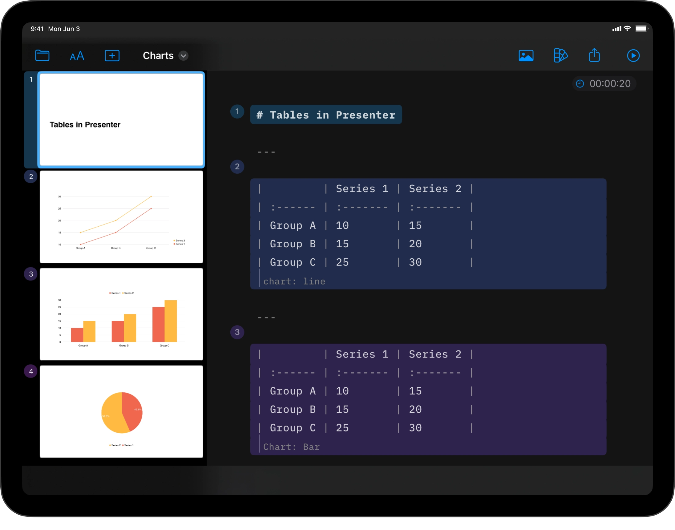
Tables and Charts iPhone
Charts tell a story better when they stay simple. Presenter’s charts are focused, with quiet colors and readable layouts. Create tables and charts directly in the Markdown Editor. No third-party tools. No copy-paste.
Adding Tables
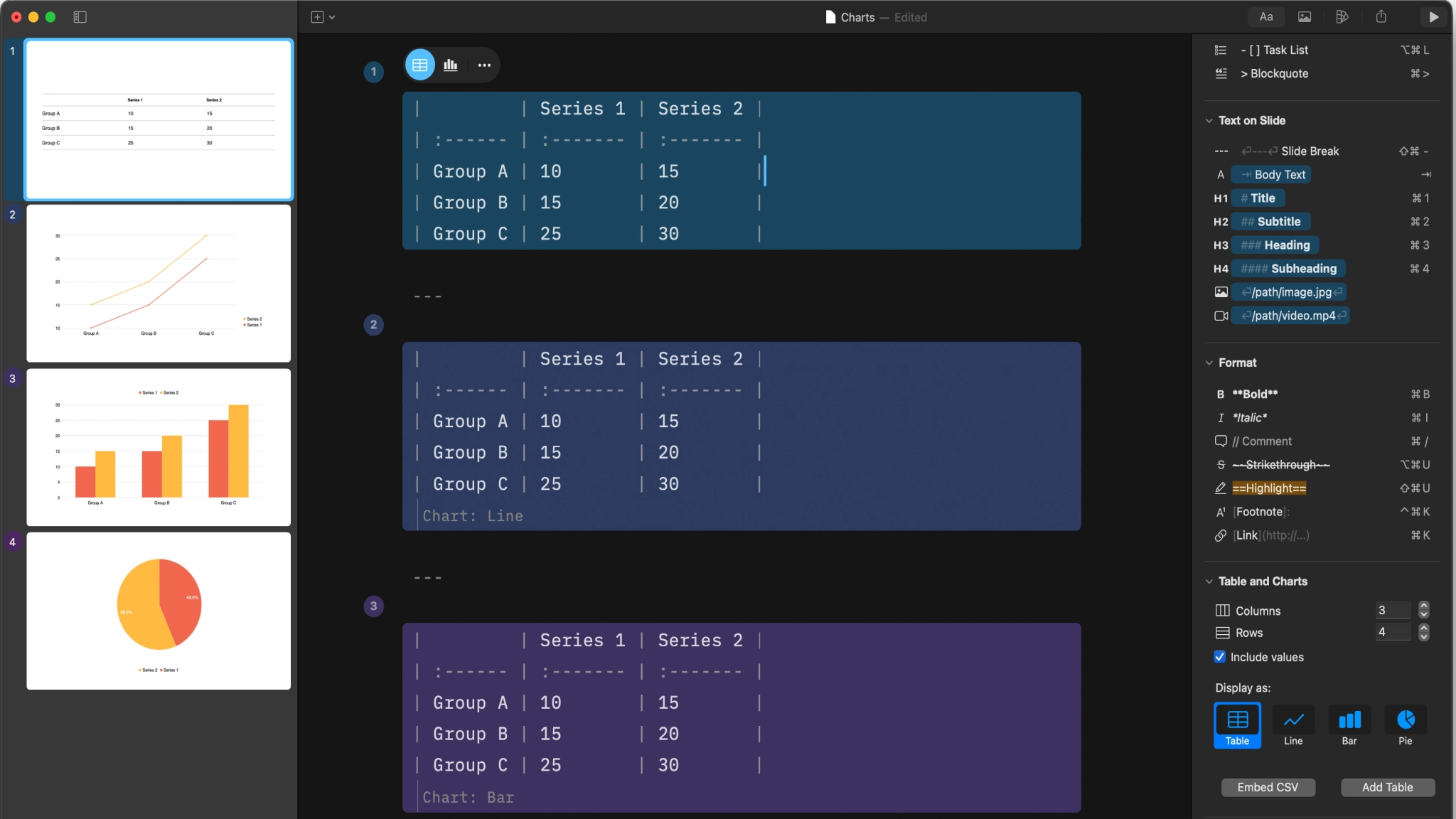
Markdown tables are easier to read than HTML, but still a weak spot. This is how a table renders in the Editor and Preview.


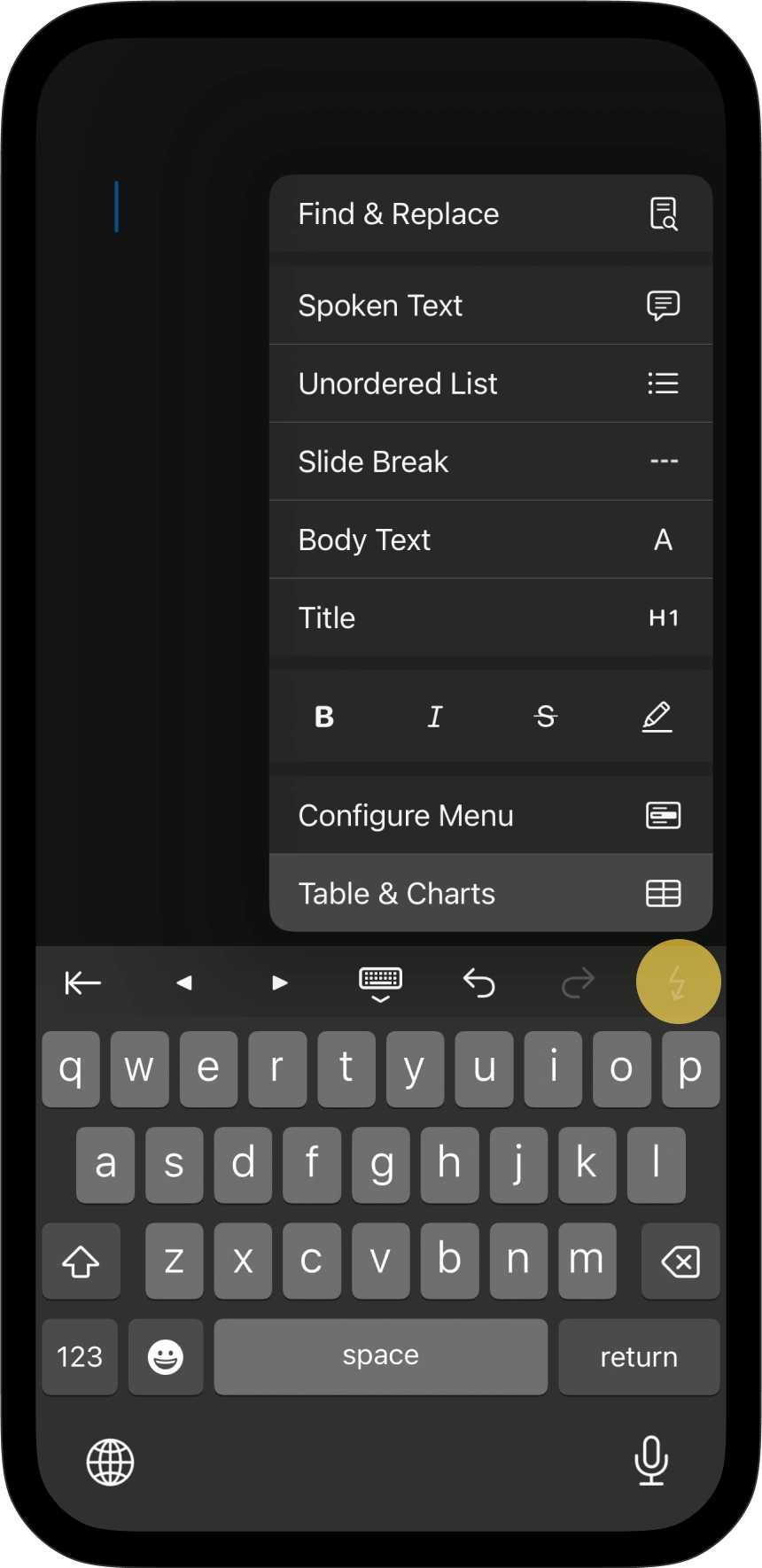
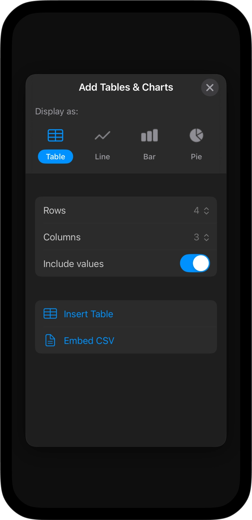
Typing tables by hand with Markdown syntax is tedious. iA Presenter includes a built-in table generator. Add the Tables and Charts action to the lightning menu (from keyboard settings), then access table and chart options directly from there.
You can import an existing CSV if your data is ready. For larger datasets, use native CSV blocks. This keeps complex data manageable.
You can also copy-paste a table from your browser. It will paste it directly in Markdown in the Editor.
To edit a table, click inside it. A contextual toolbar appears on the top of the table. Select the table icon, then the three dots ... on the right to adjust structure, add labels, apply colors, or write a caption.

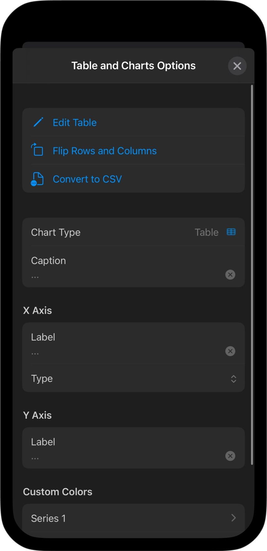
💡 Use Edit Table to work on larger tables more comfortably than editing them directly in the Editor.
More options are available inside the table. Click in the top row of the table and a drop-down arrow will appear to open another contextual menu. Add or delete columns, or change the alignment.
Tables stay clean as you work. Formatting adapts automatically, even when pasting data from external sources.
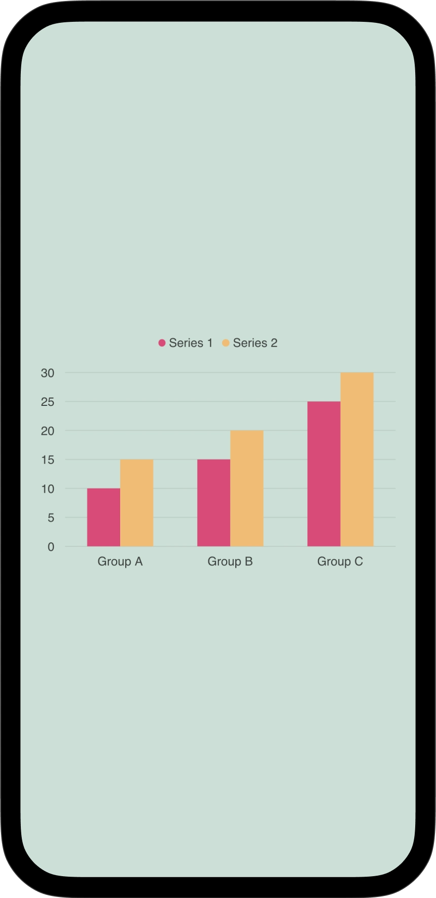
Making Charts
Every table can become a chart. Just like for tables, click inside the table, then select the chart icon in the contextual toolbar (the icon in the middle).


Use the three dots ... on the right side of the toolbar for more options. Click inside the header row to reveal the drop-down arrow with additional controls.

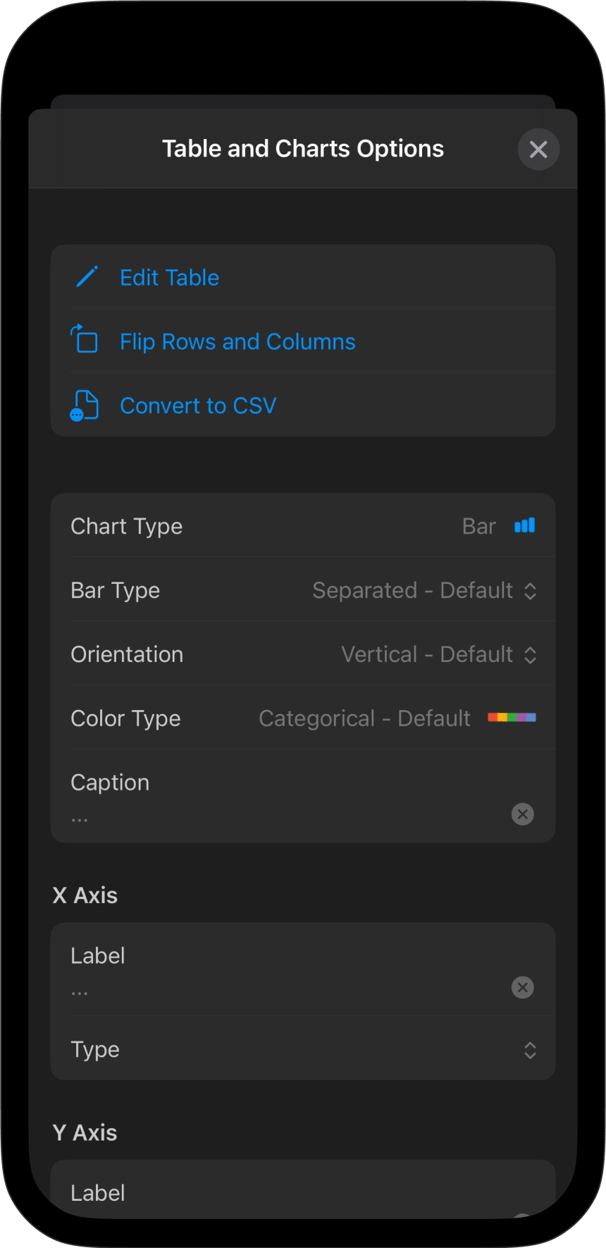
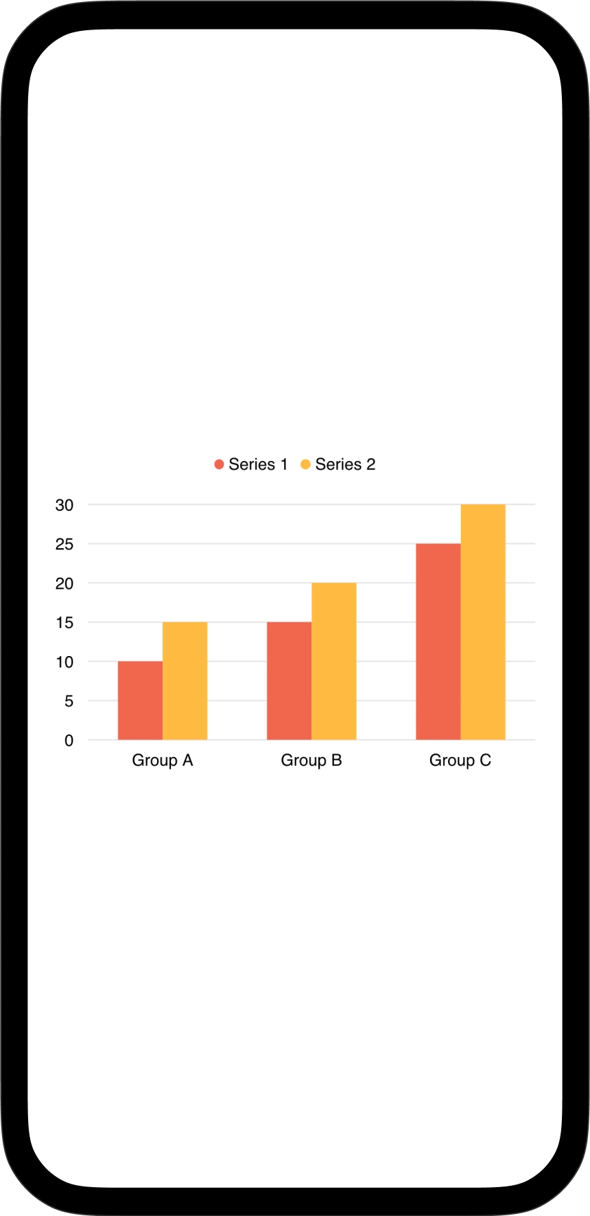
Charts work out of the box. The selection is intentionally limited: bar, line, and pie. Layouts adapt automatically. Colors are balanced and match your theme. No fine-tuning needed.
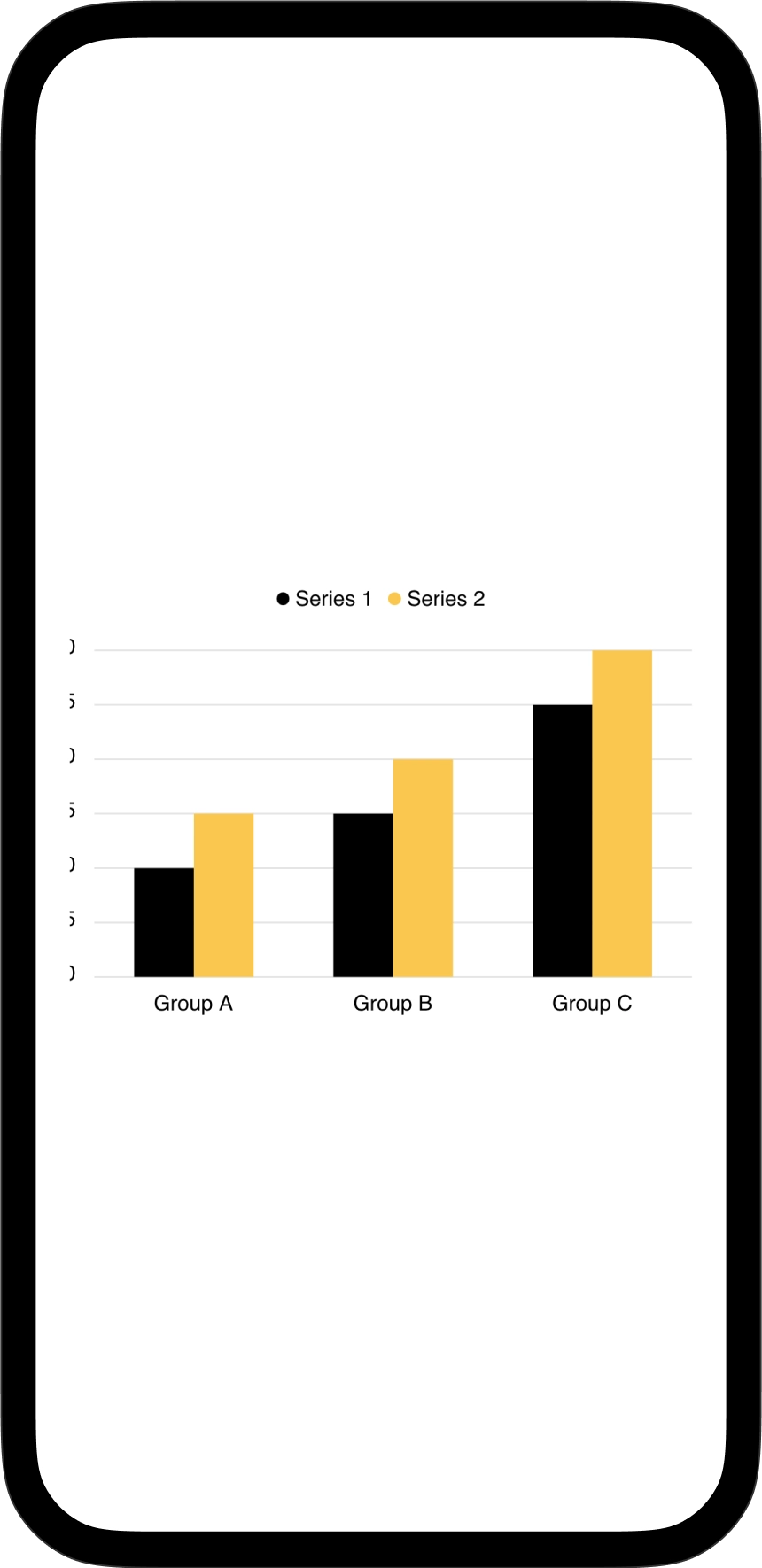
Just like with text and visual elements in slides, charts follow the good old rule: less is more. Keep your data simple, and reduce the number of charts to only what your audience truly needs to understand the story.